Record Heat May Be from Natural Sources: El Niño and Water Vapor from 2022 Tonga Eruption

The record heat worldwide over the last few months – simultaneous heat waves in both the Northern and Southern Hemispheres, and abnormally warm oceans – has led to the hysterical declaration of “global boiling” by the UN Secretary General, the media and even some climate scientists. But a rational look at the data reveals that the cause may be natural sources, not human CO2.

The primary source is undoubtedly the warming El Niño ocean cycle, a natural event that recurs at irregular intervals from two to seven years. The last strong El Niño, which temporarily raised global temperatures by about 0.14 degrees Celsius (0.25 degrees Fahrenheit), was in 2016. For comparison, it takes a full decade for current global warming to increase temperatures by that much. 

However, on top of the 2023 El Niño has been an unexpected natural source of warming – water vapor in the upper atmosphere, resulting from a massive underwater volcanic eruption in the South Pacific kingdom of Tonga in January 2022.

Normally, erupting volcanoes cause significant global cooling, from shielding of sunlight by sulfate aerosol particles in the eruption plume that linger in the atmosphere. Following the 1991 eruption of Mount Pinatubo in the Philippines, for example, the global average temperature fell by 0.6 degrees Celsius (1.1 degrees Fahrenheit) for more than a year.

But the eruption of the Hunga Tonga–Hunga Haʻapai volcano did more than just launch a destructive tsunami and shoot a plume of ash, gas, and pulverized rock 55 kilometers (34 miles) into the sky. It also injected 146 megatonnes (161 megatons) of water vapor into the stratosphere (the layer of the atmosphere above the troposphere) like a geyser. Because it occurred only about 150 meters (500 feet) underwater, the eruption immediately superheated the shallow seawater above and converted it explosively into steam.

Although the excess water vapor – enough to fill more than 58,000 Olympic-size swimming pools – was originally localized to the South Pacific, it quickly diffused over the whole globe. According to a recent study by a group of atmospheric physicists at the University of Oxford and elsewhere, the eruption boosted the water vapor content of the stratosphere worldwide by as much as 10% to 15%. 

Water vapor is a powerful greenhouse gas, the dominant greenhouse gas in the atmosphere in fact; it is responsible for about 70% of the earth’s natural greenhouse effect, which keeps the planet at a comfortable enough temperature for living organisms to survive, rather than 33 degrees Celsius (59 degrees Fahrenheit) cooler. So even 10–15% extra water vapor in the stratosphere makes the earth warmer.

The study authors estimated the additional warming from the Hunga Tonga eruption using a simple climate model combined with a widely available radiative transfer model. Their estimate was a maximum global warming of 0.035 degrees Celsius (0.063 degrees Fahrenheit) in the year following the eruption, diminishing over the next five years. The cooling effect of the small amount of sulfur dioxide (SO2) from the eruption was found to be minimal.

As I explained in an earlier post, any increase in ocean surface temperatures from the Hunga Tonga eruption would have been imperceptible, at a minuscule 14 billionths of a degree Celsius or less. That’s because the oceans, which cover 71% of the earth’s surface, are vast and can hold 1,000 times more heat than the atmosphere. Undersea volcanic eruptions can, however, cause localized marine heat waves, as I discussed in another post.

Although 0.035 degrees Celsius (0.063 degrees Fahrenheit) of warming from the Hunga Tonga eruption pales in comparison with 2016’s El Niño boost of 0.14 degrees Celsius (0.25 degrees Fahrenheit), it’s nevertheless more than double the average yearly increase of 0.014 degrees Celsius (0.025 degrees Fahrenheit) of global warming from other sources such as greenhouse gases.

El Niño is the warm phase of ENSO (the El Niño – Southern Oscillation), a natural cycle that causes drastic temperature fluctuations and other climatic effects in tropical regions of the Pacific, as well as raising temperatures globally. Its effect on sea surface temperatures in the central Pacific is illustrated in the figure below. It can be seen that the strongest El Niños, such as those in 1998 and 2016, can make Pacific surface waters more than 2 degrees Celsius (3.6 degrees Fahrenheit) hotter for a whole year or so. 

Exactly how strong the present El Niño will be is unknown, but the heat waves of July suggest that this El Niño – augmented by the Hunga Tonga water vapor warming – may be super-strong. Satellite measurements showed that, in July 2023 alone, the temperature of the lower troposphere rose from 0.38 degrees Celsius (0.68 degrees Fahrenheit) to 0.64 degrees Celsius (1.2 degrees Fahrenheit) above the 1991-2020 mean.

If this El Niño turns out to be no stronger than in the past, then the source of the current “boiling” heat will remain a mystery. Perhaps the Hunga Tonga water vapor warming is larger than the Oxford group estimates. The source certainly isn’t any warming from human CO2, which raises global temperatures gradually and not abruptly as we’ve seen in 2023.

Next: Has the Mainstream Media Suddenly Become Honest in Climate Reporting?

No Evidence That Extreme Weather on the Rise: A Look at the Past - (6) Wildfires

This post on wildfires completes the present series on the history of weather extremes. The mistaken belief that weather extremes are intensifying be­cause of climate change has only been magnified by the smoke recently wafting over the U.S. from Canadian wildfires, if you believe the apocalyptic proclamations of Prime Minister Trudeau, President Biden and the Mayor of New York.

But, just as with all the other examples of extreme weather presented in this series, there’s no scientific evidence that wildfires today are any more frequent or severe than anything experienced in the past. Although wildfires can be exacerbated by other weather extremes such as heat waves and drought, we’ve already seen that those extremes are not on the rise either.

Together with tornadoes, wildfires are probably the most fearsome of the weather extremes commonly blamed on global warming. Both can arrive with little or no warning, making it difficult or impossible to flee, are often deadly, and typi­cally destroy hundreds of homes and other structures.

The worst wildfires occur in naturally dry climates such as those in Australia, Cali­fornia or Spain. One of the most devastating fire seasons in Australia was the summer of 1938-39, which saw bushfires (as they’re called down under) burning all summer, with ash from the fires falling as far away as New Zealand. The Black Friday bushfires of January 13, 1939 engulfed approximately 75% of the southeast state of Victoria, killing over 60 people as described in the article from the Telegraph-Herald on the left below, and destroying 1,300 buildings; as reported:

In the town of Woodspoint alone, 21 men and two women were burned to death and 500 made destitute.  

Just a few days later, equally ferocious bushfires swept through the neighboring state of South Australia. The inferno reached the outskirts of the state capital, Adelaide, as documented in the excerpt from the Adelaide Chronicle newspaper on the right above.

Nationally, Australia’s most extensive bushfire season was the catastrophic series of fires in 1974-75 that consumed 117 million hectares (290 million acres), which is 15% of the land area of the whole continent. Fortunately, because nearly two thirds of the burned area was in remote parts of the Northern Territory and Western Australia, relatively little human loss was incurred – only six people died – though livestock and native animals such as lizards and red kangaroos suffered. An estimated 57,000 farm animals were killed.

The 1974-75 fires were fueled by abnormally heavy growth of lush grasses, following unprecedented rainfall in 1974. The fires began in the Barkly Tablelands region of Queensland, a scene from which is shown below. One of the other bushfires in New South Wales had a perimeter of more than 1,000 km (620 miles).

In the U.S., while the number of acres burned annually has gone up over the last 20 years or so, the present area consumed by wildfires is still only a small fraction of what it was back in the 1930s – just like the frequency and duration of heat waves, discussed in the preceding post. The western states, especially California, have a long history of disastrous wildfires dating back many centuries.

Typical of California conflagrations in the 1930s are the late-season fires around Los Angeles in November 1938, described in the following article from the New York Times. In one burned area 4,100 hectares (10,000 acres) in extent, hundreds of mountain and beach cabins were wiped out. Another wildfire burned on a 320-km (200-mile) front in the mountains. As chronicled in the piece, the captain of the local mountain fire patrol lamented that:

This is a major disaster, the worst forest fire in the history of Los Angeles County. Damage to watersheds is incalculable.

Northern California was incinerated too. The newspaper excerpts below from the Middlesboro Daily News and the New York Times report on wildfires that broke out on a 640-km (400-mile) front in the north of the state in 1936, and near San Francisco in 1945, respectively. The 1945 article documents no less than 6,500 separate blazes in California that year.

Pacific coast states further north were not spared either. Recorded in the following two newspaper excerpts are calamitous wildfires in Oregon in 1936 and Canada’s British Columbia in 1938; the articles are both from the New York Times. The 1936 Oregon fires, which covered an area of 160,000 hectares (400,000 acres), obliterated the village of Bandon in southwestern Oregon, while the 1938 fire near Vancouver torched an estimated 40,000 hectares (100,000 acres). Said a policeman in the aftermath of the Bandon inferno, in which as many as 15 villagers died:

If the wind changes, God help Coquille and Myrtle Point. They’ll go like Bandon did.

In 1937, a wildfire wreaked similar havoc in the neighboring U.S. state of Wyoming. At least 12 people died when the fire raged in a national forest close to Yellowstone National Park. As reported in the Newburgh News article on the left below:

The 12th body … was burned until even the bones were black beneath the skin.

and    A few bodies were nearly consumed.

The article on the right from the Adelaide Advertiser reports on yet more wildfires on the west coast, including northern California, in 1938.

As further evidence that modern-day wildfires are no worse than those of the past, the two figures below show the annual area burned by wildfires in Australia since 1905 (as a percentage of total land area, top), and in the U.S. since 1926 (bottom). Clearly, the area burned annually is in fact declining, despite hysterical claims to the contrary by the mainstream me­dia. The same is true of other countries around the world.

Next: Hottest in 125,000 Years? Dishonest Claim Contradicts the Evidence

No Evidence That Extreme Weather on the Rise: A Look at the Past - (5) Heat Waves

Recent blistering hot spells in Texas, the Pacific northwest and Europe have only served to amplify the belief that heat waves are now more frequent and longer than in the past, due to climate change. But a careful look at the evidence reveals that this belief is mistaken, and that current heat waves are no more linked to global warming than any of the other weather extremes we’ve examined.

It’s true that a warming world is likely to make heat waves more common. By definition, heat waves are periods of abnormally hot weather, last­ing from days to weeks. However, heat waves have been a regular feature of Earth’s climate for at least as long as recorded history, and heat waves of the last few decades pale in comparison to those of the 1930s – a period whose importance is frequently downplayed by the media and climate activists.

Those who dismiss the 1930s justify their position by claiming that the searing heat was confined to just 10 of the Great Plains states in the U.S. and caused by Dust Bowl drought. But this simply isn’t so. The evidence shows that the record heat of the 1930s – when the globe was also warming – extended throughout much of North America, as well as other countries such as France, India and Australia.

In the summer of 1930 two record-setting, back-to-back scorchers, each lasting 8 days, afflicted Washington, D.C. in late July and early August. During that time, 11 days in the capital city saw maximum temperatures above 38 Degrees Celsius (100 degrees Fahrenheit). Nearby Harrisonburg, Virginia roasted in July and August also, experiencing its longest heat wave on record, lasting 23 days, with 10 days of 38 Degrees Celsius (100 degrees Fahrenheit) or more.

In April the same year, an historic 6-day heat wave enveloped the whole eastern and part of the central U.S., as depicted in the figure below, which shows sample maximum temperatures for selected cities over that period. The accompanying excerpt from a New York Times article chronicles heat events in New York that July.

The hottest years of the 1930s heat waves in the U.S. were 1934 and 1936. Typical newspaper articles from those two extraordinarily hot years are set out below.

The Western Argus article on the left reports how the Dust Bowl state of Oklahoma in 1934 endured an incredible 36 successive days on which the mercury exceeded 38 degrees Celsius (100 degrees Fahrenheit) in central Oklahoma. On August 7, the temperature there climbed to a sizzling 47 degrees Celsius (117 degrees Fahrenheit). And in the Midwest, Chicago and Detroit, both cities for which readings of 32 degrees Celsius (90 degrees Fahrenheit) are normally considered uncomfortably hot, registered over 40 degrees Celsius (104 degrees Fahrenheit) the same day.

It was worse in other cities. In the summer of 1934, Fort Smith, Arkansas recorded an unbelievable 53 consecutive days with maximum temperatures of 38 degrees Celsius (100 degrees Fahrenheit) or higher. Topeka, Kansas, had 47 days, Oklahoma City had 45 days and Columbia, Missouri had 34 days when the mercury reached or passed that level. Approximately 800 deaths were attributed to the widespread heat wave.

In a 13-day heat wave in July, 1936, the Canadian province of Ontario – well removed from the Great Plains where the Dust Bowl was concentrated – saw the thermometer soar above 44 degrees Celsius (111 degrees Fahrenheit) during the longest, deadliest Canadian heat wave on record. The Toronto Star article on the right above describes conditions during that heat wave in normally temperate Toronto, Ontario’s capital. As reported:

a great mass of the children of the poverty-stricken districts of Toronto are today experiencing some of the horrors of Dante’s Inferno.

and, in a headline,

            Egg[s] Fried on Pavement – Crops Scorched and Highways Bulged      

Portrayed in the next figure are two scenes from the 1936 U.S. heat wave; the one on the left shows children cooling off in New York City on July 9, while the one on the right shows ice being delivered to a crowd in Kansas City, Missouri in August.

Not only did farmers suffer and infrastructure wilt in the 1936 heat waves, but thousands died from heatstroke and other hot-weather ailments. By some estimates, over 5,000 excess deaths from the heat occurred that year in the U.S. and another 1,000 or more in Canada; a few details appear in the two newspaper articles on the right below, from the Argus-Press and Bend Bulletin, respectively.

The article on the left above from the Telegraph-Herald documents the effect of the July 1936 heat wave on the Midwest state of Iowa, which endured 12 successive days of sweltering heat. The article remarks that the 1936 heat wave topped the previous one in 1934, when the mercury reached or exceeded the 38 degrees Celsius (100 degrees Fahrenheit) mark for 8 consecutive days.

Heat waves lasting a week or longer in the 1930s were not confined to North America; the Southern Hemisphere baked too. Adelaide on Australia’s south coast experienced a heat wave at least 11 days long in 1930, and Perth on the west coast saw a 10-day spell in 1933, as described in the articles below from the Register News and Longreach Leader, respectively.

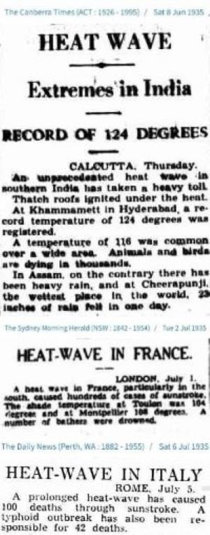
Not to be outdone, 1935 saw heat waves elsewhere in the world. The adjacent three excerpts from Australian newspapers recorded heat waves that year in India, France and Italy, although there is no information about their duration; the papers were the Canberra Times, the Sydney Morning Herald and the Daily News.  But 1935 wasn’t the only 1930s heat wave in France. In August 1930, Australian and New Zealand (and presumably French) newspapers recounted a French heat wave earlier that year, in which the temperature soared to a staggering 50 degrees Celsius (122 degrees Fahrenheit) in the Loire valley – besting a purported record of 46 degrees Celsius (115 degrees Fahrenheit) set in southern France in 2019.  

Many more examples exist of the exceptionally hot 1930s all over the globe. Even with modern global warming, there’s nothing unusual about current heat waves, either in frequency or duration.

Next: No Evidence That Extreme Weather on the Rise: A Look at the Past - (6) Wildfires

No Evidence That Extreme Weather on the Rise: A Look at the Past - (4) Droughts

Severe droughts have been a continuing feature of the earth’s climate for millennia, but you wouldn’t know that from the brouhaha in the mainstream media over last summer’s drought in Europe. Not only was the European drought not unprecedented, but there have been numerous longer and drier droughts throughout history, including during the past century.

Because droughts typically last for years or even decades, their effects are far more catastrophic for human and animal life than those of floods which usually recede in weeks or months. The consequences of drought include crop failure, starvation and mass migration. As with floods, droughts historically have been most common in Asian countries such as China and India.

One of most devastating natural disasters in Chinese history was the drought and subsequent famine in northern China from 1928 to 1933. The drought left 3.7 million hectares (9.2 million acres) of arable land barren, leading to a lengthy famine exacerbated by civil war. An estimated 3 million people died of starvation, while Manchuria in the northeast took in 4 million refugees.

Typical scenes from the drought are shown in the photos below. The upper photo portrays three starving boys who had been abandoned by their families in 1928 and were fed by the military authorities. The lower photo shows famine victims in the city of Lanzhou.

The full duration of the drought was extensively covered by the New York Times. In 1929, a lengthy article reported that relief funds from an international commission could supply just one meal daily to:

 only 175,000 sufferers out of the 20 million now starving or undernourished.

and    missionaries report that cannibalism has commenced.

A 1933 article, an excerpt from which is included in the figure above, chronicled the continuing misery four years later:

Children were being killed to end their suffering and the women of families were being sold to obtain money to buy food for the other members, according to an official report.

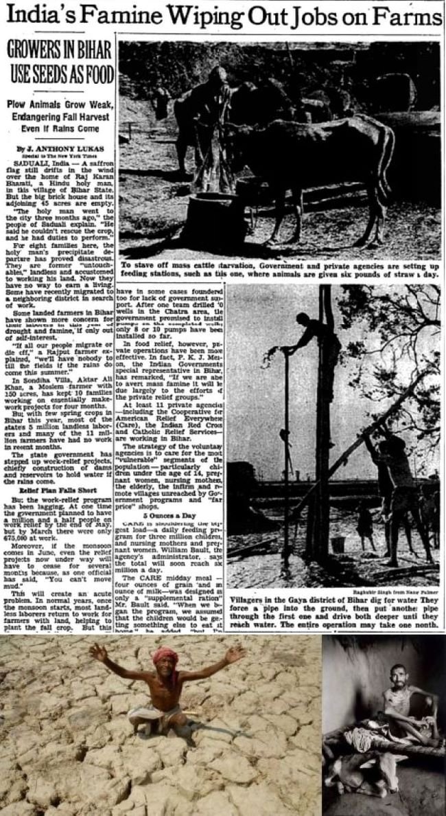
Drought has frequently afflicted India too. One of the worst episodes was the twin droughts of 1965 and 1966-67, the latter in the eastern state of Bihar. Although only 2,350 Indians died in the 1966-67 drought, it was only unprecedented foreign food aid that prevented mass starvation. Nonetheless, famine and disease ravaged the state, and it was reported that as many as 40 million people were affected.

Particularly hard hit were Bihar farmers, who struggled to keep their normally sturdy plow-pulling bullocks alive on a daily ration of 2.7 kilograms (6 pounds) of straw. As reported in the April 1967 New York Times article below, a U.S. cow at that time usually consumed over 11 kilograms (25 pounds) of straw a day. A total of 11 million farmers and 5 million laborers were effectively put out of work by the drought. Crops became an issue for starving farmers too, the same article stating that:

An official in Patna said confidently the other day that “the Indian farmer would rather die than eat his seed,” but in village after village farmers report that they ate their seed many weeks ago.

The harrowing photo on the lower right below, on permanent display at the Davis Museum in Wellesley College, Massachusetts, depicts a 45-year-old farmer and his cow dying of hunger in Bihar. Children suffered too, with many forced to subsist on a daily ration of four ounces of grain and an ounce of milk.

The U.S., like most countries, is not immune to drought either, especially in southern and southeastern states. Some of the worst droughts occurred in the Great Plains states and southern Canada during the Dust Bowl years of the 1930s.

But worse yet was a 7-year uninterrupted drought from 1950 to 1957, concentrated in Texas and Oklahoma but eventually including all the Four Corners states of Arizona, Utah, Colorado and New Mexico, as well as eastward states such as Missouri and Arkansas. For Texas, it was the most severe drought in recorded history. By the time the drought ended, 244 of Texas' 254 counties had been declared federal disaster areas.

Desperate ranchers resorted to burning cactus, removing the spines, and using it for cattle feed. Because of the lack of adequate rainfall, over 1,000 towns and cities in Texas had to ration the water supply. The city of Dallas opened centers where citizens could buy cartons of water from artesian wells for 50 cents a gallon, which was more than the cost of gasoline at the time.

Shown in the photo montage on the left below are various scenes from the Texas drought. The top photo is of a stranded boat on a dry lakebed, while the bottom photo illustrates once lakeside cabins on a shrinking Lake Waco; the middle photo shows a car being towed after becoming stuck in a parched riverbed. The newspaper articles on the right are from the West Australian in 1953 (“Four States In America Are Hit By Drought”) and the Montreal Gazette in 1957.

Reconstructions of ancient droughts using tree rings or pollen as a proxy reveal that historical droughts were even longer and more severe than those described here, many lasting for decades – so-called megadroughts. This can be seen in the figure below, which shows the pattern of dry and wet periods in drought-prone California over the past 1,200 years.

Next: No Evidence That Extreme Weather on the Rise: A Look at the Past - (5) Heat Waves

No Evidence That Extreme Weather on the Rise: A Look at the Past - (3) Floods

Devastating 2022 floods in Pakistan that affected 33 million people and damaged or destroyed over 2 million homes. A 2021 once-in-a-millennium flood in Zhengzhou, China that drowned passengers in a subway tunnel. Both events were trumpeted by the mainstream media as unmistakable signs that climate change has intensified the occurrence of weather extremes such as major floods, droughts, hurricanes, tornadoes and heat waves.

But a close look at history shows that it’s the popular narrative that is mistaken. Just as with hurricanes and tornadoes, floods today are no more common nor deadly or disruptive than any of the thousands of floods in the past, despite heavier precipitation in a warming world.

Floods tend to kill more people than hurricanes or tornadoes, either by drowning or from subsequent famine, although part of the death toll from landfalling hurricanes is often drownings caused by the associated storm surge. Many of the world’s countries regularly experience flooding, but the most notable on a recurring basis are China, India, Pakistan and Japan.

China has a long history of major floods going back to the 19th century and before. One of the worst was the flooding of the Yangtze and other rivers in 1931 that inundated approximately 180,000 square kilometers (69,500 square miles) following rainfall in July of over 610 mm (24 inches). That was a far greater area flooded than the 85,000 square kilometers (33,000 square miles) underwater in Pakistan’s terrible floods last year, and affected far more people – as many as 53 million.

The extent of the watery invasion can be seen in the top two photos of the montage on the left; the bottom photo displays the havoc wrought in the city of Wuhan. A catastrophic dike failure near Wuhan left almost 800,000 people homeless and covered the city with several meters of water for months.

Chinese historians estimate the countrywide death toll at 422,000 from drowning alone; an additional 2 million people reportedly died from starvation or disease resulting from the floods, and much of the population was reduced to “eating tree bark, weeds, and earth.” Some sold their children to survive, while others resorted to cannibalism.

 The disaster was widely reported. The Evening Independent wrote in August 1931:

Chinese reports … indicate that the flood is the greatest catastrophe the country has ever faced.

The same month, the Pittsburgh Post-Gazette, an extract from which is shown in the figure below, recorded how a United News correspondent witnessed:

thousands of starving and exhausted persons sitting motionless on roofs or in shallow water, calmly awaiting death.

The Yangtze River flooded again in 1935, killing 145,000 and leaving 3.6 million homeless, and also in 1954 when 30,000 lost their lives, as well as more recently. Several other Chinese rivers also flood regularly, especially in Sichuan province.

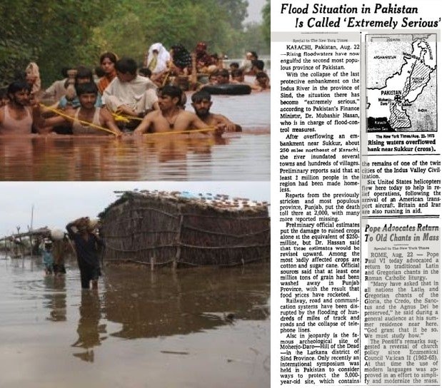
The Pakistan floods of 2022 are the nation’s sixth since 1950 to kill over 1,000 people. Major floods afflicted the country in 1950, 1955, 1956, 1957, 1959, throughout the 1970s, and in more recent years. Typical flood scenes are shown in the photos below, together with a New York Times report of a major flood in 1973.

Monsoonal rains in 1950 led to flooding that killed an estimated 2,900 people across the country and caused the Ravi River in northeastern Pakistan to burst its banks; 10,000 villages were decimated and 900,000 people made homeless.

In 1973, one of Pakistan’s worst-ever floods followed intense rainfall of 325 mm (13 inches) in Punjab (which means five rivers) province, affecting more than 4.8 million people. The Indus River – of which the Ravi River is a tributary – became a swollen, raging torrent 32 km (20 miles) wide, sweeping 300,000 houses and 70,000 cattle away. 474 people perished.

In an area heavily dependent on agriculture, 4.3 million bales of the cotton crop and hundreds of millions of dollars worth of stored wheat were lost. Villagers had to venture into floodwaters to cut fodder from the drowned and ruined crops in order to feed their livestock. Another article on the 1973 flood in the New York Times reported the plight of flood refugees:

In Sind, many farmers, peasants and shopkeepers fled to a hilltop railway station where they climbed onto trains for Karachi.

Monsoon rainfall of 580 mm (23 inches) just three years later in July and September of 1976, again mostly in Punjab province, caused a flood that killed 425 and affected another 1.7 million people. It’s worth noting here that the 1976 deluge far exceeded the 375 mm (15 inches) of rain preceding the massive 2022 flood, although both inundated approximately the same area. The 1976 flood affected a total of 18,400 villages.

A shorter yet deadly flood struck the coastal metropolis of Karachi the following year in 1977, after 210 mm (8 inches) of rain fell on the city in 12 hours. Despite its brief duration, the flood drowned 848 people and left 20,000 homeless. That same year, the onslaught of floods in the country prompted the establishment of a Federal Flood Commission.

The figure below shows the annual number of flood fatalities in Pakistan from 1950 to 2012, which includes drownings from cyclones as well as monsoonal rains.

Many other past major floods, in India, Japan, Europe and other countries, are recorded in the history books, all just as devastating as more recent ones such as those in Pakistan or British Columbia, Canada. Despite the media’s neglect of history, floods are not any worse today than before.

Next: No Evidence That Extreme Weather on the Rise: A Look at the Past - (4) Droughts

No Evidence That Extreme Weather on the Rise: A Look at the Past - (2) Tornadoes

After a flurry of tornadoes swarmed the central U.S. this March, the media were quick to fall into the trap of linking the surge to climate change, as often occurs with other forms of extreme weather. But there is no evidence that climate change is causing tornadoes to become more frequent and stronger, any more than hurricanes are increasing in strength and number, as I discussed in my previous post.

Indeed, there are ample examples of past tornadoes just as or more violent and deadly than today’s, but conveniently ignored by believers in the narrative that weather extremes are on the rise.

Like hurricanes, tornadoes are categorized according to wind speed, using the Fujita Scale going from EF0 to EF5 (F0 to F5 before 2007); EF5 tornadoes attain wind speeds up to 480 km per hour (300 mph). More terrifying than hurricanes because they often arrive without warning, tornadoes also have the awesome ability to hurl cars, struc­tural debris, animals and even people through the air.

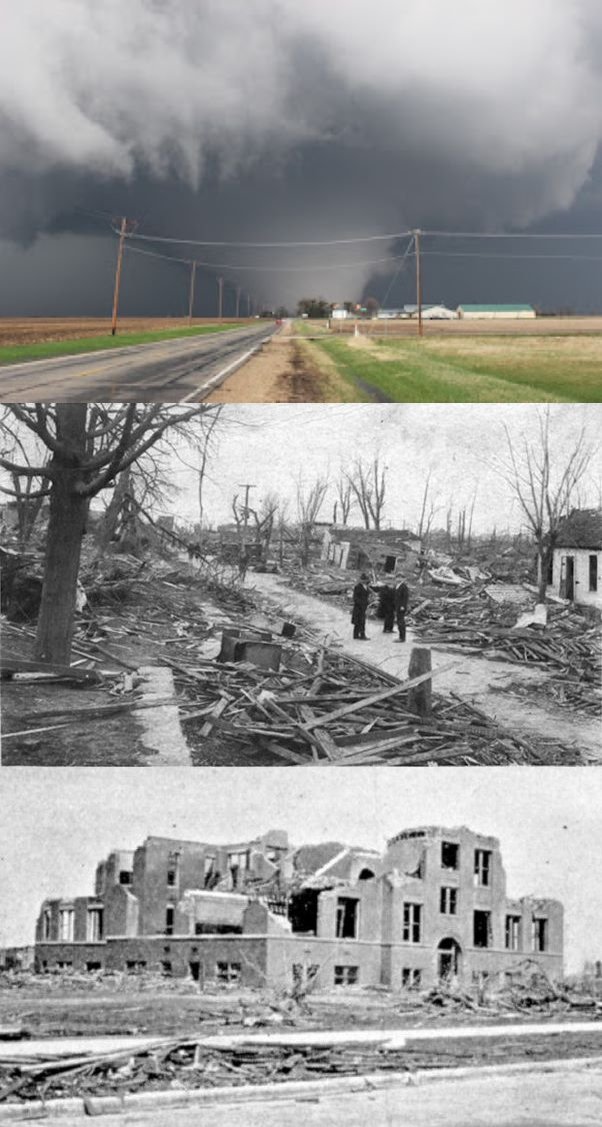
In the U.S., tornadoes cause about 80 deaths and more than 1500 injuries per year. The deadliest  episode of all time in a sin­gle day was the “tri-state” outbreak in 1925, which killed over 700 peo­ple and resulted in the most damage from any tornado outbreak in U.S. history. The photo montage on the right shows one of the 12 or more tornadoes observed in Missouri, Illinois and Indiana approaching a farm (top); some of the 154 city blocks obliterated in Murphysboro, Illinois (middle); and the wreckage of Murphysboro’s Longfellow School, where 17 children were killed (bottom).                                                                                     Unlike the narrow path of most tornadoes, the swath of destruction wrought by the main F5 tornado was up to 2.4 km (1.5 miles) wide. Amazingly, the ferocious storm persisted for a distance of 353 km (219 miles) in its 3 ½-hour lifetime. Together with smaller F2, F3 and F4 tornadoes, the F5 tri-state tornado destroyed or almost destroyed numerous towns. Another 33 schoolchildren died in De Soto, Illinois when their school collapsed. De Soto’s deputy sheriff was sucked into the funnel cloud, never to be seen again.

Newspapers of the day chronicled the devastation. United Press described how:

a populous, prosperous stretch of farms, villages and towns … suddenly turned into an inferno of destruction, fire, torture and death.

The Ellensburg Daily Record reported that bodies were carried as far as a mile by the force of the main tornado.

Over three successive days in May 1953, at least 10 different U.S. states were struck by an outbreak of more than 33 tornadoes, the deadliest being an F5 tornado that carved a path directly though the downtown area of Waco, Texas (photo immediately below). Believing falsely that their city was immune to tornadoes, officials had not insisted on construction of sturdy buildings, many of which collapsed almost immediately and buried their occupants.

The same day, a powerful F4 tornado hit the Texas city of San Angelo, causing catastrophic damage. As mentioned in the accompanying newspaper article below, an American Associated Press correspondent reported “a scene of grotesque horror” in Waco and described how San Angelo’s business area was “strewn with kindling wood.”

June that year saw a sequence of powerful tornadoes wreak havoc across the Midwest and New England, the latter being well outside so-called Tornado Alley. An F5 tornado in Flint, Michigan (upper photo in figure below) and an F4 tornado in Worcester, Massachusetts (lower photo) each caused at least 90 deaths and extensive damage. The accompanying newspaper article, in Australia’s Brisbane Courier-Mail, mentions how cars were “whisked about like toys.”

Nature’s wrath was on display again in the most ferocious tornado outbreak ever recorded, spawning a total of 30 F4 or F5 tornadoes – the so-called Super Outbreak – in April 1974. A total of 148 tornadoes of all strengths struck 13 states in Tornado Alley and the Canadian province of Ontario over two days; their distribution and approximate path lengths are depicted in the left panel of the next figure.

The photos on the right illustrate the massive F5 tornado, the worst of the 148, that bore down on Xenia, Ohio (population 29,000, top) and the resulting damage (middle and bottom). The Xenia tornado was so powerful that it tossed freight trains on their side, and even dropped a school bus onto a stage where students had been practicing just moments before. Wrote the Cincinatti Post of the devastation:

Half of Xenia is gone.

In Alabama, two F5 tornadoes, out of 75 that struck the state, hit the town of Tanner within 30 minutes; numerous homes, both brick and mobile, were chewed up or swept away. In Louisville, Kentucky, battered by an F4 tornado, a Navy veteran who lost his home lamented in the Louisville Times that:

only Pearl Harbor was worse.

In all, the Super Outbreak caused 335 fatalities and over 6,000 injuries.

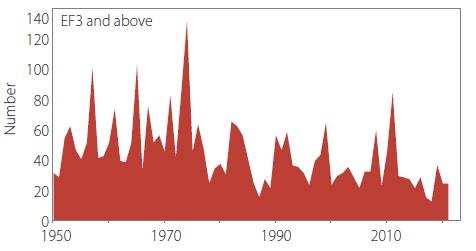
The following figure shows that the annual number of strong tornadoes (EF3 or greater) in the U.S. has declined dramatically over the last 72 years. In fact, the average number of strong tor­nadoes annually from 1986 to 2017 – a period when the globe warmed by about 0.7 degrees Celsius (1.3 degrees Fahrenheit) – was 40% less than from 1954 to 1985, when warming was much less. That turns the extreme weather caused by climate change narrative on its head.

Hat tip: Tony Heller @TonyClimate, who discovered the two newspaper articles above.

Next: No Evidence That Extreme Weather on the Rise: A Look at the Past - (3) Floods

No Evidence That Extreme Weather on the Rise: A Look at the Past - (1) Hurricanes

The popular but mistaken belief that today’s weather extremes are more common and more intense because of climate change is becoming deeply embedded in the public consciousness, thanks to a steady drumbeat of articles in the mainstream media and pronouncements by luminaries such as President Biden in the U.S., Pope Francis and the UN Secretary-General.

But the belief is wrong and more a perception than reality. An abundance of scientific evidence demonstrates that the frequency and severity of floods, droughts, hurricanes, tornadoes, heat waves and wildfires are not increasing, and may even be declining in some cases. That so many people think otherwise reflects an ignorance of, or an unwillingness to look at, our past climate. Collective memories of extreme weather are short-lived.  

In this and subsequent posts, I’ll present examples of extreme weather over the past century or so that matched or exceeded anything we’re experiencing in the present-day world. I’ll start with hurricanes.

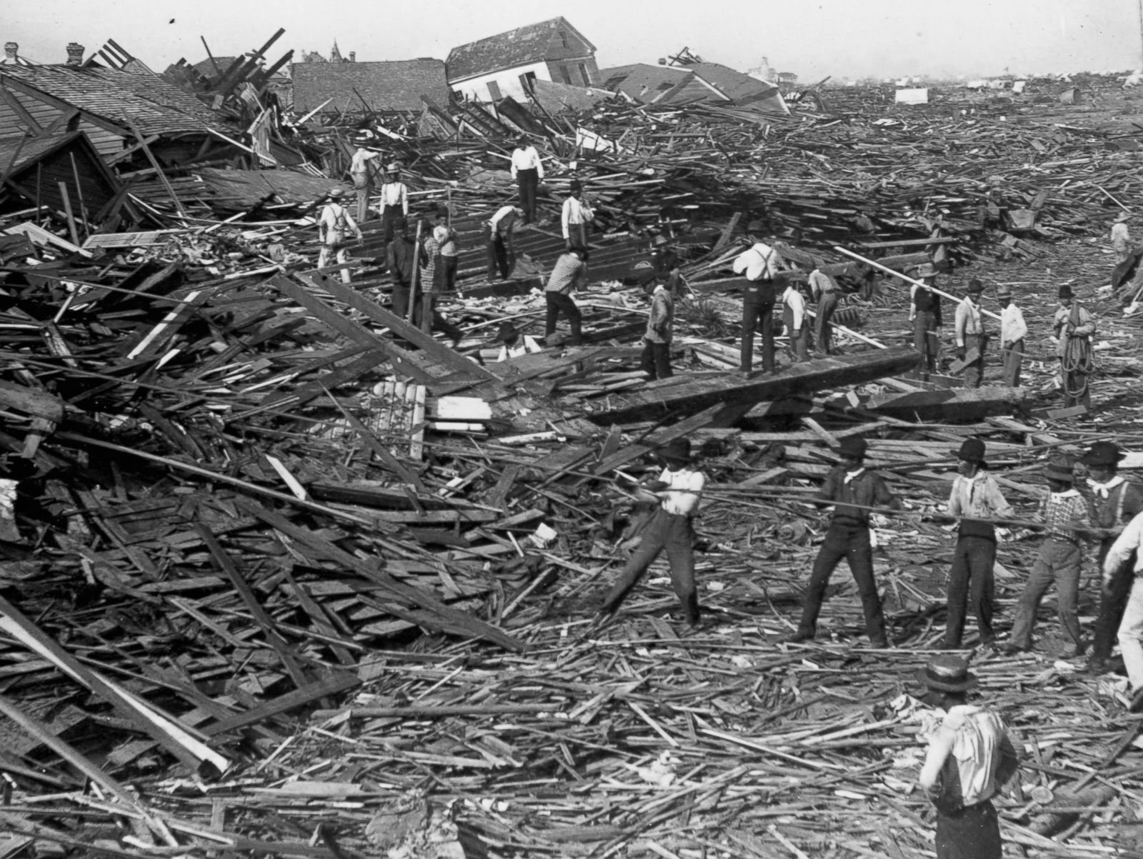
The deadliest U.S. hurricane in record­ed history struck Galveston, Texas in 1900, killing an estimated 8,000 to 12,000 people. Lacking a protective seawall built later, the thriving port was completely flattened (photo on right) by winds of 225 km per hour (140 mph) and a storm surge exceeding 4.6 meters (15 feet). With almost no automobiles, the hapless populace could flee only on foot or by horse and buggy. Reported the Nevada Daily Mail at the time:

Residents [were] crushed to death in crumbling buildings or drowned in the angry waters.

Hurricanes have been a fact of life for Americans in and around the Gulf of Mexico since Galveston and before. The death toll has come down over time with improvements in planning and engineering to safeguard structures, and the development of early warning sys­tems to allow evacuation of threatened communities.

Nevertheless, the frequency of North Atlantic hurricanes has been essentially unchanged since 1851, as seen in the following figure. The apparent heightened hurricane ac­tivity over the last 20 years, particularly in 2005 and 2020, simply reflects improvements in observational capabilities since 1970 and is unlikely to be a true climate trend, say a team of hurricane experts.

As you can see, the incidence of major North Atlantic hurricanes in recent decades is no higher than that in the 1950s and 1960s. Ironically, the earth was actually cooling during that period, unlike today.

Of notable hurricanes during the active 1950s and 1960s, the deadliest was 1963’s Hurricane Flora that cost nearly as many lives as the Galveston Hurricane. Flora didn’t strike the U.S. but made successive landfalls in Tobago, Haiti and Cuba (path shown in photo on left), reaching peak wind speeds of 320 km per hour (200 mph). In Haiti a record 1,450 mm (57 inches) of rain fell – comparable to what Hurricane Harvey dumped on Houston in 2017 – resulting in landslides which buried whole towns and destroyed crops. Even heavier rain, up to 2,550 mm (100 inches), devastated Cuba and 50,000 people were evacuated from the island, according to the Sydney Morning Herald.

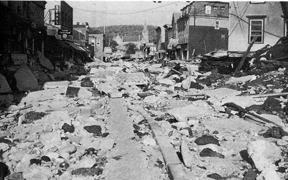
Hurricane Diane in 1955 walloped the North Carolina coast, then moved north through Virginia and Pennsylvania before ending its life as a tropical storm off the coast of New England. Although its winds had dropped from 190 km per hour (120 mph) to less than 55 km per hour (35 mph) by then, it spawned rainfall of 50 cm (20 inches) over a two-day period there, causing massive flooding and dam failures (photo to right). An estimated total of 200 people died. In North Carolina, Diane was but one of three hurricanes that struck the coast in just two successive months that year.

In 1960, Hurricane Donna moved through Florida with peak wind speeds of 285 km per hour (175 mph) after pummeling the Bahamas and Puerto Rico. A storm surge of up to 4 meters (13 feet) combined with heavy rainfall caused extensive flooding all across the peninsula (photo on left). On leaving Florida, Donna struck North Carolina, still as a Category 3 hurricane (top wind speed 180 km per hour or 110 mph), and finally Long Island and New England. NOAA (the U.S. National Oceanic and Atmospheric Administration) calls Donna “one of the all-time great hurricanes.”

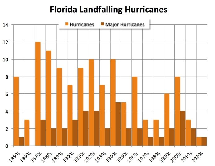
Florida has been a favorite target of hurricanes for more than a century. The next figure depicts the frequency by decade of all Florida landfalling hurricanes and major hurricanes (Category 3, 4 or 5) since the 1850s. While major Florida hurricanes show no trend over 170 years, the trend in hurricanes overall is downward – even in a warming world.

Hurricane Camille in 1969 first made landfall in Cuba, leaving 20,000 people homeless. It then picked up speed, smashing into Mississippi as a Category 5 hurricane with wind speeds of approximately 300 km per hour (185 mph); the exact speed is unknown because the hurricane’s impact destroyed all measuring instruments. Camille generated waves in the Gulf of Mexico over 21 meters (70 feet) high, beaching two ships (photo on right), and caused the Mississippi River to flow backwards. A total of 257 people lost their lives, the Montreal Gazette reporting that workers found:

a ton of bodies … in trees, under roofs, in bushes, everywhere.

These are just a handful of hurricanes from our past, all as massive and deadly as last year’s Category 5 Hurricane Ian which deluged Florida with a storm surge as high as Galveston’s and rainfall up to 685 mm (27 inches); 156 were killed. Hurricanes are not on the rise today.

Next: No Evidence That Extreme Weather on the Rise: A Look at the Past - (2) Tornadoes

CRED’s “2022 Disasters in Numbers” Report Is a Disaster in Itself

The newly released 2022 annual disasters report from the highly acclaimed international agency, CRED (Centre for Research on the Epidemiology of Disasters), is even more dishonest than its 2021 report which I reviewed in a previous post. The 2022 report contains numerous statements that cannot be justified by the evidence, and demonstrates a misunderstanding of basic statistics which is puzzling for an organization that collects and analyzes data.

The most egregious statements involve the death toll from weather-related disasters. In one section of the report, CRED cites the well-known fact that mortality from natural disasters is 98% lower today than a century earlier. Although this is actually based on CRED’s EM-DAT (Emergency Events Database), the 2022 report gripes that “A more careful examination of mortality statistics indicates that this percentage may be misleading. Misinterpreting statistics could be harmful if it supports a discourse minimizing the importance of climate action.”

Laughably, it is CRED’s new report that is misleading and misinterprets statistics. This is evident from the following two figures from the report and the accompanying commentary. Figure A shows the global annual number of deaths per decade from natural disasters between 1900 and 2020, compiled from 12,223 records in the EM-DAT da­tabase, while the highly misleading Figure B shows the same data excluding the 50 deadliest disasters.

In Figure A, it is clear that disaster-related deaths have been falling since the 1920s and are now approaching zero. Nevertheless, the 2022 CRED report makes the weak argument that if the 1910s were taken as the comparison baseline instead of the 1920s, the 98% fall would be only 30%. But a close look at the data reveals a total of 1.27 million deaths recorded in the year 1900, yet almost none at all from 1901 to 1919 (less than 50,000 in most years) – suggesting some deficiency in data collection during that period.

However, far more blatant is the report’s manipulation of the data in Figure A, by removing the 50 deadliest disasters from the dataset and then claiming that disaster deaths show “a positive mortality trend” over the last century, as depicted in Figure B.

Such subterfuge is both dishonest and statistically flawed. Some disasters are more deadly, some less; the only way to present any trend honestly is to include all the data. A fundamental tenet of the scientific method is that you can’t ignore any piece of evidence that doesn’t fit your narrative, simply because it’s inconvenient. And statistically, a disaster trend is a disaster trend, regardless of the disaster magnitude. If anything, the deadliest disasters – not the least deadly, as plotted in Figure B – carry the most weight in illustrating any trend in deaths.

While CRED sheepishly admits that Figure B “does not necessarily mean that we now have firm evidence that disaster-related mortality is increasing,” it gives away its true motive in presenting the figure by musing whether the fictitious positive trend is “supported by other drivers, e.g., population growth in exposed areas and climate change.”

The report goes on to argue that the main trend observed in Figure A is a result of five drought-induced famines, which each caused more than one million deaths from the 1920s to the 1960s. This statement is also deceptive, as can be seen from the figure below. The figure is similar to CRED’s Figure A and based on the same EM-DAT database, but breaks down the number of people killed in each decade into disaster category and corrects for population increase over time; the same data uncorrected for population increase show exactly the same features.

You can see that deaths from drought were dominant in the 1900s, 1920s, 1940s, 1960s and 1980s, but not the 1910s, 1930s, 1950s and 1970s. So CRED’s argument that the strong downward trend in Figure A is due to a large number of drought-induced famine deaths between 1920 and 1970 is nonsense.

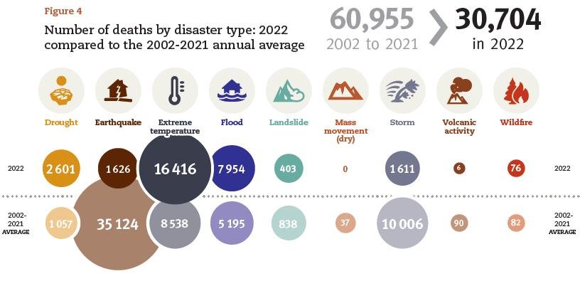
Another section of the CRED report presents disaster death data for 2022, which is summarized in the following figure from the report. CRED comments that “the total death toll of 30,704 in 2022 was three times higher than in 2021 but below the 2002-2021 average of 60,955 deaths,” both of which are correct statements. However, the report then goes on to claim that the relatively high 2002-2021 average is “influenced by a few mega-disasters” and that “a more useful comparison [is that] the 2022 toll is almost twice the 2002-2021 median of 16,011 deaths.”

Again, these are meaningless comparisons that demonstrate an ignorance of statistics. The individual yearly death totals are unrelated – independent events in the language of statistics – so assigning any statistical significance to the 30,704 deaths in 2022 being lower than the long-term average, or higher than the long-term median, is invalid. CRED’s attempt to fit its data to a narrative emphasizing “the importance of climate action” falls flat.

The statistical inadequacies of CRED’s comparisons are also made clear by examining the recent trend in CRED’s EM-DAT data. The next figure shows the yearly number of climate-related disasters globally from 2000 through 2022 by major category. The disasters are those in the climatological (droughts, glacial lake outbursts and wildfires), meteorological (storms, extreme temperatures and fog), and hydrological (floods, landslides and wave action) categories.

As can be seen, the total number of climate-related disasters exhibits a slowly declining trend since 2000 (red line), falling by 4% over 23 years.

Next: Challenges to the CO2 Global Warming Hypothesis: (8) The Antarctic Centennial Oscillation as the Source of Global Warming

No Evidence That Cold Extremes Are Becoming Less Frequent

The IPCC (Intergovernmental Panel on Climate Change), whose assessment reports are the voice of authority for climate science, errs badly in its Sixth Assessment Report (AR6) by claiming that cold weather extremes have become less frequent and severe. While that may be expected in a warming world, observational evidence shows that in fact, cold extremes are on the rise and may actually have become more severe.

Cold extremes include abnormally low temperatures, prolonged cold spells, unusually heavy snowfalls and longer winter sea­sons. That cold extremes are indeed increasing has been chronicled in detail by environmental scientist Madhav Khandekar in several recent research papers (here, here and here). While the emphasis of Khandekar’s publications has been on harsh winters in North America, he has catalogued cold extremes in South America, Europe and Asia as well.

The figure below shows the locations of 4,145 daily low-temperature records broken or tied in the northeastern U.S. during the ice-cold February of 2015; that year tied with 1904 for the coldest Janu­ary to March period in the northeast, in records extending back to 1895. Of the 4,145 records, 3,573 were new record lows and the other 572 tied previous records.

Examples of cold extremes in recent years abound (see here and here). During the 2020 southern winter and northern summer, the Australian island state of Tasmania recorded its most frigid winter minimum ever, exceeding the previous low of −13.0 degrees Celsius (8.6 degrees Fahrenheit) by 1.2 degrees Celsius (2.2 degrees Fahrenheit); Norway endured its chilliest July in 50 years; neighboring Sweden shivered through its coldest sum­mer since 1962; and Russia was also bone-chilling cold.

In the northern autumn of 2020, bitterly cold temperatures afflicted many communities in the U.S. and Canada. The north­ern U.S state of Minnesota experienced its largest early-season snowstorm in recorded history, going back about 140 years. And in late December, the subfreezing polar vortex began to expand out of the Arctic.

Earlier in 2020, massive snowstorms covered much of Patagonia in more than 150 cm (60 inches) of snow, and buried alive at least 100,000 sheep and 5,000 cattle. Snowfalls not seen for decades occurred in other parts of South America, and in South Africa, southeastern Australia and New Zealand.

A 2021 example of a cold extreme was the North American cold wave in February, which brought record-breaking subfreez­ing temperatures to much of the central U.S., as well as Canada and northern Mexico. Texas experienced its coldest February in 43 years; the frigid conditions lasted several days and resulted in widespread power outages and damage to infrastructure. Curiously, the Texan deep freeze was ascribed to global warming by a team of climate scien­tists, who linked it to stretching of the Arctic polar vortex.

Other exceptional cold extremes in 2021 included the lowest average UK minimum temperature for April since 1922; record low temperatures in both Switzerland and Slove­nia the same month; the coldest winter on record at the South Pole; and an all-time high April snowfall in Belgrade, in record books dating back to 1888.

In 2022, Australia and South America saw some of their coldest weather in a century. In May, Australia experienced the heaviest early-season mountain snow in more than 50 years. In June, Brisbane in normally temperate Queensland had its coldest start to winter since 1904. And in December, the state of Victoria set its coldest summer temperature record ever.

South America also suffered icy conditions in 2022, after an historically cold winter in 2021 which decimated crops. The same Antarctic cold front that froze Australia in May brought bone-numbing cold to northern Argentina, Paraguay and southern Brazil; Brazil’s capital Brasilia logged its lowest temperature in recorded history.

In December 2022, the U.S. set 126 monthly low-temperature records, while century-old low-temperature records tumbled in neighboring Canada. This followed all-time record-breaking snow in Japan, extra-heavy snow in the Himalayas which thwarted mountain climbers there, and heavy snow across China and South Korea.

Clearly, cold extremes are not going away or becoming less severe. And frequent statements by the mainstream media linking cold extremes to global warming are absurd, although such statements may fit the popular belief that global warming causes weather extremes in general. As I have explained in numerous blog posts and reports, this belief is mistaken and there is no evidence that weather extremes are worsening because of climate change.

Extreme weather conditions are produced by natural patterns in the climate system, not global warming. Khandekar links cold extremes to the North Atlantic and Pacific Decadal Oscil­lations, and possibly to solar activity.

Next: Global Warming from Food Production and Consumption Grossly Overestimated

Mainstream Media Jump on Extreme Weather Caused by Climate Change Bandwagon

The popular but mistaken belief that weather extremes are worsening be­cause of climate change has been bolstered in recent years by ever increasing hype in nearly all mainstream media coverage of extreme events, despite a lack of scientific evidence for the assertion. This month’s story by NPR (National Public Radio) in the U.S. is just the latest in a steady drumbeat of media misinformation.

Careful examination of the actual data reveals that if there is any trend in most weather extremes, it is downward rather than upward. In fact, a 2016 survey of extreme weather events since 1900 found strong evidence that the first half of the 20th century saw more weather extremes than the second half, when global warming was more prominent. More information can be found in my recent reports on weather extremes (here, here and here).

To be fair, the NPR story merely parrots the conclusions of an ostensibly scientific report from the AMS (American Meteorological Society), Explaining Extreme Events in 2021 and 2022 from a Climate Perspective. Both the AMS and NPR claim to show how the most extreme weather events of the previous two years were driven by climate change.

Nevertheless, all the purported connections rely on the dubious field of extreme-event attribution science, which uses statistics and climate models to supposedly detect the impact of global warming on weather disasters. The shortcomings of this approach are twofold. First, the models have a dismal track record in predicting the future (or indeed of hindcasting the past); and second, attri­bution studies that assign specific extremes to either natural variability or human causes are based on highly questionable statistical meth­odology (see here and here).  

So the NPR claim that “scientists are increasingly able to pinpoint exactly how the weather is changing as the earth heats up” and “how climate change drove unprecedented heat waves, floods and droughts in recent years” is utter nonsense. These weather extremes have occurred from time im­memorial, long before modern global warming began.

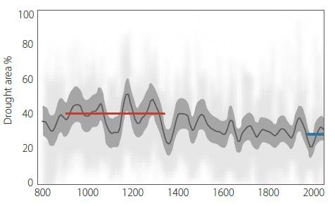
Yet the AMS and NPR insist that extreme drought in California and Nevada in 2021 was “six times more likely because of climate change.” This is completely at odds with a 2007 U.S. study which reconstructed the drought pattern in North America over the last 1200 years, using tree rings as a proxy.

The reconstruction is illustrated in the figure below, showing the drought area in western North America from 800 to 2003, as a percentage of the total land area. The thick black line is a 60-year mean, while the blue and red horizon­tal lines represent the average drought area during the periods 1900–2003 and 900–1300, respectively. Clearly, several unprecedently long and severe megadroughts have occurred in this region since the year 800; 2021 (not shown in the graph) was unexceptional.

The same is true for floods. A 2017 study of global flood risk concluded there is very little evidence that flooding is becoming more prevalent worldwide, despite average rainfall getting heavier as the planet warms. And, although the AMS report cites an extremely wet May of 2021 in the UK as likely to have resulted from climate change, “rescued” Victorian rainfall data reveals that the UK was just as wet in Victorian times as today.

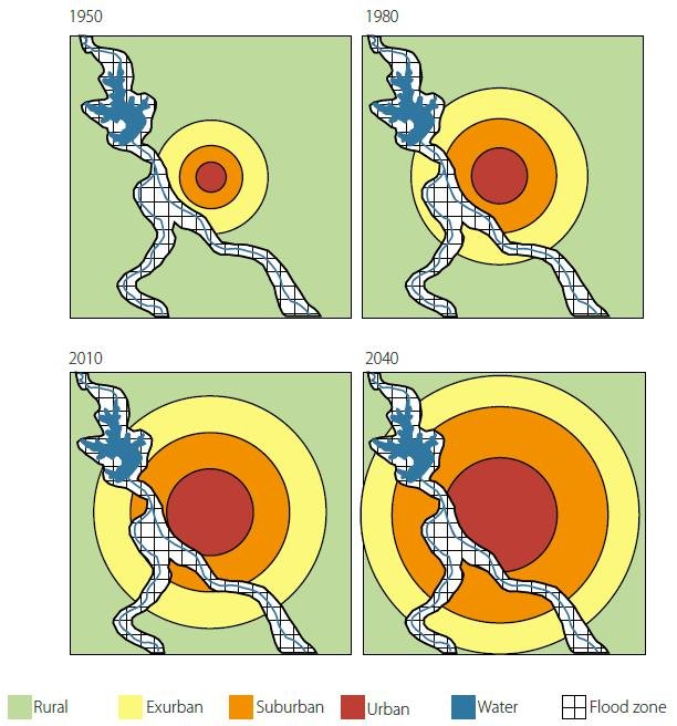
The illusion that major floods are becoming more frequent is due in part to the world’s growing population and the appeal, in the more developed countries at least, of living near water. This has led to more people building their dream homes in vulner­able locations, on river or coastal floodplains, as shown in the next figure.

Depicted is what has been termed the “Expanding Bull’s-Eye Effect” for a hypothetical river flood impacting a growing city. It can be seen that the same flood will cause much more destruction in 2040 than in 1950. A larger and wealthier population exposes more individuals and property to the devastation wrought by intermittent flooding from rainfall-swollen rivers or storm surges. Population expansion beyond urban areas, not climate change, has also worsened the death toll and property damage from hurricanes and tornadoes.

In a warming world, it is hardly surprising that heat waves are becoming more common. However, the claim by the AMS and NPR that heat waves are now “more extreme than ever” can be questioned, either because heat wave data prior to 1950 is completely ignored in many compilations, or because the data before 1950 is sparse. No recent heat waves come close to matching the frequency and duration of those experienced worldwide in the 1930s.

The media are misleading and stoking fear in the public about perfectly normal extreme weather, although there are some notable exceptions such as The Australian. The alarmist stories of the others are largely responsible for the current near-epidemic of “climate anxiety” in children, the most vulnerable members of our society.

Next: New Observations Upend Notion That Global Warming Diminishes Cloud Cover

Recent Marine Heat Waves Caused by Undersea Volcanic Eruptions, Not Human CO2

In a previous post, I showed how submarine volcanic eruptions don’t contribute to global warming, despite the release of enormous amounts of explosive energy. But they do contribute to regional climate change in the oceans, such as marine heat waves and shrinkage of polar sea ice, explained a retired geologist in a recent lecture.

Wyss Yim, who holds positions at several universities in Hong Kong, says that undersea volcanic eruptions – rather than CO2 – are an important driver of regional climate variability. The release of geothermal heat from these eruptions can explain oceanic heat waves, polar sea-ice changes and stronger-than-normal cycles of ENSO (the El Niño – Southern Oscillation), which causes temperature fluctuations and other climatic effects in the Pacific.

Submarine eruptions can eject basaltic lava at temperatures as high as 1,200 degrees Celsius (2,200 degrees Fahrenheit), often from multiple vents over a large area. Even though the hot lava is quickly quenched by the surrounding seawater, the heat absorbed by the ocean can have local, regional impacts that last for years.

The Pacific Ocean in particular is a major source of active terrestrial and submarine volcanoes, especially around the Ring of Fire bounding the Pacific tectonic plate, as illustrated in the figure below. Yim has identified eight underwater eruptions in the Pacific from 2011 to 2022 that had long-lasting effects on the climate, six of which emanated from the Ring of Fire.

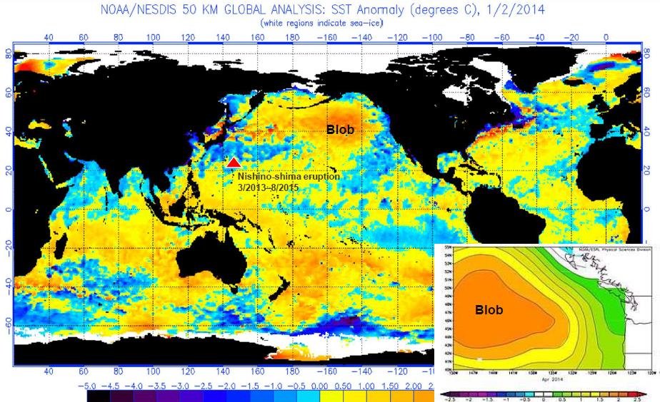
One of these eruptions was from the Nishino-shima volcano south of Tokyo, which underwent a massive blow-out, initially undersea, that persisted from March 2013 to August 2015. Yim says the event was the principal cause of the so-called North Pacific Blob, a massive pool of warm seawater that formed in the northeast Pacific from 2013 to 2015, extending all the way from Alaska to the Baja Peninsula in Mexico and up to 400 meters (1,300 feet) deep. Climate scientists at the time, however, attributed the Blob to global warming.

The Nishino-shima eruption, together with other submarine eruptions in the Pacific during 2014 and 2015, was a major factor in prolonging and strengthening the massive 2014-2017 El Niño. A map depicting sea surface temperatures in January 2014, at the onset of El Niño and almost a year after the emergence of the Blob, is shown in the next figure. At that time, surface temperatures across the Blob were about 2.5 degrees Celsius (4.5 degrees Fahrenheit) above normal.

By mid-2014, the Blob covered an area approximately 1,600 km (1,000 miles) square. Its vast extent, states Yim, contributed to the gradual decline of Arctic sea ice between 2014 and 2016, especially in the vicinity of the Bering Strait. The Blob also led to two successive years without winter along the northeast Pacific coast.

Biodiversity in the region suffered too, with sustained toxic algal blooms. Yet none of this was caused by climate change.

The 2014-2017 El Niño was further exacerbated by the eruption from May to June 2015 of the Wolf volcano on the Galapagos Islands in the eastern Pacific. Although the Wolf volcano is on land, its lava flows entered the ocean. The figure below shows the location of the Wolf eruption, along with submarine eruptions of both the Axial Seamount close to the Blob and the Hunga volcano in Tonga in the South Pacific.

According to Yim, the most significant drivers of the global climate are changes in the earth’s orbit and the sun, followed by geothermal heat, and – only in third place – human-induced changes such as increased greenhouse gases. Geothermal heat from submarine volcanic eruptions causes not only marine heat waves and contraction of polar sea ice, but also local changes in ocean currents, sea levels and surface winds.

Detailed measurements of oceanic variables such as temperature, pressure, salinity and chemistry are made today by the worldwide network of 3,900 Argo profiling floats. The floats are battery-powered robotic buoys that patrol the oceans, sinking 1-2 km (0.6-1.2 miles) deep once every 10 days and then bobbing up to the surface, recording the properties of the water as they ascend. When the floats eventually reach the surface, the data is transmitted to a satellite.

Yim says his studies show that the role played by submarine volcanoes in governing the planet’s climate has been underrated. Eruptions of any of the several thousand active underwater volcanoes can have substantial regional effects on climate, as just discussed.

He suggests that the influence of volcanic eruptions on atmospheric and oceanic circulation should be included in climate models. The only volcanic effect in current models is the atmospheric cooling produced by eruption plumes.

Next: Climate Heresy: To Avoid Extinction We Need More, Not Less CO2

Ample Evidence Debunks Gloomy Prognosis for World’s Coral Reefs

According to a just-published research paper, dangers to the world’s coral reefs due to climate change and other stressors have been underestimated and by 2035, the average reef will face environmental conditions unsuitable for survival. This is scientific nonsense, however, as there is an abundance of recent evidence that corals are much more resilient than previously thought and recover quickly from stressful events.

The paper, by a trio of environmental scientists at the University of Hawai‘i, attempts to estimate the year after which various anthropogenic (human-caused) disturbances acting simultaneously will make it impossible for coral reefs to adapt and survive. The disturbances examined are marine heat waves, ocean acidification, storms, land use changes, and pressures from population density such as overfishing, farming runoff and coastal development.

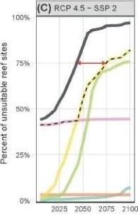
Of these disturbances, the two expected to have the greatest future effect on coral reefs are marine heat waves and ocean acidification, supposedly exacerbated by rising greenhouse gas emissions. The figure to the left shows the scientists’ projected dates of environmental unsuitability for continued existence of the world’s coral reefs, assuming an intermediate CO2 emissions scenario (SSP2). The yellow curve is for marine heat waves, the green curve for ocean acidification.

You can see that the projected unsuitability rises to an incredible 75% by the end of the century for both perturbations, and even surpasses 50% for marine heat waves by 2050. The red arrow indicates the time difference at 75% unsuitability between heat waves considered alone and all disturbances combined (solid black curve).

But these gloomy prognostications are refuted by several recent field studies, two of which I discussed in an earlier blog post. The latest paper, published in May this year, reports on a 10-year study of coral-reef stability on Palmyra Atoll in the remote central Pacific Ocean. The scuba-diving researchers, from California’s Scripps Institution of Oceanography and Saudi Arabia’s King Abdullah University, discovered – by analyzing more than 1,500 digital images – that Palmyra reefs made a remarkable recovery from two major bleaching events in 2009 and 2015.

Bleaching occurs when the multitude of polyps that constitute a coral eject the microscopic algae that normally live inside the polyps and give coral its striking colors. Hotter than normal seawater causes the algae to poison the coral that then expels them, turning the polyps white. The bleaching events studied by the Palmyra researchers were a result of prolonged El Niños in the Pacific.

However, the researchers found that, at all eight Palmyra sites investigated, the corals returned to pre-bleaching levels within two years. This was true for corals on both a wave-exposed fore reef and a sheltered reef terrace. Stated Jennifer Smith, one of the paper’s coauthors,  “During the warming event of 2015, we saw that up to 90% of the corals on Palmyra bleached but in the year following we saw less than 10% mortality.”

The rapid coral recovery can be seen in the figure on the left below, showing the percentage of coral cover from 2009 to 2019 at all sites combined; FR denotes fore reef, RT reef terrace, and the dashed vertical lines indicate the 2009 and 2015 bleaching events. It’s clear there was only a small change in the reef’s coral and algae populations after a decade, despite the violent disruption of two bleaching episodes. A typical healthy reefscape is shown on the right.

Another 2022 study, discussed in my earlier post, came to much the same conclusions for a massive reef of giant rose-shaped corals hidden off the coast of Tahiti, the largest island in French Polynesia in the South Pacific. The giant corals measure more than 2 meters (6.5 feet) in diameter. Again, the reef survived a mass 2019 bleaching event almost unscathed.

Both these studies were conducted on relatively pristine coral reefs, free from local human stressors such as fishing, pollution, coastal development and tourism. But the same ability of corals to recover from bleaching events has been demonstrated in research on Australia’s famed Great Barrier Reef, many parts of which are subject to such stressors.

Studies in 2021 and 2020 (see here and here) found that both the Great Barrier Reef and coral colonies on reefs around Christmas Island in the Pacific were able to recover quickly from bleaching caused by the 2015-17 El Niño, even while seawater temperatures were still higher than normal. Recovery of the Great Barrier Reef is illustrated in the figure below, showing that the amount of coral on the reef in 2021 and 2022 was at record high levels, in spite of extensive bleaching a few years before.

Apart from making a number of arbitrary and questionable assumptions, the new University of Hawai‘i research is fundamentally flawed because it fails to take into account the ability of corals to rebound from potentially devastating events.

Next: Recent Marine Heat Waves Caused by Undersea Volcanic Eruptions, Not Human CO2

Climate-Related Disasters Wrongly Linked to Global Warming by Two International Agencies

Two 2022 reports by highly acclaimed international agencies – CRED (Centre for Research on the Epidemiology of Disasters), a Belgian non-profit, and the WMO (World Meteorological Organi­zation), a UN agency – insist that climate-related disasters are escalating as the world warms. But the evidence shows that such a claim is indisputably wrong.

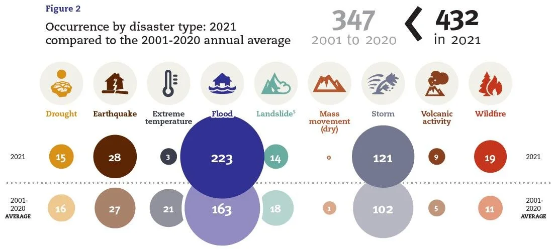
The 2022 CRED report, which covers events in 2021, draws a strong link between global warming and climate disasters, the majority of which are floods and storms. The report pointedly comments that “… 2021 was marked by an increase in the number of disaster events,” and that the total of 432 catastrophic events was “considerably higher” than the annual average of 347 catastrophic events for 2001-2020. A breakdown of these numbers by disaster category is presented in the figure below from the report.

Both CRED statements, while literally true, are dishonest as they completely ignore statistics. Although the total of 432 events for 2021 was indeed higher than the 20-year average from 2001 to 2020, the total for, say, 2018 of 289 events was lower than the 19-year annual average from 2001 to 2018 of 333 events. The individual yearly totals are unrelated – independent events in the language of statistics – and any comparison of them to a long-term average is meaningless.

The statistical inadequacy of such a comparison is also made clear by examining the long-term trend in CRED’s data. The next figure shows the yearly number of climate-related disasters globally from 2000 through 2020 by major category. The disasters are those in the yellow climatological (droughts, glacial lake outbursts and wildfires), green meteorological (storms, extreme temperatures and fog), and blue hydrological (floods, landslides and wave action) categories.

The disaster data comes from CRED’s EM-DAT (Emergency Events Database). To be recorded as a disaster, an event must meet at least one of the following criteria: 10 or more people reported killed; 100 or more people reported affected; a state of emergency declared; or a call put out for international assis­tance.

What the figure shows is that the total number of climate-related disasters exhibits a distinctly declining trend from 2000 to 2020, falling by 11% over 21 years. Yet the same graph for the period one year later, from 2001 to 2021, shows a decline of only 1% over that 21-year interval. As any statistician knows, both the trend and the average value of a time series are highly sensitive to the endpoints chosen. Nevertheless, the disaster trend is clearly downward.

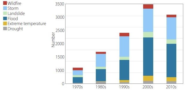
The 2022 WMO report makes the same error as an earlier CRED report and a previous WMO report in claiming that climate-related disasters have increased significantly since 1970. A key message of the 2022 report is that “weather-related disasters have increased fivefold over the last 50 years,” as purportedly shown by the WMO figure below. The WMO data is derived from the same EM-DAT database as the CRED data.

However, the WMO claim is nonsense and the figure is highly misleading. This is because, just like similar data in the earlier CRED report, the claim fails to take into account a major increase in disaster reporting since 1998 due to the arrival of the Internet. Climate writers Paul Homewood and Roger Pielke Jr. uncovered a sudden jump – a near doubling – in the annual number of disasters listed in EM-DAT in 1998 and the years thereafter. Surprisingly, CRED had acknowledged as much both in its 2004 disaster report:

Over the past 30 years, development in telecommunications, media and increased international cooperation has played a critical role in the number of disasters reported at an international level. In addition, increases in humanitarian funds have encouraged reporting of more disasters, especially smaller events that were previously managed locally.

and even more explicitly in its 2006 disaster report:

Two periods can be distinguished: 1987–1997, with the number of disasters varying generally between 200 and 250; and 2000–2006, with the number of disasters increasing by nearly a multiple factor of two. An increase of this magnitude can be partially explained by increased reporting of disasters, particularly by press organizations and specialized agencies.

That the impact of natural disasters is diminishing over time can be seen in data on the associated loss of life. The next figure illustrates the annual global number of deaths from natural disasters, including weather extremes, from 1900 to 2015, corrected for population increase over time and averaged by decade.

 Because the data is compiled from the same EM-DAT da­tabase, the annual number of deaths shows an uptick from the 1990s to the 2000s. It is clear though that disaster-related deaths from extreme weather have been falling since the 1920s and are now approaching zero. This is due as much to improved planning, more robust structures and early warning systems, as it is to diminishing numbers of natural disasters. And, as can be seen from the figure, it is earthquakes – entirely natural events – that have been the deadliest disasters over the last two decades.

Ignoring all the evidence, however, the press release accompanying the latest WMO report proclaims that “Climate science is clear: we are heading in the wrong direction,” the UN Secretary-General adding, with characteristic hype, that the report “shows climate impacts heading into uncharted territory of destruction.”

A more detailed discussion of the erroneous claims of both CRED and the WMO can be found in my two most recent reports on weather extremes (here and here).

Next: The Scientific Method at Work: The Carbon Cycle Revisited, Again

No Evidence That Climate Change Is Making Droughts Any Worse

The hullabaloo in the mainstream media about the current drought in Europe, which has been exacerbated by the continent’s fourth heat wave this summer, has only amplified the voices of those who insist that climate change is worsening droughts around the world. Yet an exami­nation of the historical record quickly confirms that severe droughts have been a feature of the earth’s climate for millennia – a fact corroborated by several recent research studies, which I described in a recent report.

The figure below shows a reconstruction of the drought pattern in central Europe from 1000 to 2012, using tree rings as a proxy, with observational data from 1901 to 2018 super­imposed. The width and color of tree rings consti­tute a record of past climate, including droughts. Black in the figure depicts the PDSI or Palmer Drought Severity Index that measures both dryness (negative values) and wetness (positive values); red denotes the so-called self-calibrated PDSI (scPDSI); and the blue line is the 31-year mean.

You can see that historical droughts from 1400 to 1480 and from 1770 to 1840 were much longer and more severe than any of those in the 21st century, when modern global warming began. The study’s conclusions are rein­forced by the results of another recent study, which failed to find any statistically significant drought trend in western Europe during the last 170 years.

Both studies give the lie to the media claim that this year’s drought is the “worst ever” in France, where rivers have dried up and crops are suffering from lack of water. But French measurements date back only to 1959: the media habitually ignores history, as indeed does the IPCC (Intergovernmental Panel on Climate Change)’s Sixth Assessment Report in discussing drought and other weather extremes.

And while it’s true that the 2022 drought in Italy is worse than any on record there since 1800, the 15th century was drier yet across Europe, as indicated in the figure above.

Another study was able to reconstruct the drought pattern in North America over the last 1200 years, also from tree ring proxies. The reconstruction is illustrated in the next figure, showing the PDSI-based drought area in western North America from 800 to 2003, as a percentage of the total land area. The thick black line is a 60-year mean, while the blue and red horizon­tal lines represent the average drought area during the periods 1900–2003 and 900–1300, respectively.

The reconstruc­tion reveals that several unprecedently long and severe “megadroughts” have also occurred in western North America since the year 800, droughts that the study authors re­mark have never been experienced in the modern era. This is em­phasized in the figure by the comparison between the period from 1900 to 2003 and the much more arid, 400-year interval from 900 to 1300. The four most significant historical droughts during that dry interval were centered on the years 936, 1034, 1150 and 1253.

As evidence that the study’s conclusions extend be­yond 2003, the figure below displays observational data showing the percentage of the contiguous U.S. in drought from 1895 up until 2015.

Comparison of this figure with the yearly data in the previous figure shows that the long-term pattern of overall drought in North America continues to be featureless, despite global warming during both the Medieval Warm Period and today. A similar conclusion was reached by a 2021 study comparing the duration and sever­ity of U.S. hydrological droughts between 1475 and 1899 to those from 1900 to 2014. A hydrological drought refers to drought-induced decreases in streamflow, reservoir levels and groundwa­ter.

A very recent 2022 paper claims that the southwestern U.S. is currently experiencing its dri­est 22-year period since at least the year 800, although it does not attribute this entirely to climate change. As shown in the figure below, from another source, the years 2000-2018 were the second-driest 19-year period in California over the past 1,200 years.

However, although the third-driest period in the 1100s and the fifth driest period in the 1200s both occurred during the Medieval Warm Period, the driest (1500s) and fourth-driest (800s) periods of drought occurred during relatively cool epochs. So there is no obvious connection between droughts and global warming. Even the IPCC concedes that a recent harsh drought in Mada­gascar cannot be attributed to climate change; one of the main sources of episodic droughts globally is the ENSO (El Niño Southern Oscillation) ocean cycle.

Regional variations are significant too. A 2021 research pa­per found that, from 1901 to 2017, the drought risk increased in the southwestern and southeastern US, while it decreased in northern states. Such regional differences in drought patterns are found throughout the world.

Next: Challenges to the CO2 Global Warming Hypothesis: (6) The Greenhouse Effect Doesn’t Exist, Revisited

Evidence for More Frequent and Longer Heat Waves Is Questionable

In a warming world, it would hardly be surprising if heat waves were becoming more common. By definition, heat waves are periods of abnormally hot weather, last­ing from days to weeks. But is this widely held belief actually supported by observational evidence?

Examination of historical temperature records reveals a lack of strong evidence linking increased heat waves to global warming, as I’ve explained in a recent report. Any claim that heat waves are now more frequent and longer than in the past can be questioned, either because data prior to 1950 is completely ignored in many compilations, or because the data before 1950 is sparse.

One of the main compilations of global heat wave and other tem­perature data comes from a large international group of climate scientists and meteorologists, who last updated their dataset in 2020. The dataset is derived from the UK Met Office Hadley Centre’s gridded daily temperature da­tabase.

The figure below depicts the group’s global heat wave frequency (lower panel) from 1901 to 2018, and the calculated global trend (upper panel) from 1950 to 2018. The frequency is the annual number of calendar days the maximum temperature exceeded the 90th percentile for 1961–1990 for at least six consecutive days, in a window centered on that calendar day.

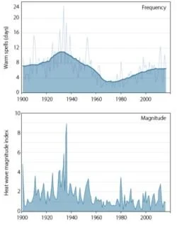
As you can see, the Hadley Centre data­set appears to support the assertion that heat waves have been on the rise globally since about 1990. However, the dataset also indicates that current heat waves are much more frequent than during the 1930s – a finding at odds with heat wave frequency data for the U.S., which has detailed heatwave records back to 1900. The next figure shows the frequency (top panel) and magnitude (bottom panel) of heat waves in the U.S. from 1901 to 2018.

It's clear that there were far more frequent and/or longer U.S. heat waves, and they were hotter, in the 1930s than in the present era of global warming. The total annual heat­ wave (warm spell) duration is seen to have dropped from 11 days during the 1930s to about 6.5 days during the 2000s. The peak heat wave index in 1936 was a full three times higher than in 2012 and up to nine times higher than in many other years.

Al­though the records for both the U.S. (this figure) and the world (previous figure) show an increase in the total annual heat wave duration since 1970, the U.S. increase is well below its 1930s level of 11 days – a level that is only about 7 days in the Hadley dataset’s global record.

The discrepancy between the two datasets very likely reflects the difference in the number of temperature stations used to calculate the average maximum temperature: the Hadley dataset used only 942 stations, compared with as many as 11,000 stations in the U.S. dataset. Before one can have any confidence in the Hadley global compilation, it needs to be tested on the much larger U.S. data­set to see if it can reproduce the U.S. data profile.

A noticeable feature of the global trend data from 1950 in the first figure above is a pronounced variation from country to country. The purported trend varies from an increase of more than 4 heat ­wave days per decade in countries such as Brazil, to an in­crease of less than 0.5 days per decade in much of the U.S. and South Africa, to a decrease of 0.5 days per decade in north­ern Argentina.

While regional differences should be expected, it seems improbable that global warming would result in such large variations in heat wave trend worldwide. The disparities are more likely to arise from insufficient data. Furthermore, the trend is artificially exaggerated because the start date of 1950 was in the middle of a 30-year period of global cooling, from 1940 to 1970.

The 1930s heat waves in the U.S. were exacerbated by Dust Bowl drought that depleted soil moisture and reduced the moderating effects of evaporation. But it wasn’t only the Dust Bowl that experienced searing temperatures in the 1930s.

In the summer of 1930 two record-setting, back-to-back scorchers, each lasting eight days, afflicted Washington, D.C.; while in 1936, the province of Ontario – well removed from the Great Plains, where the Dust Bowl was concentrated – saw the mercury soar to 44 degrees Celsius (111 degrees Fahrenheit) during the longest, deadliest Canadian heat wave on record. On the other side of the Atlantic Ocean, France too suffered during a heat wave in 1930.

Next: No Evidence That Climate Change Is Making Droughts Any Worse

Are Current Hot and Cold Extremes Climate Change or Natural Variability?

While sizzling temperatures in Europe have captured the attention of the mainstream media, recent prolonged bouts of cold in the Southern Hemisphere have gone almost unnoticed. Can these simultaneous weather extremes be ascribed to climate change, or is natural variability playing a major role?

It’s difficult to answer the question because a single year is a short time in the climate record. Formally, climate is the average of weather, or short-term changes in atmospheric conditions, over a 30-year period. But it is possible to compare the current heat and cold in different parts of the globe with their historical trends.

The recent heat wave in western and southern Europe is only one of several that have afflicted the continent recently. The July scorcher this year, labeled unprecedented by the media, was in fact less severe than back-to-back European heat waves in the summer of 2019.

In the second 2019 wave, which also occurred in July, the mercury in Paris reached a new record high of 42.6 degrees Celsius (108.7 degrees Fahrenheit), besting the previous record of 40.4 degrees Celsius (104.7 degrees Fahrenheit) set back in July 1947. A month earlier, during the first heat wave, temperatures in southern France hit a blistering 46.0 degrees Celsius (114.8 degrees Fahrenheit). Both readings exceed the highest temperatures reported in France during the July 2022 heat wave.

Yet back in 1930, the temperature purportedly soared to a staggering 50 degrees Celsius (122 degrees Fahrenheit) in the Loire valley during an earlier French heat wave, according to Australian and New Zealand newspapers. The same newspapers reported that in 1870, the ther­mometer had reached an even higher, unspecified level in that region. Europe’s official all-time high-temperature record is 48.0 degrees Celsius (118.4 degrees Fahrenheit) set in 1977.

Although the UK, Portugal and Spain have also suffered from searing heat this year, Europe experienced an unseasonably chilly spring. On April 4, France experienced its coldest April night since records began in 1947, with no less than 80 new low-temperature records being established across the nation. Fruit growers all across western Europe resorted to drastic measures to save their crops, including the use of pellet stoves for heating and spraying the fruit with water to create an insulating layer of ice.

South of the Equator, Australia and South America have seen some of their coldest weather in a century. Australia’s misery began with frigid Antarctic air enveloping the continent in May, bringing with it the heaviest early-season mountain snow in more than 50 years. In June, Brisbane in normally temperate Queensland had its coldest start to winter since 1904. And Alice Springs, which usually enjoys a balmy winter in the center of the country, has just endured 12 consecutive mornings of sub-freezing temperatures, surpassing the previous longest streak set in 1976.

South America too is experiencing icy conditions this year, after an historically cold winter in 2021 which decimated crops. The same Antarctic cold front that froze Australia in May brought bone-numbing cold to northern Argentina, Paraguay and southern Brazil; Brazil’s capital Brasilia logged its lowest temperature in recorded history. Later in the month the cold expanded north into Bolivia and Peru.

Based on history alone then, there’s nothing particularly unusual about the 2022 heat wave in Europe or the shivery winter down under, which included the coldest temperatures on record at the South Pole. Although both events have been attributed to climate change by activists and some climate scientists, natural explanations have also been put forward.

A recent study links the recent uptick in European heat waves to changes in the northern polar and subtropical jet streams. The study authors state that an increasingly persistent double jet stream pattern and its associated heat dome can explain "almost all of the accelerated trend" in heat waves across western Europe. Existence of a stable double-jet pattern is related to the blocking phenomenon, an example of which is shown in the figure below.

Blocking refers to a jet stream buckling that produces alternating, stationary highs and lows in pressure. Normally, highs and lows move on quickly, but the locking in place of a jet stream for several days or weeks can produce a heat dome. The authors say double jets and blocking are closely connected, but further research is needed to ascertain whether the observed increase in European double jets is part of internal natural variability of the climate system, or a response to climate change.

Likewise, it has been suggested that the frigid Southern Hemisphere winter may have a purely natural explanation, namely cooling caused by the January eruption of an undersea volcano in the South Pacific kingdom of Tonga. Although I previously showed how the massive submarine blast could not have contributed to global warming, it’s well known that such eruptions pour vast quantities of ash into the upper atmosphere, where it lingers and causes subsequent cooling by reflecting sunlight.

Next: Evidence for More Frequent and Longer Heat Waves Is Questionable

No Evidence That Hurricanes Are Becoming More Likely or Stronger

Despite the claims of activists and the mainstream media that climate change is making major hurricanes – such as U.S. Hurricane Harvey in 2017 or Hurricane Katrina in 2005 – more frequent and stronger, several recent studies have found no evidence for either of these assertions.

In fact, a 2022 study reveals that tropical cyclones in general, which include hurricanes, typhoons and tropical storms, are letting up as the globe warms. Over the period from 1900 to 2012, the study authors found that the annual number of tropical cyclones declined by about 13% compared with the period between 1850 and 1900, when such powerful storms were actually on the rise.

This is illustrated in the figure below, showing the tropical cyclone trend calculated by the researchers, using a combination of actual sea-level observations and climate model experiments. The solid blue line is the annual number of tropical cyclones globally, and the red line is a five-year running mean. 

The tropical cyclone trend is almost the opposite of the temperature trend: the average global temperature went down from 1880 to 1910, and increased by approximately 1.0 degrees Celsius (1.8 degrees Fahrenheit) between 1910 and 2012. After 1950, the rate of cyclone decline accelerated to about 23% compared to the 1850-1900 baseline, as global warming increased during the second half of the 20th century. Although the study authors noted a variation from one ocean basin to another, all basins demonstrated the same downward trend.

The authors remark how their findings are consistent with the predictions of climate models, in spite of the popular belief that a warming climate will spawn more, not fewer, hurricanes and typhoons, as more water evaporates into the atmosphere from the oceans and provides extra fuel. At the same time, however, tropical cyclone formation is inhibited by wind shear, which also increases as sea surface temperatures rise.    

Some climate scientists share the view of the IPCC (Intergovernmental Panel on Climate Change)’s Sixth Assessment Report that, while tropical cyclones overall may be diminishing as the climate changes, the strongest storms are becoming more common, especially in the North Atlantic. The next figure depicts the frequency of all major North Atlantic hurricanes back to 1851. Major hurricanes in Categories 3, 4 or 5 have a top wind speed of 178 km per hour (111 mph) or higher.

You can see that hurricane activity in this basin has escalated over the last 20 years, especially in 2005 and 2020. But, despite the upsurge, the data also show that the frequency of major North Atlantic hurricanes in recent decades is merely comparable to that in the 1950s and 1960s – a period when the earth was cooling rather than warming.

A team of hurricane experts concluded in a 2021 study that, at least in the Atlantic, the recent apparent increase in major hur­ricanes results from improvements in observational capabilities since 1970 and is unlikely to be a true climate trend. And, even though it appears that major Atlantic hurricanes were less frequent before about 1940, the lower numbers simply reflect the rela­tive lack of measurements in early years of the record. Aircraft re­connaissance flights to gather data on hurricanes only began in 1944, while satellite coverage dates only from the 1960s.

The team of experts found that once they corrected the data for under­counts in the pre-satellite era, there were no significant recent increases in the frequency of either major or all North Atlantic hurricanes. They suggested that the reduction in major hurricanes between the 1970s and the 1990s, clearly visible in the figure above, could have been the result of natural climate variability or possibly aerosol-induced weakening.

Natural climate cycles thought to contribute to Atlantic hurricanes include the AMO (Atlantic Multi-Decadal Oscillation) and La Niña, the cool phase of ENSO (the El Niño – Southern Oscillation). The AMO, which has a cycle time of approximately 65 years and alternates between warm and cool phases, governs many extremes, such as cyclonic storms in the Atlantic basin and major floods in eastern North America and western Europe. In the U.S., La Niñas influence major landfalling hurricanes.

Just as there’s no good evidence that global warming is increasing the strength of hurricanes, the same is true for their typhoon cous­ins in the northwestern Pacific. Although long-term data on major typhoons is not available, the frequency of all typhoon categories combined appears to be un­changed since 1951, according to the Japan Meteorological Agency. Yet a new study demonstrates a decline in both total and major typhoons for the 32-year period from 1990 to 2021, reinforcing the recent decrease in global tropical cyclones discussed above.

Next: Are Current Hot and Cold Extremes Climate Change or Natural Variability?

No Convincing Evidence That Cleaner Air Causes More Hurricanes

According to a new research study by NOAA (the U.S. National Oceanic and Atmospheric Administration), aerosol pollution plays a major role in hurricane activity. The study author claims that a recent decline in atmospheric pollutants over Europe and the U.S. has resulted in more hurricanes in the North Atlantic Ocean, while a boost in aerosols over Asia has suppressed tropical cyclones in the western Pacific.

But this claim, touted by the media, is faulty since the study only examines changes in aerosol emissions and hurricane frequency since 1980 – a selective choice of data becoming all too common among climate scientists trying to bolster the narrative of anthropogenic climate change. The aerosol pollution is mostly in the form of sulfate particles and droplets from industrial and vehicle emissions. When pre-1980 evidence is included, however, the apparent connection between aerosols and hurricanes falls apart.

Let’s look first at the North Atlantic. Data for the Atlantic basin, which has the best quality data in the world, do indeed show heightened hurricane ac­tivity over the last 20 years, particularly in 2005 and 2020. You can see this in the following figure, which illustrates the frequency of all major Atlantic hurricanes as far back as 1851. Major hurricanes (Category 3 or greater) have a top wind speed of 178 km per hour (111 mph) or higher. The recent enhanced activity is less pronounced, though still noticeable, for Category 1 and 2 hurricanes.

The next figure shows the observed increase in Atlantic hurricane frequency (top), from the 20 years between 1980 and 2000 to the 20 years between 2001 and 2020, compared to the NOAA study’s simulated change in sulfate aerosols during the same interval (bottom).

The hurricane frequency TCF is for all (Categories 1 through 5) hurricanes, with positive and negative color values denoting higher and lower frequency, respectively. A similar color scheme is used for the sulfate calculations. Both the Atlantic increase and western Pacific decrease in hurricane frequency are clearly visible, as well as the corresponding decrease and increase in aerosol pollution from 1980 to 2020.

But what the study overlooks is that the frequency of major Atlantic hurricanes in the 1950s and 1960s was at least compara­ble to that in the last two decades when, as the figure shows, it took a sudden upward hike from the 1970s, 1980s and early 1990s. If the study’s conclusions are correct, then pollution levels in Europe and the U.S. during the 1950s and 1960s must have been as low as they were from 2001 to 2020.

However, examination of pollution data for the North Atlantic reveals that the exact opposite is true: European and U.S. aerosol concentrations in the 1960s were much higher than in any later decade, including decades after 1980 during the study period. This can be seen in the figure below, which depicts the sulfate concentration in London air over the 50 years from 1962 to 2012; similar data exists for the U.S. (see here, for example).

Were the NOAA study valid, such high aerosol levels in European and U.S. skies during the 1960s would have decreased North Atlantic hurricane activity in that period – the reverse of what the data demonstrates in the first figure above. In the Pacific, the study links a supposed reduction in tropical cyclones to a well-documented rise in aerosol pollution in that region, due to growing industrial emissions.

But a close look at the bottom half of the second figure above shows the increase in pollution since 1980 has occurred mostly in southern Asia. The top half of the same figure indicates increased cyclone activity near India and the Persian Gulf, associated with higher, not lower pollution. The only decreases are in the vicinity of Japan and Australia, where any changes in pollution level are slight.

The NOAA study aside, changes in global hurricane frequency are much more likely to be associated with naturally occurring ocean cycles than with aerosols. Indeed, NOAA has previously linked increased Atlantic hurricane activity to the warm phase of the Atlantic Multidecadal Oscillation (AMO).

The AMO, which has a cycle time of approximately 65 years and alternates between warm and cool phases, governs many extremes, such as cyclonic storms in the Atlantic basin and major floods in eastern North America and western Europe. The present warm phase began in 1995, triggering a more tempestuous period when both named Atlantic storms and hurricanes have become more common on average.

Another contribution to storm activity in the Atlantic comes from La Niña cycles in the Pacific. Apart from a cooling effect, La Niñas result in quieter conditions in the eastern Pacific and enhanced activity in the Atlantic. In the U.S., major landfalling hurricanes are tied to La Niña cycles in the Pacific, not to global warming.

Next: Why There’s No Need to Panic about Methane in the Atmosphere

“Rescued” Victorian Rainfall Data Casts Doubt on Claims of a Wetter UK

Millions of handwritten rainfall records dating back nearly 200 years have revealed that the UK was just as wet in Victorian times as today. The records were “rescued” by more than 16,000 volunteers who digitally transcribed the observations from the archives of the UK Met Office, as a means of distracting themselves during the recent pandemic. The 5.3 million digitized records boost the number of pre-1961 observations by an order of magnitude.

The new data extends the official UK rainfall record back to 1836 and even earlier for some regions. The year 1836 was when Charles Darwin returned to the UK after his famous sea voyage gathering specimens that inspired his theory of evolution, and a year before Queen Victoria came to the throne. The oldest record in the collection dates back to 1677.

As a result of the project, the number of rain gauges contributing to the official record for the year 1862, for example, has increased from 19 to more than 700. The rain gauges were situated in almost every town and village across the UK, in locations as diverse as lighthouses, a chocolate factory, and next door to children’s author Beatrix Potter's Hilltop Farm in the Lake District.

Raw data in the form of “Ten Year rainfall sheets” included monthly rainfall amounts measured across the UK, Ireland and the Channel Islands between 1677 and 1960. After digitizing and organizing the raw data by county, the volunteer scientists combined data from different decades and applied quality control measures such as removing estimates and duplicate measurements, and identifying rain gauge moves.

The outcome of their efforts, presented in a recently published paper, is depicted in the figure below showing the annual average UK rainfall by season from 1836 to 2019. The rescue data for 1836-1960 is shown in black and the previous Met Office data for 1862-2019 in blue. Both sets of data agree well for the overlapping period from 1862 to 1960.

 While the annual rainfall for all seasons combined is not included in the paper, the figure shows clearly that current UK rainfall is no higher on average than it was during the 19th century, with the possible exception of winter. This conclusion conflicts with statements on the Met Office website, such as: “… the UK has become wetter over the last few decades … From the start of the observational record in 1862, six of the ten wettest years across the UK have occurred since 1998 … these trends point to an increase in frequency and intensity of rainfall across the UK.”

In fact, the wettest UK month on record was in the early 20th century, October 1903. The rescue data for the 19th century reveals that November and December 1852 were also exceptionally wet months. December 1852 is found to have been the third wettest month on record in Cumbria County in northern England, and November 1852 the wettest month on record for large parts of southern England.

The next figure illustrates how much UK rainfall varies regionally in time and space, for the four wettest months between 1836 and 1960. It can be seen that the soggiest regions of the nation are consistently Scotland, Wales and northwestern England. Shown in the subsequent figure is the monthly rainfall pattern from 1850 to 1960 recorded by rain gauges located near Seathwaite in Cumbria’s Lake District – one of the wettest spots in the country, with annual rainfall sometimes exceeding 5,000 mm (200 inches). The different colors represent nine different gauges.

By contrast, the driest UK month on record was February 1932 – during a prolonged period of heat waves across the globe. But the new data finds that the driest year on record was actually 1855. And 1844 now boasts the driest spring month of May, during a period of notably dry winters in the 1840s and 1850s.

Gathering the original rain gauge readings transcribed by the volunteers was evidently no simple task. The published paper summarizing the rescue project includes amusing comments found on the Ten Year sheets, such as “No readings as gauge stolen”; “Gauge emptied by child”; and “Gauge hidden by inmates of a mental hospital.”

But the newly expanded dataset does bring recent Met Office statements into question. While precipitation tends to increase as the world warms because of enhanced evap­oration from tropical oceans, which results in more water vapor in the atmosphere, there’s very little evidence that the UK has become any rainier so far.

Next: Science on the Attack: Nuclear Fusion – the Energy Hope of the Future

Can Undersea Volcanoes Cause Global Warming?

It’s well known that active volcanoes on land can cause significant global cooling when they erupt, from shielding of sunlight by sulfate aerosol particles in the eruption plume which linger in the atmosphere. But what is the effect on climate of undersea volcanic eruptions such as the massive submarine blast that blanketed the nearby South Pacific kingdom of Tonga with ash in January?
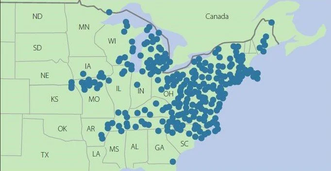
Submarine volcanoes are relatively unexplored but are thought to number over a million, of which several thousand may be currently active. Many lie along tectonic plate boundaries, where plates are pulling apart or colliding with each other. The Tonga volcano sits above a geological pileup, where the western edge of the Pacific plate dives under the Indian–Australian plate.

The eruption of any volcano releases a huge amount of energy. In the case of a submarine volcano that may be thousands of meters deep, the plume may not even reach the surface and all the energy is absorbed by the ocean. The Tonga eruption was from a shallow depth, so much of the energy was dissipated at the ocean surface – launching a destructive tsunami – and in the atmosphere – generating a plume of ash that reached a record altitude of 55 kilometers (34 miles), a shockwave that traveled around the globe, and nearly 400,000 lightning strikes.

You might think all that energy could contribute to global warming, had the volcano erupted in deeper water that would have converted all the energy to heat. However, the oceans, which cover 71% of the earth’s surface, are vast and can hold 1,000 times more heat than the atmosphere. Any change in sea surface temperatures from even multiple underwater volcanic eruptions would be imperceptible.

This can be seen from a simple calculation. According to NASA scientists, the energy released by the undersea Tonga eruption was equivalent to the explosive power of 3.6 to 16 megatonnes (4 to 18 megatons) of TNT. For comparison, the 1980 eruption on land of Mount Saint Helens in Washington state released about 22 megatonnes of TNT equivalent, and the famous 1883 explosion of Indonesia's Krakatoa unleashed 180 megatonnes; the atomic bomb that the U.S. dropped on Hiroshima in Japan in 1945 released roughly 14 kilotonnes of TNT equivalent.

The upper Tonga limit of 16 megatonnes is equal to 7.5 x 10¹⁶ Joules of energy. Assuming the heat capacity of seawater to be 3,900 Joules per kilogram per degree Celsius and the total mass of the oceans to be 1.4 × 10²¹ kilograms, it would take 5.5 × 1024 Joules (5.5 trillion trillion Joules) to warm the entire ocean by 1 degree Celsius (1.8 degrees Fahrenheit).

So if all 16 megatonnes had gone into the ocean, ocean temperatures would have risen by (7.5 x 10¹⁶)/( 5.5 × 1024) or a minuscule 1.4 x 10⁻⁸ (14 billionths) of a degree Celsius. The Krakatoa above-water eruption, on the other hand, decreased global air temperatures by as much as 1.2 degrees Celsius (2.2 degrees Fahrenheit) for several years and may have cooled the oceans as well.

But there’s another potential source of warming from submarine volcanoes, and that is the CO2 emitted along with the sulfur dioxide (SO2) that causes cooling through formation of sulfate aerosols. If the underwater plume reaches the ocean surface, both gases are released into the atmosphere. In the case of Tonga, while the amount of SO2 emitted was too small to have any cooling effect, the emitted CO2 could in theory contribute to global warming.

However, the yearly average of CO2 emissions from all volcanoes, both on land and submarine, is only 1 to 2% of current human emissions that have raised global temperatures by 1 degree Celsius (1.8 degrees Fahrenheit) at most. So any CO2 warming effect from an underwater eruption is unlikely to be much larger than the above calculation for energy release. Interestingly though, Chinese researchers recently reported that the atmospheric concentration of CO2 near Tonga after the eruption jumped by 2 parts per million, which is as much as the global concentration normally increases in a whole year from human sources. But this is most probably a temporary local effect that won’t affect the global CO2 increase expected in 2022.

Despite the inability of undersea eruptions to affect our present climate, it was suggested in a 2015 research paper that CO2 from submarine volcanoes may have triggered the warming that pulled the earth out of the last ice age about 15,000 years ago.

The basic idea is that lower sea levels during glaciation relieved the hydrostatic pressure on submarine volcanoes that suppressed eruptions during warmer times. This caused them to erupt more. After a lengthy ice age, the buildup of CO2 from undersea eruptions initiated warming that then began to melt the ice sheets covering volcanoes on land, causing them in turn to belch CO2 that enhanced the warming, melting more ice in a feedback effect.

Next: New Projections of Sea Level Rise Are Overblown