
Sea Level Rise Dominated by Subsidence, Not Global Warming
/Of all the topics I’ve covered in this blog, none have attracted as many readers as sea level rise (see for example here, here and here). And for good reason, since rising seas threaten the livelihood of tens of millions of coastal dwellers around the world.
What is not generally known is that the main culprit is land subsidence resulting from groundwater extraction and urban development that causes more sea level rise than any human-induced global warming. The importance of subsidence has been brought to light by two recent research papers: a Dutch study finding that current model-based estimates of sea levels are much too low, and a study of river delta subsidence by an international team of environmental scientists and others.
Several different processes can affect vertical motion of land. Long-term glacial rebound after melting of the last ice age’s heavy ice sheets is causing land to rise in high northern latitudes. Yet in many regions, the ground is sinking because of sediment settling and aquifer compaction caused by human activities, especially groundwater depletion resulting from rapid urbanization and population growth.
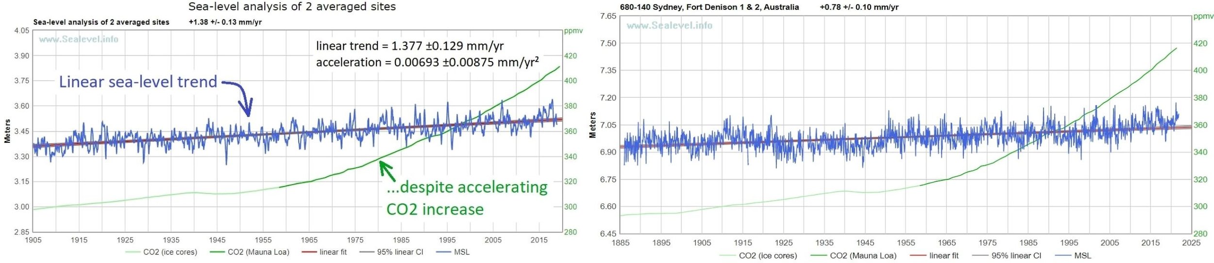
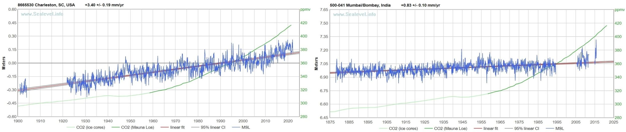
Land subsidence artificially amplifies any local rise in sea level, which can be measured by either tide gauges or satellite altimetry. Tide gauges measure the height of the sea relative to the land to which the gauge is attached, the so-called RSL (Relative Sea Level) metric. Satellite observations of absolute sea level measure the height of the sea, which is the distance of its surface to the center of the earth.
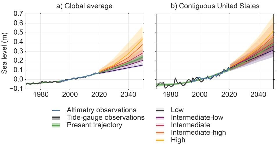
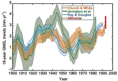
Subsidence of the land independently of sea level makes satellite-measured sea levels higher than tide gauge RSLs. That’s why the average rate of rise from 1900 to 2020 determined by tide gauges was only 1.75 mm (0.07 inches) per year, while NASA’s satellite measurements say the rate was more like 3.3 mm (0.13 inches) per year from 1993 to 2024.
But neither tide gauges nor satellites measure sea levels at all points on every coastline in the world, which is why so-called geoid models, rather than actual sea level measurements, are used to make estimates. A geoid is an equipotential surface that approximates mean sea level based on gravity and the earth’s rotation.
However, because the actual height of the sea surface is not determined only by the gravity and rotation of the earth, but also by other factors such as ocean currents, winds, tides and seawater temperature, the time-average sea-surface height can deviate strongly (up to several meters) from a geoid. The discrepancy between geoid and actual sea level has led to widespread underestimation of coastal sea level rise.
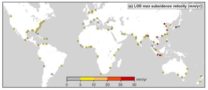
This occurs predominantly in parts of the world where the most rapid land subsidence is happening – in southeastern and eastern Asia, for example. The Dutch study examined 40 river deltas worldwide subject to severe subsidence such as the Vietnamese Mekong Delta, which is one of the most densely populated coastal landscapes exposed to rising sea levels worldwide.
The figure below shows how much land subsidence has already occurred in the 40 deltas. Yellow and red circles denote subsidence, the circle size indicating the percentage of the delta area subsiding faster than satellite-measured sea level rise, which averages about 4 mm (0.16 inches) per year globally.
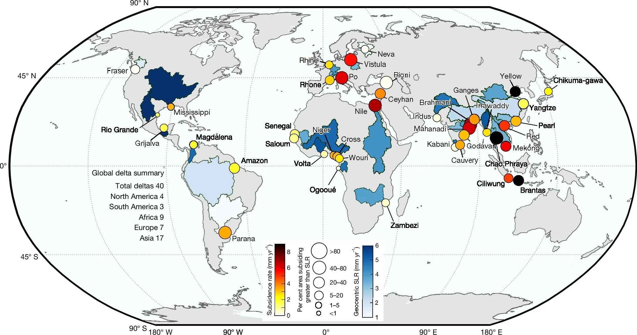
In 13 of the deltas (Brahmani, Brantas, Ceyhan, Chao Phraya, Ciliwung, Godavari, Mahanadi, Mekong, Nile, Po, Red, Vistula and Yellow River), the subsidence rate exceeds 4 mm (0.16 inches) per year. Among these, the Chao Phraya (Thailand), Brantas (Indonesia) and Yellow River (China) deltas show an average sinking rate of more than twice the current rate of global sea level rise.
Overall, more than 90% of the delta area is affected by subsidence in 19 of the 40 deltas studied, while more than 50% of the delta area is subsiding in 38 of the 40. Coastal cities in the deltas are experiencing subsidence rates even greater than the deltas themselves. In Jakarta (Ciliwung), for example, parts of the city are subsiding at alarming rates surpassing 30 mm (1.2 inches) per year, dwarfing average global sea level rise by almost an order of magnitude.
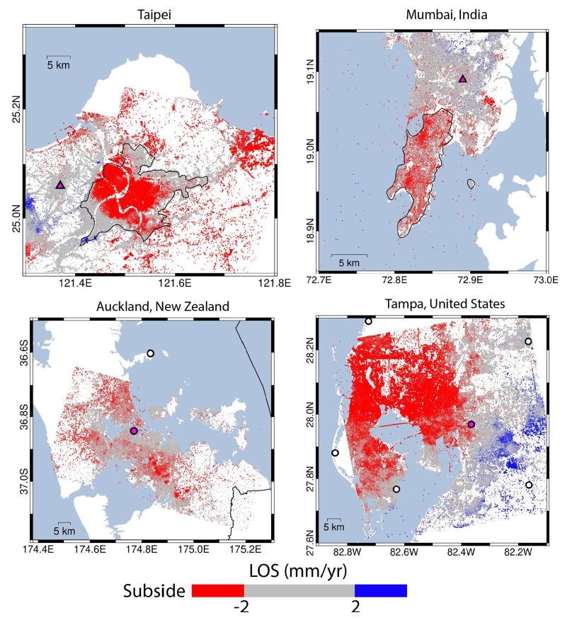
The effect of land subsidence in river deltas on local populations is demonstrated in the next figure. The upper left panel (a) compares rates of local sea level rise and subsidence; current average subsidence rates exceed sea level rise in 18 of the 40 deltas, including the Mekong and Nile. The lower left panel (b) makes the same comparison, but only for populations living within 1 meter of sea level. Panel c on the right is a bar plot of subsidence vs sea level rise for 30 of the 40 deltas.
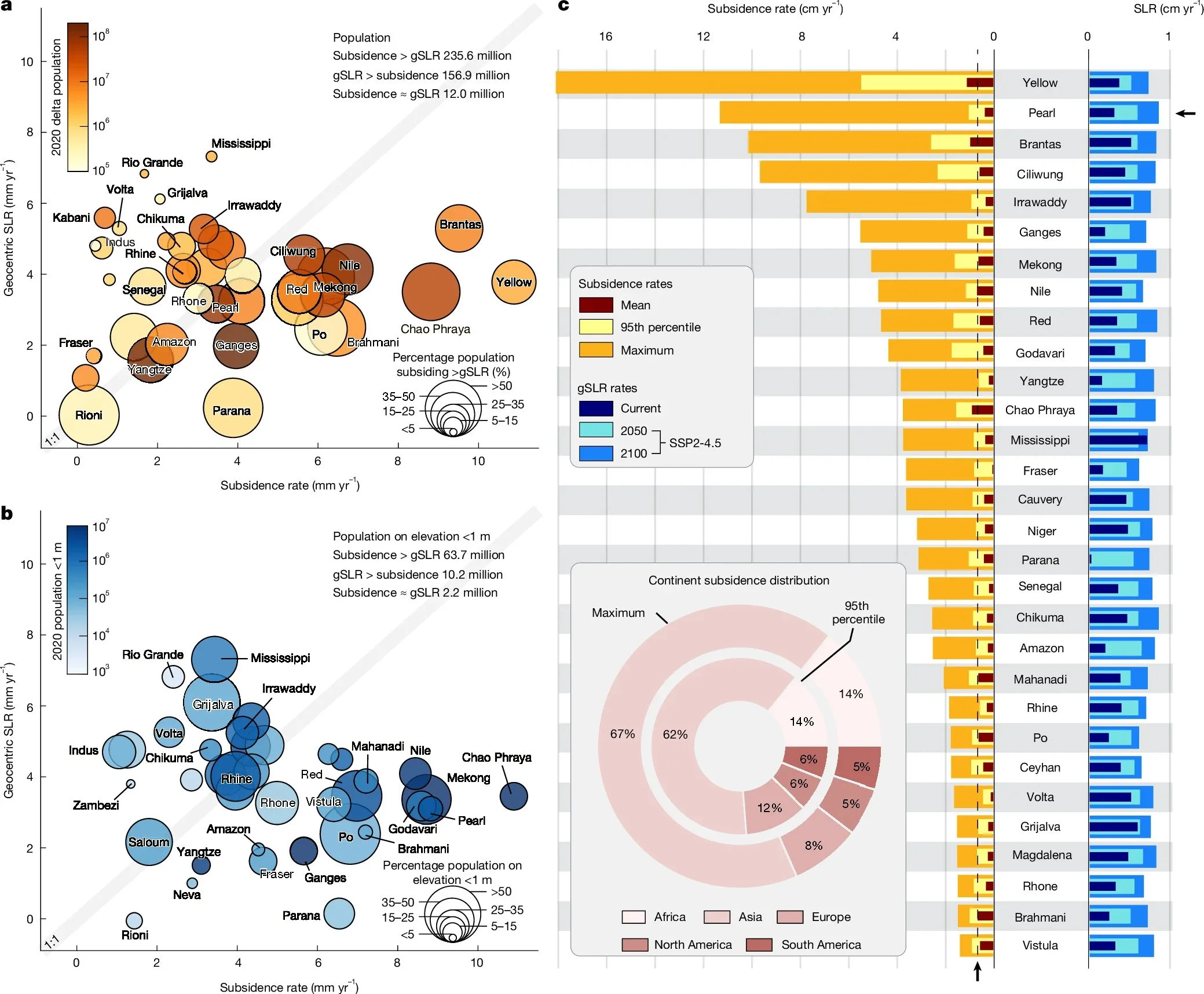
Of the various possible contributions to subsidence, groundwater storage has the strongest relative influence in 10 of the 40 deltas. The other drivers are sediment flux and urban expansion.
Next: A New Threat to Science: AI Making Up References in Research Papers


