The Pseudoscience behind Extreme Weather Attribution
/As I wrote in a previous post, newly popular extreme event attribution studies are deeply flawed, with fundamental logical and methodological errors. Here I examine these failings in more detail.
To begin with, attribution studies rely on computer climate models, the weaknesses of which I’ve described multiple times in these pages (see for example here and here). The models have a dismal track record in predicting the future, or indeed of hindcasting the past. Not only do the majority of models overestimate the warming rate, but they also wrongly predict a hot spot in the upper atmosphere that isn’t there and are unable to accurately reproduce sea surface temperatures and sea-level rise.
Most importantly for attribution studies, the models are poor at hindcasting. That matters because the models are used to compare the present climate with anthropogenic CO2 emissions to a preindustrial climate without extra CO2.
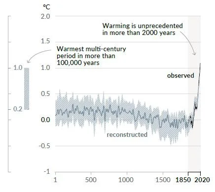
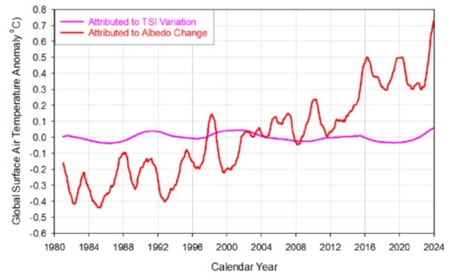
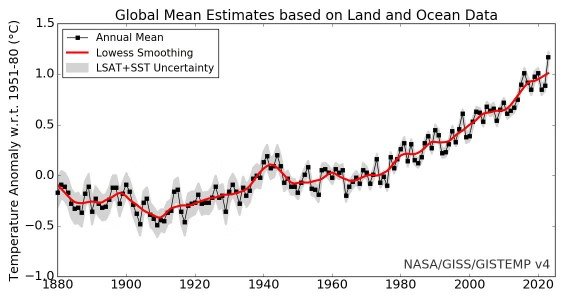
In particular, climate models underestimate the warming during the global warming spell from 1910 to 1940, seen in the figure below. If the same deficiency applies to hindcasted temperatures before that period, including those in 1850 which is the baseline preindustrial year for attribution studies, then such studies will underestimate the magnitude of any counterfactual, comparison warming (and probably any other weather characteristic) in preindustrial times.
Another weakness of attribution methodology is that, in the absence of CO2, we simply do not know what the “natural” climate would have been. Although we have reliable historic meteorological data for a few countries such as the UK and the U.S., we do not for most of the other countries on the planet. And historical data for variables such as cloud cover and wind speeds is lacking worldwide.
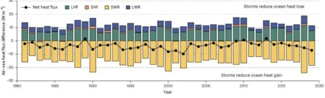
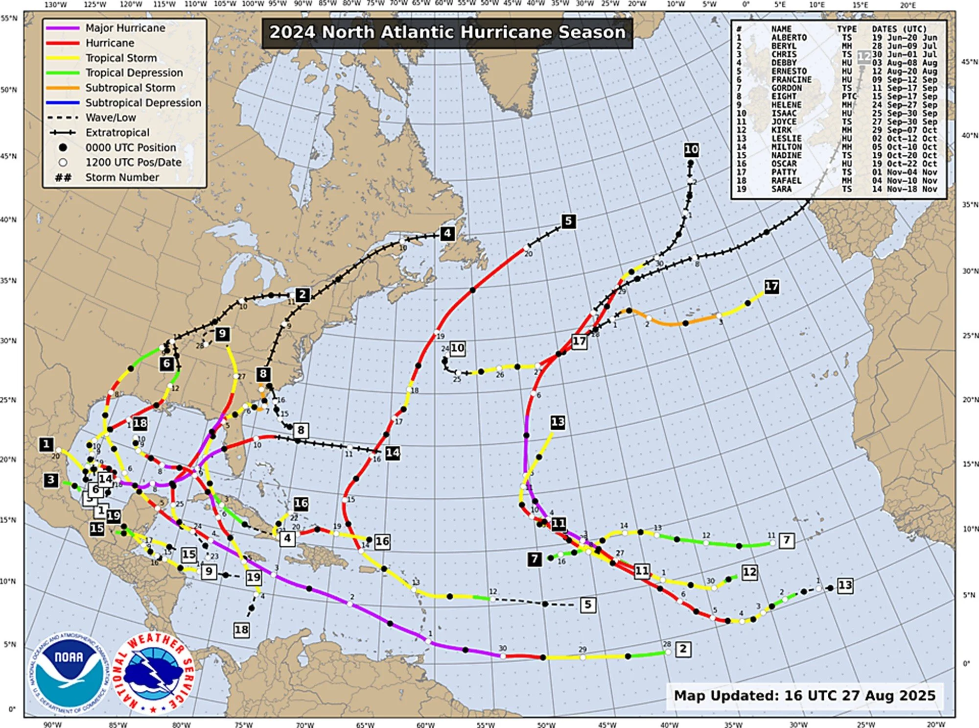
A further deficiency in event attribution studies is lack of attention to the uncertainty involved in temperature or other measurements, as I mentioned in the earlier post. An example of this is a Grantham Institute attribution study claiming that 2024’s Hurricane Helene that struck the U.S. was 100%, or 2 times, more likely than would have occurred in a preindustrial climate. Helene was a large Category 4 (top wind speed 250 km per hour or 156 mph) hurricane when it made landfall and caused significant damage across Florida and the southeastern U.S.
The next figure shows the path of Hurricane Helene, together with the maximum speed locations of historically observed and simulated hurricanes that followed paths within a 2° radius of Helene landfall. It also includes the attribution study’s estimates of landfall maximum wind speed as a function of “return period”; the return period is the expected interval between successive hurricanes at the same location, which is the inverse of hurricane frequency.
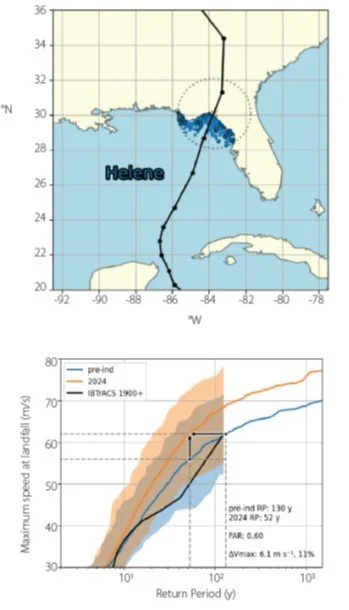
However, the methodology of the Hurricane Helene study is fundamentally flawed. Beyond the general limitations of attribution studies, hurricane behavior in particular is poorly reproduced by climate models. This contrasts with heatwaves, for which models are relatively skillful. Furthermore, very few North Atlantic hurricanes have made landfall in the same region of Florida, limiting the amount of observational data available.
The study’s solution to this problem was to include data from hurricanes that passed nearby but never actually made landfall in the same region – historic “near misses,” which are depicted in the top panel of the figure. Such practice is highly questionable at best, deceptive at worst. The blatant dishonesty is exemplified in the bottom panel, where it can be seen that the uncertainty (colored bands) associated with the partly simulated 2024 Helene curve (orange line) embraces the preindustrial curve (blue line); in other words, Helene may have been no more likely than normal.
The lack of attention to uncertainty is evident in the same data. For example, the uncertainty range (blue band) for the preindustrial curve includes the observational data (black line) for all North Atlantic hurricanes since 1900 – suggesting that there has been nothing very different about Florida landfalling hurricanes, including Helene, over the whole period of observation.
After accounting for this uncertainty, therefore, the Helene study’s conclusions that the return period decreased from 130 years in the preindustrial era to 52 years, and the wind speed increased by 6.1 meters per second or 11%, are meaningless.
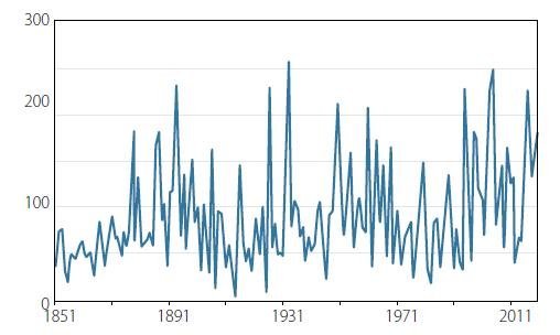
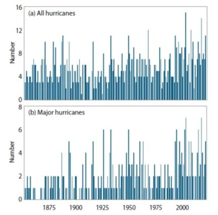
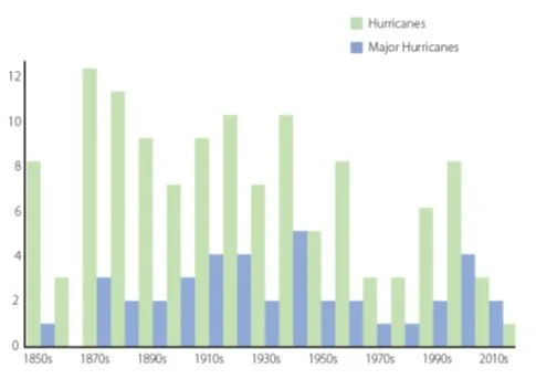
That there was indeed nothing exceptional about Hurricane Helene is reinforced by the plot of all Florida landfalling hurricanes since 1850, presented below. Neither hurricanes overall nor major hurricanes, of which Helene was the latest, exhibit any long-term trend. Taken as a whole, the conclusions of this Hurricane Helene attribution study are faulty.
Extreme event attribution studies, as currently conducted, fail to reinforce the mistaken belief that weather extremes are rising due to global warming – as I will demonstrate in subsequent posts.
Next: No Evidence That Weather Extremes Are Becoming More Frequent or Intense: (1) Heat Waves