
The Evidence Shows We Are Nowhere Near a Climate Tipping Point, As Alarmists Claim
/A recent paper raises the specter of the earth’s climate being on a “hothouse trajectory” – a pathway in which self-reinforcing feedbacks push the climate system past a point of no return, an irreversible disaster beyond which the planet would become unbearably hot. But a careful look at the evidence reveals this claim to be absurd, with no sign that we are currently anywhere close to such a tipping point.
This is not a new form of alarmism. In fact, the paper’s lead author published another paper over six years ago titled “World Scientists’ Warning of a Climate Emergency,” perhaps the beginning of the recent obsession with the erroneous notion of a climate crisis caused by global warming. And a new NGO (non-governmental organization), Global Tipping Points, has in 2023 and 2025 produced fearmongering reports on tipping points.
That we are approaching a tipping point, insists the new paper, is evident from an imagined surge in extreme weather that the paper claims is becoming “more frequent, intense, and costly.” However, the observational evidence shows that most forms of extreme weather are becoming neither more frequent nor more intense, as I’ve demonstrated numerous times in these pages (see Category “Weather extremes”). The increasing costs of natural disasters are simply a result of population gain and the ever-escalating value of property in harm’s way.
The NGO’s 2025 report features the following summary of supposed global-warming-enhanced tipping points faced by our earth. The vertical bars represent the range of anticipated temperature increases that would trigger various tipping points. The report’s purported nearness of tipping points is reflected in the lower limits of all the bars being in the current level of warming band.
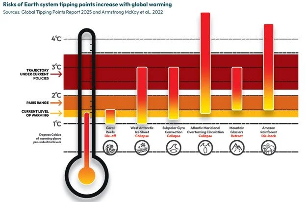
Nevertheless, it’s not difficult to show that none of these tipping points – nor several others cited in the report – are imminent. I’ll discuss just three here: coral reefs, ice sheets, and the AMOC (Atlantic Meridional Overturning Circulation).
According to the figure above, die-off of low-latitude coral reefs has already begun, with an estimated tipping point of 1.2 degrees Celsius (2.2 degrees Fahrenheit) above preindustrial temperatures. This shortsighted claim, probably based on temporary losses in global coral cover during the recent period of elevated sea surface temperatures, is irrational.
Australian physicist and leading coral reef authority, Professor Peter Ridd has explained in a 2023 report that most corals that bleach due to higher temperatures do not die, but are capable of rapid recovery in a decade or less. This is exemplified by studies of Australia’s Great Barrier Reef, which has the most reliable long-term record of large-area coral cover. Despite four supposedly catastrophic bleaching events in the six years prior to 2022, the reef’s coral cover reached a record high in 2024, as depicted in the image on the left below.
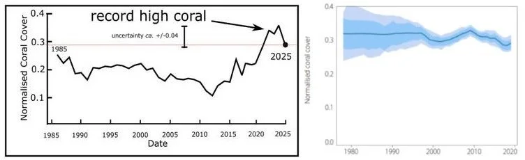
The image on the right shows the estimated global average cover of hard coral (solid line) and its associated uncertainty (shaded areas) since the late 1970s. Note that data before the late 1990s is of little value, says Ridd, because of small sample sizes; but the data since then reveals little overall variation – certainly nothing suggestive of a tipping point, either already passed or impending.
As for likely collapse of the West Antarctic ice sheet, there’s no evidence that such a catastrophic event is just around the corner either. As I discussed in a 2025 post, the Antarctic ice sheet overall is growing, and no longer melting, for the first time in decades. This is illustrated in the figure below, which shows changes in Antarctic ice sheet mass from April 2002 to December 2023, measured in billions of tonnes (gigatonnes, Gt where 1 gigatonne = 1.102 U.S. gigatons).
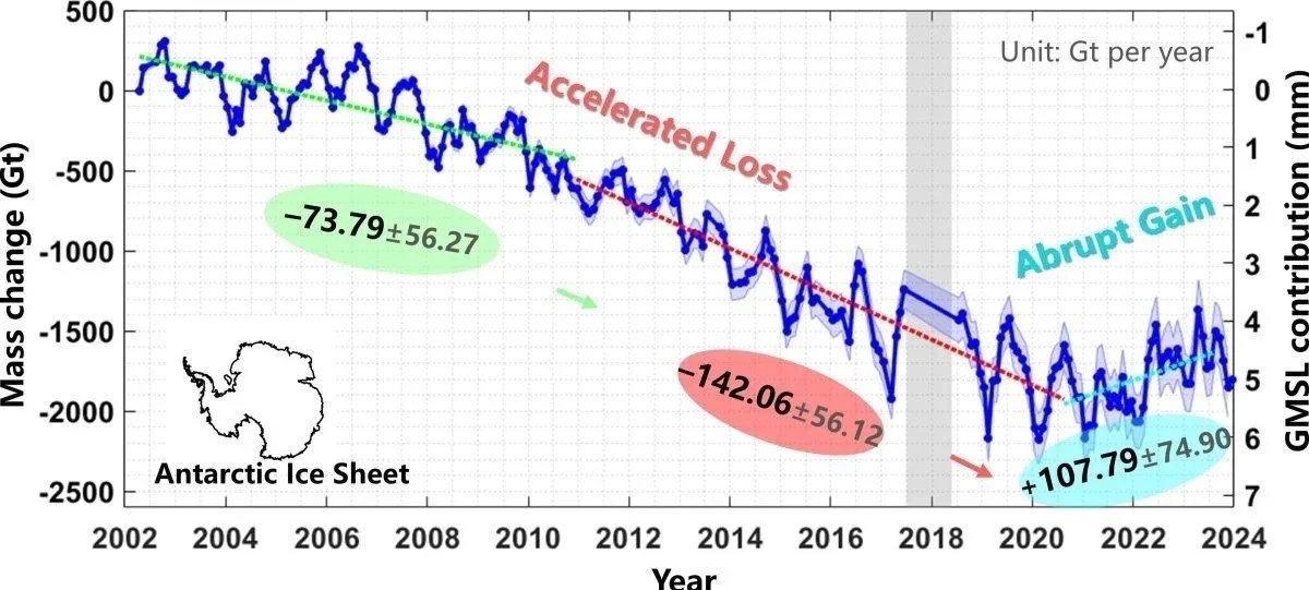
Although the ice sheet does appear to be growing in East Antarctica, the ice loss there in the form of melting glaciers is partly caused by active volcanoes underneath the continent. There’s no evidence that the East Antarctica portion of the ice sheet is anywhere near collapse.
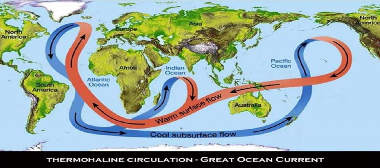
Finally, I also discussed the very unlikely slowing down, let alone collapse, of the AMOC in a very recent blog post. All claims of impending doom rely on computer climate models, which have a generally poor history of making predictions. Although some models do indeed support the existence of a weakened AMOC, such cherry picking is highly unscientific and many of the ignored models in fact simulate a strengthened AMOC.
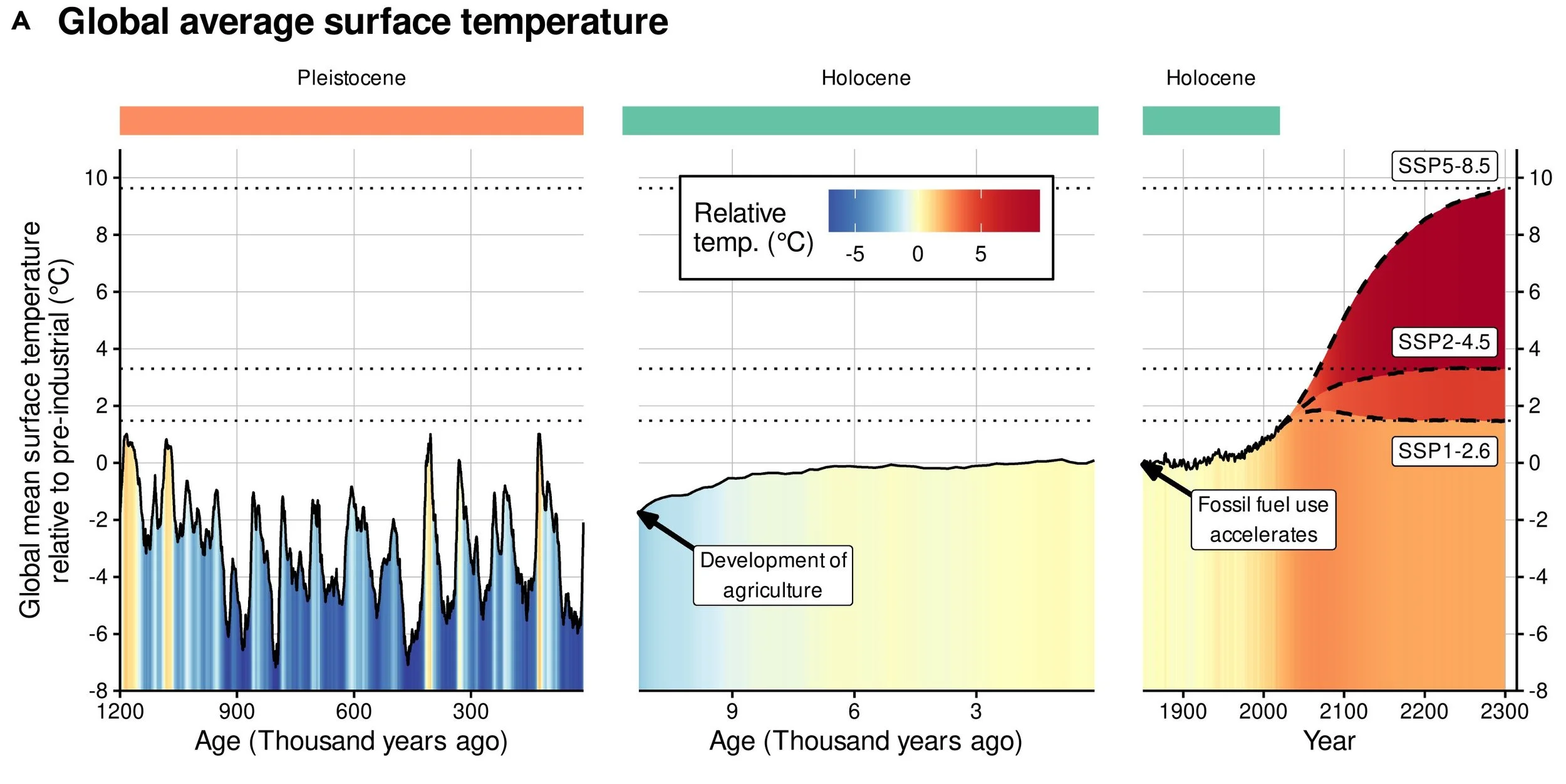
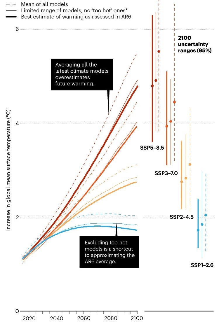
The next figure, from the new paper, graphs the mean global temperature over past millennia, with future projections based on so-called SSPs (Shared Socioeconomic Pathways) that range from low- to high-emission scenarios. As climate writer Roger Pielke Jr. has emphasized on many occasions (see here, for example), high-emission scenarios such as SSP5-8.5 are implausibly extreme. More realistic scenarios such as SSP1-2.6 or even SSP2-4.5 will produce only modest warming in the near future, with no likelihood of triggering tipping points.
Next: Uncertainty in Ocean Heat Content May Be Grossly Underestimated


