Challenges to the CO2 Global Warming Hypothesis: (11) Global Warming Driven by Oceanic Seismic Activity, Not CO2

Although undersea volcanic eruptions can’t cause global warming directly, as I discussed in a previous post, they can contribute indirectly by altering the deep-ocean thermohaline circulation. According to a recent lecture, submarine volcanic activity is currently intensifying the thermohaline circulation sufficiently to be the principal driver of global warming.

The lecture was delivered by Arthur Viterito, a renowned physical geographer and retired professor at the College of Southern Maryland. His provocative hypothesis links an upsurge in seismic activity at mid-ocean ridges to recent global warming, via a strengthening of the ocean conveyor belt that redistributes seawater and heat around the globe.

Viterito’s starting point is the observation that satellite measurements of global warming since 1979 show distinct step increases following major El Niño events in 1997-98 and 2014-16, as demonstrated in the following figure. The figure depicts the satellite-based global temperature of the lower atmosphere in degrees Celsius, as compiled by scientists at the University of Alabama in Huntsville; temperatures are annual averages and the zero baseline represents the mean tropospheric temperature from 1991 to 2020.

Viterito links these apparent jumps in warming to geothermal heat emitted by volcanoes and hydrothermal vents in the middle of the world’s ocean basins – heat that shows similar step increases over the same time period, as measured by seismic activity. The submarine volcanoes and hydrothermal vents lie along the earth’s mid-ocean ridges, which divide the major oceans roughly in half and are illustrated in the next figure. The different colors denote the geothermal heat output (in milliwatts per square meter), which is highest along the ridges.

The total mid-ocean seismic activity along the ridges is shown in the figure below, in which the global tropospheric temperature, graphed in the first figure above, is plotted in blue against the annual number of mid-ocean earthquakes (EQ) in orange. The best fit between the two sets of data occurs when the temperature readings are lagged by two years: that is, the 1979 temperature reading is paired with the 1977 seismic reading, and so on. As already mentioned, seismic activity since 1979 shows step increases similar to the temperature.

A regression analysis yields a correlation coefficient of 0.74 between seismic activity and the two-year lagged temperatures, which implies that mid-ocean geothermal heat accounts for 55% of current global warming, says Viterito. However, a correlation coefficient of 0.74 is not as high as some estimates of the correlation between rising CO2 and temperature.

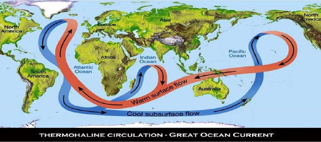
In support of his hypothesis, Viterito states that multiple modeling studies have demonstrated how geothermal heating can significantly strengthen the thermohaline circulation, shown below. He then links the recently enhanced undersea seismic activity to global warming of the atmosphere by examining thermohaline heat transport to the North Atlantic-Arctic and western Pacific oceans.

In the Arctic, Viterito points to several phenomena that he believes are a direct result of a rapid intensification of North Atlantic currents which began around 1995 – the same year that mid-ocean seismic activity started to rise. The phenomena include the expansion of a phytoplankton bloom toward the North Pole due to incursion of North Atlantic currents into the Arctic; enhanced Arctic warming; a decline in Arctic sea ice; and rapid warming of the Subpolar Gyre, a circular current south of Greenland.

In the western Pacific, he cites the increase since 1993 in heat content of the Indo-Pacific Warm Pool near Indonesia; a deepening of the Indo-Pacific Warm Pool thermocline, which divides warmer surface water from cooler water below; strengthening of the Kuroshio Current near Japan; and recently enhanced El Niños.

But, while all these observations are accurate, they do not necessarily verify Viterito’s hypothesis that submarine earthquakes are driving current global warming. For instance, he cites as evidence the switch of the AMO (Atlantic Multidecadal Oscillation) to its positive or warm phase in 1995, when mid-ocean seismic activity began to increase. However, his assertion begs the question: Isn’t the present warm phase of the AMO just the same as the hundreds of warm cycles that preceded it?

In fact, perhaps the AMO warm phase has always been triggered by an upturn in mid-ocean earthquakes, and has nothing to do with global warming.

There are other weaknesses in Viterito’s argument too. One example is his association of the decline in Arctic sea ice, which also began around 1995, with the current warming surge. What he overlooks is that the sea ice extent stopped shrinking on average in 2007 or 2008, but warming has continued.

And while he dismisses CO2 as a global warming driver because the rising CO2 level doesn’t show the same step increases as the tropospheric temperature, a correlation coefficient between CO2 and temperature as high as 0.8 means that any CO2 contribution is not negligible.

It’s worth noting here that a strengthened thermohaline circulation is the exact opposite of the slowdown postulated by retired meteorologist William Kininmonth as the cause of global warming, a possibility I described in an earlier post in this Challenges series (#7). From an analysis of longwave radiation from greenhouse gases absorbed at the tropical surface, Kininmonth concluded that a slowdown in the thermohaline circulation is the only plausible explanation for warming of the tropical ocean.

Next: Foundations of Science Under Attack in U.S. K-12 Education

Challenges to the CO2 Global Warming Hypothesis: (10) Global Warming Comes from Water Vapor, Not CO2

In something of a twist to my series on challenges to the CO2 global warming hypothesis, this post describes a new paper that attributes modern global warming entirely to water vapor, not CO2.

Water vapor (H2O) is in fact the major greenhouse gas in the earth’s atmosphere and accounts for about 70% of the Earth’s natural greenhouse effect. Water droplets in clouds account for another 20%, while CO2 contributes only a small percentage, between 4 and 8%, of the total. The natural greenhouse effect keeps the planet at a comfortable enough temperature for living organisms to survive, rather than 33 degrees Celsius (59 degrees Fahrenheit) cooler.

According to the CO2 hypothesis, it’s the additional greenhouse effect of CO2 and other gases from human activities that is responsible for the current warming (ignoring El Niño) of about 1.0 degrees Celsius (1.8 degrees Fahrenheit) since the preindustrial era. Because elevated CO2 on its own causes only a tiny increase in temperature, the hypothesis postulates that the increase from CO2 is amplified by water vapor in the atmosphere and by clouds – a positive feedback effect.

The paper’s authors, Canadian researchers H. Douglas Lightfoot and Gerald Ratzer, don’t dispute that the natural greenhouse effect exists, as do other, heretical challenges described previously in this series. But the authors ignore the postulated water vapor amplification of CO2 greenhouse warming, and claim that increased water vapor alone accounts for today’s warmer world. It’s well known that extra water vapor is produced by the sun’s evaporation of seawater.

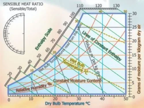
The basis of Lightfoot and Ratzer’s conclusion is something called the psychrometric chart, which is a rather intimidating tool used by architects and engineers in designing heating and cooling systems for buildings. The chart, illustrated below, is a mathematical model of the atmosphere’s thermodynamic properties, including heat content (enthalpy), temperature and relative humidity.

As inputs to their psychrometric model, the researchers used temperature and relative humidity measurements recorded on the 21st of the month over a 12-month period at 20 different locations: four north of the Arctic Circle, six in north mid-latitudes, three on the equator, one in the Sahara Desert, five in south mid-latitudes and one in Antarctica.

As indicated in the figure above, one output of the model from these inputs is the mass of water vapor in grams per kilogram of dry air. The corresponding mass of CO2 per kilogram of dry air at each location was calculated from Mauna Loa CO2 data in ppm (parts per million).

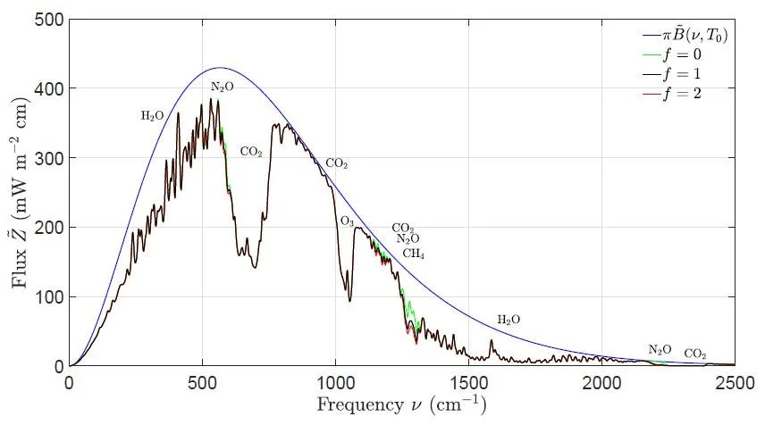
Their results revealed that the ratio of water vapor molecules to CO2 molecules ranges from 0.3 in polar regions to 108 in the tropics. Then, in a somewhat obscure argument, Lightfoot and Ratzer compared these ratios to calculated spectra for outgoing radiation at the top of the atmosphere. Three spectra – for the Sahara Desert, the Mediterranean, and Antarctica – are shown in the next figure.

The significant dip in the Sahara Desert spectrum arises from absorption by CO2 of outgoing radiation whose emission would otherwise cool the earth. You can see that in Antarctica, the dip is absent and replaced by a bulge. This bulge has been explained by William Happer and William van Wijngaarden as being a result of the radiation to space by greenhouse gases over wintertime Antarctica exceeding radiation by the cold ice surface.

Yet Lightfoot and Ratzer assert that the dip must be unrelated to CO2 because their psychrometric model shows there are 0.3 to 40 molecules of water vapor per CO2 molecule in Antarctica, compared with a much higher 84 to 108 in the tropical Sahara where the dip is substantial. Therefore, they say, the warming effect of CO2 must be negligible.

As I see it, however, there are at least two fallacies in the researchers’ arguments, First, the psychrometric model is an inadequate representation of the earth’s climate. Although the model takes account of both convective heat and latent heat (from evaporation of H2O) in the atmosphere, it ignores multiple feedback processes, including the all-important water vapor feedback mentioned above. Other feedbacks include the temperature/altitude (lapse rate) feedback, high- and low-cloud feedback, and the carbon cycle feedback.

A more important objection is that the assertion about water vapor causing global warming represents a circular argument.

According to Lightfoot and Ratzer’s paper, any warming above that provided by the natural greenhouse effect comes solely from the sun. On average, they correctly state, about 26% of the sun’s incoming energy goes into evaporation of water (mostly seawater) to water vapor. The psychrometric model links the increase in water vapor to a gain in temperature.

But the Clausius-Clapeyron equation tells us that warmer air holds more moisture, about 7% more for each degree Celsius of temperature rise. So an increase in temperature raises the water vapor level in the atmosphere – not the other way around. Lightfoot and Ratzer’s claim is circular reasoning.

Next: Rapid Climate Change Is Not Unique to the Present

Two Statistical Studies Attempt to Cast Doubt on the CO2 Narrative

As I’ve stated many times in these pages, the evidence that global warming comes largely from human emissions of CO2 and other greenhouse gases is not rock solid. Two recent statistical studies affirm this position, but both studies can be faulted.

The first study, by four European engineers, is provocatively titled “On Hens, Eggs, Temperatures and CO2: Causal Links in Earth’s Atmosphere.” As the title suggests, the paper addresses the question of whether modern global warming results from increased CO2 in the atmosphere, according to the CO2 narrative, or whether it’s the other way around. That is, whether rising temperatures from natural sources are causing the CO2 concentration to go up.

The study’s controversial conclusion is the latter possibility – that extra atmospheric CO2 can’t be the cause of higher temperatures, but that raised temperatures must be the origin of elevated CO2, at least over the last 60 years for which we have reliable CO2 data. The mathematics behind the conclusion is complicated but relies on something called the impulse response function.

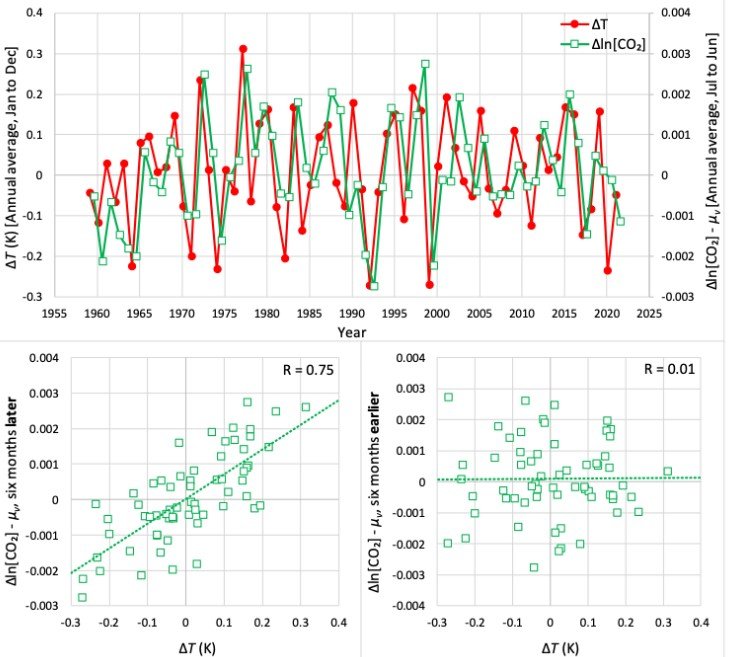
The impulse response function describes the reaction over time of a dynamic system to some external change or impulse. Here, the impulse and response are the temperature change ΔT and the increase in the logarithm of the CO2 level, Δln(CO2), or the reverse. The study authors took ΔT to be the average one-year temperature difference from 1958 to 2022 in the Reanalysis 1 dataset compiled by the U.S. NCEP (National Centers for Environmental Prediction) and the NCAR (National Center for Atmospheric Research); CO2 data was taken from the Mauna Loa time series which dates from 1958.

Based on these two time series, the study’s calculated IRFs (impulse response functions) are depicted in the figure below, for the alternate possibilities of ΔT => Δln(CO2) (left, in green) and Δln(CO2) => ΔT (right, in red). Clearly, the IRF indicates that ΔT is the cause and Δln(CO2) the effect, since for the opposite case of Δln(CO2) causing ΔT, the time lag is negative and therefore unphysical.

This is reinforced by the correlations shown in the following figure (lower panels), which also illustrates the ΔT and Δln(CO2) time series (upper panel). A strong correlation (R = 0.75) is seen between ΔT and Δln(CO2) when the CO2 increase occurs six months later than ΔT, while there is no correlation (R = 0.01) when the CO2 increase occurs six months earlier than ΔT, so ΔT must cause Δln(CO2). Note that the six-month displacement of Δln(CO2) from ΔT in the two time series is artificial, for easier viewing.

However, while the above correlation and the behavior of the impulse response function are impressive mathematically, I personally am dubious about the study’s conclusion.

The oceans hold the bulk of the world’s CO2 and release it as the temperature rises, since warmer water holds less CO2 according to Henry’s Law. For global warming of approximately 1 degree Celsius (1.8 degrees Fahrenheit) since 1880, the corresponding increase in atmospheric CO2 outgassed from the oceans is only about 16 ppm (parts per million) – far below the actual increase of 130 ppm over that time. The Hens and Eggs study can’t account for the extra 114 ppm of CO2.

The equally provocative second study, titled “To what extent are temperature levels changing due to greenhouse gas emissions?”, comes from Statistics Norway, Norway’s national statistical institute and the principal source of the country’s official statistics. From a statistical analysis, the study claims that the effect of human CO2 emissions during the last 200 years has not been strong enough to cause the observed rise in temperature, and that climate models are incompatible with actual temperature data.

The conclusions are based on an analysis of 75 temperature time series from weather stations in 32 countries, the records spanning periods from 133 to 267 years; both annual and monthly time series were examined. The analysis attempted to identify systematic trends in temperature, or the absence of trends, in the temperature series.

What the study purports to find is that only three of the 75 time series show any systematic trend in annual data (though up to 10 do in monthly data), so that 72 sets of long-term temperature data show no annual trend at all. From this finding, the study authors conclude it’s not possible to determine how much of the observed temperature increase since the 19th century is due to CO2 emissions and how much is natural.

One of the study’s weaknesses is that it excludes sea surface temperatures, even though the oceans cover 70% of the earth’s surface, so the study is not truly global. A more important weakness is that it confuses local temperature measurements with global mean temperature. Furthermore, the study authors fail to understand that a statistical model simply can’t approximate the complex physical processes of the earth’s climate system.

In any case, statistical analysis in climate science doesn’t have a strong track record. The infamous “hockey stick” - a recon­structed temperature graph for the past 2000 years resembling the shaft and blade of a hockey stick on its side – is perhaps the best example.

The reconstruction was debunked in 2003 by Stephen McIntyre and Ross McKitrick, who found (here and here) that the graph was based on faulty statistical analysis, as well as preferential data selection. The hockey stick was further discredited by a team of scientists and statisticians from the National Research Council of the U.S. National Academy of Sciences.

Next: Extreme Weather in the Distant Past Was Just as Frequent and Intense as Today’s

Targeting Farmers for Livestock Greenhouse Gas Emissions Is Misguided

Farmers in many countries are increasingly coming under attack over their livestock herds. Ireland’s government is contemplating culling the country’s cattle herds by 200,000 cows to cut back on methane (CH4) emissions; the Dutch government plans to buy out livestock farmers to lower emissions of CH4 and nitrous oxide (N2O) from cow manure; and New Zealand is close to taxing CH4 from cow burps.

But all these measures, and those proposed in other countries, are misguided and shortsighted – for multiple reasons.

The thrust behind the intended clampdown on the farming community is the estimated 11-17% of current greenhouse gas emissions from agriculture worldwide, which contribute to global warming. Agricultural CH4, mainly from ruminant animals, accounted for approximately 4% of total greenhouse gas emissions in the U.S. in 2021, according to the EPA (Environmental Protection Agency), while N2O accounted for another 5%.

The actual warming produced by these two greenhouse gases depends on their so-called “global warming potential,” a quantity determined by three factors: how efficiently the gas absorbs heat, its lifetime in the atmosphere, and its atmospheric concentration. The following table illustrates these factors for CO2, CH4 and N2O, together with their comparative warming effects.

The conventional global warming potential (GWP) is a dimensionless metric, in which the GWP per molecule of a particular greenhouse gas is normalized to that of CO2; the GWP takes into account the atmospheric lifetime of the gas. The table shows both GWP-20 and GWP-100, the warming potentials calculated over a 20-year and 100-year time horizon, respectively.

The final column shows what I call weighted GWP values, as percentages of the CO2 value, calculated by multiplying the conventional GWP by the ratio of the rate of concentration increase for that gas to that of CO2. The weighted GWP indicates how much warming CH4 or N2O causes relative to CO2.

Over a 100-year time span, you can see that both CH4 and N2O exert essentially the same warming influence, at 10% of CO2 warming. But over a 20-year interval, CH4 has a stronger warming effect than N2O, at 27% of CO2 warming, because of its shorter atmospheric lifetime which boosts the conventional GWP value from 30 (over 100 years) to 83.

However, the actual global temperature increase from CH4 and N2O – concern over which is the basis for legislation targeting the world’s farmers – is small. Over a 20-year period, the combined contribution of these two gases is approximately 0.075 degrees Celsius (0.14 degrees Fahrenheit), assuming that all current warming comes from CO2, CH4 and N2O combined, and using a value of 0.14 degrees Celsius (0.25 degrees Fahrenheit) per decade for the current warming rate.

But, as I’ve stated in many previous posts, at least some current warming is likely to be from natural sources, not greenhouse gases. So the estimated 20-year temperature rise of 0.075 degrees Celsius (0.14 degrees Fahrenheit) is probably an overestimate. The corresponding number over 100 years, also an overestimate, is 0.23 degrees Celsius (0.41 degrees Fahrenheit).

Do such small, or even smaller, gains in temperature justify the shutting down of agriculture? Farmers around the globe certainly don’t think so, and for good reason.

First, CH4 from ruminant animals such as cows, sheep and goats accounts for only 4% of U.S. greenhouse emissions as noted above, compared with 29% from transportation, for example. And our giving up eating meat and dairy products would have little impact on global temperatures. Removing all livestock and poultry from the U.S. food system would only reduce global greenhouse gas emissions by 0.36%, a study has found.

Other studies have shown that the elimination of all livestock from U.S. farms would leave our diets deficient in vital nutrients, including high-quality protein, iron and vitamin B12 that meat provides, says the Iowa Farm Bureau.

Furthermore, as agricultural advocate Kacy Atkinson argues, the methane that cattle burp out during rumination breaks down in 10 to 15 years into CO2 and water. The grasses that cattle graze on absorb that CO2, and the carbon gets sequestered in the soil through the grasses’ roots.

Apart from cow manure management, the largest source of N2O emissions worldwide is the application of nitrogenous fertilizers to boost crop production. Greatly increased use of nitrogen fertilizers is the main reason for massive increases in crop yields since 1961, part of the so-called green revolution in agriculture.

The figure below shows U.S. crop yields relative to yields in 1866 for corn, wheat, barley, grass hay, oats and rye. The blue dashed curve is the annual agricultural usage of nitrogen fertilizer in megatonnes (Tg). The strong correlation with crop yields is obvious.

Restricting fertilizer use would severely impact the world’s food supply. Sri Lanka’s ill-conceived 2022 ban of nitrogenous fertilizer (and pesticide) imports caused a 30% drop in rice production, resulting in widespread hunger and economic turmoil – a cautionary tale for any efforts to extend N2O reduction measures from livestock to crops.

Next: No Evidence That Today’s El Niños Are Any Stronger than in the Past

Challenges to the CO2 Global Warming Hypothesis: (9) Rotation of the Earth’s Core as the Source of Global Warming

Yet another challenge to the CO2 global warming hypothesis, but one radically different from all the other challenges I’ve discussed in this series, hypothesizes that global warming or cooling result entirely from the slight speeding up or slowing down of the earth’s rotating inner core.

Linking the earth’s rotation to its surface temperature is not a new idea and has been discussed by several geophysicists over the last 50 years. What is new is the recent (2023) discovery that changes in global temperature follow changes in the earth’s rotation rate that in turn follow changes in the rotation rate of the inner core, both with a time delay. This discovery underlies the postulate that the earth’s temperature is regulated by rotational variations of the inner core, not by CO2.

The history and recent developments of the rotational hypothesis have been summarized in a recent paper by Australian Richard Mackey. The apparently simplistic hypothesis, which is certain to raise scientific eyebrows, does, however, meet the requirements for its scientific validation or rejection: it makes a prediction that can be tested against observation.

As Mackey explains, the prediction is that our current bout of global warming will come to an end in 2025, when global cooling will begin.

The prediction is based on the geophysical findings that shifts in the earth’s temperature appear to occur about eight years after the planet’s rotation rate changes, and the earth’s rotation rate changes eight years after the inner core’s rotation rate does. Because the inner core’s rotation rate began to slow around 2009, cooling should set in around 16 years later in 2025, according to the rotational hypothesis.

As illustrated in the figure below, the partly solid inner core is surrounded by the liquid metal outer core; the outer core is enveloped by the thick solid mantle, which underlies the thin crust on which we live. Convection in the outer core generates an electromagnetic field. The resulting electromagnetic torque on the inner core, together with gravitational coupling between the inner core and mantle, drive rotational variations in the inner core.

Although all layers rotate with the whole earth, the outer and inner cores also oscillate back and forth. Variations in the inner core rotation rate appear to be correlated with changes in the earth’s electromagnetic field mentioned above, changes that are in phase with variations in the global mean temperature.

Only recently was it found that the inner core rotates at a different speed than the outer core and mantle, with decadal fluctuations superimposed on the irregular rotation. The rotational hypothesis links these decadal fluctuations of the inner core to global warming and cooling: as the core rotates faster, the earth warms and as it puts the brakes on, the earth cools.

The first apparent evidence for the rotational hypothesis was reported in a 1976 research paper by geophysicists Kurt Lambeck and Amy Cazenave, who argued that global cooling in the 1960s and early 1970s arose from a slowing of the earth’s rotation during the 1950s.

At that time, the role of inner-core rotation was unknown. Nevertheless, the authors went on to predict that a period of global warming would commence in the 1980s, following a 1972 switch in rotation rate from deceleration to acceleration. Their prediction was based on a time lag of 10 to 15 years between changes in the earth’s rotational speed and surface temperature, rather than the 16 years established recently.

Other researchers had proposed a total time lag of only eight years. The next figure compares their estimates of rotation rate (green line) and surface temperature (red line) from 1880 to 2002, clearly showing the temperature lag, at least since 1900. (The black and blue lines should be ignored).

A minimum lag of eight years and a maximum of 16 years means that global warming should have begun at anytime between 1980 and 1988, according to the rotational hypothesis. In fact, the current warming stretch started in the late 1970s, so the hypothesis is on weak ground.

Another weakness is whether the hypothesis can account for all of modern warming. Mackey argues that it can, based on known shortcomings in the various global temperature datasets with which predictions of the rotational hypothesis are compared. But those shortcomings mean merely that there are large uncertainties associated with any comparison, and that a role for CO2 can’t be definitely ruled out.

A moment of truth for the rotational hypothesis will come in 2025 when, it predicts, the planet will start to cool. However, if that indeed happens, rotational fluctuations of the earth’s inner core won’t be the only possible explanation. As I’ve discussed in a previous post, a potential drop in the sun’s output, known as a grand solar minimum, could also initiate a cold spell around that time.

Next: Estimates of Economic Losses from El Niños Are Farfetched

The Sun Can Explain 70% or More of Global Warming, Says New Study

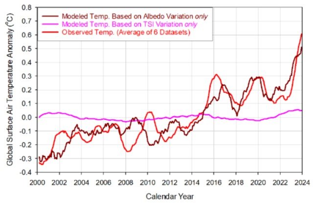
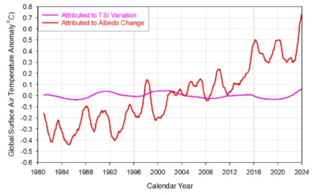
Few people realize that the popular narrative of overwhelmingly human-caused global warming, with essentially no contribution from the sun, hinges on a satellite dataset showing that the sun’s output of heat and light has decreased since the 1950s.

But if a different but plausible dataset is substituted, say the authors of a new study, the tables are turned and a staggering 70% to 87% of global warming since 1850 can be explained by solar variability. The 37 authors constitute a large international team of scientists, headed by U.S. astrophysicist Willie Soon, from many countries around the world.

The two rival datasets, each of which implies a different trend in solar output or TSI (total solar irradiance) since the late 1970s when satellite measurements began, are illustrated in the figure below, which includes pre-satellite proxy data back to 1850. The TSI and associated radiative forcing – the difference in the earth’s incoming and outgoing radiation, a difference which produces heating or cooling – are measured in units of watts per square meter, relative to the mean from 1901 to 2000.   

The upper graph (Solar #1) is the TSI dataset underlying the narrative that climate change comes largely from human emissions of greenhouse gases, and was used by the IPCC (Intergovernmental Panel on Climate Change) in its 2021 AR6 (Sixth Assessment Report). The lower graph (Solar #2) is a TSI dataset from a different satellite series, as explained in a previous post, and exhibits a more complicated trend since 1950 than Solar #1.

To identify the drivers of global warming since 1850, the study authors carried out a statistical analysis of observed Northern Hemisphere land surface temperatures from 1850 to 2018; the temperature record is shown as the black line in the next figure. Following the approach of the IPCC’s AR6, three possible drivers were considered: two natural forcings (solar and volcanic) and a composite of multiple human-caused or anthropogenic forcings (which include greenhouse gases and aerosols), as employed in AR6.   

Time series for the different forcings, or a combination of them, were fitted to the temperature record utilizing multiple linear regression. This differs slightly from the IPCC’s method, which used climate model hindcasts based on the forcing time series as an intermediate step, as well as fitting global land and ocean, rather than Northern Hemisphere land-only, temperatures.

The figure below shows the new study’s best fits to the Northern Hemisphere land temperature record for four scenarios using a combination of solar, volcanic and anthropogenic forcings. Scenarios 1 and 2 correspond to the Solar #1 and Solar #2 TSI time series depicted in the first figure above, respectively, combined with volcanic and anthropogenic time series. Scenarios 3 and 4 are the same without the anthropogenic component – that is, with natural forcings only. Any volcanic contribution to natural forcing usually has a cooling effect and is short in duration.

The researchers’ analysis reveals that if the Solar #1 TSI time series is valid, as assumed by the IPCC in AR6, then natural (solar and volcanic) forcings can explain at most only 21% of the observed warming from 1850 to 2018 (Scenario 3). In this picture, adding anthropogenic forcing brings that number up to an 87% fit (Scenario 1).

However, when the Solar #1 series is replaced with the Solar #2 series, then the natural contribution to overall warming increases from 21% to a massive 70% (Scenario 4), while the combined natural and anthropogenic forcing number rises from an 87% to 92% fit (Scenario 2). The better fits with the Solar #2 TSI time series compared to the Solar #1 series are visible if you look closely at the plots in the figure above.

These findings are enhanced further if urban temperatures are excluded from the temperature dataset, on the grounds that urbanization biases temperature measurements upward. The authors have also found that the long-term warming rate for rural temperature stations is only 0.55 degrees Celsius (0.99 degrees Fahrenheit) per century, compared with a rate of 0.89 degrees Celsius (1.6 degrees Fahrenheit) per century for rural and urban stations combined, as illustrated in the figure below.

Fitting the various forcing time series to a temperature record based on rural stations alone, the natural contribution to global warming rises from 70% to 87% when the Solar #2 series is used.

If the Solar #2 TSI time series represents reality better than the Solar #1 series used by the IPCC, this means that between 70% and 87% of global warming is mostly natural and the human-caused contribution is less than 30% – the complete opposite to the IPCC’s claim of largely anthropogenic warming.

Unsurprisingly, such an upstart conclusion has raised some hackles in the climate science community. But the three lead authors of the study have effectively countered their critics in lengthy, detailed rebuttals (here and here).

The study authors do point out that “it is still unclear which (if any) of the many TSI time series in the literature are accurate estimates of past TSI,” and say that we cannot be certain yet whether the warming since 1850 is mostly human-caused, mostly natural, or some combination of both. In another paper they remark that, while three of 27 or more different TSI time series can explain up to 99% of the warming, another seven time series cannot account for more than 3%.

Next: Challenges to the CO2 Global Warming Hypothesis: (9) Rotation of the Earth’s Core as the Source of Global Warming

Challenges to the CO2 Global Warming Hypothesis: (8) The Antarctic Centennial Oscillation as the Source of Global Warming

Possibly overlooked at the time it was published, a 2018 paper on Antarctica presents an unusual challenge to the CO2 global warming hypothesis, which postulates that observed global warming – currently about 0.9 degrees Celsius (1.6 degrees Fahrenheit) since the preindustrial era – has been caused primarily by human emissions of CO2 and other greenhouse gases into the atmosphere.

The proposed challenge is that current global warming can be explained by a natural ocean cycle known as the ACO (Antarctic Centennial Oscillation), the evolutionary precursor of today’s AAO (Antarctic Oscillation), also called the SAM (Southern Annular Mode). This unconventional idea comes from a group of researchers at the Environmental Studies Institute in Santa Cruz, California.

The Santa Cruz group points out that global temperatures have oscillated for at least the last 542 million years, since the beginning of the current Phanerozoic Eon. Superimposed on multi-millennial climate cycles are numerous shorter global and regional cycles ranging in period from millennia down to a few weeks. Among these are numerous present-day ocean cycles, including the above AAO, ENSO (the El Niño – Southern Oscillation) and the AMO (Atlantic Multidecadal Oscillation).

In their 2018 paper the researchers report on the previously unexplored ACO, the record of which is entrained in stable isotopes frozen in ice cores at Vostok in Antarctica and three additional Antarctic drill sites widely distributed on the East Antarctic Plateau, namely, EPICA (European Project for Ice Coring in Antarctica) Dronning Maud Land, EPICA Dome C and Talos Dome.

Past surface temperatures were calculated from the ice cores by measuring either the oxygen 18O to 16O, or hydrogen 2H to 1H, isotopic ratios. Precise ice-core chronology enabled the paleoclimate records from the four drill sites to be synchronized in time.

In analyzing the ice-core data, the paper’s authors found a prominent cycle with a mean repetition period of 352 years over the time interval they evaluated, from 226,400 years before 1950 to the year 1801. Identified as the ACO, the cycle time series nevertheless shows a progressive increase in both frequency and amplitude or temperature swing, the period shortening as the amplitude increases proportionally.

The figure below illustrates the cycle’s temperature oscillations, as measured at Vostok for the last 20,000 years. LGM is the Last Glacial Maximum, LGT the subsequent Last Glacial Termination, and the time scale is measured in thousands of years before 1950 (Kyb1950). The top panel shows temperatures from the LGM to the present, while the lower four panels show the record on an expanded time and temperature scale, with every identified ACO cycle labeled. The small blue and red numbers designate smaller-amplitude oscillations (approximately 10% of all cycles identified), which were found at all four drill sites.

The steady decline of the ACO period over 226 millennia, and the corresponding rise in temperature swing, are depicted in the next figure for the Vostok record. Here individual records have been averaged over 5,000-year intervals. Without averaging, the period ranges from 63 to 1,174 years, and the cycle temperature swing varies from 0.05 degrees Celsius (0.09 degrees Fahrenheit) to as much as 3.2 degrees Celsius (5.8 degrees Fahrenheit).

Because of the variation in period (frequency) and amplitude, the null hypothesis that the observed cycles represent random fluctuations in cycle structure was tested by the researchers, using the statistical concept of autocorrelation. This confirmed that the cycle structure was indeed nonrandom. However, the data for the whole 226,400 years did reveal evidence for other, lower-frequency cycles, including ones with periods of 1,096 and 1,470 years.

So how is all this connected to global warming?

The variable ACO cycles show that temperature fluctuations of several degrees Celsius have occurred many times in the past 226 millennia, including our present Holocene (c and d in the first figure above) – at least in Antarctica. That these Antarctic cycles extend globally was inferred by the researchers from the correspondence between the 1,096- and 1,470-year ACO cycles mentioned above and so-called Bond events in the Northern Hemisphere, which are thought to have the same periodicity but occur up to 3 millennia later.

Bond events refer to glacial debris rafted into the North Atlantic Ocean by icebergs and then dropped onto the sea floor as the icebergs melt.  The volume of glacial debris, which is measured in deep-sea sediment cores, fluctuates as global temperatures rise and fall.

1,096 and 1,470 years are also approximate multiples of the mean ACO period of 352 years. This finding, together with the observation about Bond events, is considered by the researchers to be strong evidence that the ACO is a natural climate cycle that arises in Antarctica and then propagates northward, influencing global temperatures. It’s feasible that our current global warming – during which temperatures have already risen by close to 1 degree Celsius (1.8 degrees Fahrenheit) – is simply part of the latest ACO (or AAO/SAM) cycle.

Such speculation, however, needs to be reinforced by solid scientific evidence before it can be considered a serious challenge to the CO2 hypothesis.

Next: No Evidence That Extreme Weather on the Rise: A Look at the Past - (1) Hurricanes

Global Warming from Food Production and Consumption Grossly Overestimated

A recent peer-reviewed study makes the outrageous claim that production and consumption of food could contribute as much as 0.9 degrees Celsius (1.6 degrees Fahrenheit) to global warming by 2100, from emissions of the greenhouse gases methane (CH4), nitrous oxide (N2O) and carbon dioxide (CO2).

Such a preposterous notion is blatantly wrong, even if it were true that global warming largely comes from human CO2 emissions. Since agriculture is considered responsible for an estimated 15-20% of current warming, a 0.9 degrees Celsius (1.6 degrees Fahrenheit) agricultural contribution in 2100 implies a total warming (since 1850-1900) at that time of 0.9 / (0.15–0.2), or 4.5 to 6.0 degrees Celsius (8.1 to 10.8 degrees Fahrenheit).

As I discussed in a previous post, only the highest, unrealistic CO2 emissions scenarios project such a hot planet by the end of the century. A group of prominent climate scientists has estimated the much lower range of likely 2100 warming, of 2.6-3.9 degrees Celsius (4.7-7.0 degrees Fahrenheit). And climate writer Roger Pielke Jr. has pegged the likely warming range at 2-3 degrees Celsius (3.6-5.4 degrees Fahrenheit), based on the most plausible emissions scenarios.

Using the same 15-20% estimate for the agricultural portion of global warming, a projected 2100 warming of say 3 degrees Celsius (5.4 degrees Fahrenheit) would mean a contribution from food production of only 0.45-0.6 degrees Celsius (0.8-1.1 degrees Fahrenheit) – about half of what the new study’s authors calculate.

That even this estimate of future warming from agriculture is too high can be seen by examining the following figure from their study. The figure illustrates the purported temperature rise by 2100 attributable to each of the three greenhouse gases generated by the agricultural industry: CH4, N2O and CO2. CH4 is responsible for nearly 60% of the temperature increase, while N2O and CO2 each contribute about 20%.

This figure can be compared with the one below from a recent preprint by a team which includes atmospheric physicists William Happer and William van Wijngaarden, showing the authors’ evaluation of expected radiative forcings at the top of the troposphere over the next 50 years. The forcings are increments relative to today, measured in watts per square meter; the horizontal lines are the projected temperature increases (ΔT) corresponding to particular values of the forcing increase.

To properly compare the two figures, we need to know what percentages of total CH4, N2O and CO2 emissions in the Happer and van Wijngaarden figure come from the agricultural sector; these are approximately 50%, 67% and 3%, respectively, according to the authors of the food production study.

Using these percentages and extrapolating the Happer and van Wijngaarden graph to 78 years (from 2022), the total additional forcing from the three gases in 2100 can be shown to be about 0.52 watts per square meter. This forcing value corresponds to a temperature increase due to food production and consumption of only around 0.1 degrees Celsius (0.18 degrees Fahrenheit).

The excessively high estimate of 0.9 degrees Celsius (1.6 degrees Fahrenheit) in the study may be due in part to the study’s dependence on a climate model: many climate models greatly exaggerate future warming.

While on the topic of CH4 and N2O emissions, let me draw your attention to a fallacy widely propagated in the climate science literature; the fallacy appears on the websites of both the U.S. EPA (Environmental Protection Agency) and NOAA (the U.S. National Oceanic and Atmospheric Administration), and even in the IPCC’s Sixth Assessment Report (Table 7.15).

The fallacy conflates the so-called “global warming potential” for greenhouse gas emissions, which measures the warming potential per molecule (or unit mass) of various gases, with their warming potential weighted by their rate of concentration increase relative to CO2. Because the abundances of CH4 and N2O in the atmosphere are much lower than that of CO2, and are increasing even more slowly, there is a big difference between their global warming potentials and their weighted warming potentials.

The difference is illustrated in the table below. The conventional global warming potential (GWP) is a dimensionless metric, in which the GWP of a particular greenhouse gas is normalized to that of CO2; the GWP takes into account the atmospheric lifetime of the gas. The table shows values of GWP-100, the warming potential calculated over a 100-year time horizon.

The final column shows the value of the weighted GWP-100, which is not dimensionless like the conventional GWP-100 but measured in units of watts per square meter, the same as radiative forcing. The weighted GWP-100 is calculated by multiplying the conventional GWP-100 by the ratio of the rate of concentration increase for that gas to that of CO2.

As you can see, the actual anticipated warming in 100 years from either CH4 or N2O agricultural emissions will be only 10% of that from CO2 – in contrast to the conventional GWP-100 values extensively cited in the literature. What a waste of time and effort in trying to rein in CH4 and N2O emissions!

Next: CRED’s 2022 Disasters in Numbers report is a Disaster in Itself

Nitrous Oxide No More a Threat for Global Warming than Methane

Nitrous oxide (N2O), a minor greenhouse gas, has recently come under increasing scrutiny for its supposed global warming potency. But, just as with methane (CH4, concerns over N2O emissions stem from a basic misunderstanding of the science. As I discussed in a previous post, CH4 contributes only one tenth as much to global warming as carbon dioxide (CO2). N2O contributes even less.

The misunderstanding has been elucidated in a recent preprint by a group of scientists including atmospheric physicists William Happer and William van Wijngaarden, who together wrote an earlier paper on CH4. The new paper compares the radiative forcings – disturbances that alter the earth’s climate – of N2O and CH4 to that of CO2.

The largest source of N2O emissions is agriculture, particularly the application of nitrogenous fertilizers to boost crop production, together with cow manure management. As the world’s population continues to grow, so does the use of fertilizers in soil and the head count of cows. Agriculture accounts for approximately 75% of all N2O emissions in the U.S., emissions which comprise about 7% of the country’s total greenhouse gas emissions from human activities.

But the same hype surrounding the contribution of CH4 to climate change extends to N2O as well. The U.S. EPA (Environmental Protection Agency)’s website, among many others, claims that the impact of N2O on global warming is a massive 300 times that of CO2 – surpassing even that of CH4 at supposedly 25 times CO2. Happer, van Wijngaarden and their coauthors, however, show that the actual contribution of N2O is tiny, comparable to that of CH4.

The authors have calculated the spectrum of cooling outgoing radiation for several greenhouse gases at the top of the atmosphere. A calculated spectrum emphasizing N2O is shown in the figure below, as a function of wavenumber or spatial frequency. The dark blue curve is the spectrum for an atmosphere with no greenhouse gases at all, while the black curve is the spectrum including all greenhouse gases. Removing the N2O results in the green curve; the red curve, barely distinguishable from the black curve, represents a doubling of the present N2O concentration.

The yearly abundance of N2O in the atmosphere since 1977, as measured by NOAA (the U.S. National Oceanic and Atmospheric Administration), is depicted in the adjacent figure. Currently, the N2O concentration is about 0.34 ppm (340 ppb), three orders of magnitude lower than the CO2 level of approximately 415 ppm, and increasing much more slowly – at a rate of 0.85 ppb per year since 1985, 3000 times smaller than the rate of increase of CO2.

At current atmospheric concentrations of N2O and CO2, the radiative forcing for each additional molecule of N2O is about 230 times larger than that for each additional molecule of CO2. Importantly, however, because the rate of increase in the N2O level is 3000 times smaller, the contribution of N2O to the annual increase in forcing is only 230/3000 or about one thirteenth that of CO2. For comparison, the contribution of CH4 is about one tenth the CO2 contribution.

The relative contributions to future forcing of N2O, CH4 and CO2 can be seen in the next figure, showing the research authors’ evaluation of expected forcings at the top of the troposphere over the next 50 years; the forcings are increments relative to today, measured in watts per square meter. The horizontal lines are the projected temperatures increases (ΔT) corresponding to particular values of the forcing increase.

Atmospheric N2O dissociates into nitrogen (N2), the most abundant gas in the atmosphere. N2 is “fixed” by microrganisms in soils and the oceans as ammonium ions, which are then converted to inorganic nitric oxide ions (NO3-) and various compounds. These in turn are incorporated into organic molecules such as amino acids and other nitrogen-containing molecules essential for life, like DNA (deoxyribonucleic acid). Nitrogen is the third most important requirement for plant growth, after water and CO2.

Greatly increased use of nitrogen fertilizers is the main reason for massive increases in crop yields since 1961, part of the so-called green revolution in agriculture. The following figure shows U.S. crop yields relative to yields in 1866 for corn, wheat, barley, grass hay, oats and rye. The blue dashed curve is the annual agricultural usage of nitrogen fertilizer in megatonnes (Tg). The strong correlation with crop yields is obvious.

While most soil nitrogen is eventually returned to the atmosphere as N2 molecules, some of the slow increase in the atmospheric N2O level seen in the second figure above may be due to nitrogen fertilizer usage. But the impact of nitrogen fertilizer and natural nitrogen fixation on the nitrogen cycle is not yet clear and more research is needed.

Nonetheless, proposed cutbacks in fertilizer use will drastically reduce agricultural yields around the world, for the sake of only a tiny reduction in global warming potential.

Next: Science on the Attack: The James Webb Telescope and Mysteries of the Universe

New Observations Upend Notion That Global Warming Diminishes Cloud Cover

Climate scientists have long thought that low clouds, which act like a parasol and cool the earth’s surface, will diminish as the earth heats up – thus amplifying warming in a positive feedback process. This notion has been reinforced by climate models. But recent empirical observations refute the idea and show that the mechanism causing the strongest cloud reductions in models doesn’t actually occur in nature.

The observations were reported in a 2022 paper by an international team of French and German scientists. In a major field campaign, the team collected and analyzed observational data from cumulus clouds near the Atlantic island of Barbados, utilizing two research airplanes and a ship. Barbados is in the tropical trade-wind region where low-level cumulus clouds are common.

More than 800 probes were dropped from one plane that flew in circles about 200 km (120 miles) in diameter at an altitude of 9 km (6 miles); the probes gathered data on atmospheric temperature, moisture, pressure and winds as they fell. The other plane used radar and lidar sensors to measure cloudiness at the base of the cloud layer, at an altitude of 0.8 km (2,600 feet), while the ship conducted surface-based measurements.

The response to global warming of small cumulus clouds in the tropics is critically dependent on how much extra moisture from increased evaporation of seawater accumulates at the base of the clouds.

In climate models, dry air from the upper cloud layer is transported or entrained downward when the clouds grow higher and mixes with the moister air at the cloud base, drying out the lower cloud layer. This causes moisture there to evaporate more rapidly and boosts the probability that the clouds will dissipate. The phenomenon is known to climate scientists as the “mixing-desiccation hypothesis,” the strength of the mixing mechanism increasing with global warming.

But the observations of the research team reveal that the mixing-desiccation mechanism is not actually present in nature. This is because – as the researchers found – mesoscale (up to 200 km) circulation of air vertically upward dominates the smaller-scale entrainment mixing downward. Although mesoscale circulations are ubiquitous in trade-wind regions, their effect on humidity is completely absent from climate models.

The two competing processes are illustrated in the figure below, in which M represents mixing, E is downward entrainment, W is mesoscale vertical air motion, and z is the altitude; the dashed line represents the trade-wind inversion layer.

Predicted by the mixing-desiccation hypothesis is that warming strongly diminishes cloudiness compared with the base state shown in the left panel above. In the base state, vertical air motion is mostly downward and normal convective mixing occurs. According to the hypothesis, stronger mixing (M++ in panel a) caused by entrainment (E++) of dry air from higher to lower cloud layers, below the cloud base, results in excessive drying and fewer clouds.

The mesoscale circulation mechanism, on the other hand, prevents drying through mesoscale vertical air motion upward (W++ in panel b) that overcomes the entrainment mixing, thus preventing cloud loss. If anything, cloud cover actually increases with more vertical mixing. Climate models simulate only the mixing-desiccation mechanism, but the new research demonstrates that a second and more dominant mechanism operates in nature.

That cloudiness increases with mixing can be seen from the next figure, which shows the research team’s observed values of the vertical mixing rate M (in mm per second) and the cloud-base cloudiness (as a percentage). The trend is clear: as M gets larger, so does cloudiness.

The research has important implications for cloud feedback. In climate models, the refuted mixing-desiccation mechanism leads to strong positive cloud feedback – feedback that amplifies global warming. The models find that low clouds would thin out, and many would not form at all, in a hotter world.

Analysis of the new observations, however, shows that climate models with large positive feedbacks are implausible and that a weak trade cumulus feedback is much more likely than a strong one. Climate models with large trade cumulus feedbacks exaggerate the dependence of cloudiness on cloud-base moisture compared with mixing, as well as overestimating variability in cloudiness.

Weaker than expected low cloud feedback is also suggested by lack of the so-called CO2 “hot spot” in the atmosphere, as I discussed in a previous post. Climate models predict that the warming rate at altitudes of 9 to 12 km (6 to 7 miles) above the tropics should be about twice as large as at ground level. Yet the hot spot doesn’t show up in measurements made by weather balloons or satellites.

Next: Nitrous Oxide No More a Threat for Global Warming than Methane

Are Ocean Surface Temperatures, Not CO2, the Climate Control Knob?

According to the climate change narrative, modern global warming is largely the result of human emissions of CO2 into the atmosphere. But a recent lecture questioned that assertion with an important observation suggesting that ocean surface temperatures, not CO2, are the planet’s climate control knob.

The lecture was delivered by Norwegian Ole Humlum, who was formerly a full professor in physical geography at both the University Centre in Svalbard, Norway and the University of Oslo, in addition to holding visiting positions in Scotland and the Faroe Islands. He currently publishes regular updates on the state of the global climate.

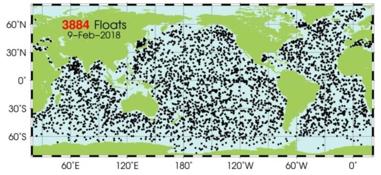
In his lecture, Humlum dwelt on temperature measurements of the world’s oceans. Since 2004, ocean temperatures have been studied in detail at depths of up to 2 km (1.2 miles), by means of a global array of almost 3,900 Argo profiling floats. These free-drifting robotic floats patrol the oceans, taking a deep dive every 10 days to probe the temperature and salinity of the watery depths, and transmitting the data to a satellite within hours of reaching the surface again. A 2018 map of the Argo array is shown below.

The next figure illustrates how the oceans have warmed during the period that the floats have been in operation, up to August 2020. The vertical scale is the global ocean temperature change in degrees Celsius averaged from 65oS to 65oN (excluding the polar regions), while the horizontal scale gives the depth up to 1,900 meters (6,200 feet).

You can see that warming has been most prominent at the surface, where the average sea surface temperature has gone up since 2004 by about 0.27 degrees Celsius (0.49 degrees Fahrenheit). The temperature increase deep down is an order of magnitude smaller. Most of the temperature rise at shallow depths comes from the tropics (30oS to 30oN) and the Antarctic (65oS to 55oS), although the Arctic (55oN to 65oN) measurements reveal considerable cooling down to about 1,400 meters (4,600 feet) in that region.

But Humlum’s most profound observation is of the timeline for Argo temperature measurements as a function of depth. These are depicted in the following figure showing global depth profiles for the tropical oceans in degrees Celsius, from 2004 to 2014. The tropics cover almost 40% of the earth’s surface; the oceans in total cover 71%.

The fluctuations in each Argo depth profile arise from seasonal variations in temperature from summer to winter, which are more pronounced at the surface than at greater depths. If you focus your attention on any yearly summer peak at zero depth, you will notice that it moves to the right – that is, to later times – as the depth increases. In other words, there is a time delay of any temperature change with depth.

From a correlation analysis of the Argo data, Humlum finds that the time delay at a depth of 200 meters (650 feet) is a substantial 20 months, so that it takes 20 months for a temperature increase or decrease at the tropical surface to propagate down to that depth. A similar, though smaller, delay exists between any change in sea surface temperature (SST) and corresponding temperature changes in the atmosphere and on land, as shown in the figure below.

At an altitude of 200 meters (650 feet) in the atmosphere, changes in the SST show up slightly less than half a month later. But in the lower troposphere, where satellite temperature measurements are made, the delay is 2 months, as it is also for land surface temperatures. Humlum’s crucial argument is that sea surface temperatures lead all other global temperature observations – that is, the global temperature signal originates at the ocean surface.

However, according to the CO2 global warming hypothesis, the CO2 signal originates at an altitude of about 9 km (5.6 miles) in the upper troposphere and is seen at the sea surface some time later. So the CO2 hypothesis predicts that the sea surface is a lagging, not a leading indicator – exactly the opposite of what actual observations are telling us.

Humlum concludes that CO2 cannot be the earth’s climate control knob and that our global climate is apparently controlled by the SST. The climate control knob must instead be whatever natural system controls sea surface temperatures. Potential candidates, he says, include the sun, cloud cover, sediments and organic life in the oceans, and the action of winds. Further research is needed to identify which of these possibilities truly powers the global climate.

Next: Mainstream Media Jumps on Extreme Weather Caused by Climate Change Bandwagon

Challenges to the CO2 Global Warming Hypothesis: (7) Ocean Currents More Important than the Greenhouse Effect

A rather different challenge to the CO2 global warming hypothesis from the challenges discussed in my previous posts postulates that human emissions of CO2 into the atmosphere have only a minimal impact on the earth’s temperature. Instead, it is proposed that current global warming comes from a slowdown in ocean currents.

The daring challenge has been made in a recent paper by retired Australian meteorologist William Kininmonth, who was head of his country’s National Climate Centre from 1986 to 1998. Kininmonth rejects the claim of the IPCC (Intergovernmental Panel on Climate Change) that greenhouse gases have caused the bulk of modern global warming. The IPCC's claim is based on the hypothesis that the intensity of cooling longwave radiation to space has been considerably reduced by the increased atmospheric concentration of gases such as CO2.

But, he says, the IPCC glosses over the fact that the earth is spherical, so what happens near the equator is very different from what happens at the poles. Most absorption of incoming shortwave solar radiation occurs over the tropics, where the incident radiation is nearly perpendicular to the surface. Yet the emission of outgoing longwave radiation takes place mostly at higher latitudes. Nowhere is there local radiation balance.

In an effort by the climate system to achieve balance, atmospheric winds and ocean currents constantly transport heat from the tropics toward the poles. Kininmonth argues, however, that radiation balance can’t exist globally, simply because the earth’s average surface temperature is not constant, with an annual range exceeding 2.5 degrees Celsius (4.5 degrees Fahrenheit). This shows that the global emission of longwave radiation to space varies seasonally, so radiation to space can’t define Earth’s temperature, either locally or globally.

In warm tropical oceans, the temperature is governed by absorption of solar shortwave radiation, together with absorption of longwave radiation radiated downward by greenhouse gases; heat carried away by ocean currents; and heat (including latent heat) lost to the atmosphere. Over the last 40 years, the tropical ocean surface has warmed by about 0.4 degrees Celsius (0.7 degrees Fahrenheit).

But the warming can’t be explained by rising CO2 that went up from 341 ppm in 1982 to 417 ppm in 2022. This rise boosts the absorption of longwave radiation at the tropical surface by only 0.3 watts per square meter, according to the University of Chicago’s MODTRAN model, which simulates the emission and absorption of infrared radiation in the atmosphere. The calculation assumes clear sky conditions and tropical atmosphere profiles of temperature and relative humidity.

The 0.3 watts per square meter is too little to account for the increase in ocean surface temperature of 0.4 degrees Celsius (0.7 degrees Fahrenheit), which in turn increases the loss of latent and “sensible” (conductive) heat from the surface by about 3.5 watts per square meter, as estimated by Kininmonth.

So twelve times as much heat escapes from the tropical ocean to the atmosphere as the amount of heat entering the ocean due to the increase in CO2 level. The absorption of additional radiation energy due to extra CO2 is not enough to compensate for the loss of latent and sensible heat from the increase in ocean temperature.

The minimal contribution of CO2 is evident from the following table, which shows how the amount of longwave radiation from greenhouse gases absorbed at the tropical surface goes up only marginally as the CO2 concentration increases. The dominant greenhouse gas is water vapor, which produces 361.4 watts per square meter of radiation at the surface in the absence of CO2; its value in the table (surface radiation) is the average global tropical value.

You can see that the increase in greenhouse gas absorption from preindustrial times to the present, corresponding roughly to the CO2 increase from 300 ppm to 400 ppm, is 0.62 watts per square meter. According to the MODTRAN model, this is almost the same as the increase of 0.63 watts per square meter that occurred as the CO2 level rose from 200 ppm to 280 ppm at the end of the last ice age – but which resulted in tropical warming of about 6 degrees Celsius (11 degrees Fahrenheit), compared with warming of only 0.4 degrees Celsius (0.7 degrees Fahrenheit) during the past 40 years.

Therefore, says Kininmonth, the only plausible explanation left for warming of the tropical ocean is a slowdown in ocean currents, those unseen arteries carrying the earth’s lifeblood of warmth away from the tropics. His suggested slowing mechanism is natural oscillations of the oceans, which he describes as the inertial and thermal flywheels of the climate system.

Kininmonth observes that the overturning time of the deep-ocean thermohaline circulation is about 1,000 years. Oscillations of the thermohaline circulation would cause a periodic variation in the upwelling of cold seawater to the tropical surface layer warmed by solar absorption; reduced upwelling would lead to further heating of the tropical ocean, while enhanced upwelling would result in cooling.

Such a pattern is consistent with the approximately 1,000-year interval between the Roman and Medieval Warm Periods, and again to current global warming.

Next: Ample Evidence Debunks Gloomy Prognosis for World’s Coral Reefs

The Scientific Method at Work: The Carbon Cycle Revisited, Again

In a previous post, I demonstrated how a new model of the carbon cycle, described in a 2020 preprint, is falsified by empirical observations that fail to confirm a prediction of the model. The crucial test of any scientific hypothesis is whether its predictions match real-world observations. But a newly publicized discussion now questions the foundations of the model itself.

The model in question, developed by U.S. physicist Ed Berry, describes quantitatively the exchange of carbon between the earth’s land masses, atmosphere and oceans. Berry argues that natural emissions of CO2 into the atmosphere since 1750 have increased as the world has warmed, and that only 25% of the increase in atmospheric CO2 after 1750 is from humans.

This is contrary to the CO2 global warming hypothesis that human emissions have caused all of the CO2 increase above its preindustrial level in 1750 of 280 ppm (parts per million). The CO2 hypothesis is based on the apparent correlation between rising worldwide temperatures and the CO2 level in the lower atmosphere, which has gone up by 49% over the same period.

Natural CO2 emissions are part of the carbon cycle that includes fauna and flora, as well as soil and sedimentary rocks. Human CO2 from burning fossil fuels constitutes less than 5% of total CO2 emissions into the atmosphere, the remaining emissions being natural. Atmospheric CO2 is absorbed by vegetation during photosynthesis, and by the oceans through precipitation. The oceans also release CO2 as the temperature climbs.

In a recent discussion between Ed Berry and the CO2 Coalition, the Coalition says that Berry confuses the 5% of CO2 emissions originating from fossil fuels with the percentage of atmospheric CO2 molecules that actually come from fossil fuel burning. This percentage is very small, because the molecules are continually recycled and thus “diluted” with the much larger quantity of CO2 molecules from natural emissions.

Physicist David Andrews amplifies this comment of the CO2 Coalition in a 2022 preprint, by pointing out that total CO2 emissions into the atmosphere from human activity over time exceed the rise in atmospheric CO2 over the same interval. So all the modern CO2 increase (from 280 to 416 ppm) must come from human emissions. Adds Andrews:

… we know immediately that land and sea reservoirs together have been net sinks, not sources, of carbon during this period. We can be sure of this without knowledge of the detailed inventory changes of individual non-atmospheric reservoirs. … Global uptake is simply what is left over after atmospheric accumulation has been subtracted from total emissions. If more carbon was injected into the atmosphere by fossil fuel burning than stayed there, it had to have gone somewhere else.

The arguments of both Andrews and the CO2 Coalition are at odds with Berry’s calculations, depicted in the figure below; H denotes human and N natural CO2.

This figure shows that the sum total of human CO2 emissions (blue dots) exceeds the rise in atmospheric CO2 (black dots), at least since 1960, in agreement with Andrews’ comment. Where Berry goes astray is by claiming that natural emissions, represented by the area between the blue and red solid lines, have not stayed at the same 280 ppm level over time, but have gone up as global temperatures have increased.

Such a claim is extremely puzzling, as the model requires the addition to the atmosphere of approximately 100 ppm of CO2 from natural sources since 1840 – an amount far in excess of the roughly 10 ppm of CO2 outgassed from the oceans as ocean temperatures rose about 1 degree Celsius (1.8 degrees Fahrenheit) over that time. Berry acknowledges the problem, but only proposes unphysical explanations, such as mysteriously adding new carbon to the carbon cycle.

The falsified prediction of his model, on the other hand, involves the atmospheric concentration of the radioactive carbon isotope 14C, produced by cosmic rays interacting with nitrogen in the upper atmosphere. The concentration of 14C almost doubled following above-ground nuclear bomb tests in the 1950s and 1960s, and has since been slowly dropping. At the same time, concentrations of the stable carbon isotopes 12C and 13C, generated by fossil-fuel burning, have been steadily rising. Because the carbon in fossil fuels is millions of years old, all the 14C in fossil-fuel CO2 has decayed away.

Although Berry claims that his model’s prediction of the recovery in 14C concentration since 1970 matches experimental observations, Andrews found that Berry had confused the concentration of 14C with its isotopic or abundance ratio relative to 12C, as I described in my earlier post.

As a result, Berry’s carbon cycle model does not replicate the actual measurements of 14C concentration in the atmosphere since 1970, as he insists it does. Needless to say, he also disputes the arguments of Andrews and the CO2 Coalition about the very basis of his model.

Next: Challenges to the CO2 Global Warming Hypothesis: (7) Ocean Currents More Important than the Greenhouse Effect

Challenges to the CO2 Global Warming Hypothesis: (6) The Greenhouse Effect Doesn’t Exist, Revisited

As a further addendum to my series of posts in 2020 and 2021 on the CO2 global warming hypothesis, this post presents another challenge to the hypothesis central to the belief that humans make a substantial contribution to climate change. The hypothesis is that observed global warming – currently about 0.85 degrees Celsius (1.5 degrees Fahrenheit) since the preindustrial era – has been caused primarily by human emissions of CO2 and other greenhouse gases into the atmosphere.

The challenge, made in two papers published by Australian scientist Robert Holmes in 2017 and 2018 (here and here), purports to show that there is no greenhouse effect, a heretical claim that even global warming skeptics such as me find dubious. According to the paper’s author, greenhouses gases in the earth’s atmosphere have played essentially no role in heating the earth, either before or after human emissions of such gases began.

The papers are similar to one that I discussed in an earlier post in the series, by U.S. research scientists Ned Nikolov and Karl Zeller, who claim that planetary temperature is controlled by only two forcing variables. A forcing is a disturbance that alters climate, producing heating or cooling. The two forcings are the total solar irradiance, or total energy from the sun incident on the atmosphere, and the total atmospheric pressure at a planetary body’s surface.

In Nikolov and Zeller’s model, the radiative effects integral to the greenhouse effect are replaced by a previously unknown thermodynamic relationship between air temperature, solar heating and atmospheric pressure, analogous to compression heating of the atmosphere.

Their findings are illustrated in the figure below where the red line shows the modeled, and the circles the actually measured, mean surface temperature of the rocky planets and moons in the solar system that have atmospheres: Venus, Earth, Mars, our Moon, Titan (a moon of Saturn) and Triton (a moon of Neptune). Ts is the surface temperature and Tna the calculated temperature with no atmosphere.

Like Nikolov and Zeller, Holmes claims that the temperatures of all planets and moons with an atmosphere are determined only by solar insolation and surface atmospheric pressure, but with a twist. The twist, in the case of Earth, is that its temperature of -18.0 degrees Celsius (-0.4 degrees Fahrenheit) in the absence of an atmosphere is entirely due to heating by the sun, but the additional 33 degrees Celsius (59 degrees Fahrenheit) of warmth provided by the atmosphere comes solely from atmospheric compression heating.

Holmes argues that the extra 33 degrees Celsius (59 degrees Fahrenheit) of heating cannot be provided by the greenhouse effect. If it were, he says, planetary surface temperatures could not be accurately calculated using the ideal gas law, as Holmes shows that they can.

The next figure compares Holmes’ calculated temperatures for seven planets including Earth, the moon Titan and Earth’s South Pole, using the ideal gas law in the form T = PM/Rρ, where T is the near-surface temperature, M is the mean molar mass near the surface, R is the gas constant and ρ is the near-surface atmospheric density.

However, the close agreement between calculated and actual surface temperatures is not as remarkable as Holmes thinks, simply because we would expect planets and moons with an atmosphere to obey the ideal gas law.

In any case, the argument of both Holmes and Nikolov and Zeller that compression of the atmosphere can explain greenhouse heating has been invalidated by PhD meteorologist Roy Spencer. Spencer points out that, if atmospheric pressure causes the lower troposphere (the lowest layer of the atmosphere) to be warmer than the upper troposphere, then the same should be true of the stratosphere, where the pressure at the bottom of this atmospheric layer is about 100 times larger than that at the top.

Yet the bottom of the stratosphere is cooler than the top for all planets except Venus, as can be seen clearly from the following figure of Holmes. The vertical scale of decreasing pressure is equivalent to increasing altitude; the dotted horizontal line at 0.100 bar (10 kilopascals) marks the boundary between the troposphere and stratosphere.

Both of these farfetched claims that there is no greenhouse effect stem from misunderstandings about energy, as I discussed in my earlier post.

Next: Arctic Sea Ice Refuses to Disappear, despite Ever Rising Arctic Temperatures

Why There’s No Need to Panic about Methane in the Atmosphere

You’ve probably heard that methane, one of the minor greenhouse gases, allegedly makes an outsized contribution to global warming. But the current obsession with methane emissions is totally unwarranted and based on a fundamental misunderstanding of basic physics.

This misconception has been explained in detail by atmospheric physicists William Happer and William van Wijngaarden, in a recent summary of an extensive paper being prepared for a research publication. Happer is an emeritus professor at Princeton University with over 200 scientific papers to his credit, while van Wijngaarden is a professor at York University in Canada. The new paper compares the radiative forcings – disturbances that alter the earth’s climate – of methane (CH4) and carbon dioxide (CO2).

The largest source of CH4 in the atmosphere is emissions from cows and other livestock, in burps from animal mouths during rumination – not farts, as is popularly believed – together with decay of animal dung. Natural gas is mostly CH4, and large quantities of CH4 are sequestered on the seafloor as methane clathrates.

Hype about the impact of CH4 on climate change abounds, both in the media and in pronouncements from scientific organizations. One environmental website claims that “At least 25% of today's global warming is driven by methane from human actions.” To show how small an effect CH4 actually has on global warming in comparison with CO2, Happer and van Wijngaarden have calculated the spectrum of cooling outgoing radiation for various greenhouse gases at the top of the atmosphere.

The calculated spectrum is shown in the figure below, as a function of wavenumber or spatial frequency. The blue curve is the spectrum for an atmosphere with no greenhouse gases at all, while the black curve is the spectrum including all greenhouse gases. Removing the CH4 results in the green curve; the red curve, barely distinguishable from the black curve, represents a doubling of the CH4 concentration from its present 1.9 ppm to 3.8 ppm.

The tiny decrease in area underneath the curve, from black to red, as the CH4 level is doubled corresponds to a total forcing increase of 0.8 watts per square meter. This increase in forcing, which decreases the earth’s cooling radiation emitted to space and thus results in warming, is trivial compared with the total greenhouse gas forcing of about 140 watts per square meter at the top of the troposphere, or 120 watts per square meter at the top of the whole atmosphere.

The 25% attribution of global warming to CH4 that I mentioned above probably comes from comparing its 0.8 watts per square meter forcing increase for doubled CH4 to the 3 watts per square meter additional forcing for doubling of CO2, which I discussed in a previous post – 0.8 being approximately 25% of 3. However, the fallacy in such a comparison is that it completely ignores the much smaller concentration of CH4 relative to CO2, and a much smaller rate of increase from year to year.

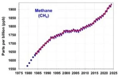
The yearly abundance of CH4 in the atmosphere since 1980, as measured by NOAA (the U.S. National Oceanic and Atmospheric Administration), is depicted in the next figure. Currently, the CH4 concentration is about 1.9 ppm (1900 ppb), two orders of magnitude lower than the CO2 level of approximately 415 ppm.

Combining the forcing calculations with the concentration data, the forcing per added molecule for CH4 is about 30 times larger than it is for CO2. But the rate of increase in the CH4 level over the last 10 years, of about 0.0076 ppm (7.6 ppb) per year, is about 300 times smaller than the rate of increase in the CO2 level, which is around 2.3 ppm per year. This means the contribution of CH4 to the annual increase in forcing is only 30/300 or one tenth that of CO2.

Although the CH4 concentration increased at a faster rate in 2020 and 2021, the rate has fluctuated in the past, both speeding up and slowing down (from 2000 to 2008, for example) for years at a time – as you can see from the figure above. But even if the rate were to permanently double, the CH4 contribution to the forcing increase would still be just one fifth (0.2) of the CO2 contribution. That’s nowhere near NOAA’s contention that "methane is roughly 25 times more powerful than carbon dioxide at trapping heat in the atmosphere."

It won’t be any different in the future. Using average rates of increase for CH4 and CO2 concentrations from the past, Happer and van Wijngaarden have evaluated forcings at the top of the troposphere for the next 50 years, as shown in the following figure; the forcings are increments relative to today.

As can be seen, both projected forcings will still be small a half century from now. Panic over methane (or CO2) is completely unnecessary.

Next: No Evidence That Hurricanes Are Becoming More Likely or Stronger

The Crucial Role of Water Feedbacks in Global Warming

One of the most important features of our climate system, and the computer models developed to represent it, is feedbacks. Most people don’t know that without positive feedbacks, the climate would be so insensitive to CO2 and other greenhouse gases that global warming wouldn’t be a concern. Positive feedbacks amplify global warming, while negative feedbacks tamp it down.

A doubling of CO2, acting entirely on its own, would raise global temperatures only by a modest 1.1 degrees Celsius (2.0 degrees Fahrenheit). In climate models, it’s positive feedback from water vapor – by far the most abundant greenhouse gas – and, to a lesser extent, feedback from clouds, snow and ice, that boosts the warming effect of doubled CO2 alone to the predicted very likely range of 2 degrees Celsius (3.6 degrees Fahrenheit) to 5 degrees Celsius (9 degrees Fahrenheit).

Contributions of the various greenhouse gases to global warming can be surmised from the figure below, which depicts the wavelength spectrum of thermal radiation transmitted through the atmosphere, where wavelength is measured in micrometers. Greenhouse gases cause warming by absorbing a substantial portion of the cooling longwave radiation emitted upwards by the earth. The lower panels of the figure show how water vapor absorbs strongly in several wavelength bands that don’t overlap CO2.

The assumption that water vapor feedback is positive and not negative was originally made by the Swedish chemist Svante Arrhenius over a century ago. The feedback arises when slight CO2-induced warming of the earth causes more water to evaporate from oceans and lakes, and the extra moisture then adds to the heat-trapping water vapor already in the atmosphere. This amplifies the warming even more.

The magnitude of the feedback is critically dependent on how much of the extra water vapor ends up in the upper atmosphere as the planet warms, because that’s where heat escapes to outer space. An increase in moisture there means stronger, more positive water vapor feedback and thus more heat trapping.

The concentration of water vapor in the atmosphere declines steeply with altitude, more than 95% of it being within 5 kilometers of the earth’s surface. Limited data do show that upper atmosphere humidity strengthened slightly in the tropics during the 30-year period from 1979 to 2009, during which the globe warmed by about 0.5 degrees Celsius (0.9 degrees Fahrenheit). However, the humidity diminished in the subtropics and possibly at higher latitudes also during this time.

But the predicted warming of 2 degrees Celsius (3.6 degrees Fahrenheit) to 5 degrees Celsius (9 degrees Fahrenheit) for doubled CO2 assumes that the water vapor concentration in the upper atmosphere increases at all latitudes as it heats up. In the absence of observational evidence for this assumption, we can’t be at all sure that the water vapor feedback is strong enough to produce temperatures in the predicted range.

The uncertainty over CO2 warming is exacerbated by lack of knowledge about another water feedback, from clouds. As I’ve discussed in another post, cloud feedback can be either positive or negative.

Positive cloud feedback is normally associated with an increase in high-level clouds such as cirrus clouds, which allow most of the sun’s incoming shortwave radiation to penetrate, but also act as a blanket inhibiting the escape of longwave heat radiation to space. More high-level clouds amplify warming that in turn evaporates more water and produces yet more clouds.

Negative cloud feedback can arise from a warming-induced increase in low-level clouds such as cumulus and stratus clouds. These clouds reflect 30-60% of the sun’s radiation back into space, acting like a parasol and thus cooling the earth’s surface. The cooling results in less evaporation that then reduces new cloud formation.

Conversely, a decrease in high-level clouds would imply negative cloud feedback, while a decrease in low-level clouds would imply positive feedback. Because of all these possibilities, together with the paucity of empirical data, it’s simply not known whether net cloud feedback in the earth’s climate system is one or the other – positive or negative.

If overall cloud feedback is negative, rather than positive as the computer models suggest, it’s possible that negative feedbacks in the climate system from the lapse rate (the rate of temperature decrease with altitude in the lower atmosphere) and clouds dominate the positive feedbacks from water vapor, and from snow and ice. This would mean that the response of the climate to added CO2 in the atmosphere is to lessen, rather than magnify, the temperature increase from CO2 acting alone, the opposite of what climate models tell us. Most feedbacks in nature are negative, keeping the natural world stable.

So until water feedbacks are better understood, there’s little scientific justification for any political action on CO2 emissions.

Next: El Niño and La Niña May Influence the Climate More than Greenhouse Gases

Challenges to the CO2 Global Warming Hypothesis: (5) Peer Review Abused to Axe Skeptical Paper

A climate research paper featured in a previous post of mine has recently been removed by the publisher, following a post-publication review by seven new reviewers who all recommended rejection of the paper. This drastic action represents an abuse of the peer review process in my opinion, as the reviews are based on dubious science.

The paper in question was a challenge to the CO2 global warming hypothesis by French geologist Pascal Richet. From analysis of an Antarctic ice core, Richet postulates that greenhouse gases such as CO2 had only a minor effect on the earth’s climate over the past 423,000 years, and that any assumed forcing of climate by CO2 is incompatible with ice-core data.

Past atmospheric CO2 levels and surface temperatures are calculated from ice cores by measuring the air composition and the oxygen 18O to 16O isotopic ratio, respectively, in air bubbles trapped by the ice. Data from the core, drilled at the Russian Vostok station in East Antarctica, is depicted in the figure below. The CO2 level is represented by the upper graphs (below the insolation data) that show the substantial drop in CO2 during an ice age; the associated drop in temperature ΔT is represented by the lower graphs.

It’s well known that the CO2 level during the ice ages closely mimicked changes in temperature, but the CO2 concentration lagged behind. What Richet observed is that the temperature peaks in the Vostok record are much narrower than the corresponding CO2 peaks. From this observation, he argued that CO2 can’t drive temperature since an effect can’t last for a shorter period than its cause.

The seven negative reviews focused on two main criticisms. The first is that Richet supposedly fails to understand that CO2 can act both as a temperature driver, when CO2 leads, and as an amplifying feedback, when CO2 lags.

At the end of ice ages, it’s thought that a subtle change in the earth’s orbit around the sun initiated a sudden upward turn of the temperature. This slight warming was then amplified by feedbacks, including CO2 feedback triggered by a surge in atmospheric CO2 as it escaped from the oceans; CO2 is less soluble in warmer water. A similar but opposite chain of events is believed to have enhanced global cooling as the temperature fell at the beginning of an ice age. In both cases – deglaciation and glaciation – CO2 as a feedback lagged temperature.

However, several of Richet’s reviewers base their criticism on a 2012 paper, by paleoclimatologist Jeremy Shakun and coauthors, which proposes the somewhat preposterous notion that CO2 lagged temperature during the most recent glaciation, all through the subsequent ice age, and during 0.3 degrees Celsius (0.5 degrees Fahrenheit) of the initial warming as the ice age ended – but then switched roles from feedback to driver and led temperature during the remaining deglaciation.

Shakun’s proposal is illustrated in the left graph below, in which the blue curve shows the mean global temperature during deglaciation, the red curve represents the temperature in Antarctica and the yellow dots are the atmospheric CO2 concentration. The CO2 levels and Antarctic temperatures are derived from an ice core, as in Richet’s paper but using the so-called Dome C core, while global temperatures are calculated from proxy data obtained from ocean and lake sediments.

The apparent switch of CO2 from feedback to driver is clearly visible in the figure above about 17,500 years ago, when the temperature escalated sharply. Although the authors attempt to explain the sudden change as resulting from variability of the AMOC (Atlantic Meridional Overturning Circulation), their argument is only hand-waving at best and does nothing to bolster their postulated dual role for CO2.

In any case, a detailed, independent analysis of the same proxy data has found there is so much data scatter that whether CO2 leads or lags the warming can’t even be established. This analysis is shown in the right graph above, where the green dots represent the temperature data and the black circles are the CO2 level.

All this invalidates the reviewers’ first main criticism of Richet’s paper. The second criticism is that Richet dismisses computer climate models as an unreliable tool for studying the effect of CO2 on climate, past or present. But, as frequently pointed out in these pages, climate models indeed have many weaknesses. These include the omission of many types of natural variability, exaggeration of predicted temperatures and the inability to reproduce the past climate accurately. Repudiation of climate models is therefore no reason to reject a paper.

Some of the reviewers’ lesser criticisms of Richet’s paper are justified, such as his analysis of only one Antarctic ice core when several are available, and his inappropriate philosophical and political comments in a scientific paper. But outright rejection of the paper smacks of bias against climate change skeptics and is an abuse of the time-honored tradition of peer review.

Next: The Crucial Role of Water Feedbacks in Global Warming

Ice Sheet Update (2): Greenland Ice Sheet Melting No Faster than Last Century

The climate doomsday machine makes much more noise about warming-induced melting of Greenland’s ice sheet than Antarctica’s, even though the Greenland sheet holds only about 10% as much ice. That’s because the smaller Greenland ice sheet is melting at a faster rate and contributes more to sea level rise. But the melt rate is no faster today than it was 90 years ago and appears to have slowed over the last few years.

The ice sheet, 2-3 km (6,600-9,800 feet) thick, consists of layers of compressed snow built up over at least hundreds of thousands of years. Melting takes place only during Greenland’s late spring and summer, the meltwater running over the ice sheet surface into the ocean, as well as funneling its way down through thick glaciers, helping speed up their flow toward the sea.

In addition to summer melting, the sheet loses ice at its edges from calving or breaking off of icebergs, and from submarine melting by warm seawater. Apart from these losses, a small amount of ice is gained over the long winter from the accumulation of compacted snow at high altitudes in the island’s interior. The net result of all these processes at the end of summer melt in August is illustrated in the adjacent figure, based on NASA satellite data.

The following figure depicts the daily variation, over the past year, of the estimated surface mass balance of the Greenland ice sheet – which includes gains from snowfall and losses from melt runoff, but not sheet edge losses – as well as the mean daily variation for the period from 1981 to 2010. The loss of ice during the summer months of June, July and August is clearly visible, though the summer loss was smaller in 2021 than in many years. An unusual, record-setting gain can also be seen in May 2021.

The next figure shows the average annual gain or loss of both the surface mass balance (in blue) and a measure of the total mass balance (in black), going all the way back to 1840. Most of the data comes from meteorological stations across Greenland. The total mass balance in this graph includes the surface mass balance, iceberg calving and submarine melting (combined in the gray dashed line), and melting from basal sources underneath the ice sheet, but not peripheral glaciers – glaciers that contribute 15 to 20% of Greenland’s total mass loss.

It can be seen that the rate of ice loss excluding glaciers has increased since about 2000. But it’s also clear from the graph that high short-term loss rates have occurred more than once in the past, notably in the 1930s and the 1950s – so the current shrinking of the Greenland ice sheet is nothing remarkable. There’s no obvious correlation with global temperatures, since the planet warmed from 1910 to 1940 but cooled from 1940 to 1970.

The total ice loss (not its rate) since 1972 is displayed in more detail in the final figure below. The slightly different estimates of the total mass are because some estimates include losses from peripheral glaciers and basal melting, while others don’t. Nevertheless, the insert showing mass loss from 2010 to 2020 reveals clearly that the rate of loss may have slowed down since about 2015.

The 2020 loss was 152 gigatonnes (168 gigatons), much lower than the average annual losses of 258 gigatonnes (284 gigatons) and 247 gigatonnes (272 gigatons) from 2002 to 2016 and 2012 through 2016, respectively. The 2020 loss also pales in comparison with the record high losses of 458 gigatonnes (505 gigatons) in 2012 and 329 gigatonnes (363 gigatons) in 2019. The 2021 loss is on track to be similar to 2020, according to estimates at the end of the summer melt season.

The Sixth Assessment Report of the UN’s IPCC (Intergovernmental Panel on Climate Change) maintains with high confidence that, between 2006 and 2018, melting of the Greenland ice sheet and peripheral glaciers was causing sea levels to rise by 0.63 mm (25 thousandths of an inch) per year. This can be compared with a rise of 0.37 mm (15 thousandths of an inch) per year from melting of Antarctic ice. However, the rate of rise from Greenland ice losses may be falling, as discussed above.

If the rate of Greenland ice loss were to remain at its 2012 to 2016 average of 247 gigatonnes (272 gigatons) per year, which is an annual loss of about 0.01% of the total mass of the ice sheet, it would take another 10,000 years for all Greenland’s ice to melt. If the rate stays at the 2020 value of 152 gigatonnes (168 gigatons) per year, the ice sheet would last another 17,000 years.

Next: Challenges to the CO2 Global Warming Hypothesis: (5) Peer Review Abused to Axe Skeptical Paper

Challenges to the CO2 Global Warming Hypothesis: (4) A Minimal Ice-Age Greenhouse Effect

As an addendum to my 2020 series of posts on the CO2 global warming hypothesis (here, here and here), this post presents a further challenge to the hypothesis central to the belief that humans make a substantial contribution to climate change. The hypothesis is that observed global warming – currently about 1 degree Celsius (1.8 degrees Fahrenheit) since the preindustrial era – has been caused primarily by human emissions of CO2 and other greenhouse gases into the atmosphere.

The new challenge to the CO2 hypothesis is set out in a recent research paper by French geologist Pascal Richet. Richet claims, by reexamining previous analyses of an Antarctic ice core, that greenhouse gases such as CO2 and methane had only a minor effect on the earth’s climate over the past 423,000 years, and that the assumed forcing of climate by CO2 is incompatible with ice-core data. The paper is controversial, however, and the publisher has subjected it to a post-publication review, as a result of which the paper has since been removed.

The much-analyzed ice core in question was drilled at the Russian Vostok station in East Antarctica. Past atmospheric CO2 levels and surface temperatures are calculated from ice cores by measuring the air composition and the oxygen 18O to 16O isotopic ratio, respectively, in air bubbles trapped by the ice. The Vostok record, which covers the four most recent ice ages or glaciations as well as the current interglacial (Holocene), is depicted in the figure below. The CO2 level is represented by the upper set of graphs (below the insolation data), and shows the substantial drop in CO2 during an ice age; the associated drop in temperature ΔT is represented by the lower set of graphs.

Vostok ice cores.jpg

It is seen that transitions from glacial to interglacial conditions are relatively sharp, while the ice ages themselves are punctuated by smaller warming and cooling episodes. And, though it’s hardly visible in the figure, the ice-age CO2 level closely mimics changes in temperature, but the CO2 concentration lags behind – with CO2 going up or down after the corresponding temperature shift occurs. The lag is more pronounced for temperature declines than increases.

The oceans, which are where the bulk of the CO2 on our planet is stored, can hold much more CO2 (and heat) than the atmosphere. Warm water holds less CO2 than cooler water, so the oceans release CO2 when the temperature rises, but take it in when the earth cools.

Richet noticed that the temperature peaks in the Vostok record are much narrower than the corresponding CO2 peaks. The full widths at half maximum, marked by thick horizontal bars in the figure above, range from about 7,000 to 16,000 years for the initial temperature peak in cycles II, III and IV, but from 14,000 to 23,000 years for the initial CO2 peak; cycle V can’t be analyzed because its start is missing from the data. All other peaks are also narrower for temperature than for CO2.

The author argues that CO2 can’t drive temperature since an effect can’t last for a shorter period of time than its cause. The fact that the peaks are systematically wider for CO2 than for temperature implies that the CO2 level responds to temperature changes, not the other way round. And for most of cycles II, III and IV, CO2 increases correspond to temperature decreases and vice versa.

Richet’s conclusion, if correct, would deal a deathblow to the CO2 global warming hypothesis. The reason has to do with the behavior of the temperature and CO2 level at the commencement and termination of ice ages.

Ice ages are believed to have ended (and begun) because of changes in the Earth’s orbit around the sun. After tens of thousands of years of bitter cold, the temperature suddenly took an upward turn. But according to the CO2 hypothesis, the melting of ice sheets and glaciers caused by the slight initial warming could not have continued, unless this temperature rise was amplified by positive feedbacks. These include CO2 feedback, triggered by a surge in atmospheric CO2 as it escaped from the oceans.

The problem with this explanation is that it requires a similar chain of events, based on CO2 and other feedbacks, to have enhanced global cooling as the temperature fell at the beginning of an ice age. But, says Richet, “From the dual way in which feedback would work, temperature decreases and increases should be similar for the same concentrations of greenhouse gases, regardless of the residence times of these gases in the atmosphere.” The fact that temperature decreases don’t depend in any straightforward way on CO2 concentration in the figure above demonstrates that the synchronicity required by the feedback mechanism is absent.

Next: Fishy Business: Alleged Fraud over Ocean Acidification Research, Reversal on Coral Extinction

How Near-Saturation of CO2 Limits Future Global Warming

The climate change narrative is based in part on the concept that adding more and more CO2 to the atmosphere will cause the planet to become unbearably hot. But recent research refutes this notion by concluding that extra CO2 quickly becomes less effective in raising global temperatures – a saturation effect, long disputed by believers in the narrative.

First reported in 2020, the new and highly detailed research is described in a preprint by physicists William Happer and William van Wijngaarden. Happer is an emeritus professor at Princeton University and prominent in optical and radiation physics. In their paper, the two authors examine the radiative forcings – disturbances that alter the earth’s climate – of the five most abundant greenhouse gases, including CO2 and water vapor.

The researchers find that the current levels of atmospheric CO2 and water vapor are close to saturation. Saturation is a technical term meaning that the greenhouse effect has already had its maximum impact and further increases in concentration will cause little additional warming. For CO2, doubling its concentration from its 2015 level of 400 ppm (parts per million) to 800 ppm will increase its radiative forcing by just 1%. This increase in forcing will decrease the cooling radiation emitted to space by about 3 watts per square meter, out of a total of about 300 watts per square meter currently radiated to space.

The science behind greenhouse gas warming is illustrated in the figure below, depicting the wavelength spectrum of the intensity of thermal radiation transmitted through the atmosphere, where wavelength is measured in micrometers. Radiation is absorbed and radiated by the earth in two different wavelength regions: absorption of solar radiation takes place at short (ultraviolet and visible) wavelengths, shown in red in the top panel, while heat is radiated away at long (infrared) wavelengths, shown in blue.

Happer 1.jpg

Greenhouse gases in the atmosphere allow most of the downward shortwave radiation to pass through, but prevent a substantial portion of the upward longwave radiation from escaping – resulting in net warming, as suggested by the relative areas of red and blue in the figure above. The absorption by various greenhouse gases of upward (emitted) radiation at different wavelengths can be seen in the lower panels of the figure, water vapor and CO2 being the most dominant gases.

The research of Happer and van Wijngaarden takes into account both absorption and emission, as well as atmospheric temperature variation with altitude. The next figure shows the authors’ calculated spectrum for cooling outgoing radiation at the top of the atmosphere, as a function of wavenumber or spatial frequency rather than wavelength, which is the inverse of spatial frequency. (The temporal frequency is the spatial frequency multiplied by the speed of light.)

Happer 2.jpg

The blue curve is the spectrum for an atmosphere without any greenhouse gases at all, while the green curve is the spectrum for all greenhouse gases except CO2. Including CO2 results in the black or red curve, for concentrations of 400 ppm or 800 ppm, respectively; the gap in the spectrum represents the absorption of radiation that would otherwise cool the earth. The small decrease in area underneath the curve, from black to red, corresponds to the forcing increase of 3 watts per square meter resulting from doubling the CO2 level.

What matters for global warming is how much the additional forcing bumps up the temperature. This depends in part on the assumption made about climate feedback, since it’s the positive feedback from much more abundant water vapor in the atmosphere that is thought to amplify the modest temperature rise from CO2 acting alone. The strength of the water vapor feedback is closely tied to relative humidity.

Assuming positive water vapor feedback and constant relative humidity with increasing altitude, the preprint authors find that the extra forcing from doubled CO2 causes a temperature increase of 2.2 to 2.3 degrees Celsius (4.0 to 4.1 degrees Fahrenheit). If the water vapor feedback is set to zero, then the temperature increase is only 1.4 degrees Celsius (2.5 degrees Fahrenheit). These results can be compared with the prediction of 2.6 to 4.1 degrees Celsius (4.7 to 7.4 degrees Fahrenheit) in a recent study based on computer climate models and other evidence.

Although an assumption of zero water vapor feedback may seem unrealistic, Happer points out that something important is missing from their calculations, and that is feedback from clouds – an omission the authors are currently working on. Net cloud feedback, from both low and high clouds, is poorly understood currently but could be negative rather than positive.

If indeed overall cloud feedback is negative rather than positive, it’s possible that negative feedbacks in the climate system from the lapse rate (the rate of temperature decrease with altitude in the lower atmosphere) and clouds dominate the positive feedbacks from water vapor, and from snow and ice. In either case, this research demonstrates that future global warming won’t be nearly as troublesome as the climate change narrative insists.

Next: Natural Sources of Global Cooling: (1) Solar Variability and La Niña