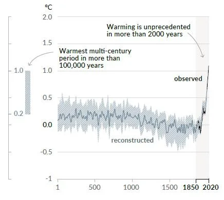
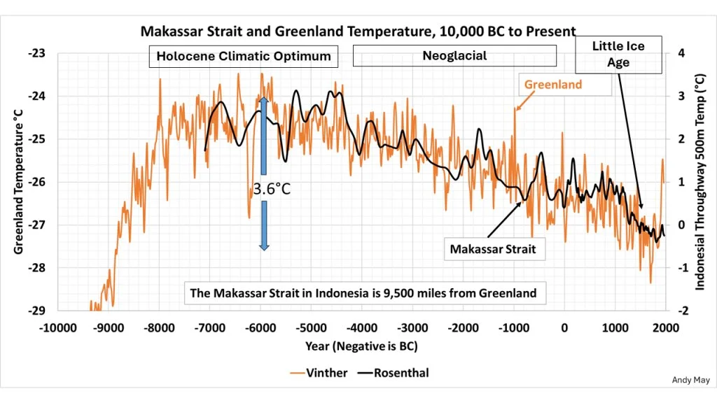
Uncertainty in Ocean Heat Content May Be Grossly Underestimated
/According to measurements made by Argo profiling floats, the amount of heat stored in upper ocean layers has been rising rapidly over the past few decades. But a new paper casts doubt on this assertion, claiming that uncertainty in the measurements is so large that any increase in stored heat is statistically indistinguishable from zero.
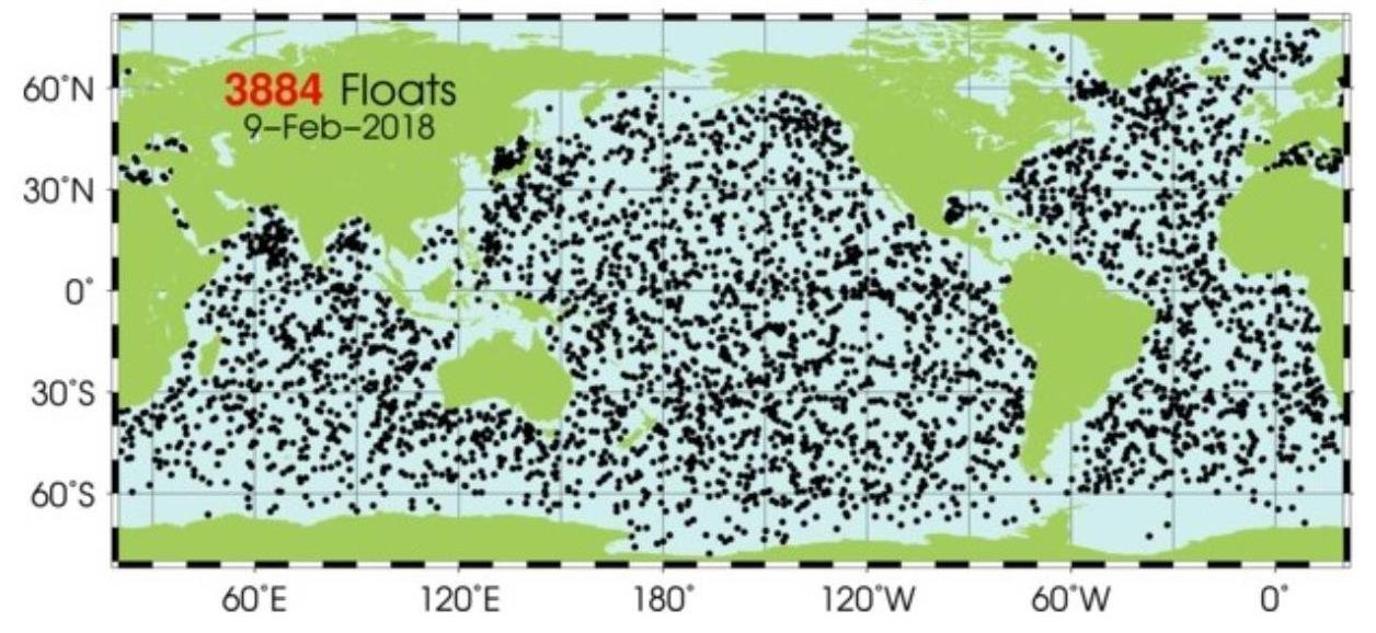
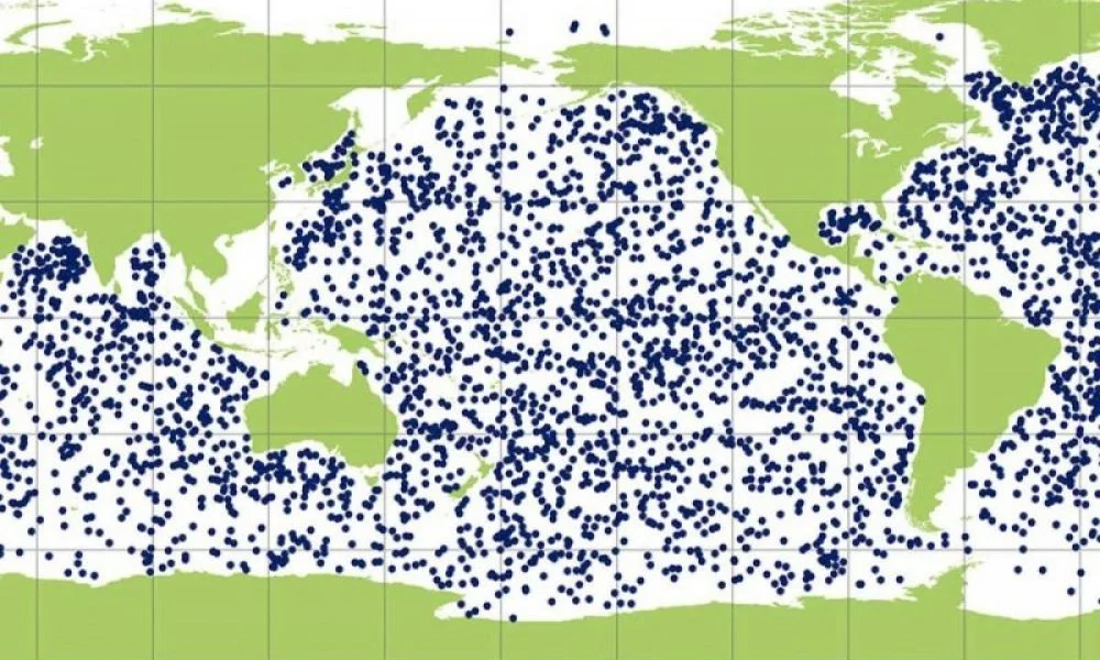
Argo floats have been used since 2004 to study ocean temperatures and other properties at depths up to 2 km (1.2 miles), by means of a global array of over 4,100 robotic cylinders. As illustrated in the figure below, these free-drifting floats patrol the oceans, taking a deep dive every 10 days to probe the temperature, salinity and pressure of the watery depths, and then transmitting the data to a satellite within hours of bobbing up to the surface again. A recent map of the Argo array is shown in the second figure.

One of the principal sources of uncertainty in the float measurements is evident from the first figure above – namely, the large volume of seawater sampled during a float’s traverse to record just a single reading. That reading is an average of measurements made approximately every second during the float’s 6-to-10-hour ascent from depth to surface.
During the ascent stage, the exact horizontal position when the temperature is measured is highly uncertain because of depth-varying currents, mesoscale eddies and other turbulent motions. The study authors estimate the horizontal uncertainty to be as much as 5-50 km (3-30 miles), stating that the float’s path as it ascends is “an unknown and complex, meandering curve through a spatially and temporally varying flow field.”
Furthermore, the average reading during ascent is considered to be representative of the whole volume encountered by the float since its initial descent. The positional uncertainty in a single temperature measurement, therefore, can cause an associated uncertainty in temperature of 0.5-3 degrees Celsius (0.9-5.4 degrees Fahrenheit), say the researchers.
The uncertainty in Argo float temperature measurements leads to even more uncertainty in estimating OHC (ocean heat content), which is the mathematical integral of absolute temperature (usually expressed as an anomaly from some mean) multiplied by seawater density multiplied by ocean specific heat capacity. Density and heat capacity vary with depth and other factors such as large-scale currents.
Another major source of uncertainty is sampling error. The total global volume sampled by all Argo floats in one year is about nine orders of magnitude smaller than the volume of the upper ocean (to a 2 km depth). The associated uncertainty in OHC estimates is approximately 0.1-0.5 watts per square meter, the researchers say – a level from sampling error alone comparable to the total uncertainty in OHC of 0.2 watts per square meter cited by the IPCC (Intergovernmental Panel on Climate Change) in its 2021 AR6 (Sixth Assessment Report).
For the deep ocean, sampled by a paltry 315 Argo floats, they estimate the sampling error uncertainty to be as large as 0.35 watts per square meter from 1971 to 2018, which is half the IPCC’s actual OHC value of 0.7 watts per square meter.
The uncertainty in temperature measurement of 0.5-3 degrees Celsius (0.9-5.4 degrees Fahrenheit) results in an OHC uncertainty of up to 0.1 watts per square meter. Additional sources of uncertainty include unresolved mesoscale variability, altimetry uncertainty and baseline date range, among others.
By mesoscale variability, the researchers are referring to uncertainties in boundary currents and eddy-rich regions. Certain areas of the global ocean such as the Gulf Stream and the Antarctic Circumpolar Current exhibit intense fluctuations, on a scale of 10-200 km (6-125 miles), in temperature and salinity driven by eddies and other instabilities. The researchers estimate that these fluctuations contribute 0.6-1.2 watts per square meter of uncertainty to the OHC.
Altimetry uncertainty arises from the discrepancy between changes in sea level estimated from OHC, and changes determined by satellite altimetry. Altimetry deduces absolute sea level by measuring the height of the sea, which is the distance of its surface to the center of the earth. The much less direct OHC method relies on Argo float measurements of seawater temperature and salinity, the latter of which is related to density. The researchers assign an OHC uncertainty of 0.29-0.37 watts per square meter to this cause.
And baseline date range uncertainty refers to possible errors in the calculated OHC due to any shift in the reference period, for example from 2004-18 to 2005-19. Such a shift can obscure the influence of different phases of ocean cycles such as the PDO (Pacific Decadal Oscillation) or AMO (Atlantic Multidecadal Oscillation). This can produce an OHC uncertainty of 0.1-0.3 watts per square meter, say the paper’s authors.
Collectively, these and other sources can contribute a total uncertainty of 1 watt per square meter, which exceeds the IPCC’s estimate of 0.7 watts per square meter for the OHC itself.
Next: Sea Level Rise Dominated by Subsidence, Not Global Warming