Proxy Evidence Shows Early Holocene Was Warmer than Today
/A persistent claim in the climate science literature, one that is used to bolster the narrative of catastrophic anthropogenic climate change, is that current temperatures are the highest the world has seen in the 125,000 years since the interglacial period between the last two ice ages. But a close look at the evidence reveals it was warmer than today as recently as the early Holocene – the geological epoch since the last ice age ended.
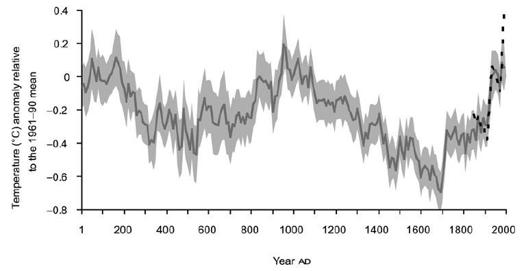
Underlying the preposterous claim is an erroneous temperature graph featured in the 2021 Sixth Assessment Report of the IPCC (Intergovernmental Panel on Climate Change). As shown in the figure below, the report displays the IPCC’s latest version of the so-called “hockey stick,” which exhibits no change or a slight decline in temperature for the past 2020 years and a sudden, rapid upturn since 1900.
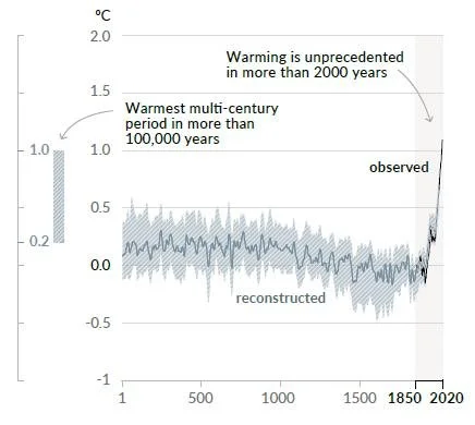
The solid grey line from 1 to 2000 is a reconstruction of global surface temperature from paleoclimate proxies, while the solid black line from 1850 to 2020 represents direct observations. Both are relative to the 1850–1900 mean and averaged by decade.
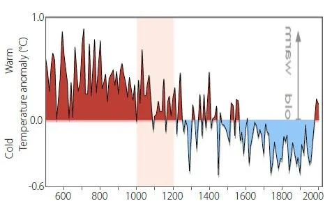
Among other features missing from the spurious hockey stick are two previously well-documented aspects of our past climate: the MWP (Medieval Warm Period) around the year 1000, a time when warmer than normal conditions were reported in many parts of the world, and the cool period centered around 1650 known as the LIA (Little Ice Age).
But the IPCC report also excludes early Holocene warming by its statement “Warmest multi-century period in more than 100,000 years” in the figure above. That such warming took place is evidenced by numerous paleoclimate proxies such as tree rings, marine sediments, ice cores, boreholes and leaf fossils.
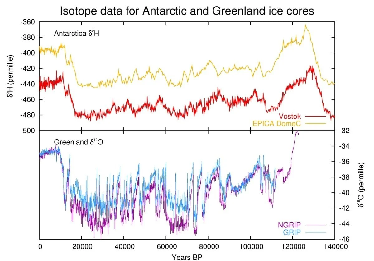
A 2009 research paper provides proxy evidence from Greenland ice cores of a period known as the Holocene Thermal Maximum that occurred from approximately 10,000 to 6,000 years ago. The researchers used the isotopic ratio of 18O to 16O, or δ18O, in ice cores from six different locations as a proxy for past surface temperatures in Greenland; the locations are indicated in the image on the left below.
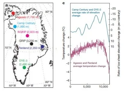
The lower part of the image on the right shows the proxy temperature at two of the locations, Agassiz and Renland, over the period from the present back to 11,700 years ago. (Note that the time scale is reversed relative to the IPCC figure.) Of the six Greenland sites, only these two were suitable for analysis, because the ice cores were retrieved from icecap domes and were not influenced by ice flow that occurred at the other four sites. The existence of elevated temperatures during the Holocene Thermal Maximum is abundantly clear.
On the other side of the globe, further proxy evidence for the Holocene Thermal Maximum comes from marine sediment cores in Indonesia. A 2013 paper deduced that temperatures at both the sea surface and at intermediate depths in passages between the Pacific and Indian Oceans were higher during the early Holocene than in the past century.
The proxy in this case was the ratio of magnesium to calcium in the sediment cores, which is a measure of the seawater temperature at the time the sediment was deposited; a timeline can be established by radiocarbon dating. Temperatures dating back 16,000 years derived from well-dated sediment cores in several locations are depicted in the next figure. Part A denotes sea surface temperatures, while part B denotes sub-surface temperatures at the thermocline that divides warmer surface water from cooler water below.
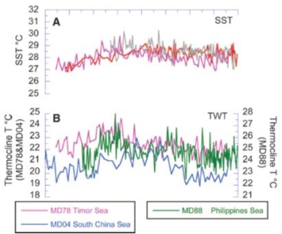
Again, it can be seen that temperatures were higher during the Holocene Thermal Maximum than at present, more so at depth than at the surface. The magnitude of the Maximum relative to the 1850-80 mean was estimated to be 2.2 degrees Celsius (4.0 degrees Fahrenheit) and 1.5 degrees Celsius (2.7 degrees Fahrenheit) at depth and the surface, respectively.
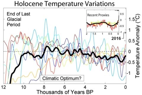
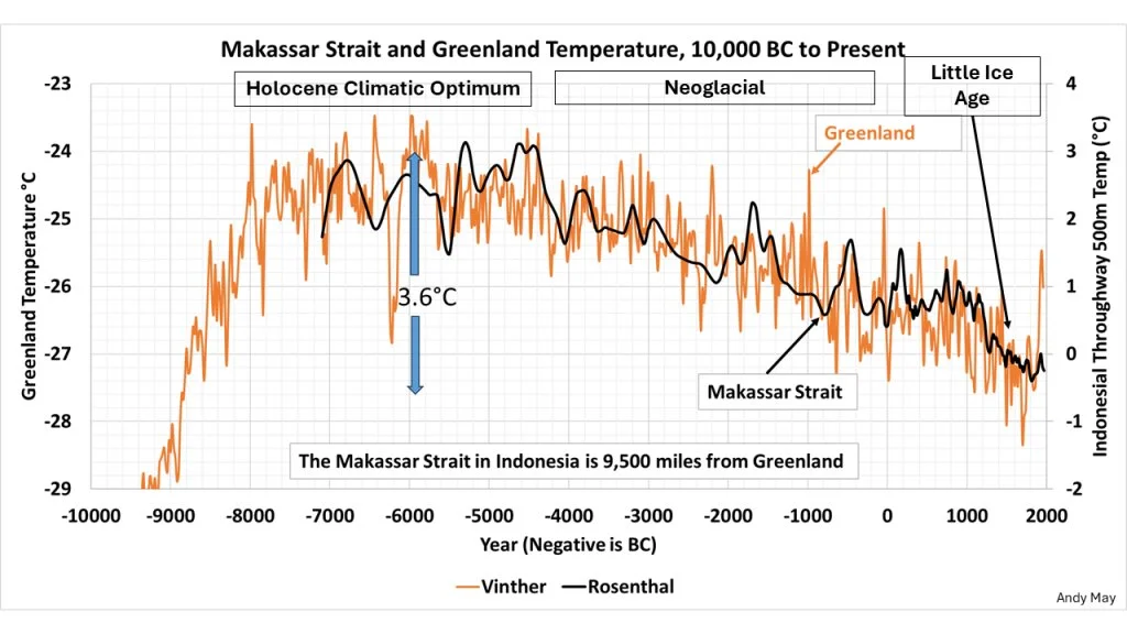
Both the Greenland and Indonesian (Makassar Strait at 500 meters depth) proxy temperature data during the Holocene are displayed together in the figure below, compiled by petrophysicist Andy May. You can see that both datasets are closely matched and that the Holocene Thermal Maximum (Climatic Optimum) was more than 1 degree Celsius (1.8 degrees Fahrenheit) warmer than today.
Likewise, sea surface temperatures near the southern Australian coast are estimated to have been as much as 4.0 degrees Celsius (7.2 degrees Fahrenheit) higher during the mid-Holocene than today. This was deduced from δ18O and radiocarbon measurements in mollusc fossils, which were reported in a recent paper by Australian scientists.
It could be argued that all of the assertions I’ve made here rely on proxy, not actual data. But so does the shaft of the hockey stick. Reliable global instrumental measurements of temperature and other climate variables date back only about 150 years.
Next: Abuse of Science: Extreme Event Attribution Studies