Ocean Acidification: No Evidence of Impending Harm to Sea Life

ocean fish.jpg

Apocalyptic warnings about the effect of global warming on the oceans now embrace ocean acidification as well as sea level rise and ocean heating, both of which I’ve examined in previous posts. Acidification is a potential issue because the oceans absorb up to 30% of our CO2 emissions, according to the UN’s IPCC (Intergovernmental Panel on Climate Change). The extra CO2 increases the acidity of seawater.

But there’s no sign that any of the multitude of ocean inhabitants is suffering from the slightly more acidic conditions, although some species are affected by the warming itself. The average pH – a measure of acidity – of ocean surface water is currently falling by only 0.02 to 0.03 pH units per decade, and has dropped by only 0.1 pH units over the whole period since industrialization and CO2 emissions began in the 18th century. These almost imperceptible changes pale in comparison with the natural worldwide variation in ocean pH, which ranges from a low of 7.8 in coastal waters to a high of 8.4 in upper latitudes.

The pH scale sets 7.0 as the neutral value, with lower values being acidic and higher values alkaline. It’s a logarithmic scale, so a change of 1 pH unit represents a 10-fold change in acidity. A decrease of 0.1 units, representing a 26% increase in acidity, still leaves the ocean pH well within the alkaline range.    

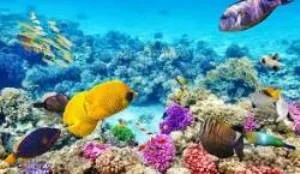
The primary concern with ocean acidification is its effect on marine creatures – such as corals, some plankton, and shellfish – that form skeletons and shells made from calcium carbonate. The dissolution of CO2 in seawater produces carbonic acid (H2CO3), which in turn produces hydrogen ions (H+) that eat up any carbonate ions (CO32-) that were already present, depleting the supply of carbonate available to calcifying organisms, such as mussels and krill, for shell building.

Yet the wide range of pH values in which sea animals and plants thrive tells us that fears about acidification from climate change are unfounded. The figure below shows how much the ocean pH varies even at the same location over the period of one month, and often within a single day.

ocean pH over 1 month.jpg

In the Santa Barbara kelp forest (F in the figure), for example, the pH fluctuates by 0.5 units, a change in acidity of more than 200%, over 13 days; the mean variation in the Elkhorn Slough estuary (D) is a full pH unit, or a staggering 900% change in acidity, per day. Likewise, coral reefs (E) can withstand relatively large fluctuations in acidity: the pH of seawater in the open ocean can vary by 0.1 to 0.2 units daily, and by as much as 0.5 units seasonally, from summer to winter.

ocean coral.jpg

A 2011 study of coral formation in Papua New Guinea at underwater volcanic vents that exude CO2 found that coral reef formation ceased at pH values less than 7.7, which is 0.5 units below the pre-industrial ocean surface average of 8.2 units and 216% more acidic. However, at the present rate of pH decline, that point won’t be reached for at least another 130 to 200 years. In any case, there’s empirical evidence that existing corals are hardy enough to survive even lower pH values.

Australia’s Great Barrier Reef periodically endures surges of pronouncedly acid rainwater at the low pH of about 5.6 that pours onto the Reef from flooding of the Brisbane River, which has occurred 11 times since 1840. But the delicate corals have withstood the onslaught each time. And there have been several epochs in the distant past when the CO2 level in the atmosphere was much higher than now, yet marine species that calcify were able to persist for millions of years.

Nonetheless, advocates of the climate change narrative insist that marine animals and plants are headed for extinction if the CO2 level continues to rise, supposedly because of reduced fertility and growth rates. However, there’s a paucity of research conducted under realistic conditions that accurately simulates the actual environment of marine organisms. Acidification studies often fail to provide the organisms with a period of acclimation to lowered seawater pH, as they would experience in their natural surroundings, and ignore the chemical buffering effect of neighboring organisms on acidification.

Ocean acidification, often regarded as the evil twin of global warming, is far less of a threat to marine life than overfishing and pollution. In Shakespeare’s immortal words, the uproar over acidification is much ado about nothing.

Next: No Evidence That Marine Heat Waves Are Unusual

Ocean Heating: How the IPCC Distorts the Evidence

Part of the drumbeat accompanying the narrative of catastrophic human-caused warming involves hyping or distorting the supposed evidence, as I’ve demonstrated in recent posts on ice sheets, sea ice, sea levels and extreme weather. Another gauge of a warming climate is the amount of heat stashed away in the oceans. Here too, the IPCC (Intergovernmental Panel on Climate Change) and alarmist climate scientists bend the truth to bolster the narrative.

Perhaps the most egregious example comes from the IPCC itself. In its 2019 Special Report on the Ocean and Cryosphere in a Changing Climate, the IPCC declares that the world’s oceans have warmed unabated since 2005, and that the rate of ocean heating has accelerated – despite contrary evidence for both assertions presented in the very same report! It appears that catastrophists within the IPCC are putting a totally unjustified spin on the actual data.

Argo float being deployed.

Argo float being deployed.

Ocean heat, known technically as OHC (ocean heat content), is currently calculated from observations made by Argo profiling floats. These floats are battery-powered robotic buoys that patrol the oceans, sinking 1-2 km (0.6-1.2 miles) deep once every 10 days and then bobbing up to the surface, recording the temperature and salinity of the water as they ascend. When the floats eventually reach the surface, the data is transmitted to a satellite. Before the Argo system was deployed in the early 2000s, OHC data was obtained from older types of instrument.

The table below shows empirical data documented in the IPCC report, for the rate of ocean heating (heat uptake) over various intervals from 1969 to 2017, in two ocean layers: an upper layer down to a depth of 700 meters (2,300 feet), and a deeper layer from 700 meters down to 2,000 meters (6,600 feet). The data is presented in alternative forms: as the total heat energy absorbed by the global ocean yearly, measured in zettajoules (1021 joules), and as the rate of areal heating over the earth’s surface, measured in watts (1 watt = 1 joule per second) over one square meter.

OHC Table.jpg

Examination of the data in either form reveals clearly that in the upper, surface layer, the oceans heated less rapidly during the second half of the interval between 1993 and 2017, that is from 2005 to 2017, than during the first half from 1993 to 2005.

The same is true for the two layers combined, that is for all depths from the surface down to 2,000 meters (6,600 feet). When the two lines in the table above are added together, the combined layer heating rate was 9.33 zettajoules per year or 0.58 watts per square meter from 2005 to 2017, and 10.14 zettajoules per year or 0.63 watts per square meter from 1993 to 2017. Although these numbers ignore the large uncertainties in the measurements, they demonstrate that the ocean heating rate fell between 1993 and 2017.

Yet the IPCC has the audacity to state in the same report that “It is likely that the rate of ocean warming has increased since 1993,” even while correctly recognizing that the present heating rate is higher than it was back in 1969 or 1970. That the heating rate has not increased since 1993 can also be seen in the following figure, again from the same IPCC report.

Ocean Heat Content 1995-2017

OHC recent.jpg

The light and dark green bands in the figure show the change in OHC, measured in zettajoules, from the surface down to 2,000 meters (6,600 feet), relative to its average value between 2000 and 2010, over the period from 1995 to 2017. It’s obvious that the ocean heating rate – characterized by the slope of the graph – slowed down over this period, especially from 2003 to about 2008 when ocean heating appears to have stopped altogether. Both the IPCC’s table and figure in the report completely contradict its conclusions.

This contradiction is important not only because it reveals how the IPCC is a blatantly political more than a scientific organization, but also because OHC science has already been tarnished by the publication and subsequent retraction of a 2018 research paper claiming that ocean heating had reached the absurdly high rate of 0.83 watts per square meter.

If true, the claim would have meant that the climate is much more sensitive to CO2 emissions than previously thought – a finding the mainstream media immediately pounced on. But mathematician Nic Lewis quickly discovered that the researchers had miscalculated the ocean warming trend, as well as underestimating the uncertainty of their result in the retracted paper. Lewis has also uncovered errors in a 2019 paper on ocean heating.

In a recent letter to the IPCC, the Global Warming Policy Foundation has pointed out the errors and misinterpretations in both the 2018 and 2019 papers, as well as in the IPCC report discussed above. There’s been no response to date.

Next: Ocean Acidification: No Evidence of Impending Harm to Sea Life

Shrinking Sea Ice: Evaluation of the Evidence

Most of us know about the loss of sea ice in the Arctic due to global warming. The dramatic reduction in summer ice cover, which has continued for almost 40 years, is frequently hyped by the mainstream media and climate activists as an example of what we’re supposedly doing to the planet.

But the loss is nowhere near as much as predicted, and in fact was no more in the summer of 2019 than in 2007. Also, it’s little known that Arctic sea ice has melted before during the record heat of the 1930s. And the sea ice around Antarctica, at the other end of the globe, has been expanding since at least 1979.

Actual scientific observations of sea ice in the Arctic and Antarctic have only been possible since satellite measurements began in 1979. The figure below shows satellite-derived images of Arctic sea ice extent in the summer of 1979 (left image), and the summer (September) and winter (March) of 2018 (right image). Sea ice expands to its maximum extent during the winter and shrinks during summer months.   

Arctic ice 1979.jpg
Arctic ice 2018.jpg

Arctic summer ice extent decreased by approximately 33% over the interval from 1979 to 2018; while it still encases northern Greenland, it no longer reaches the Russian coast.

However, there has been no net ice loss since 2007, with the year-to-year minimum extents fluctuating around a plateau. An exception was 2012, when a powerful August storm known as the Great Arctic Cyclone tore off a large chunk of ice from the main sea ice pack. Clearly, the evidence refutes numerous prognostications by advocates of catastrophic human-caused warming that Arctic ice would be completely gone by 2016. 

Before 1979, the only data available on Arctic sea ice are scattered observations from sources such as ship reports, aircraft reconnaissance and drifting buoys – observations recorded and synthesized by the Danish Meteorological Institute and the Russian Arctic and Antarctic Research Institute. Analyses of this spotty data have resulted in numerous reconstructions of Arctic sea ice extent in the pre-satellite era.

One such recent reconstruction is shown in the next figure, depicting reconstructed Arctic summer ice area, in millions of square kilometers, from 1900 to 2013. The reconstruction was based on the strong correlation of Arctic sea ice extent with Arctic air temperatures during the satellite era, especially in the summer, a correlation assumed to be the same in earlier years as well. This assumption then enabled the researchers to reconstruct the sea ice area before 1979 from observed temperatures in that era.  

Ice.jpg

What this graph reveals is that summer ice cover in the Arctic, apart from its present decline since about 1979, contracted previously in the 1920s and 1930s. According to the researchers, the biggest single-year decrease in area, which occurred in 1936, was about 26% – not much less than the 33% drop by 2018. Although this suggests that the relatively low sea ice extents in recent years are comparable to the 1930s, the reconstruction doesn’t incorporate any actual pre-satellite observations. Other reconstructions that do incorporate the earlier data show a smaller difference between the 1930s and today.

It’s the opposite story for sea ice in the Antarctic, which is at its lowest extent during the southern summer in February, as shown in the satellite-derived image below for 2018-19.

Antarctic ice 2018-2019.jpg

Despite the contraction in the Arctic, the sea ice around Antarctica has been expanding during the satellite era. As can be seen from the following figure, Antarctic sea ice has gained in extent by an average of 1.8% per decade (the dashed line represents the trend), though the ice extent fluctuates greatly from year to year. Antarctic sea ice covers a larger area than Arctic ice but occupies a smaller overall volume, because it’s only about half as thick.

Antarctic ice.jpg

Another fallacious claim about disappearing sea ice in the Arctic, one that has captured the public imagination like no other, is that the polar bear population is diminishing along with the ice. But, while this may yet happen in the future, current evidence shows that the bear population has been stable for the whole period that the ice has been decreasing and may even be growing, according to the native Inuit.

In summary, Arctic sea ice shrank from about 1979 to 2007 because of global warming, but has remained at the same extent on average in the 12 years since then, while Antarctic sea ice has expanded slightly over the whole period. So there’s certainly no cause for alarm.

Next: No Convincing Evidence That Antarctic Ice Sheet is Melting

No Evidence That Climate Change Is Accelerating Sea Level Rise

Malé, Maldives Capital City

Malé, Maldives Capital City

By far the most publicized phenomenon cited as evidence for human-induced climate change is rising sea levels, with the media regularly trumpeting the latest prediction of the oceans flooding or submerging cities in the decades to come. Nothing instills as much fear in low-lying coastal communities as the prospect of losing one’s dwelling to a hurricane storm surge or even slowly encroaching seawater. Island nations such as the Maldives in the Indian Ocean and Tuvalu in the Pacific are convinced their tropical paradises are about to disappear beneath the waves.

There’s no doubt that the average global sea level has been increasing ever since the world started to warm after the Little Ice Age ended around 1850. But there’s no reliable scientific evidence that the rate of rise is accelerating, or that the rise is associated with any human contribution to global warming.   

A comprehensive 2018 report on sea level and climate change by Judith Curry, a respected climate scientist and global warming skeptic, emphasizes the complexity of both measuring and trying to understand recent sea level rise. Because of the switch in 1993 from tide gauges to satellite altimetry as the principal method of measurement, the precise magnitude of sea level rise as well as projections for the future are uncertain.

According to both Curry and the UN’s IPCC (Intergovernmental Panel on Climate Change), the average global rate of sea level rise from 1901 to 2010 was 1.7 mm (about 1/16th of an inch) per year. In the latter part of that period from 1993 onward, the rate of rise was 3.2 mm per year, almost double the average rate – though this estimate is considered too high by some experts. But, while the sudden jump may seem surprising and indicative of acceleration, the fact is that the globally averaged sea level fluctuates considerably over time. This is illustrated in the IPCC’s figure below, which shows estimates from tide gauge data of the rate of rise from 1900 to 1993.

cropped.jpg

It’s clear that the rate of rise was much higher than its 20th century average during the 30 years from 1920 to 1950, and much lower than the average from 1910 to 1920 and again from 1955 to 1980. Strong regional differences exist too. Actual rates of sea level rise range from negative in Stockholm, corresponding to a falling sea level, as that region continues to rebound after melting of the last ice age’s heavy ice sheet, to positive rates three times higher than average in the western Pacific Ocean.

The regional variation is evident in the next figure, showing the average rate of sea level rise across the globe, measured by satellite, between 1993 and 2014.

Sea level rise rate 1993-2014.jpg

You can see that during this period sea levels increased fastest in the western Pacific as just noted, and in the southern Indian and Atlantic Oceans. At the same time, the sea level fell near the west coast of North America and in the Southern Ocean near Antarctica.

The reasons for such a jumbled picture are several. Because water expands and occupies more volume as it gets warmer, higher ocean temperatures raise sea levels. Yet the seafloor is not static and can sink under the weight of the extra water in the ocean basin that comes from melting glaciers and ice caps, and can be altered by underwater volcanic eruptions. Land surfaces can also sink (as well as rebound), as a result of groundwater depletion in arid regions or landfilling in coastal wetlands. For example, about 50% of the much hyped worsening of tidal flooding in Miami Beach, Florida is due to sinking of reclaimed swampland.

Historically, sea levels have been both lower and higher in the past than at present. Since the end of the last ice age, the average level has risen about 120 meters (400 feet), as depicted in the following figure. After it reached a peak in at least some regions about 6,000 years ago, however, the sea level has changed relatively little, even when industrialization began boosting atmospheric CO2. Over the 20th century, the worldwide average rise was about 15-18 cm (6-7 inches).

Sea level rise 24,000 yr.jpg

That the concerns of islanders are unwarranted despite rising seas is borne out by recent studies revealing that low-lying coral reef islands in the Pacific are actually growing in size by as much as 30% per century, and not shrinking. The growth is due to a combination of coral debris buildup, land reclamation and sedimentation. Another study found that the Maldives -- the world's lowest country -- formed when sea levels were even higher than they are today. Studies such as these belie the popular claim that islanders will become “climate refugees,” forced to leave their homes as sea levels rise.

Next: Shrinking Sea Ice: Evaluation of the Evidence

Science, Political Correctness and the Great Barrier Reef

A recent Australian court case highlights the intrusion of political correctness into science to bolster the climate change narrative. On April 16, a federal judge ruled that Australian coral scientist Dr. Peter Ridd had been unlawfully fired from his position at North Queensland’s James Cook University, for questioning his colleagues’ research on the impact of climate change on the Great Barrier Reef. In his ruling, the judge criticized the university for not respecting Ridd’s academic freedom.

Great Barrier Reef.jpg

The Great Barrier Reef is the world's largest coral reef system, 2,300 km (1,400 miles) long and visible from outer space. Labeled by CNN as one of the seven natural wonders of the world, the reef is a constant delight to tourists, who can view the colorful corals from a glass-bottomed boat or by snorkeling or scuba diving.

Rising temperatures, especially during the prolonged El Niño of 2014-17, have severely damaged portions of the Great Barrier Reef – so much so that the reef has become the poster child for global warming. Corals are susceptible to overheating and undergo bleaching when the water gets too hot, losing their vibrant colors. But exactly how much of the Great Barrier Reef has been affected, and how quickly it’s likely to recover, are controversial issues among reef researchers.

Ridd’s downfall came after he authored a chapter on the resilience of Great Barrier Reef corals in the book, Climate Change: The Facts 2017. In his chapter and subsequent TV interviews, Ridd bucked the politically correct view that the reef is doomed to an imminent death by climate change, and criticized the work of colleagues at the university’s Centre of Excellence for Coral Reef Studies. He maintained that his colleagues’ findings on the health of the reef in a warming climate were flawed, and that scientific organizations such as the Centre of Excellence could no longer be trusted.

Ridd had previously been censured by the university for going public with a dispute over a different aspect of reef health. This time, his employer accused Ridd of “uncollegial” academic misconduct and warned him to remain silent about the charge. When he didn’t, the university fired him after a successful career of more than 40 years.

At the crux of the issue of bleaching is whether or not it’s a new phenomenon. The politically correct view of many of Ridd’s fellow reef scientists is that bleaching didn’t start until the 1980s as global warming surged, so is an entirely man-made spectacle. But Ridd points to scientific records that reveal multiple coral bleaching events around the globe throughout the 20th century.

The fired scientist also disagrees with his colleagues over the extent of bleaching from the massive 2014-17 El Niño. Ridd estimates that just 8% of Great Barrier Reef coral actually died; much of the southern end of the reef didn’t suffer at all. But his politically correct peers maintain that the die-off was anywhere from 30% to 95%.

Such high estimates, however, are for very shallow water coral – less than 2 meters (7 feet) below the surface, which is only a small fraction of all the coral in the reef. A recent independent study found that deep water coral – down to depths of more than 40 meters (130 feet) – saw far less bleaching. And while Ridd’s critics claim that warming has reduced the growth rate of new coral by 15%, he finds that the growth rate has increased slightly over the past 100 years.

Ridd explains the adaptability of corals to heating as a survival mechanism, in which the multitude of polyps that constitute a coral exchange the microscopic algae that normally live inside the polyps and give coral its striking colors. Hotter than normal water causes the algae to poison the coral that then expels them, turning the polyps white. But to survive, the coral needs resident algae which supply it with energy by photosynthesis of sunlight. So from the surrounding water, the coral selects a different species of algae better suited to hot conditions, a process that enables the coral to recover within a few years, says Ridd.

Ridd attributes what he believes are the erroneous conclusions of his reef scientist colleagues to a failure of the peer review process in scrutinizing their work. To support his argument, he cites the so-called reproducibility crisis in contemporary science – the vast number of peer-reviewed studies that can’t be replicated in subsequent investigations and whose findings turn out to be false. Although it’s not known how severe irreproducibility is in climate science, it’s a serious problem in the biomedical sciences, where as many as 89% of published results in certain fields can’t be reproduced.

In Ridd’s opinion, as well as mine, studies predicting that the Great Barrier Reef is in imminent peril are based more on political correctness than good science.

Next: UN Species Extinction Report Spouts Unscientific Hype, Dubious Math