No Evidence That Islands Are Sinking Due to Rising Seas

According to the climate-change narrative, island nations such as the Maldives in the Indian Ocean and Tuvalu in the Pacific face the specter of rising seas, fleeing residents and vanishing villages. But recent research belies the claim that such tropical paradises are about to disappear beneath the waves, revealing that most of the hundreds of atolls studied actually grew in size from 2000 to 2017.

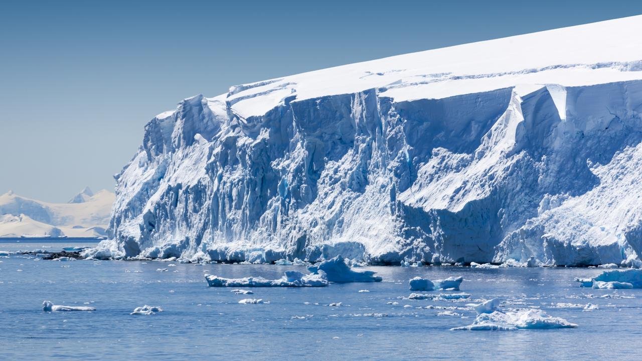
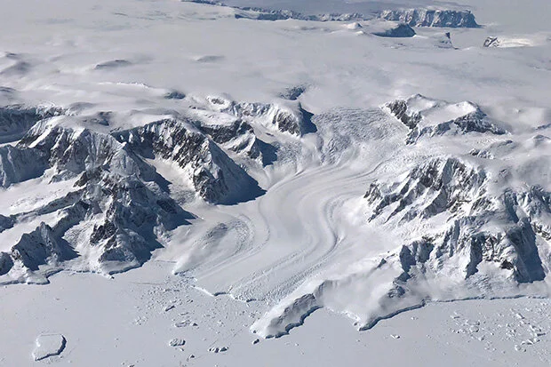
Low-lying atoll islands consist of a ring-shaped coral reef partly or completely encircling a shallow green lagoon in the midst of a deep blue sea. Perched just a few meters above sea level, these coral-reef islands are susceptible to rising waters that can cause flooding, damage to infrastructure and the intrusion of saltwater into groundwater. Such concerns are behind the grim prognosis that islanders will become “climate refugees,” forced to leave their homes as the oceans rise.

However, two recent studies conclude that this threat is unfounded. A 2021 study analyzed changes in land area on 221 atolls in the Indian and Pacific Oceans, utilizing cloud-free imagery from Landsat satellites. The atolls studied are shown in red in the following figure. Apart from the Maldives and Tuvalu, the dataset included islands in the South China Sea, the Marshall Islands and French Polynesia.

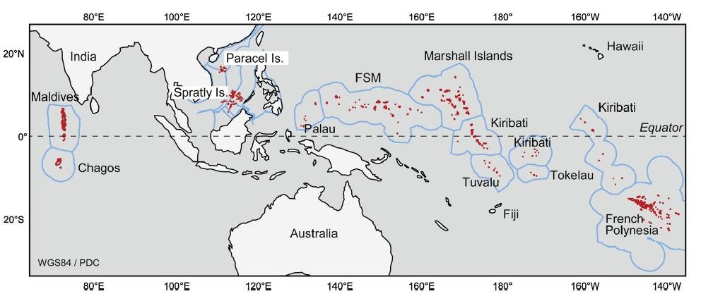
The study found that the total land area of the atolls increased by 6.1% between 2000 and 2017, from 1,008 to 1,069 square kilometers (389 to 413 square miles). Most of the gain was from the Maldives and South China Sea atolls, which together accounted for 88% of the total increase, and came from artificial building of islands within those areas for development of infrastructure, extra land and resorts.

As shown in the next figure, the areas of two island groups – French Polynesia and Palau – did diminish over the study period. Although these two groups accounted for 68 of the 221 atolls studied, the combined decrease represents only 0.15% of the global total area. The Republic of the Marshall Islands is designated as RMI; the percentages at the bottom of the figure are the increases or decreases of the individual island groups.

An earlier study by the same researchers analyzed shoreline changes in the 101 reef islands of the Pacific nation of Tuvalu between 1971 and 2014; this excluded the 9 atolls forming part of the subsequent study. During these 43 years the local sea level rose at twice the global average, at a rate of 3.9 mm (about 1/8 of an inch) per year. But despite surging seas, the total land area of the 101 islands expanded by 2.9% over the slightly more than four decades. The changes are illustrated in the figure below, where the areas on the horizontal axis and the changes on the vertical axis are measured in hectares (ha).

Altogether, 73 reef islands grew in size – some by more than 100% – and the other 28 shrank, though by a smaller average amount. Light blue circles enclosing symbols in the figure denote populated islands. Tuvalau is home to 10,600 people, half of whom live on the urban island of Fogafale in Funafuti atoll. Fogafale expanded by 3% or 4.6 hectares (11.4 acres) over the 43-year study period.

Concerns about rising seas in the Maldives, the world’s lowest country, gained worldwide attention in 2009 when the Maldivian president and cabinet held an underwater meeting at the bottom of a turquoise lagoon. But the theatrics of ministers clad in black diving suits and goggles, signing a document asking all countries to reduce their CO2 emissions, were unnecessary. A research paper published subsequently in 2018 by Northumbria University scientists found that the Maldives actually formed when sea levels were even higher than they are today.

The researchers studied the formation of five atoll rim islands in the southern Maldives, by drilling cores in sand- and gravel-based reefs. A timeline was established by radiocarbon dating. What they found was that the islands formed approximately three to four thousand years ago, through the pounding on the reefs of large waves caused by distant storms off the coast of South Africa.

These large waves, known as high-energy wave events, broke coral debris off the reefs and transported it onto reef platforms, initiating reef island growth. Sea levels at that time were at least 0.5 meters (1.6 feet) higher than they are today, so the waves had more energy than current ocean swells. Further vertical reef growth is possible in the future, the study authors say, as sea levels continue to rise and large wave events increase, accompanied by sedimentation.

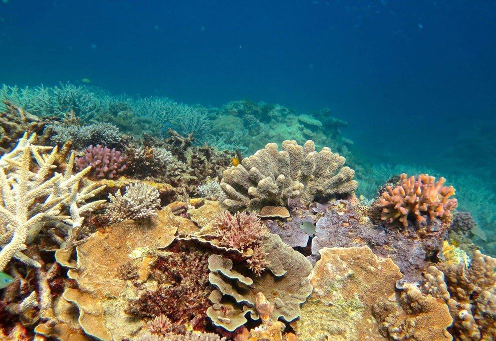
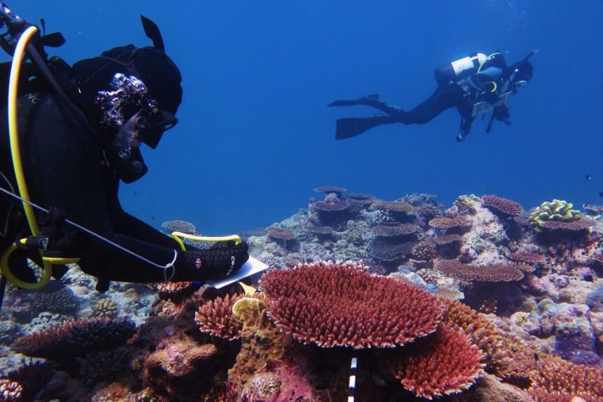
Next: Little Evidence That Global Warming Is Causing Extinction of Coral Reefs

No Evidence That Thwaites Glacier in Antarctica Is about to Collapse

Contrary to recent widespread media reports and dire predictions by a team of earth scientists, Antarctica’s Thwaites Glacier – the second fastest melting glacier on the continent – is not on the brink of collapse. The notion that catastrophe is imminent stems from a basic misunderstanding of ice sheet dynamics in West Antarctica.

The hoopla began with publication of a research study in November 2021 and a subsequent invited presentation to the AGU (American Geophysical Union). Both postulated that giant cracks recently observed in the Thwaites Eastern Ice Shelf (pictured to the left) may cause the whole ice shelf to shatter within as little as five years. The cracks result from detachment of the ice shelf’s seaward edge from an underwater mountain about 40 kilometers (25 miles) offshore that pins the shelf in place like a cork in a bottle.

Because the ice shelf already floats on the ocean, collapse of the shelf itself and release of a flotilla of icebergs wouldn’t cause global sea levels to rise. But the researchers argue that loss of the ice shelf would speed up glacier flow, increasing the contribution to sea level rise of the Thwaites Glacier – often dubbed the “doomsday glacier” – from 4% to 25%. A sudden increase of this magnitude would have a devastating impact on coastal communities worldwide. The glacier’s location is indicated by the lower red dot in the figure below.  

But such a drastic scenario is highly unlikely, says geologist and UN IPCC expert reviewer Don Easterbrook. The misconception is about the submarine “grounding” of the glacier terminus, the boundary between the glacier and its ice shelf extending out over the surrounding ocean, as illustrated in the next figure.

The grounding line of the Thwaites Glacier, shown in red in the left figure below, has been retreating since 2000. According to the study authors, this spells future disaster: the retreat, they say, will lead to dynamic instability and greatly accelerated discharge of glacier ice into the ocean, by as much as three times.

As evidence, the researchers point to propagating rifts on the top of the ice shelf and basal crevasses beneath it, both of which are visible in the satellite image above, the rifts as diagonal lines and the crevasses as nearly vertical ones. The crevasses arise from basal melting produced by active volcanoes underneath West Antarctica combined with so-called circumpolar deep water warmed by climate change.

However, as Easterbrook explained in response to a 2014 scare about the adjacent Pine Island glacier, this reasoning is badly flawed since a glacier is not restrained by ice at its terminus. Rather, the terminus is established by a balance between ice gains from snow accumulation and losses from melting and iceberg calving. The removal of ice beyond the terminus will not cause unstoppable collapse of either the glacier or the ice sheet behind it.

Other factors are important too, one of which is the source area of Antarctic glaciers. Ice draining into the Thwaites Glacier is shown in the right figure above in dark green, while ice draining into the Pine Island glacier is shown in light green; light and dark blue represent ice draining into the Ross Sea to the south of the two glaciers. The two glaciers between them drain only a relatively small portion of the West Antarctic ice sheet, and the total width of the Thwaites and Pine Island glaciers constitutes only about 170 kilometers (100 miles) of the 4,000 kilometers (2,500) miles of West Antarctic coastline.

Of more importance are possible grounding lines for the glacier terminus. The retreat of the present grounding line doesn’t mean an impending calamity because, as Easterbrook points out, multiple other grounding lines exist. Although the base of much of the West Antarctic ice sheet, including the Thwaites glacier, lies below sea level, there are at least six potential grounding lines above sea level, as depicted in the following figure showing the ice sheet profile. A receding glacier could stabilize at any of these lines, contrary to the claims of the recent research study.

As can be seen, the deepest parts of the subglacial basin lie beneath the central portion of the ice sheet where the ice is thickest. What is significant is the ice thickness relative to its depth below sea level. While the subglacial floor at its deepest is 2,000 meters (6,600 feet) below sea level, almost all the subglacial floor in the above profile is less than 1,000 meters (3,300 feet) below the sea. Since the ice is mostly more than 2,500 meters (8,200 ft) thick, it couldn’t float in 1,000 meters (3,300 feet) of water anyway.

Next: Science Under Renewed Attack: New Zealand Proposal to Equate Maori Mythology with Science

Sudden Changes in Ocean Currents Warmed Arctic, Cooled Antarctic in Past

Abrupt changes in ocean currents – and not greenhouse gases – were responsible for sudden warming of the Arctic and for sudden cooling in the Antarctic at different times in the past, according to two recent research studies. The Antarctic cooling marked the genesis of the now massive Antarctic ice sheet.

The first study, by a team of European scientists, discovered that the expansion of warm Atlantic Ocean water flowing into the Arctic caused sea surface temperatures in the Fram Strait east of Greenland to rise by about 2 degrees Celsius (3.6 degrees Fahrenheit) as early as 1900. The phenomenon, known as “Atlantification” of the Arctic, is important because it precedes instrumental measurements of the effect by several decades and is not simulated by computer climate models.

The conclusion is based on an 800-year reconstruction of Atlantification along the Fram Strait, which separates Atlantic waters from the Arctic Ocean. The researchers used marine sediment cores as what they call a “natural archive” of past climate variability, deriving the chronological record from radionuclide dating.

Shown in the figure below is the sea surface temperature and Arctic sea ice extent from 1200 to 2000. The blue curve represents the reconstructed mean summer temperature (in degrees Celsius) of Atlantic waters in the eastern Fram strait, while the red curve indicates the April retreat (in kilometers) of the sea ice edge toward the Arctic. You can see clearly that the seawater temperature increased abruptly around 1900, after centuries of remaining constant, and that sea ice began to retreat at the same time, after at least a century of extending about 200 kilometers farther into the strait.

Along with temperature, the salinity of Atlantic waters in the strait suddenly increased also. The researchers suggest that this Atlantification phenomenon could have been due to weakening of two ocean currents – the AMOC (Atlantic Meridional Overturning Circulation) and the SPG (Subpolar Gyre), a circular current south of Greenland – at the end of the Little Ice Age. The AMOC forms part of the ocean conveyor belt that redistributes seawater and heat around the globe.

This abrupt change in ocean currents is thought to have redistributed nutrients, heat and salt in the northeast Atlantic, say the study authors, but is unlikely to be associated with greenhouse gases. The change caused subtropical Atlantic waters to flow northward through the Fram Strait, as illustrated schematically in the figure below; the halocline is the subsurface layer in which salinity changes sharply from low (at the surface) to high. The WSC (West Spitsbergen Current) carries heat and salt to the Arctic and keeps the eastern Fram Strait ice-free.

Sudden cooling occurred in the Antarctic but millions of years earlier, a second study has found. Approximately 34 million years ago, a major reorganization of ocean currents in the Southern Ocean resulted in Antarctic seawater temperatures abruptly falling by as much as 5 degrees Celsius (9 degrees Fahrenheit). The temperature drop initiated growth of the Antarctic ice sheet, at the same time that the earth underwent a drastic transition from warm Greenhouse to cold Icehouse conditions.

This dramatic cooling was caused by tectonic events that opened up two underwater gateways around Antarctica, the international team of researchers says. The gateways are the Tasmanian Gateway, formerly a land bridge between Antarctica and Tasmania, and Drake Passage, once a land bridge from Antarctica to South America. The scientists studied the effect of tectonics using a high-resolution ocean model that includes details such as ocean eddies and small-scale seafloor roughness.

After tectonic forces caused the two land bridges to submerge, the present-day ACC (Antarctic Circumpolar Current) began to flow. This circumpolar current, although initially less strong than today, acted to weaken the flow of warm waters to the Antarctic coast. As the two gateways slowly deepened, the warm-water flow weakened even further, causing the relatively sudden cooling event.

Little cooling occurred before one or both gateways subsided to a depth of more than 300 meters (1,000 feet). After the second gateway had subsided from 300 meters (1,000 feet) to 600 meters (2,000 feet), surface waters along the entire Antarctic coast cooled by 2 to 3.5 degrees Celsius (3.6 to 6.3 degrees Fahrenheit). And once the second gateway had subsided below 600 meters (2,000 feet), the temperature of Antarctic coastal waters decreased another 0.5 to 2 degrees Celsius (0.9 to 3.6 degrees Fahrenheit). The next figure depicts the gradual opening of the two gateways.

Although declining CO2 levels in the atmosphere may have played a minor role, the study authors conclude that undersea tectonic changes were the key factor in altering Southern Ocean currents and in creating our modern-day Icehouse world.

Next: No Evidence That Thwaites Glacier in Antarctica Is about to Collapse

El Niño and La Niña May Influence the Climate More than Greenhouse Gases

The familiar El Niño and La Niña cycles are known to cause drastic fluctuations in global temperature, along with often catastrophic climatic effects in tropical regions of the Pacific Ocean. What is less well known is that the powerful ocean oscillations have been a feature of our climate for at least 20,000 years – that is, since before the most recent ice age ended.

A 2005 study established a complete record of El Niño events in the southeastern Pacific, by examining marine sediment cores drilled off the coast of Peru. The cores contain an El Niño signature in the form of tiny, fine-grained stone fragments, washed into the sea by multiple Peruvian rivers following floods on the continent caused by heavy El Niño rainfall. As indicated in the adjacent figure, the study site was approximately 80 kilometers (50 miles) from Lima at a depth of 184 meters (604 feet).

Northern Peru sees the heaviest El Niño rainfall, generating floods capable of dispersing large amounts of fine-grained river sediments. Smaller amounts of rainfall in central and southern Peru, which are not caused by El Niño, don’t result in flooding with the same dispersal capability.

The study authors classified the flood event signal as very strong when the concentration of stone fragments, known as lithics, was more than two standard deviations above the centennial mean. The frequency of these very strong events over the last 12,000 years is illustrated in the next figure; the black and gray bars show the frequency as the number of 500- and 1,000-year floods, respectively. Radiocarbon dating of the sediment cores was used to establish the timeline.

It can be seen that the number of very strong Peruvian flood events peaked around 9,500 years ago and again about 2,500 years ago, since when the number has been decreasing. No extreme floods occurred at all from about 5,500 to 7,500 years in the past.

A more detailed record is presented in the following figure, showing the variation over 20,000 years of the sea surface temperature off Peru (top), the lithic concentration (bottom) and a proxy for lithic concentration (middle). Sea surface temperatures were derived from chemical analysis of the marine sediment cores.

As indicated in this figure, the lithic concentration and therefore El Niño strength were high around 2,000 and 10,000 years ago – approximately the same periods when the most devastating floods occurred. The figure also reveals the absence of strong El Niño activity from 5,500 to 7,500 years ago, a dry interval without any major Peruvian floods.

But it’s seen that El Niños were strong in other eras too. During this 20,000-year span, El Niños first became prominent between 17,000 and 16,000 years before now, at the same time that sea surface temperatures jumped several degrees. The initial rise in both El Niños and ocean temperature was followed by roughly centennial fluctuations, alternating between weaker and stronger El Niño activity. After the gap from 7,500 to 5,500 years ago, El Niños surged again, as did sea surface temperatures.

On a finer scale, El Niños during the last two millennia were distinctly stronger than their modern counterparts between 2,000 and 1,300 years ago, then relatively weak during the MWP (Medieval Warm Period) from about 800 (1,300 years ago) to 1300. During the LIA (Little Ice Age) from about 1500 to 1850, El Niños strengthened once more before falling back to their present-day levels.

It may seem counterintuitive that El Niños, which release vast amounts of heat from the Pacific Ocean into the atmosphere and often raise the global temperature by several tenths of a degree for a year or so, are associated historically with prolonged periods of cooling such as the LIA. But ecologist Jim Steele has explained this phenomenon as arising from the absence of La Niña conditions during an El Niño. La Niña is the cool phase of the so-called ENSO (El Niño–Southern Oscillation), El Niño being the warm phase.

In a La Niña event, east to west trade winds cause warm water heated by the sun to pile up in the western tropical Pacific. This removes solar‑heated water from the eastern Pacific, resulting in upwelling of cooler subsurface waters there that replace the surface waters transported to the west and cause a temporary decline in global temperatures. But at the same time, the ocean gains heat at greater depths.

With the absence of this recharging of ocean heat during an El Niño, global cooling sets in for an extended period. Such cooling is usually associated with lower heat output from the sun, characterized by a falloff in the average monthly number of sunspots. Conversely, La Niñas usually accompany periods of higher solar output and result in extended global warming, as occurred during the MWP.

El Niño and La Niña have been major influences on our climate for many millennia and will continue to be. Until they are better understood, we can’t be sure they play less of a role in global warming than greenhouse gases.

Next: Sudden Changes in Ocean Currents Warmed Arctic, Cooled Antarctic in Past

Ice Sheet Update (1): Evidence That Antarctica Is Cooling, Not Warming

Melting due to climate change of the Antarctic and Greenland ice sheets has led to widespread panic about the future impact of global warming. But, as we’ll see in this and a subsequent post, Antarctica may not be warming overall, while the rate of ice loss in Greenland has slowed recently.

The kilometers-thick Antarctic ice sheet contains about 90% of the world’s freshwater ice and would raise global sea levels by about 60 meters (200 feet) were it to melt completely. The Sixth Assessment Report of the UN’s IPCC (Intergovernmental Panel on Climate Change) maintains with high confidence that, between 2006 and 2018, melting of the Antarctic ice sheet was causing sea levels to rise by 0.37 mm (15 thousandths of an inch) per year, contributing about 10% of the global total.

By far the largest region is East Antarctica, which covers two thirds of the continent as seen in the figure below and holds nine times as much ice by volume as West Antarctica. The hype about imminent collapse of the Antarctic ice sheet is based on rapid melting of the glaciers in West Antarctica; the glaciers contribute an estimated 63% (see here) to 73% (here) of the annual Antarctic ice loss. East Antarctica, on the other hand, may not have shed any mass at all – and may even have gained slightly – over the last three decades, due to the formation of new ice resulting from enhanced snowfall.  

The influence of global warming on Antarctica is uncertain. In an earlier post, I reported the results of a 2014 research study that concluded West Antarctica and the small Antarctic Peninsula, which points toward Argentina, had warmed appreciably from 1958 to 2012, but East Antarctica had barely heated up at all over the same period. The warming rates were 0.22 degrees Celsius (0.40 degrees Fahrenheit) and 0.33 degrees Celsius (0.59 degrees Fahrenheit) per decade, for West Antarctica and the Antarctic Peninsula respectively – both faster than the global average.

But a 2021 study reaches very different conclusions, namely that both West Antarctica and East Antarctica cooled between 1979 and 2018, while the Antarctic Peninsula warmed but at a much lower rate than found in the 2014 study. Both studies are based on reanalyses of limited Antarctic temperature data from mostly coastal meteorological stations, in an attempt to interpolate temperatures in the more inaccessible interior regions of the continent.

This later study appears to carry more weight as it incorporates data from 41 stations, whereas the 2014 study includes only 15 stations. The 2021 study concludes that East Antarctica and West Antarctica have cooled since 1979 at rates of 0.70 degrees Celsius (1.3 degrees Fahrenheit) per decade and 0.42 degrees Celsius (0.76 degrees Fahrenheit) per decade, respectively, with the Antarctic Peninsula having warmed at 0.18 degrees Celsius (0.32 degrees Fahrenheit) per decade.

It’s the possible cooling of West Antarctica that’s most significant, because of ice loss from thinning glaciers. Ice loss and gain rates from Antarctica since 2003, measured by NASA’s ICESat satellite, are illustrated in the next figure, in which dark reds and purples show ice loss and blues show gain.

The high loss rates along the coast of West Antarctica have been linked to thinning of the floating ice shelves that terminate glaciers, by so-called circumpolar deep water warmed by climate change. Although disintegration of an ice shelf already floating on the ocean doesn’t raise sea levels, a retreating ice shelf can accelerate the downhill flow of glaciers that feed the shelf. It’s thought this can destabilize the glaciers and the ice sheets behind them.

However, not all the melting of West Antarctic glaciers is due to global warming and the erosion of ice shelves by circumpolar deep water. As I’ve discussed in a previous post, active volcanoes underneath West Antarctica are melting the ice sheet from below. One of these volcanoes is making a major contribution to melting of the Pine Island Glacier, which is adjacent to the Thwaites Glacier in the first figure above and is responsible for about 25% of the continent’s ice loss.

If the Antarctic Peninsula were to cool along with East Antarctica and West Antarctica, the naturally occurring SAM (Southern Annular Mode) – the north-south movement of a belt of strong southern westerly winds surrounding Antarctica – could switch from its present positive phase to negative. A negative SAM would result in less upwelling of circumpolar deep water, thus reducing ice shelf thinning and the associated melting of glaciers.

As seen in the following figure, the 2021 study’s reanalysis of Antarctic temperatures shows an essentially flat trend for the Antarctic Peninsula since the late 1990s (red curve); warming occurred only before that time. The same behavior is even evident in the earlier 2014 study, which goes back to 1958. So future cooling of the Antarctic Peninsula is not out of the question. The South Pole in East Antarctica this year experienced its coldest winter on record.

Peninsula.jpg

Next: Ice Sheet Update (2): Evidence That Greenland Melting May Have Slowed Down

Sea Ice Update: No Evidence for Recent Ice Loss

Climate activists have long lamented the supposedly impending demise of Arctic sea ice due to global warming. But, despite the constant drumbeat of apocalyptic predictions, the recently reached minimum extent of Arctic ice in 2021 is no smaller than it was back in 2008.  And at the other end of the globe, the sea ice around Antarctica has been expanding for at least 42 years.

Scientific observations of sea ice in the Arctic and Antarctic have only been possible since satellite measurements began in 1979. The figure below shows satellite-derived images of Arctic sea ice extent in the summer of 1979 (left image), and the summer (September) and winter (March) of 2021 (right image, with September on the left). Sea ice shrinks during summer months and expands to its maximum extent during the winter.

Blog 10-7-19 JPG(1).jpg
Arctic sea ice.jpg

Over the interval from 1979 to 2021, Arctic summer ice extent decreased by approximately 30%; while it still embraces northern Greenland, it no longer reaches the Russian coast. The left graph in the next figure compares the monthly variation of Arctic ice extent from its March maximum to the September minimum, for the years 2021 (blue curve) and 2008 (green curve). The 2021 summer minimum is seen to be almost identical to that in 2008, with the black curve depicting the median extent over the period from 1981 to 2010.

Arctic sea ice volume 9-16.jpg

The right graph in the figure shows the estimated month-by-month variation of Arctic ice volume in recent years. The volume depends on both ice extent and its thickness, which varies with location as well as season – the thickest, and oldest, winter ice currently lying along the northern coasts of the Canadian Arctic Archipelago and Greenland.

Arctic ice thickness is notoriously difficult to measure, the best data coming from limited submarine observations. According to one account based on satellite data, more than 75% of the Arctic winter ice pack today consists of thin ice just a few months old, whereas in the past it was only 50%. However, these estimates are unreliable and a trio of Danish research institutions that monitor the Arctic estimate that the ice volume has changed very little over the last 17 years, as seen in the figure above.

Another indication that Arctic ice is not melting as fast as climate activists claim is the state of the Northwest Passage – the waterway between the Atlantic and Pacific Oceans through the Arctic Ocean, along the coast of North America. Although both the southern and northern routes of the Northwest Passage have been open intermittently since 2007, ice conditions this year are relatively severe compared to the past two decades: thicker multiyear ice is the main hazard. The northern deep-water route is already choked with ice and will not open until at least next year.

In the Antarctic, sea ice almost disappears completely during the southern summer and reaches its maximum extent in September, at the end of winter. This is illustrated in the satellite-derived images below, showing the summer minimum (left image) and winter maximum extent (right image) in 2021. The Antarctic winter sea ice extent is presently well above its long-term average.

In fact, despite the long-term loss of ice in the Arctic, the sea ice around Antarctica has expanded slightly during the satellite era, as shown in the following figure up to 2020. Although the maximum Antarctic ice extent (shown in red) fluctuates greatly from year to year, and took a tumble in 2017, it has grown at an average rate between 1% and 2% per decade (dashed red line) since 1979.

Note that the ice losses shown in this figure are “anomalies,” or departures from the monthly mean ice extent for the period from 1981 to 2010, rather than the minimum extent of summer ice. So the Arctic data don’t reveal how the 2021 minimum was almost identical to 2008, as illustrated in the earlier figures.

Several possible reasons have been put forward for the greater fluctuations in Antarctic winter sea ice compared to that in the Arctic. One analysis links the Antarctic oscillations to ENSO (the El Niño – Southern Oscillation), a natural cycle that causes variations in mean temperature and other climatic effects in tropical regions of the Pacific Ocean. The Pacific impinges on a substantial portion of the Southern Ocean that surrounds Antarctica.

The analysis suggests that the very large winter ice extents of 2012, 2013 and 2014 were a consequence of the 2012 La Niña, which is the cool phase of ENSO. Reinforcing that idea is the fact that this year’s surge in ice extent follows another La Niña earlier in 2021; the big loss of sea ice in 2017 could be associated with 2016’s strong El Niño, the warm phase of ENSO. The natural Pacific Decadal Oscillation may also play a role.

Next: Ice Sheet Update (1): Evidence That Antarctica Is Cooling, Not Warming

New Doubts on Climatic Effects of Ocean Currents, Clouds

Recent research has cast doubt on the influence of two watery entities – ocean currents and clouds – on future global warming. But, unlike many climate studies, the two research papers are grounded in empirical observations rather than theoretical models.

The first study examined so-called deep water formation in the Labrador Sea, located between Greenland and Canada in the North Atlantic Ocean, and its connection to the strength of the AMOC (Atlantic Meridional Overturning Circulation). The AMOC forms part of the ocean conveyor belt that redistributes seawater and heat around the globe. Despite recent evidence to the contrary, computer climate models have predicted that climate change may weaken the AMOC or even shut it down altogether.  

Deep water formation, which occurs in a few localized areas across the world, refers to the sinking of cold, salty surface water to depths of several kilometers because it’s denser than warm, fresher water; winter winds in the Labrador Sea both cool the surface and increase salinity through evaporation. Most climate models link any decline in North Atlantic deep water formation, due to global warming, to decreases in the strength of the AMOC.

But the researchers found that winter convection in the Labrador Sea and the adjacent Irminger Sea (east of Greenland) had very little impact on deep ocean currents associated with the AMOC, over the period from 2014 to 2018. Their observational data came from a new array of seagoing instruments deployed in the North Atlantic, including moorings anchored on the sea floor, underwater gliders and submersible floats. The devices measure ocean current, temperature and salinity.

Results for the strength of the AMOC are illustrated in the figure below, in which “OSNAP West” includes the Labrador and Irminger Seas while the more variable “OSNAP East” is in the vicinity of Iceland. As can be seen, the AMOC in the Labrador Sea didn’t change on average during the whole period of observation. The study authors caution, however, that measurements over a longer time period are needed to confirm their conclusion that strong winter cooling in the Labrador Sea doesn’t contribute significantly to variability of the AMOC.

Fig 1.jpg

Understanding the behavior of the AMOC is important because its strength affects sea levels, as well as weather in Europe, North America and parts of Africa. Variability of the AMOC is thought to have caused multiple episodes of abrupt climate change, in a decade or less, during the last ice age.

The second study to question the effect of water on global warming involves clouds. As I described in an earlier post, the lack of detailed knowledge about clouds is one of the major limitations of computer climate models. One problem with the existing models is that they simulate too much rainfall from “warm” clouds and, therefore, underestimate their lifespan and cooling effect.

Warm clouds contain only liquid water, compared with “cool” clouds that consist of ice particles mixed with water droplets. Since the water droplets are usually smaller than the ice particles, they have a larger surface area to mass ratio which makes them reflect the sun’s radiation more readily. So warm clouds block more sunlight and produce more cooling than cool, icy clouds. At the same time, warm clouds survive longer because they don’t rain as much.

The research team used satellite data to ascertain how much precipitation from clouds occurs in our present climate. The results for warm clouds are illustrated in the following map showing the warm-rain fraction; red designates 100% warm rain, while various shades of blue indicate low fractions. As would be expected, most warm rain falls near the equator where temperatures are highest. It also falls predominantly over the oceans.

Fig 2.jpg

The researchers then employed the empirical satellite data for rainfall to modify the warm-rain processes in an existing CMIP6 climate model (the latest generation of models). The next figure, which shows the probability of rain from warm clouds at different latitudes, compares the satellite data (gray) to the model results before (maroon) and after (yellow) modification.

Fig 3.jpg

It’s seen that the modified climate model is in much better agreement with the satellite data, except for a latitude band just north of the equator, and is also a major improvement over the unmodified model. The scientists say that their correction to the model makes negative “cloud-lifetime feedback” – the process by which higher temperatures inhibit warm clouds from raining as much and increases their lifetime – almost three times larger than in the original model.

This larger cooling feedback is enough to account for the greater greenhouse warming predicted by CMIP6 models compared with earlier CMIP5 models. But, as the study tested only a single model, it needs to be extended to more models before that conclusion can be confirmed.

Next: Could Pacific Northwest Heat Wave, European Floods Have Been Caused by the Sun?

Fishy Business: Alleged Fraud over Ocean Acidification Research, Reversal on Coral Extinction

In the news recently have been two revelations about the sometimes controversial world of coral reef research. The first is fraud allegations against research claiming that ocean acidification from global warming impairs the behavior of coral reef fish. The second is an about-face on inflated estimates for the extinction risk of Pacific Ocean coral species due to climate change. 

The alleged fraud involves 22 research papers authored by Philip Munday, a marine ecologist at JCU (James Cook University) in Townsville, Australia and Danielle Dixson, a U.S. biologist who completed her PhD under Munday’s supervision in 2012. The fraud charges were made in August 2020 by three of an international group of mostly biological and environmental scientists, plus the group leader, fish physiologist Timothy Clark of Deakin University in Geelong, Australia. The Clark group says it will publicize the alleged data problems shortly.

The research in question studied the behavior of coral reef fish in slightly acidified seawater, in order to simulate the effect of ocean acidification caused by the absorption of up to 30% of humanity’s CO2 emissions. The additional CO2 has so far lowered the average pH – a measure of acidity – of ocean surface water from about 8.2 to 8.1 since industrialization began in the 18th century.

Munday and Dixson claim that the extra CO2 causes reef fish to be attracted by chemical cues from predators, instead of avoiding them; to become hyperactive and disoriented; and to suffer loss of vision and hearing. But Clark and his fellow scientists, in their own paper published in January 2020, debunk all of these conclusions. Most damningly of all, the researchers find that the reported effects of ocean acidification on the behavior of coral reef fish are not reproducible – the basis for their fraud allegations against the JCU work.

In a published rebuttal, Munday and Dixson say that the Clark group’s replication study differed from the original research “in at least 16 crucial ways” and didn’t acknowledge other papers that support the JCU position.

Nevertheless, while the university has dismissed the allegations after a preliminary investigation, Science magazine points out that a 2016 paper by another former PhD student of Munday’s was subsequently deemed fraudulent and retracted. And Clark and his colleagues say they have evidence of manipulation in publicly available raw data files for two papers published by Munday’s research laboratory, as well as documentation of large and “statistically impossible” effects from CO2 reported in many of the other 20 allegedly fraudulent papers.

Coral reef fish.jpg

CREDIT: ALEX MUSTARD/MINDEN PICTURES

The about-turn on coral extinction involves another JCU group, the university’s Centre of Excellence for Coral Reef Studies. Four Centre researchers published a paper in March 2021 that completely contradicts previous apocalyptic predictions of the imminent demise of coral reefs, predictions that include an earlier warning by three of the same authors of ongoing coral degradation from global warming.

As an example of past hype, the IUCN (International Union for Conservation of Nature) states on its website that 33% of all reef-building corals are at risk of extinction. The IUCN is highly regarded for its assessments of the world’s biodiversity, including evaluation of the extinction risk of thousands of species. An even more pessimistic environmental organization suggests that more than 90% of the planet’s coral reefs may be extinct by 2050.

The recent JCU paper turns all such alarming prophecies on their head. But the most astounding revelation is perhaps the sheer number of corals estimated to exist on reefs across the Pacific Ocean, from Indonesia to French Polynesia – approximately half a trillion, similar to the number of trees in the Amazon, or birds in the world. To estimate abundances, the JCU scientists used a combination of coral reef habitat maps and counts of coral colonies.

This colossal population is for a mere 300 species, a small fraction of the 2,175 coral species estimated to exist worldwide by the IUCN. And of the 80 species considered by the IUCN to be at an elevated risk of extinction, those in its “critically endangered” and “endangered” categories, 12 species have estimated Pacific populations of over a billion colonies. One of the study’s authors remarks that the eight most common coral species in the region each have a population size larger than the 7.8 billion people on Earth.

The implication of this stunning research is that the global extinction risk of most coral species is lower than previously estimated, even though a local loss can be ecologically devastating to coral reefs in the vicinity. So any future extinctions due to global warming are unlikely to unfold rapidly, if at all.

Next: New Doubts on the Climatic Effects of Ocean Currents, Clouds

What Triggered the Ice Ages? The Uncertain Role of CO2

About a million years ago, the earth’s ice ages became colder and longer – with a geologically sudden jump from thinner, smaller glaciers that came and went every 41,000 years to thicker, larger ice sheets that persisted for 100,000 years. Although several hypotheses have been put forward to explain this transition, including a long-term decline in the atmospheric CO2 level, the phenomenon remains a scientific conundrum.

Two research teams spearheaded by geologists from Princeton University have recently described their attempts to resolve the mystery. A 2019 study measured the CO2 content in two-million-year-old ice cores extracted from Antarctica, which are by far the oldest cores ever recovered and span the puzzling transition to a 100,000-year ice age cycle that occurred a million years before. A just reported 2020 study utilized seabed sediment cores from the Antarctic Ocean to investigate storing of CO2 in the ocean depths over the last 150,000 years.

Both studies recognize that the prolonged deep freezes of the ice ages are set off partly by perpetual but regular changes in the earth’s orbit around the sun. That’s the basis of a hypothesis proposed by Serbian engineer and meteorologist Milutin Milankovitch. As shown in the figure below, the earth orbits the sun in an elliptical path and spins on an axis that is tilted. The elliptical orbit stretches and contracts over a 100,000-year cycle (top), while the angle of tilt or obliquity oscillates with a 41,000-year period (bottom), and the planet also wobbles on its axis in a 26,000-year cycle (center).

94_card_with_border.jpg

Milankovitch linked all three cycles to glaciation, but his hypothesis has been dogged by two persistent problems. First, it predicts a dominant 41,000-year cycle governed by obliquity, whereas the current pattern is ruled by the 100,000-year eccentricity cycle as mentioned above. Second, the orbital fluctuations thought to trigger the extended cooling cycles are too subtle to cause on their own the needed large changes in solar radiation reaching the planet – known as insolation. That’s where CO2 comes in, as one of various feedbacks that amplify the tiny changes that do occur.

Before the 2019 Princeton study, it had been suspected that the transition from 41,000-year to 100,000-year cycles was due to a long-term decline in the atmospheric CO2 level over both glacial and interglacial epochs. But that belief held when ice-core data went back only about 800,000 years. Armed with their new data from 2 million years in the past, the first Princeton team discovered surprisingly that the average CO2 level was unchanged over that time span, even though the minimum level dropped after the transition to longer ice age cycles.

This means that the 100,000-year transition can’t be attributed to CO2, although CO2 feedback has been invoked to explain the relatively sudden temperature rise at the end of ice ages. Rather, said the study authors, the switch in ice age length was probably caused by enhanced growth of ice sheets or changes in global ocean circulation.

It’s another feedback process involving CO2 that was investigated by the second Princeton team, who made measurements on tiny fossils embedded in Antarctic Ocean sediments. While it has long been known that the atmospheric CO2 level and global temperatures varied in tandem over glacial cycles, and that CO2 lagged temperature, the causes of the CO2 fluctuations are not well understood.

We know that the oceans can hold more CO2 than the atmosphere. Because CO2 is less soluble in warm water than cooler water, CO2 is absorbed from the atmosphere by cold ocean water at the poles and released by warmer water at the equator. The researchers found that, during ice ages, the Antarctic Ocean stored even more CO2 than expected. Absorption in the Antarctic is enabled by the sinking of floating algae that carry CO2 deep into the ocean before becoming fossilized, a process referred to as the "biological carbon pump."

But some of the sequestered CO2 normally escapes, due to the strong eastward winds encircling Antarctica that drag CO2-rich deep water up to the surface and vent the CO2 back to the atmosphere. The new research provides evidence that this wind-driven Antarctic Ocean upwelling slowed down during the ice ages, allowing less CO2 to be vented and more to remain locked up in the ocean waters.

Apart from any effect this retention of CO2 may have had on ice-age temperatures, the researchers say their data suggests that the past lag of CO2 behind temperature may have been caused directly by the effect on Antarctic upwelling of changing obliquity in the earth’s orbit – Milankovitch’s 41,000-year cycle. The study authors believe this explains why the eccentricity and precession cycles now prevail over the obliquity cycle.

Next: Both Greenland and Antarctic Ice Sheets Melting from Below

No Evidence That 2020 Hurricane Season Was Record-Breaking

In a world that routinely hypes extreme weather events, it’s no surprise that the mainstream media and alarmist climate scientists have declared this year’s Atlantic hurricane season “unprecedented” and “record-shattering.” But the reality is that the season was merely so-so and no records fell.

While it’s true that the very active 2020 season saw a record-breaking 30 named storms, only 13 of these became hurricanes. That was fewer than the historical high of 15 recorded in 2005 and only one more than the 12 hurricanes recorded in 1969 and 2010, according to NOAA (the U.S. National Oceanic and Atmospheric Administration). The figure below shows the frequency of all Atlantic hurricanes from 1851 to 2020.

Atlantic hurricanes.jpg

Of 2020’s 13 hurricanes, only six were major hurricanes, less than the record eight in 1950 and seven in 1961 and 2005, as shown in the next figure. A major hurricane is defined as one in Category 3, 4 or 5 on the so-called Saffir-Simpson scale, corresponding to a top wind speed of 178 km per hour (111 mph) or greater. Although it appears that major Atlantic hurricanes were less frequent before about 1940, the lower numbers reflect the relative lack of observations in early years of the record. Aircraft reconnaissance flights to gather data on hurricanes only began in 1944, while satellite coverage dates only from the 1960s.

Atlantic major hurricanes.jpg

Despite the lack of any significant trend in Atlantic hurricanes in a warming world, the frequency of hurricanes globally is actually diminishing as seen in the following figure. The apparent slight increase in major hurricanes since 1981 has been ascribed to improvements in observational capabilities, rather than warming oceans that provide the fuel for hurricanes and typhoons.

Hurricane frequency global (Ryan Maue).jpg

As further evidence that recent hurricane activity is nothing unusual, the figure below depicts what is known as the ACE (Accumulated Cyclone Energy) index for the Atlantic basin from 1855 to 2020. The ACE index is an integrated metric combining the number of storms each year, how long they survive and how intense they become. Mathematically, the index is calculated by squaring the maximum sustained wind speed in a named storm every six hours that it remains above tropical storm intensity and summing that up for all storms in the season.

Atlantic ACE.jpg

For 2020, the Atlantic basin ACE index was 179.8, which ranks 13th behind 2017, 2005, the peak in 1933 and nine other years. For comparison, this year’s ACE index for the northwestern Pacific, where typhoons are common, was 148.5. The higher value for the Atlantic this year reflects the greater number of named storms.

NOAA attributes the enhanced number of atmospheric whirligigs in the Atlantic in recent years to the warm phase of the naturally occurring AMO (Atlantic Multi-Decadal Oscillation). The AMO, which has a cycle time of approximately 65 years and alternates between warm and cool phases, governs many extremes, such as cyclonic storms in the Atlantic basin and major floods in eastern North America and western Europe. The present warm phase began in 1995, marking the beginning of a period when both named Atlantic storms and hurricanes have become more common on average – as seen in the first two figures above.

Another contribution to storm activity in the Atlantic comes from La Niña cycles in the Pacific. Apart from a cooling effect, La Niñas result in quieter conditions in the eastern Pacific and heightened activity in the Atlantic. The current La Niña started several months ago and is expected to continue into 2021.

Despite NOAA’s recognition of what has caused so many Atlantic storms in 2020, activists continue to claim that climate change is making hurricanes stronger and more destructive and increasing the likelihood of more frequent major hurricanes. Pontificates Michael “hockey stick” Mann: “The impacts of climate change are no longer subtle. We’re seeing them play out right now in the form of unprecedented wildfires out West and an unprecedented hurricane season back East.”

Clearly, there’s no evidence for such nonsensical, unscientific statements.

Next: New Evidence That the Ancient Climate Was Warmer than Today’s

No Evidence for Dramatic Loss of Great Barrier Reef Corals

A 2020 study of the Great Barrier Reef that set alarm bells ringing in the mainstream media is based on faulty evidence, according to Australian scientist and leading coral reef authority, Professor Peter Ridd. The study claims that between 1995 and 2017 the reef lost half its corals, especially small baby colonies, because of global warming – but Ridd says the claims are false.

The breathtakingly beautiful Great Barrier Reef, labeled by CNN as one of the seven natural wonders of the world, is the planet’s largest living structure. Visible from outer space and 2,300 km (1,400 miles) long, the reef hugs the northeastern coast of Australia. A healthy portion of the reef is shown in the image below.

Ridd-GBF coral.jpg

CREDIT: DAVID CHILD, EVENING STANDARD.

But corals are susceptible to overheating and undergo bleaching when the water gets too hot, losing their vibrant colors. During the prolonged El Niño of 2016-17, higher temperatures caused mass bleaching that damaged portions of the northern and central regions of the Great Barrier Reef. Ridd’s fellow reef scientists contended at the time that as much as 30% to 95% of the reef’s corals died. However, Ridd disagreed, estimating that only 8% of the Great Barrier Reef suffered; much of the southern end of the reef wasn’t affected at all. 

Likewise, Ridd finds no evidence for the 50% loss of corals since 1995 claimed in the recent study. He says the most reliable data on coral extent comes from AIMS (the Australian Institute of Marine Science), who have been measuring over 100 reefs every year since 1986. As the following figure illustrates, AIMS data shows that coral cover fluctuates dramatically with time but there is approximately the same amount of Great Barrier Reef coral today as in 1995. Adds Ridd:

There was a huge reduction in coral cover in 2011 which was caused by two major cyclones that halved coral cover. Cyclones have always been the major cause of temporary coral loss on the Reef.

Ridd coral cover.jpg

It can be seen that the coral cover averages only about 20% in the years since 1986, when AIMS measurements began. But a 2019 research paper reported that the first reef expedition back in 1928-29 discovered very similar coverage: on a reef island known as Low Isles, the coral cover ranged from 8% to 42% in different parts of the island. So essentially no coral has disappeared over a period of 90 years that encompasses both warming and cooling periods.

The paper’s authors did find that the coral colonies on Low Isles were 30% smaller in 2019 than in 1928-29, and that coral “richness” had declined. Apart from its faulty conclusion about coral loss, the 2020 study also found smaller colony sizes throughout the reef, even though the relative abundance of large colonies was unchanged.

Nevertheless, the most recent AIMS report records small gains in the cover of hard corals in the central and southern Great Barrier Reef, following another mass bleaching event in late 2019. Hard corals are the primary reef-building corals; soft corals don’t form reefs.

Even more encouraging news for coral reef health comes from a just-reported survey of coral reefs on the opposite side of the country – the Rowley Shoals, a chain of three coral atolls 300 km (190 miles) off the coast of northwest Western Australia. Following an extensive marine heat wave in December 2019, an April 2020 survey found that up to 60% of the Rowley Shoals corals had become a pallid white (left image below). Yet a follow-up survey just six months later revealed that much of the bleached coral had already recovered (right image) and that perhaps only 10% of the reef had been killed.

Rowley Shoals bleaching.jpg
Rowley Shoals coral.jpg

CREDIT: WESTERN AUSTRALIA DBCA.

Tom Holmes, the marine monitoring coordinator at Western Australia’s DBCA (Department of Biodiversity, Conservation and Attractions), said "We were expecting to see widespread mortality, and we just didn't see it … which is a really amazing thing." Holmes explained that, while high ocean temperatures cause coral to bleach, what is less well known is that bleached corals don’t die immediately. Bleaching is initially just a sign of stress, but if the stress continues for a long time, it does lead to mortality.

However, Holmes – ever the cautious scientist – feels the reef may have been lucky and dodged a bullet this time. That’s because the marine heat wave that caused the bleaching was short-lived, dissipating at the end of the Australian summer a few months ago and giving the corals a chance to recover.

The resilience of the Rowley Shoals is no surprise to Ridd. Despite having been fired from his position at James Cook University in northern Queensland for his politically incorrect views on the Great Barrier Reef and climate change, Ridd continues to push the case for more accurate measurements and better quality assurance in coral reef science.

Next: No Evidence That 2020 Hurricane Season Was Record-Breaking

No Evidence That Marine Heat Waves Are Unusual

A new wrinkle in the narrative of human-induced global warming is the observation and study of marine heat waves. But, just as in other areas of climate science, the IPCC (Intergovernmental Panel on Climate Change) twists and hypes the evidence to boost the claim that heat waves at sea are becoming more common.

Marine heat waves describe extended periods of abnormally high ocean temperatures, just like atmospheric heat waves on land. The most publicized recent example was the “Blob,” a massive pool of warm water that formed in the northeast Pacific Ocean from 2013 to 2015, extending all the way from Alaska to the Baja Peninsula in Mexico as shown in the figure below, and up to 400 meters (1,300 feet) deep. Sea surface temperatures across the Blob averaged 3 degrees Celsius (5 degrees Fahrenheit) above normal. A similar temperature spike lasting for eight months was seen in Australia’s Tasman Sea in 2015 and 2016.

Recent Marine Heat Waves

OceanHeatWaveGlobe.jpg

The phenomenon has major effects on marine organisms and ecosystems, causing bleaching of coral reefs or loss of kelp forests, for example. Shellfish and small marine mammals such as sea lions and sea otters are particularly vulnerable, because the higher temperatures deplete the supply of plankton at the base of the ocean food chain. And toxic algae blooms can harm fish and larger marine animals.

OceanHeatWave kelp.jpg

Larger marine heat waves not only affect maritime life, but may also influence weather conditions on nearby land. The Blob is thought to have worsened California’s drought at the time, while the Tasman Sea event may have led to flooding in northeast Tasmania. The IPCC expresses only low confidence in such connections, however.   

Nevertheless, in its recent Special Report on the Ocean and Cryosphere in a Changing Climate, the IPCC puts its clout behind the assertion that marine heat waves doubled in frequency from 1982 to 2016, and that they have also become longer-lasting, more intense and more extensive. But these are false claims, for two reasons.

First, the observations supporting the claims were all made during the satellite era. Satellite measurements of ocean temperature are far more accurate and broader in coverage than measurements made by the old-fashioned methods that preceded satellite data. These cruder methods included placing a thermometer in seawater collected in wooden, canvas or insulated buckets tossed overboard from ships and hauled back on deck, or in seawater retained in ship engine-room inlets from several different depths; and data from moored or drifting buoys.

Because of the unreliability and sparseness of sea surface temperature data from the pre-satellite era, it’s obvious that earlier marine heat waves may well have been missed. Indeed, it would be surprising if no significant marine heat waves occurred during the period of record-high atmospheric temperatures of the 1930s, a topic discussed in a previous blog post.

The second reason the IPCC claims are spurious is that most of the reported studies (see for example, here and here) fail to take into account the overall ocean warming trend. Marine heat waves are generally measured relative to the average surface temperature over a 30-year baseline period. This means that any heat wave measured toward the end of that period will appear hotter than it really is, since the actual surface temperature at that time will be higher than the 30-year baseline. As pointed out by a NOAA (U.S. National Oceanic and Atmospheric Administration) scientist, not adjusting for the underlying warming falsely conflates natural regional variability with climate change.  

Even if the shortcomings of the data are ignored, it’s been found that from 1925 to 2016, the global average marine heatwave frequency and duration increased by only 34% and 17%, respectively – hardly dramatic increases. And in any case, the sample size for observations made since satellite observations began in 1982 is statistically small.

There’s no evidence, therefore, that marine heat waves are anything out of the ordinary.

Next: No Evidence That Snow Is Disappearing

Ocean Acidification: No Evidence of Impending Harm to Sea Life

ocean fish.jpg

Apocalyptic warnings about the effect of global warming on the oceans now embrace ocean acidification as well as sea level rise and ocean heating, both of which I’ve examined in previous posts. Acidification is a potential issue because the oceans absorb up to 30% of our CO2 emissions, according to the UN’s IPCC (Intergovernmental Panel on Climate Change). The extra CO2 increases the acidity of seawater.

But there’s no sign that any of the multitude of ocean inhabitants is suffering from the slightly more acidic conditions, although some species are affected by the warming itself. The average pH – a measure of acidity – of ocean surface water is currently falling by only 0.02 to 0.03 pH units per decade, and has dropped by only 0.1 pH units over the whole period since industrialization and CO2 emissions began in the 18th century. These almost imperceptible changes pale in comparison with the natural worldwide variation in ocean pH, which ranges from a low of 7.8 in coastal waters to a high of 8.4 in upper latitudes.

The pH scale sets 7.0 as the neutral value, with lower values being acidic and higher values alkaline. It’s a logarithmic scale, so a change of 1 pH unit represents a 10-fold change in acidity. A decrease of 0.1 units, representing a 26% increase in acidity, still leaves the ocean pH well within the alkaline range.    

The primary concern with ocean acidification is its effect on marine creatures – such as corals, some plankton, and shellfish – that form skeletons and shells made from calcium carbonate. The dissolution of CO2 in seawater produces carbonic acid (H2CO3), which in turn produces hydrogen ions (H+) that eat up any carbonate ions (CO32-) that were already present, depleting the supply of carbonate available to calcifying organisms, such as mussels and krill, for shell building.

Yet the wide range of pH values in which sea animals and plants thrive tells us that fears about acidification from climate change are unfounded. The figure below shows how much the ocean pH varies even at the same location over the period of one month, and often within a single day.

ocean pH over 1 month.jpg

In the Santa Barbara kelp forest (F in the figure), for example, the pH fluctuates by 0.5 units, a change in acidity of more than 200%, over 13 days; the mean variation in the Elkhorn Slough estuary (D) is a full pH unit, or a staggering 900% change in acidity, per day. Likewise, coral reefs (E) can withstand relatively large fluctuations in acidity: the pH of seawater in the open ocean can vary by 0.1 to 0.2 units daily, and by as much as 0.5 units seasonally, from summer to winter.

ocean coral.jpg

A 2011 study of coral formation in Papua New Guinea at underwater volcanic vents that exude CO2 found that coral reef formation ceased at pH values less than 7.7, which is 0.5 units below the pre-industrial ocean surface average of 8.2 units and 216% more acidic. However, at the present rate of pH decline, that point won’t be reached for at least another 130 to 200 years. In any case, there’s empirical evidence that existing corals are hardy enough to survive even lower pH values.

Australia’s Great Barrier Reef periodically endures surges of pronouncedly acid rainwater at the low pH of about 5.6 that pours onto the Reef from flooding of the Brisbane River, which has occurred 11 times since 1840. But the delicate corals have withstood the onslaught each time. And there have been several epochs in the distant past when the CO2 level in the atmosphere was much higher than now, yet marine species that calcify were able to persist for millions of years.

Nonetheless, advocates of the climate change narrative insist that marine animals and plants are headed for extinction if the CO2 level continues to rise, supposedly because of reduced fertility and growth rates. However, there’s a paucity of research conducted under realistic conditions that accurately simulates the actual environment of marine organisms. Acidification studies often fail to provide the organisms with a period of acclimation to lowered seawater pH, as they would experience in their natural surroundings, and ignore the chemical buffering effect of neighboring organisms on acidification.

Ocean acidification, often regarded as the evil twin of global warming, is far less of a threat to marine life than overfishing and pollution. In Shakespeare’s immortal words, the uproar over acidification is much ado about nothing.

Next: No Evidence That Marine Heat Waves Are Unusual

Ocean Heating: How the IPCC Distorts the Evidence

Part of the drumbeat accompanying the narrative of catastrophic human-caused warming involves hyping or distorting the supposed evidence, as I’ve demonstrated in recent posts on ice sheets, sea ice, sea levels and extreme weather. Another gauge of a warming climate is the amount of heat stashed away in the oceans. Here too, the IPCC (Intergovernmental Panel on Climate Change) and alarmist climate scientists bend the truth to bolster the narrative.

Perhaps the most egregious example comes from the IPCC itself. In its 2019 Special Report on the Ocean and Cryosphere in a Changing Climate, the IPCC declares that the world’s oceans have warmed unabated since 2005, and that the rate of ocean heating has accelerated – despite contrary evidence for both assertions presented in the very same report! It appears that catastrophists within the IPCC are putting a totally unjustified spin on the actual data.

Argo float being deployed.

Argo float being deployed.

Ocean heat, known technically as OHC (ocean heat content), is currently calculated from observations made by Argo profiling floats. These floats are battery-powered robotic buoys that patrol the oceans, sinking 1-2 km (0.6-1.2 miles) deep once every 10 days and then bobbing up to the surface, recording the temperature and salinity of the water as they ascend. When the floats eventually reach the surface, the data is transmitted to a satellite. Before the Argo system was deployed in the early 2000s, OHC data was obtained from older types of instrument.

The table below shows empirical data documented in the IPCC report, for the rate of ocean heating (heat uptake) over various intervals from 1969 to 2017, in two ocean layers: an upper layer down to a depth of 700 meters (2,300 feet), and a deeper layer from 700 meters down to 2,000 meters (6,600 feet). The data is presented in alternative forms: as the total heat energy absorbed by the global ocean yearly, measured in zettajoules (1021 joules), and as the rate of areal heating over the earth’s surface, measured in watts (1 watt = 1 joule per second) over one square meter.

OHC Table.jpg

Examination of the data in either form reveals clearly that in the upper, surface layer, the oceans heated less rapidly during the second half of the interval between 1993 and 2017, that is from 2005 to 2017, than during the first half from 1993 to 2005.

The same is true for the two layers combined, that is for all depths from the surface down to 2,000 meters (6,600 feet). When the two lines in the table above are added together, the combined layer heating rate was 9.33 zettajoules per year or 0.58 watts per square meter from 2005 to 2017, and 10.14 zettajoules per year or 0.63 watts per square meter from 1993 to 2017. Although these numbers ignore the large uncertainties in the measurements, they demonstrate that the ocean heating rate fell between 1993 and 2017.

Yet the IPCC has the audacity to state in the same report that “It is likely that the rate of ocean warming has increased since 1993,” even while correctly recognizing that the present heating rate is higher than it was back in 1969 or 1970. That the heating rate has not increased since 1993 can also be seen in the following figure, again from the same IPCC report.

Ocean Heat Content 1995-2017

OHC recent.jpg

The light and dark green bands in the figure show the change in OHC, measured in zettajoules, from the surface down to 2,000 meters (6,600 feet), relative to its average value between 2000 and 2010, over the period from 1995 to 2017. It’s obvious that the ocean heating rate – characterized by the slope of the graph – slowed down over this period, especially from 2003 to about 2008 when ocean heating appears to have stopped altogether. Both the IPCC’s table and figure in the report completely contradict its conclusions.

This contradiction is important not only because it reveals how the IPCC is a blatantly political more than a scientific organization, but also because OHC science has already been tarnished by the publication and subsequent retraction of a 2018 research paper claiming that ocean heating had reached the absurdly high rate of 0.83 watts per square meter.

If true, the claim would have meant that the climate is much more sensitive to CO2 emissions than previously thought – a finding the mainstream media immediately pounced on. But mathematician Nic Lewis quickly discovered that the researchers had miscalculated the ocean warming trend, as well as underestimating the uncertainty of their result in the retracted paper. Lewis has also uncovered errors in a 2019 paper on ocean heating.

In a recent letter to the IPCC, the Global Warming Policy Foundation has pointed out the errors and misinterpretations in both the 2018 and 2019 papers, as well as in the IPCC report discussed above. There’s been no response to date.

Next: Ocean Acidification: No Evidence of Impending Harm to Sea Life

Shrinking Sea Ice: Evaluation of the Evidence

Most of us know about the loss of sea ice in the Arctic due to global warming. The dramatic reduction in summer ice cover, which has continued for almost 40 years, is frequently hyped by the mainstream media and climate activists as an example of what we’re supposedly doing to the planet.

But the loss is nowhere near as much as predicted, and in fact was no more in the summer of 2019 than in 2007. Also, it’s little known that Arctic sea ice has melted before during the record heat of the 1930s. And the sea ice around Antarctica, at the other end of the globe, has been expanding since at least 1979.

Actual scientific observations of sea ice in the Arctic and Antarctic have only been possible since satellite measurements began in 1979. The figure below shows satellite-derived images of Arctic sea ice extent in the summer of 1979 (left image), and the summer (September) and winter (March) of 2018 (right image). Sea ice expands to its maximum extent during the winter and shrinks during summer months.   

Arctic ice 1979.jpg
Arctic ice 2018.jpg

Arctic summer ice extent decreased by approximately 33% over the interval from 1979 to 2018; while it still encases northern Greenland, it no longer reaches the Russian coast.

However, there has been no net ice loss since 2007, with the year-to-year minimum extents fluctuating around a plateau. An exception was 2012, when a powerful August storm known as the Great Arctic Cyclone tore off a large chunk of ice from the main sea ice pack. Clearly, the evidence refutes numerous prognostications by advocates of catastrophic human-caused warming that Arctic ice would be completely gone by 2016. 

Before 1979, the only data available on Arctic sea ice are scattered observations from sources such as ship reports, aircraft reconnaissance and drifting buoys – observations recorded and synthesized by the Danish Meteorological Institute and the Russian Arctic and Antarctic Research Institute. Analyses of this spotty data have resulted in numerous reconstructions of Arctic sea ice extent in the pre-satellite era.

One such recent reconstruction is shown in the next figure, depicting reconstructed Arctic summer ice area, in millions of square kilometers, from 1900 to 2013. The reconstruction was based on the strong correlation of Arctic sea ice extent with Arctic air temperatures during the satellite era, especially in the summer, a correlation assumed to be the same in earlier years as well. This assumption then enabled the researchers to reconstruct the sea ice area before 1979 from observed temperatures in that era.  

Ice.jpg

What this graph reveals is that summer ice cover in the Arctic, apart from its present decline since about 1979, contracted previously in the 1920s and 1930s. According to the researchers, the biggest single-year decrease in area, which occurred in 1936, was about 26% – not much less than the 33% drop by 2018. Although this suggests that the relatively low sea ice extents in recent years are comparable to the 1930s, the reconstruction doesn’t incorporate any actual pre-satellite observations. Other reconstructions that do incorporate the earlier data show a smaller difference between the 1930s and today.

It’s the opposite story for sea ice in the Antarctic, which is at its lowest extent during the southern summer in February, as shown in the satellite-derived image below for 2018-19.

Antarctic ice 2018-2019.jpg

Despite the contraction in the Arctic, the sea ice around Antarctica has been expanding during the satellite era. As can be seen from the following figure, Antarctic sea ice has gained in extent by an average of 1.8% per decade (the dashed line represents the trend), though the ice extent fluctuates greatly from year to year. Antarctic sea ice covers a larger area than Arctic ice but occupies a smaller overall volume, because it’s only about half as thick.

Antarctic ice.jpg

Another fallacious claim about disappearing sea ice in the Arctic, one that has captured the public imagination like no other, is that the polar bear population is diminishing along with the ice. But, while this may yet happen in the future, current evidence shows that the bear population has been stable for the whole period that the ice has been decreasing and may even be growing, according to the native Inuit.

In summary, Arctic sea ice shrank from about 1979 to 2007 because of global warming, but has remained at the same extent on average in the 12 years since then, while Antarctic sea ice has expanded slightly over the whole period. So there’s certainly no cause for alarm.

Next: No Convincing Evidence That Antarctic Ice Sheet is Melting

No Evidence That Climate Change Is Accelerating Sea Level Rise

Malé, Maldives Capital City

Malé, Maldives Capital City

By far the most publicized phenomenon cited as evidence for human-induced climate change is rising sea levels, with the media regularly trumpeting the latest prediction of the oceans flooding or submerging cities in the decades to come. Nothing instills as much fear in low-lying coastal communities as the prospect of losing one’s dwelling to a hurricane storm surge or even slowly encroaching seawater. Island nations such as the Maldives in the Indian Ocean and Tuvalu in the Pacific are convinced their tropical paradises are about to disappear beneath the waves.

There’s no doubt that the average global sea level has been increasing ever since the world started to warm after the Little Ice Age ended around 1850. But there’s no reliable scientific evidence that the rate of rise is accelerating, or that the rise is associated with any human contribution to global warming.   

A comprehensive 2018 report on sea level and climate change by Judith Curry, a respected climate scientist and global warming skeptic, emphasizes the complexity of both measuring and trying to understand recent sea level rise. Because of the switch in 1993 from tide gauges to satellite altimetry as the principal method of measurement, the precise magnitude of sea level rise as well as projections for the future are uncertain.

According to both Curry and the UN’s IPCC (Intergovernmental Panel on Climate Change), the average global rate of sea level rise from 1901 to 2010 was 1.7 mm (about 1/16th of an inch) per year. In the latter part of that period from 1993 onward, the rate of rise was 3.2 mm per year, almost double the average rate – though this estimate is considered too high by some experts. But, while the sudden jump may seem surprising and indicative of acceleration, the fact is that the globally averaged sea level fluctuates considerably over time. This is illustrated in the IPCC’s figure below, which shows estimates from tide gauge data of the rate of rise from 1900 to 1993.

cropped.jpg

It’s clear that the rate of rise was much higher than its 20th century average during the 30 years from 1920 to 1950, and much lower than the average from 1910 to 1920 and again from 1955 to 1980. Strong regional differences exist too. Actual rates of sea level rise range from negative in Stockholm, corresponding to a falling sea level, as that region continues to rebound after melting of the last ice age’s heavy ice sheet, to positive rates three times higher than average in the western Pacific Ocean.

The regional variation is evident in the next figure, showing the average rate of sea level rise across the globe, measured by satellite, between 1993 and 2014.

Sea level rise rate 1993-2014.jpg

You can see that during this period sea levels increased fastest in the western Pacific as just noted, and in the southern Indian and Atlantic Oceans. At the same time, the sea level fell near the west coast of North America and in the Southern Ocean near Antarctica.

The reasons for such a jumbled picture are several. Because water expands and occupies more volume as it gets warmer, higher ocean temperatures raise sea levels. Yet the seafloor is not static and can sink under the weight of the extra water in the ocean basin that comes from melting glaciers and ice caps, and can be altered by underwater volcanic eruptions. Land surfaces can also sink (as well as rebound), as a result of groundwater depletion in arid regions or landfilling in coastal wetlands. For example, about 50% of the much hyped worsening of tidal flooding in Miami Beach, Florida is due to sinking of reclaimed swampland.

Historically, sea levels have been both lower and higher in the past than at present. Since the end of the last ice age, the average level has risen about 120 meters (400 feet), as depicted in the following figure. After it reached a peak in at least some regions about 6,000 years ago, however, the sea level has changed relatively little, even when industrialization began boosting atmospheric CO2. Over the 20th century, the worldwide average rise was about 15-18 cm (6-7 inches).

Sea level rise 24,000 yr.jpg

That the concerns of islanders are unwarranted despite rising seas is borne out by recent studies revealing that low-lying coral reef islands in the Pacific are actually growing in size by as much as 30% per century, and not shrinking. The growth is due to a combination of coral debris buildup, land reclamation and sedimentation. Another study found that the Maldives -- the world's lowest country -- formed when sea levels were even higher than they are today. Studies such as these belie the popular claim that islanders will become “climate refugees,” forced to leave their homes as sea levels rise.

Next: Shrinking Sea Ice: Evaluation of the Evidence

Science, Political Correctness and the Great Barrier Reef

A recent Australian court case highlights the intrusion of political correctness into science to bolster the climate change narrative. On April 16, a federal judge ruled that Australian coral scientist Dr. Peter Ridd had been unlawfully fired from his position at North Queensland’s James Cook University, for questioning his colleagues’ research on the impact of climate change on the Great Barrier Reef. In his ruling, the judge criticized the university for not respecting Ridd’s academic freedom.

Great Barrier Reef.jpg

The Great Barrier Reef is the world's largest coral reef system, 2,300 km (1,400 miles) long and visible from outer space. Labeled by CNN as one of the seven natural wonders of the world, the reef is a constant delight to tourists, who can view the colorful corals from a glass-bottomed boat or by snorkeling or scuba diving.

Rising temperatures, especially during the prolonged El Niño of 2014-17, have severely damaged portions of the Great Barrier Reef – so much so that the reef has become the poster child for global warming. Corals are susceptible to overheating and undergo bleaching when the water gets too hot, losing their vibrant colors. But exactly how much of the Great Barrier Reef has been affected, and how quickly it’s likely to recover, are controversial issues among reef researchers.

Ridd’s downfall came after he authored a chapter on the resilience of Great Barrier Reef corals in the book, Climate Change: The Facts 2017. In his chapter and subsequent TV interviews, Ridd bucked the politically correct view that the reef is doomed to an imminent death by climate change, and criticized the work of colleagues at the university’s Centre of Excellence for Coral Reef Studies. He maintained that his colleagues’ findings on the health of the reef in a warming climate were flawed, and that scientific organizations such as the Centre of Excellence could no longer be trusted.

Ridd had previously been censured by the university for going public with a dispute over a different aspect of reef health. This time, his employer accused Ridd of “uncollegial” academic misconduct and warned him to remain silent about the charge. When he didn’t, the university fired him after a successful career of more than 40 years.

At the crux of the issue of bleaching is whether or not it’s a new phenomenon. The politically correct view of many of Ridd’s fellow reef scientists is that bleaching didn’t start until the 1980s as global warming surged, so is an entirely man-made spectacle. But Ridd points to scientific records that reveal multiple coral bleaching events around the globe throughout the 20th century.

The fired scientist also disagrees with his colleagues over the extent of bleaching from the massive 2014-17 El Niño. Ridd estimates that just 8% of Great Barrier Reef coral actually died; much of the southern end of the reef didn’t suffer at all. But his politically correct peers maintain that the die-off was anywhere from 30% to 95%.

Such high estimates, however, are for very shallow water coral – less than 2 meters (7 feet) below the surface, which is only a small fraction of all the coral in the reef. A recent independent study found that deep water coral – down to depths of more than 40 meters (130 feet) – saw far less bleaching. And while Ridd’s critics claim that warming has reduced the growth rate of new coral by 15%, he finds that the growth rate has increased slightly over the past 100 years.

Ridd explains the adaptability of corals to heating as a survival mechanism, in which the multitude of polyps that constitute a coral exchange the microscopic algae that normally live inside the polyps and give coral its striking colors. Hotter than normal water causes the algae to poison the coral that then expels them, turning the polyps white. But to survive, the coral needs resident algae which supply it with energy by photosynthesis of sunlight. So from the surrounding water, the coral selects a different species of algae better suited to hot conditions, a process that enables the coral to recover within a few years, says Ridd.

Ridd attributes what he believes are the erroneous conclusions of his reef scientist colleagues to a failure of the peer review process in scrutinizing their work. To support his argument, he cites the so-called reproducibility crisis in contemporary science – the vast number of peer-reviewed studies that can’t be replicated in subsequent investigations and whose findings turn out to be false. Although it’s not known how severe irreproducibility is in climate science, it’s a serious problem in the biomedical sciences, where as many as 89% of published results in certain fields can’t be reproduced.

In Ridd’s opinion, as well as mine, studies predicting that the Great Barrier Reef is in imminent peril are based more on political correctness than good science.

Next: UN Species Extinction Report Spouts Unscientific Hype, Dubious Math