Ice Sheet Update (1): Evidence That Antarctica Is Cooling, Not Warming

Melting due to climate change of the Antarctic and Greenland ice sheets has led to widespread panic about the future impact of global warming. But, as we’ll see in this and a subsequent post, Antarctica may not be warming overall, while the rate of ice loss in Greenland has slowed recently.

The kilometers-thick Antarctic ice sheet contains about 90% of the world’s freshwater ice and would raise global sea levels by about 60 meters (200 feet) were it to melt completely. The Sixth Assessment Report of the UN’s IPCC (Intergovernmental Panel on Climate Change) maintains with high confidence that, between 2006 and 2018, melting of the Antarctic ice sheet was causing sea levels to rise by 0.37 mm (15 thousandths of an inch) per year, contributing about 10% of the global total.

By far the largest region is East Antarctica, which covers two thirds of the continent as seen in the figure below and holds nine times as much ice by volume as West Antarctica. The hype about imminent collapse of the Antarctic ice sheet is based on rapid melting of the glaciers in West Antarctica; the glaciers contribute an estimated 63% (see here) to 73% (here) of the annual Antarctic ice loss. East Antarctica, on the other hand, may not have shed any mass at all – and may even have gained slightly – over the last three decades, due to the formation of new ice resulting from enhanced snowfall.  

The influence of global warming on Antarctica is uncertain. In an earlier post, I reported the results of a 2014 research study that concluded West Antarctica and the small Antarctic Peninsula, which points toward Argentina, had warmed appreciably from 1958 to 2012, but East Antarctica had barely heated up at all over the same period. The warming rates were 0.22 degrees Celsius (0.40 degrees Fahrenheit) and 0.33 degrees Celsius (0.59 degrees Fahrenheit) per decade, for West Antarctica and the Antarctic Peninsula respectively – both faster than the global average.

But a 2021 study reaches very different conclusions, namely that both West Antarctica and East Antarctica cooled between 1979 and 2018, while the Antarctic Peninsula warmed but at a much lower rate than found in the 2014 study. Both studies are based on reanalyses of limited Antarctic temperature data from mostly coastal meteorological stations, in an attempt to interpolate temperatures in the more inaccessible interior regions of the continent.

This later study appears to carry more weight as it incorporates data from 41 stations, whereas the 2014 study includes only 15 stations. The 2021 study concludes that East Antarctica and West Antarctica have cooled since 1979 at rates of 0.70 degrees Celsius (1.3 degrees Fahrenheit) per decade and 0.42 degrees Celsius (0.76 degrees Fahrenheit) per decade, respectively, with the Antarctic Peninsula having warmed at 0.18 degrees Celsius (0.32 degrees Fahrenheit) per decade.

It’s the possible cooling of West Antarctica that’s most significant, because of ice loss from thinning glaciers. Ice loss and gain rates from Antarctica since 2003, measured by NASA’s ICESat satellite, are illustrated in the next figure, in which dark reds and purples show ice loss and blues show gain.

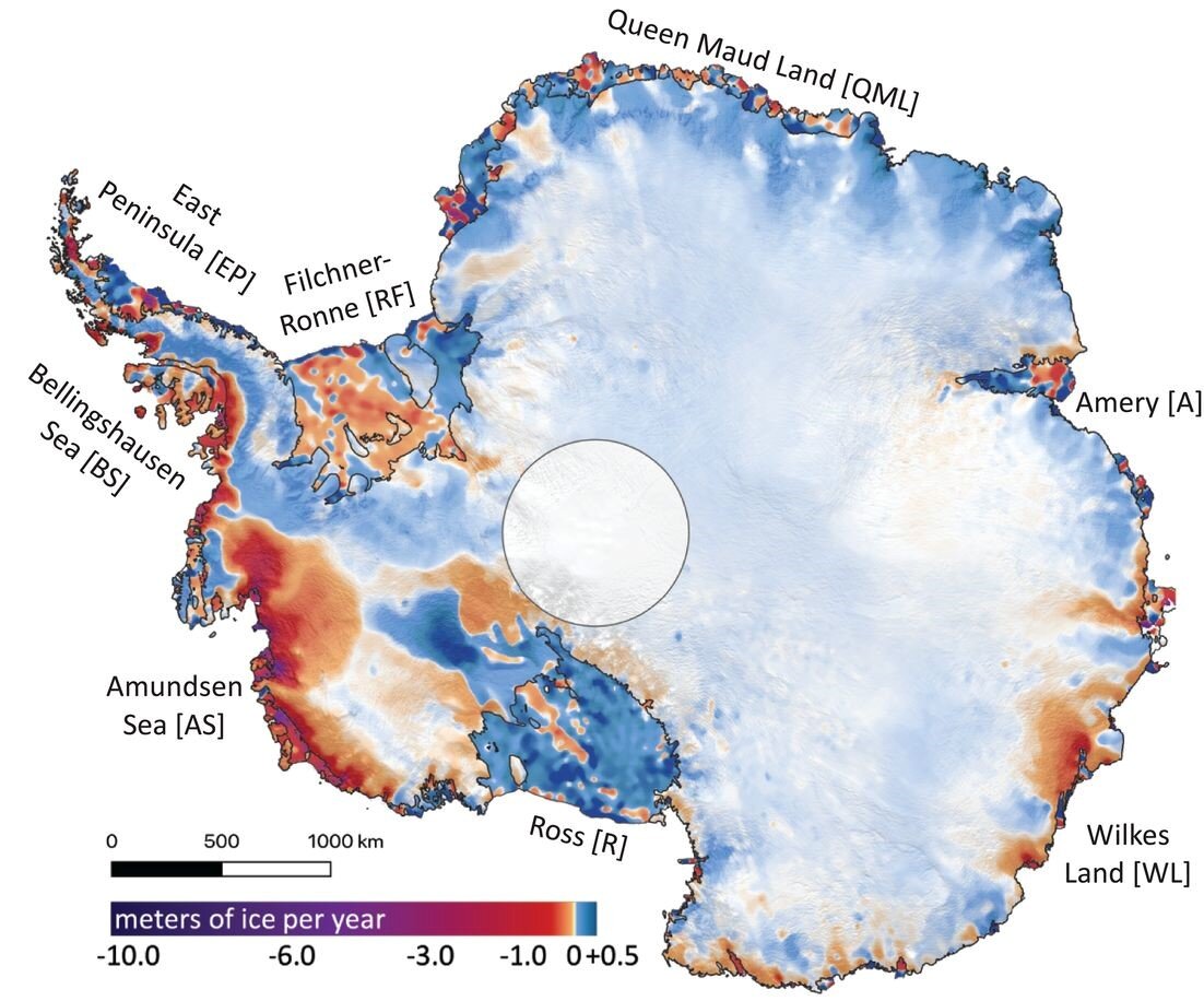
The high loss rates along the coast of West Antarctica have been linked to thinning of the floating ice shelves that terminate glaciers, by so-called circumpolar deep water warmed by climate change. Although disintegration of an ice shelf already floating on the ocean doesn’t raise sea levels, a retreating ice shelf can accelerate the downhill flow of glaciers that feed the shelf. It’s thought this can destabilize the glaciers and the ice sheets behind them.

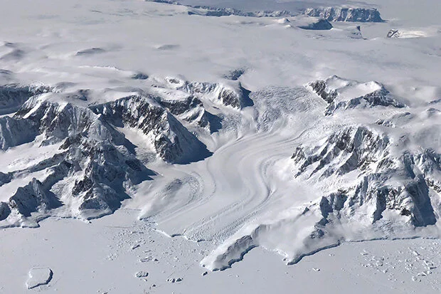
However, not all the melting of West Antarctic glaciers is due to global warming and the erosion of ice shelves by circumpolar deep water. As I’ve discussed in a previous post, active volcanoes underneath West Antarctica are melting the ice sheet from below. One of these volcanoes is making a major contribution to melting of the Pine Island Glacier, which is adjacent to the Thwaites Glacier in the first figure above and is responsible for about 25% of the continent’s ice loss.

If the Antarctic Peninsula were to cool along with East Antarctica and West Antarctica, the naturally occurring SAM (Southern Annular Mode) – the north-south movement of a belt of strong southern westerly winds surrounding Antarctica – could switch from its present positive phase to negative. A negative SAM would result in less upwelling of circumpolar deep water, thus reducing ice shelf thinning and the associated melting of glaciers.

As seen in the following figure, the 2021 study’s reanalysis of Antarctic temperatures shows an essentially flat trend for the Antarctic Peninsula since the late 1990s (red curve); warming occurred only before that time. The same behavior is even evident in the earlier 2014 study, which goes back to 1958. So future cooling of the Antarctic Peninsula is not out of the question. The South Pole in East Antarctica this year experienced its coldest winter on record.

Peninsula.jpg

Next: Ice Sheet Update (2): Evidence That Greenland Melting May Have Slowed Down

Sea Ice Update: No Evidence for Recent Ice Loss

Climate activists have long lamented the supposedly impending demise of Arctic sea ice due to global warming. But, despite the constant drumbeat of apocalyptic predictions, the recently reached minimum extent of Arctic ice in 2021 is no smaller than it was back in 2008.  And at the other end of the globe, the sea ice around Antarctica has been expanding for at least 42 years.

Scientific observations of sea ice in the Arctic and Antarctic have only been possible since satellite measurements began in 1979. The figure below shows satellite-derived images of Arctic sea ice extent in the summer of 1979 (left image), and the summer (September) and winter (March) of 2021 (right image, with September on the left). Sea ice shrinks during summer months and expands to its maximum extent during the winter.

Blog 10-7-19 JPG(1).jpg
Arctic sea ice.jpg

Over the interval from 1979 to 2021, Arctic summer ice extent decreased by approximately 30%; while it still embraces northern Greenland, it no longer reaches the Russian coast. The left graph in the next figure compares the monthly variation of Arctic ice extent from its March maximum to the September minimum, for the years 2021 (blue curve) and 2008 (green curve). The 2021 summer minimum is seen to be almost identical to that in 2008, with the black curve depicting the median extent over the period from 1981 to 2010.

Arctic sea ice volume 9-16.jpg

The right graph in the figure shows the estimated month-by-month variation of Arctic ice volume in recent years. The volume depends on both ice extent and its thickness, which varies with location as well as season – the thickest, and oldest, winter ice currently lying along the northern coasts of the Canadian Arctic Archipelago and Greenland.

Arctic ice thickness is notoriously difficult to measure, the best data coming from limited submarine observations. According to one account based on satellite data, more than 75% of the Arctic winter ice pack today consists of thin ice just a few months old, whereas in the past it was only 50%. However, these estimates are unreliable and a trio of Danish research institutions that monitor the Arctic estimate that the ice volume has changed very little over the last 17 years, as seen in the figure above.

Another indication that Arctic ice is not melting as fast as climate activists claim is the state of the Northwest Passage – the waterway between the Atlantic and Pacific Oceans through the Arctic Ocean, along the coast of North America. Although both the southern and northern routes of the Northwest Passage have been open intermittently since 2007, ice conditions this year are relatively severe compared to the past two decades: thicker multiyear ice is the main hazard. The northern deep-water route is already choked with ice and will not open until at least next year.

In the Antarctic, sea ice almost disappears completely during the southern summer and reaches its maximum extent in September, at the end of winter. This is illustrated in the satellite-derived images below, showing the summer minimum (left image) and winter maximum extent (right image) in 2021. The Antarctic winter sea ice extent is presently well above its long-term average.

In fact, despite the long-term loss of ice in the Arctic, the sea ice around Antarctica has expanded slightly during the satellite era, as shown in the following figure up to 2020. Although the maximum Antarctic ice extent (shown in red) fluctuates greatly from year to year, and took a tumble in 2017, it has grown at an average rate between 1% and 2% per decade (dashed red line) since 1979.

Note that the ice losses shown in this figure are “anomalies,” or departures from the monthly mean ice extent for the period from 1981 to 2010, rather than the minimum extent of summer ice. So the Arctic data don’t reveal how the 2021 minimum was almost identical to 2008, as illustrated in the earlier figures.

Several possible reasons have been put forward for the greater fluctuations in Antarctic winter sea ice compared to that in the Arctic. One analysis links the Antarctic oscillations to ENSO (the El Niño – Southern Oscillation), a natural cycle that causes variations in mean temperature and other climatic effects in tropical regions of the Pacific Ocean. The Pacific impinges on a substantial portion of the Southern Ocean that surrounds Antarctica.

The analysis suggests that the very large winter ice extents of 2012, 2013 and 2014 were a consequence of the 2012 La Niña, which is the cool phase of ENSO. Reinforcing that idea is the fact that this year’s surge in ice extent follows another La Niña earlier in 2021; the big loss of sea ice in 2017 could be associated with 2016’s strong El Niño, the warm phase of ENSO. The natural Pacific Decadal Oscillation may also play a role.

Next: Ice Sheet Update (1): Evidence That Antarctica Is Cooling, Not Warming

What “The Science” Really Says about the Coronavirus Pandemic

The answer is not much – at least, not yet.

While advocates of lockdowns and masking mandates claim to be invoking “the science,” science by its very nature can’t provide short-term answers to the efficacy of such measures. The scientific method demands extensive data gathering and testing, which generally take longer than the duration of a pandemic. An abundance of scientific evidence does exist for the effectiveness of vaccination, but whether vaccines can completely eradicate the coronavirus is an open question. Social distancing as a preventive measure is also on firm scientific ground.

Lockdowns have been used for centuries as a way to slow the spread of disease, including the Black Death plague in the 14th century and the Spanish Flu in 1918-1919. But all they do is initially reduce transmission of the virus, and to claim otherwise is scientifically disingenuous.

The primary purpose of slowing down the spread of a contagious and deadly disease is to prevent the healthcare system from becoming overwhelmed. If more people get sick enough to require hospitalization than the number of hospital beds available, some won’t get adequate treatment and deaths will increase. However, lockdowns also have a devastating effect on a society’s economic and mental health. Studies have shown that negative socioeconomic impacts greatly limit the effectiveness of lockdowns over time.

In some countries such as Taiwan and Australia, death rates from COVID-19 are very low so far after repeated lockdowns, causing lockdown supporters to link the two. But other nations with small populations such as Israel have much higher mortality rates despite continued shutdowns. So there’s no correlation and, in fact, many other factors influence the death rate.  

The science behind masking, shown below in use during the Spanish Flu pandemic, is muddier yet and has been badly contaminated by politics. Unfortunately, the gold standard in medical testing – the RCT (randomized controlled trial) – isn’t the basis for evaluating the benefit of mask-wearing by institutions like the U.S. CDC (Centers for Disease Control and Prevention) or the WHO (World Health Organization).

In an RCT or clinical trial, participants are divided randomly into two identical groups, with intervention in only one group and the other group used as a control. Neither the researchers nor the participants are told which group the participants are part of until the very end. Such double-blind trials are therefore able to establish causation.

For masks, just 14 RCTs have been carried out across the world to study how well masks guard against respiratory diseases, primarily influenza. Nearly all the trials tested so-called surgical, three-ply paper masks, rather than the N95 respirator style. Of the 14 trials, just two investigated the claim that wearing a mask benefits others who come in close contact with the mask wearer, while the other 12 tested the combination of benefit to others and protection for the wearer.

A recent analysis by a prominent statistician of all 14 RCTs, which include the only trial to test mask-wearing’s specific effectiveness against COVID-19, reveals that masks have no significant effect on either the wearer or those in close proximity, although some trials were ambiguous. There was no strong evidence that N95 masks performed any better than surgical or cloth masks. Exactly the same conclusions were reached in two independent analyses of 13 (see here) and 11 (here) of the same RCTs.

The CDC, however, relies on observational studies conducted since the start of the coronavirus pandemic, not RCTs, in issuing its masking guidance. An observational study is less scientific in being unable to assign a cause to an effect; it can only establish association.

Vaccination against infectious diseases, on the other hand, has a solid scientific basis. Pioneered by Edward Jenner at the end of the 18th century, vaccination has eradicated killer diseases such as smallpox and polio in many countries, and drastically curtailed others such as measles, mumps and pertussis (whooping cough).

Nevertheless, the science underlying vaccination against COVID-19 is incomplete. In the past it’s taken several years to develop a new vaccine, but the COVID-19 vaccines currently available were brought to market at lightning speed. Although such haste was seen as necessary to combat a rapidly proliferating virus, it meant shortening the RCTs designed to test vaccine efficacy, leaving questions such as long-term side effects and duration of effectiveness unresolved.

And barely understood yet is the greater protection against infection acquired though natural immunity – the result of having recovered from a previous COVID-19 infection – than from vaccination. This complicates calls for vaccine mandates, as those with natural immunity arguably don’t need to be vaccinated.

Moreover, the coronavirus is an RNA virus like influenza and so frequently mutates. This means that mandatory vaccination for the coronavirus is unlikely to be any more effective community-wide than a mandated flu vaccine would be. Regular COVID-19 booster shots will probably be needed, just like the flu.

That’s where science stands on the coronavirus. But rather than following the science, most decisions on lockdowns, masking and vaccination are ruled by politics.

Next: Sea Ice Update: No Evidence for Recent Ice Loss

Weather Extremes: Hurricanes and Tornadoes Likely to Diminish in 2021

Despite the brouhaha over the recent record-breaking heat wave in the Pacific northwest and disastrous floods in Europe and China, windy weather extremes – hurricanes and tornadoes – are attracting little media attention because they’re both on track for a relatively quiet season.

Scientists at the Climate Prediction Center of NOAA (the U.S. National Oceanic and Atmospheric Administration) don’t anticipate that 2021 will see the record-breaking 30 named storms of 2020, even though they think the total may still be above average. However, of last year’s 30 storms, only 13 became actual hurricanes, including 6 major hurricanes. The record annual highs are 15 hurricanes recorded in 2005 and 8 major hurricanes in 1950.

Hurricanes are classified by their sustained wind speeds on the Saffir-Simpson scale, ranging from Category 1, the weakest, to Category 5, the strongest. A major hurricane is defined as one in Category 3, 4 or 5, corresponding to a top wind speed of 178 km per hour (111 mph) or greater. NOAA predicts just 6 to 10 hurricanes this year, with 3 to 5 of those being in the major hurricane categories.

Hurricanes in the Atlantic basin, which has the best quality data available in the world, do show heightened ac­tivity over the last 20 years, particularly in 2005 and 2020. This can be seen in the figure below, depicting the frequency of all Atlantic hurricanes from 1851 to 2020. But researchers have found that the apparent increase in recent times is not related to global warming.

Hurricanes Atlantic 1851-2020.jpg

Rather, say the scientists who work at NOAA and several universities, the increase reflects natural variability. Although enhanced evaporation from warming oceans pro­vides more fuel for hurricanes, recent numbers have been artificially boosted by a big improvement in our ability to detect hurricanes, especially since the advent of satellite coverage in the late 1960s. And global warming can’t be the explanation, as the earth was cooling during the previous period of increased activity in the 1950s and 1960s.

Prior to that time, most data on hurricane frequency were based on eyewitness accounts, thus excluding all the hurricanes that never made landfall. What the researchers did was examine the eyewitness records, preserved by NOAA workers, in order to calculate the ratio of Atlantic hurricanes that didn’t come ashore to those that did, both in the modern era and in the past. The observations of non-landfalling hurricanes before the early 1970s came primarily from ships at sea.

Then, using a model for the radius of hurricane or major hurricane winds, the researchers were able to estimate the number of hurricanes or major hurricanes going back to 1860 that were never recorded. Their analysis revealed that the recent hike in the hurricane count is nothing remarkable, being comparable to earlier surges in the early 1880s and late 1940s. In the U.S., the past decade was in fact the second quietest for landfalling hurricanes and landfalling major hurricanes since the 1850s. Hurricane Ida was the first major U.S. landfalling hurricane this year.

Tornadoes, which occur predominantly in the U.S., have been less violent and fewer in number than average so far in 2021. Like hurricanes, tornadoes are categorized according to wind speed, using the Fujita Scale going from EF0 to EF5; EF5 tornadoes attain wind speeds up to 480 km per hour (300 mph).

Up to the end of August, 958 tornadoes had been reported by NOAA’s Storm Prediction Center in 2021 – of which 740 had been confirmed, according to Wikipedia. These numbers can be compared with the January to August average of 1035 confirmed tornadoes; the yearly average is 1253.

The annual incidence of all tornadoes in the U.S. shows no meaningful trend from 1950 to 2020, a period that included both warming and cooling spells, with net global warming of approximately 1.1 degrees Celsius (2.0 degrees Fahrenheit) during that time. But the number of strong tornadoes (EF3 or greater) has declined dramatically over the last half century, as seen in the next figure illustrating the number observed each year from 1954 to 2017.

Strong tornadoes.jpg

Clearly, the trend is downward instead of upward. Indeed, the average number of strong tornadoes annually from 1986 to 2017 was 40% less than from 1954 to 1985. In May this year, there wasn’t a single strong tornado for the first time since record-keeping began in 1950. Although there’s debate over whether the current system for rating tornadoes is flawed, 2021 looks like being another quiet year.

Next: What “The Science” Really Says about the Coronavirus Pandemic

Latest UN Climate Report Is More Hype than Science

In its latest climate report, the UN’s IPCC (Intergovernmental Panel on Climate Change) falls prey to the hype usually characteristic of alarmists who ignore the lack of empirical evidence for the climate change narrative of “unequivocal” human-caused global warming.

Past IPCC assessment reports have served as the voice of authority for climate science and, even among those who believe in man-made climate change, as a restraining influence – being hesitant in linking weather extremes to a warmer world, for instance. But all that has changed in its Sixth Assessment Report, which the UN Secretary-General has hysterically described as “code red for humanity.”

Among other claims trumpeted in the report is the statement that “Evidence of observed changes in extremes such as heat waves, heavy precipitation, droughts, and tropical cyclones, and, in particular, their attribution to human influence, has strengthened since [the previous report].” This is simply untrue and actually contrary to the evidence, with the exception of precipitation that tends to increase with global warming because of enhanced evap­oration from tropical oceans, resulting in more water vapor in the atmosphere.

In other blog posts and a recent report, I’ve shown how there’s no scientific evidence that global warm­ing triggers extreme weather, or even that weather extremes are becoming more frequent. Anomalous weather events, such as heat waves, hurricanes, floods, droughts and tornadoes, show no long-term trend over more than a century of reliable data.

As one example, the figure below shows how the average glob­al area and intensity of drought remained unchanged on aver­age from 1950 to 2019, even though the earth warmed by about 1.1 degrees Celsius (2.0 degrees Fahrenheit) over that interval. The drought area is the percentage of total global land area, excluding ice sheets and deserts, while the intensity is characterized by the self-calibrating Palmer Drought Severity Index, which measures both dryness and wetness and classifies events as “moderate,” “severe” or “extreme.”

Drought.jpg

Although the IPCC report claims, with high confidence, that “the frequency of concurrent heatwaves and droughts on the global scale” are increasing, the scientific evidence doesn’t sup­port such a bold assertion. An accompanying statement that cold extremes have become less frequent and less severe is also blatantly incorrect.

Cold extremes are in fact on the rise, as I’ve discussed in previous blog posts (here and here). The IPCC’s sister UN agency, the WMO (World Meteorological Organi­zation) does at least acknowledge the existence of cold weather extremes, but has no explanation for their origin nor their growing frequency. Cold extremes include prolonged cold spells, unusually heavy snowfalls and longer winter seasons. Why the IPCC should draw the wrong conclusion about them is puzzling.

In discussing the future climate, the IPCC makes use of five scenarios that project differing emissions of CO2 and other greenhouse gases. The scenarios start in 2015 and range from one that assumes very high emissions, with atmospheric CO2 doubling from its present level by 2050, to one assuming very low emissions, with CO2 declining to “net zero” by mid-century.

But, as pointed out by the University of Colorado’s Roger Pielke Jr., the estimates in the IPCC report are dominated by the highest emissions scenario. Pielke finds that this super-high emissions scenario accounts for 41.5% of all scenario mentions in the report, whereas the scenarios judged to be the most likely under current trends account for only a scant 18.4% of all mentions. The hype inherent in the report is obvious by comparing these percentages with the corresponding ones in the Fifth Assessment Report, which were 31.4% and 44.5%, respectively. 

Not widely known is that the supposed linkage between climate change and human emissions of greenhouse gases, as well as the purported connection between global warming and weather extremes, both depend entirely on computer climate models. Only the models link climate change or extreme weather to human activity. The empirical evidence does not – it merely shows that the planet is warming, not what’s causing the warming.

A recent article in the mainstream scientific journal Science surprisingly drew attention to the shortcomings of climate models, weaknesses that have been emphasized for years by climate change skeptics. Apart from falsely linking global warming to CO2 emissions – because the models don’t include many types of natural variability – the models greatly exaggerate predicted temperatures, and can’t even reproduce the past climate accurately. As leading climate scientist Gavin Schmidt says, “You end up with numbers for even the near-term that are insanely scary—and wrong.”

The new IPCC report, with its prognostications of gloom and doom, should have paid more attention to its modelers. In making wrong claims about the present climate, and relying too heavily on high-emissions scenarios for future projections, the IPCC has strayed from the path of science.

Next: Weather Extremes: Hurricanes and Tornadoes Likely to Diminish in 2021

Has the Sun’s Role in Climate Change Been Trivialized?

Central to the narrative that climate change comes largely from human emissions of greenhouse gases is the assertion that the sun plays almost no role at all. According to its Fifth Assessment Report, the IPCC (Intergovernmental Panel on Climate Change) attributes no more than a few percent of total global warming to the sun’s influence.

But the exact amount of the solar contribution to global warming is critically dependent on how much the sun’s heat and light output, known technically as the TSI (total solar irradiance), has varied since the 19th century. According to an international team of scientists in a recently published paper, different estimates of the TSI lead to different conclusions about global warming – ranging from the sun making a trivial contribution, which backs up the IPCC claim that recent warming is mostly human-caused, to the opposite conclusion that global warming is mostly natural and due to changes in solar activity.

How can there be such a wide discrepancy between these two positions? Over the approximately 11-year solar cycle, the TSI varies by only a tenth of one percent. However, long-term fluctuations in the sun’s internal magnetic field cause the baseline TSI to vary over decades and centuries.

This can be seen in the somewhat congested figure below, which depicts several reconstructions of the TSI since 1850 and shows variations in both the TSI baseline and its peak-to-peak amplitude. The curve plotted in black forms the basis for the current CMIP6 generation of computer climate models; the curve in yellow was the basis for the previous CMIP5 models featured in the IPCC’s Fifth Assessment Report.

TSI Matthes.jpg

A rather different reconstruction of the TSI since 1700 is shown in the next figure, based on an earlier solar irradiance model augmented with recent satellite data. You can see that in this reconstruction, the TSI since 1850 exhibits much larger fluctuations – from 1358 to 1362 watts per square meter – compared with the reconstruction above, in which the variation since 1850 is only from about 1360.5 to 1362 watts per square meter.

The dramatic difference between the two estimates of the TSI arises from rival sets of satellite data. Satellite measurements of TSI began in 1978, the two main sources of data being the Royal Meteorological Institute of Belgium’s so-called ACRIM (Active Cavity Radiometer Irradiance Monitor) composite, and the World Radiation Center’s PMOD (Physikalisch-Meteorologisches Observatorium Davos) composite.

The ACRIM composite implies that the TSI rose during the 1980s and 1990s but has fallen slightly since then, as seen in the second figure above. The PMOD composite implies that the TSI has been steadily dropping since the late 1970s, a trend just visible in the first figure. The PMOD composite, showing a decline in solar activity during the period after 1975 in which global temperatures went up, therefore downplays the sun’s role in global warming. On the other hand, the ACRIM composite indicates an increase in solar activity over the same period, so supports the notion that global temperatures are strongly linked to the TSI.

The ACRIM satellite data set and the PMOD data differ in the procedures used to bridge a two-year gap in ACRIM data around 1990. The gap in data gathering occurred after the launch of a new ACRIM satellite was delayed by the Challenger disaster. It’s these disparate gap-bridging procedures that result in the ACRIM and PMOD composite data showing such different behavior of the TSI during the most recent solar cycles 21 to 23.

The authors of the recent paper also discuss other TSI reconstructions, some of which support the ACRIM data and some of which back the rival PMOD data. Rather than passing judgment on which dataset is the better representation of reality, the authors urge the climate science community to consider all relevant estimates of the TSI and not just the one illustrated in the first figure above. But they conclude that, contrary to the current narrative, the question of how much the sun has influenced recent global temperatures – at least in the Northern Hemisphere – has not yet been answered satisfactorily.

The researchers go on to comment: “The PMOD dataset is more politically advantageous to justify the ongoing considerable political and social efforts to reduce greenhouse gas emissions under the assumption that the observed global warming since the late 19th century is mostly due to greenhouse gases.” They add that political considerations have been acknowledged as one of the motivations for the development of the PMOD composite as a rival dataset to the ACRIM measurements.

Next: Latest UN Climate Report Is More Hype than Science

Could Pacific Northwest Heat Wave, European Floods Have Been Caused by the Sun?

The recent record-shattering heat wave in the Pacific Northwest and devastating floods in western Europe have both been ascribed to global warming by many climate scientists. But an alternative explanation, voiced by some climatologists yet ignored by the mainstream media, is that the disasters were caused by the phenomenon of jet-stream blocking – which may or may not be a result of global warming, and could instead arise from a weakening of the sun’s output.

Blocking refers to the locking in place for several days or weeks of the jet stream, a narrow, high-altitude air current that flows rapidly from west to east in each hemisphere and governs much of our weather. One of the more common blocking patterns is known as an “omega block,” a buckling of the jet stream named for its resemblance to the upper-case Greek letter omega, that produces alternating, stationary highs and lows in pressure as shown in the figure below. Under normal weather conditions, highs and lows move on quickly.

According to the blocking explanation, the torrential rains that hovered over parts of eastern Germany, Belgium and the Netherlands came from a low-pressure system trapped between two blocking highs to the west and east – the opposite situation to that shown in the figure.

Precipitation tends to increase in a warmer world because of enhanced evap­oration from tropical oceans, resulting in more water vapor in the atmosphere. So with a blocking low stuck over the Rhine valley and the ground already saturated from previous rainfall, it’s not surprising that swollen rivers overflowed and engulfed whole villages.

A similar argument can be invoked to explain the intense “heat dome” that parked itself over British Columbia, Washington and Oregon for five blisteringly hot days last month. In this case, it was a region of high pressure that was pinned in place by lows on either side, with the sweltering heat intensified by the effects of La Niña on North America. Several Pacific Northwest cities experienced temperatures a full 5 degrees Celsius (9 degrees Fahrenheit) above previous records.

There’s little doubt that both of these calamitous events resulted from jet-stream omega blocks. Blocking can also induce cold extremes, such as the deep freeze endured by Texas earlier this year. But how can blocking be caused by the sun?

Over the 11-year solar cycle, the sun’s heat and visible light fluctuate, as does its production of invisible UV, which varies much more than the tenth of a percent change in total solar output. It’s thought that changes in solar UV irradiance cause wind shifts in the stratosphere (the layer of the atmosphere above the troposphere), which in turn induce blocking in the tropospheric jet stream via a feedback effect. Blocking can also stem from other mechanisms. In the North Atlantic at least, a 2008 research paper found that during periods of low solar activity, blocking events in more eastward locations are longer and more intense than during higher solar activity.

Right now we’re entering a stretch of diminished solar output, signified by a falloff in the average monthly number of sunspots as depicted in the next figure. The decline in the maximum number of sunspots over the last few cycles may herald the onset of a grand solar minimum, which could usher in a period of global cooling.

wolfjmms.jpg

However, climate scientists are divided on the question of whether global warming exacerbates jet-stream blocking. Computer climate models in fact predict that blocking will diminish in a warming climate, though the frequency of past blocking events has been simulated poorly by the models. Many climate scientists admit that it’s not yet clear how large a role is played by natural variability – which includes solar fluctuations.

Adherents to the global warming explanation got a boost from a just-completed attribution study, claiming that the deadly US-Canada heat wave was “virtually impossible” without climate change. The study authors used 21 climate models to estimate how much global warming contributed to excessive heat in the areas around the cities of Vancouver, Seattle and Portland. Their conclusion was that the heat wave was a one-in-1,000-year event, and would have been at least 150 times rarer in the past.

But such a highly exaggerated claim is based on dubious computer models, not on actual scientific evidence. June’s scorching temperatures in the Pacific Northwest were no match for the persistently searing heat waves that afflicted North America in the 1930s.

And despite the hoopla over the European floods, it’s not the first time some of the flooded areas have suffered catastrophic flooding. For example, the Ayr valley in Germany, struck again this month, experienced major floods in the same locations on June 12, 1910, when at least 52 people were killed.

Next: Has the Sun’s Role in Climate Change Been Trivialized?

New Doubts on Climatic Effects of Ocean Currents, Clouds

Recent research has cast doubt on the influence of two watery entities – ocean currents and clouds – on future global warming. But, unlike many climate studies, the two research papers are grounded in empirical observations rather than theoretical models.

The first study examined so-called deep water formation in the Labrador Sea, located between Greenland and Canada in the North Atlantic Ocean, and its connection to the strength of the AMOC (Atlantic Meridional Overturning Circulation). The AMOC forms part of the ocean conveyor belt that redistributes seawater and heat around the globe. Despite recent evidence to the contrary, computer climate models have predicted that climate change may weaken the AMOC or even shut it down altogether.  

Deep water formation, which occurs in a few localized areas across the world, refers to the sinking of cold, salty surface water to depths of several kilometers because it’s denser than warm, fresher water; winter winds in the Labrador Sea both cool the surface and increase salinity through evaporation. Most climate models link any decline in North Atlantic deep water formation, due to global warming, to decreases in the strength of the AMOC.

But the researchers found that winter convection in the Labrador Sea and the adjacent Irminger Sea (east of Greenland) had very little impact on deep ocean currents associated with the AMOC, over the period from 2014 to 2018. Their observational data came from a new array of seagoing instruments deployed in the North Atlantic, including moorings anchored on the sea floor, underwater gliders and submersible floats. The devices measure ocean current, temperature and salinity.

Results for the strength of the AMOC are illustrated in the figure below, in which “OSNAP West” includes the Labrador and Irminger Seas while the more variable “OSNAP East” is in the vicinity of Iceland. As can be seen, the AMOC in the Labrador Sea didn’t change on average during the whole period of observation. The study authors caution, however, that measurements over a longer time period are needed to confirm their conclusion that strong winter cooling in the Labrador Sea doesn’t contribute significantly to variability of the AMOC.

Fig 1.jpg

Understanding the behavior of the AMOC is important because its strength affects sea levels, as well as weather in Europe, North America and parts of Africa. Variability of the AMOC is thought to have caused multiple episodes of abrupt climate change, in a decade or less, during the last ice age.

The second study to question the effect of water on global warming involves clouds. As I described in an earlier post, the lack of detailed knowledge about clouds is one of the major limitations of computer climate models. One problem with the existing models is that they simulate too much rainfall from “warm” clouds and, therefore, underestimate their lifespan and cooling effect.

Warm clouds contain only liquid water, compared with “cool” clouds that consist of ice particles mixed with water droplets. Since the water droplets are usually smaller than the ice particles, they have a larger surface area to mass ratio which makes them reflect the sun’s radiation more readily. So warm clouds block more sunlight and produce more cooling than cool, icy clouds. At the same time, warm clouds survive longer because they don’t rain as much.

The research team used satellite data to ascertain how much precipitation from clouds occurs in our present climate. The results for warm clouds are illustrated in the following map showing the warm-rain fraction; red designates 100% warm rain, while various shades of blue indicate low fractions. As would be expected, most warm rain falls near the equator where temperatures are highest. It also falls predominantly over the oceans.

Fig 2.jpg

The researchers then employed the empirical satellite data for rainfall to modify the warm-rain processes in an existing CMIP6 climate model (the latest generation of models). The next figure, which shows the probability of rain from warm clouds at different latitudes, compares the satellite data (gray) to the model results before (maroon) and after (yellow) modification.

Fig 3.jpg

It’s seen that the modified climate model is in much better agreement with the satellite data, except for a latitude band just north of the equator, and is also a major improvement over the unmodified model. The scientists say that their correction to the model makes negative “cloud-lifetime feedback” – the process by which higher temperatures inhibit warm clouds from raining as much and increases their lifetime – almost three times larger than in the original model.

This larger cooling feedback is enough to account for the greater greenhouse warming predicted by CMIP6 models compared with earlier CMIP5 models. But, as the study tested only a single model, it needs to be extended to more models before that conclusion can be confirmed.

Next: Could Pacific Northwest Heat Wave, European Floods Have Been Caused by the Sun?

Fishy Business: Alleged Fraud over Ocean Acidification Research, Reversal on Coral Extinction

In the news recently have been two revelations about the sometimes controversial world of coral reef research. The first is fraud allegations against research claiming that ocean acidification from global warming impairs the behavior of coral reef fish. The second is an about-face on inflated estimates for the extinction risk of Pacific Ocean coral species due to climate change. 

The alleged fraud involves 22 research papers authored by Philip Munday, a marine ecologist at JCU (James Cook University) in Townsville, Australia and Danielle Dixson, a U.S. biologist who completed her PhD under Munday’s supervision in 2012. The fraud charges were made in August 2020 by three of an international group of mostly biological and environmental scientists, plus the group leader, fish physiologist Timothy Clark of Deakin University in Geelong, Australia. The Clark group says it will publicize the alleged data problems shortly.

The research in question studied the behavior of coral reef fish in slightly acidified seawater, in order to simulate the effect of ocean acidification caused by the absorption of up to 30% of humanity’s CO2 emissions. The additional CO2 has so far lowered the average pH – a measure of acidity – of ocean surface water from about 8.2 to 8.1 since industrialization began in the 18th century.

Munday and Dixson claim that the extra CO2 causes reef fish to be attracted by chemical cues from predators, instead of avoiding them; to become hyperactive and disoriented; and to suffer loss of vision and hearing. But Clark and his fellow scientists, in their own paper published in January 2020, debunk all of these conclusions. Most damningly of all, the researchers find that the reported effects of ocean acidification on the behavior of coral reef fish are not reproducible – the basis for their fraud allegations against the JCU work.

In a published rebuttal, Munday and Dixson say that the Clark group’s replication study differed from the original research “in at least 16 crucial ways” and didn’t acknowledge other papers that support the JCU position.

Nevertheless, while the university has dismissed the allegations after a preliminary investigation, Science magazine points out that a 2016 paper by another former PhD student of Munday’s was subsequently deemed fraudulent and retracted. And Clark and his colleagues say they have evidence of manipulation in publicly available raw data files for two papers published by Munday’s research laboratory, as well as documentation of large and “statistically impossible” effects from CO2 reported in many of the other 20 allegedly fraudulent papers.

Coral reef fish.jpg

CREDIT: ALEX MUSTARD/MINDEN PICTURES

The about-turn on coral extinction involves another JCU group, the university’s Centre of Excellence for Coral Reef Studies. Four Centre researchers published a paper in March 2021 that completely contradicts previous apocalyptic predictions of the imminent demise of coral reefs, predictions that include an earlier warning by three of the same authors of ongoing coral degradation from global warming.

As an example of past hype, the IUCN (International Union for Conservation of Nature) states on its website that 33% of all reef-building corals are at risk of extinction. The IUCN is highly regarded for its assessments of the world’s biodiversity, including evaluation of the extinction risk of thousands of species. An even more pessimistic environmental organization suggests that more than 90% of the planet’s coral reefs may be extinct by 2050.

The recent JCU paper turns all such alarming prophecies on their head. But the most astounding revelation is perhaps the sheer number of corals estimated to exist on reefs across the Pacific Ocean, from Indonesia to French Polynesia – approximately half a trillion, similar to the number of trees in the Amazon, or birds in the world. To estimate abundances, the JCU scientists used a combination of coral reef habitat maps and counts of coral colonies.

This colossal population is for a mere 300 species, a small fraction of the 2,175 coral species estimated to exist worldwide by the IUCN. And of the 80 species considered by the IUCN to be at an elevated risk of extinction, those in its “critically endangered” and “endangered” categories, 12 species have estimated Pacific populations of over a billion colonies. One of the study’s authors remarks that the eight most common coral species in the region each have a population size larger than the 7.8 billion people on Earth.

The implication of this stunning research is that the global extinction risk of most coral species is lower than previously estimated, even though a local loss can be ecologically devastating to coral reefs in the vicinity. So any future extinctions due to global warming are unlikely to unfold rapidly, if at all.

Next: New Doubts on the Climatic Effects of Ocean Currents, Clouds

Challenges to the CO2 Global Warming Hypothesis: (4) A Minimal Ice-Age Greenhouse Effect

As an addendum to my 2020 series of posts on the CO2 global warming hypothesis (here, here and here), this post presents a further challenge to the hypothesis central to the belief that humans make a substantial contribution to climate change. The hypothesis is that observed global warming – currently about 1 degree Celsius (1.8 degrees Fahrenheit) since the preindustrial era – has been caused primarily by human emissions of CO2 and other greenhouse gases into the atmosphere.

The new challenge to the CO2 hypothesis is set out in a recent research paper by French geologist Pascal Richet. Richet claims, by reexamining previous analyses of an Antarctic ice core, that greenhouse gases such as CO2 and methane had only a minor effect on the earth’s climate over the past 423,000 years, and that the assumed forcing of climate by CO2 is incompatible with ice-core data. The paper is controversial, however, and the publisher has subjected it to a post-publication review, as a result of which the paper has since been removed.

The much-analyzed ice core in question was drilled at the Russian Vostok station in East Antarctica. Past atmospheric CO2 levels and surface temperatures are calculated from ice cores by measuring the air composition and the oxygen 18O to 16O isotopic ratio, respectively, in air bubbles trapped by the ice. The Vostok record, which covers the four most recent ice ages or glaciations as well as the current interglacial (Holocene), is depicted in the figure below. The CO2 level is represented by the upper set of graphs (below the insolation data), and shows the substantial drop in CO2 during an ice age; the associated drop in temperature ΔT is represented by the lower set of graphs.

Vostok ice cores.jpg

It is seen that transitions from glacial to interglacial conditions are relatively sharp, while the ice ages themselves are punctuated by smaller warming and cooling episodes. And, though it’s hardly visible in the figure, the ice-age CO2 level closely mimics changes in temperature, but the CO2 concentration lags behind – with CO2 going up or down after the corresponding temperature shift occurs. The lag is more pronounced for temperature declines than increases.

The oceans, which are where the bulk of the CO2 on our planet is stored, can hold much more CO2 (and heat) than the atmosphere. Warm water holds less CO2 than cooler water, so the oceans release CO2 when the temperature rises, but take it in when the earth cools.

Richet noticed that the temperature peaks in the Vostok record are much narrower than the corresponding CO2 peaks. The full widths at half maximum, marked by thick horizontal bars in the figure above, range from about 7,000 to 16,000 years for the initial temperature peak in cycles II, III and IV, but from 14,000 to 23,000 years for the initial CO2 peak; cycle V can’t be analyzed because its start is missing from the data. All other peaks are also narrower for temperature than for CO2.

The author argues that CO2 can’t drive temperature since an effect can’t last for a shorter period of time than its cause. The fact that the peaks are systematically wider for CO2 than for temperature implies that the CO2 level responds to temperature changes, not the other way round. And for most of cycles II, III and IV, CO2 increases correspond to temperature decreases and vice versa.

Richet’s conclusion, if correct, would deal a deathblow to the CO2 global warming hypothesis. The reason has to do with the behavior of the temperature and CO2 level at the commencement and termination of ice ages.

Ice ages are believed to have ended (and begun) because of changes in the Earth’s orbit around the sun. After tens of thousands of years of bitter cold, the temperature suddenly took an upward turn. But according to the CO2 hypothesis, the melting of ice sheets and glaciers caused by the slight initial warming could not have continued, unless this temperature rise was amplified by positive feedbacks. These include CO2 feedback, triggered by a surge in atmospheric CO2 as it escaped from the oceans.

The problem with this explanation is that it requires a similar chain of events, based on CO2 and other feedbacks, to have enhanced global cooling as the temperature fell at the beginning of an ice age. But, says Richet, “From the dual way in which feedback would work, temperature decreases and increases should be similar for the same concentrations of greenhouse gases, regardless of the residence times of these gases in the atmosphere.” The fact that temperature decreases don’t depend in any straightforward way on CO2 concentration in the figure above demonstrates that the synchronicity required by the feedback mechanism is absent.

Next: Fishy Business: Alleged Fraud over Ocean Acidification Research, Reversal on Coral Extinction

New EPA Climate Change Indicator Is Deceptive

New climate change indicators on the U.S. EPA (Environmental Protection Agency) website are intended to inform science-based decision-making by presenting climate science transparently. But many of the indicators are misleading or deceptive, being based on incomplete evidence or selective data.

A typical example is the indicator for heat waves. This is illustrated in the left panel of the figure below, depicting the EPA’s representation of heat wave frequency in the U.S. from 1961 to 2019. The figure purports to show a steady increase in the occurrence of heat waves, which supposedly tripled from an average of two per year during the 1960s to six per year during the 2010s.

Heat waves (min) EPA.jpg
Heat waves (max) EPA.jpg

Unfortunately, the chart on the left is highly deceptive in several ways. First, the data is derived from minimum, not maximum, temperatures averaged across 50 American cities. The corresponding chart for maximum temperatures, shown in the right panel above, paints a rather different picture – one in which the heat wave frequency less than doubled from 2.5 per year in the 1960s to 4.5 per year in the 2010s, and actually declined from the 1980s to the 2000s.

This maximum-temperature graph revealing a much smaller increase in heat waves than the minimum-temperature graph displayed so boldly on the EPA website is dishonestly hidden away in its technical documentation.

A second deception is that the starting date of 1961 for both graphs is conveniently cherry-picked during a 30-year period of global cooling from 1940 to 1970. That in itself exaggerates the warming effect since then. Starting instead in 1980, after the current bout of global warming had begun, it can be seen that the heat wave frequency based on maximum temperatures (right panel) barely increased at all from 1981 to 2019. Similar exaggeration and sleight of hand can be seen in the EPA indicators for heat wave duration, season length and intensity.

A third deception is that the 1961 start date ignores the record U.S. heat of the 1930s, a decade characterized by persistent, searing heat waves across North America, especially in 1934 and 1936. The next figure shows the frequency and magnitude of U.S. heat waves from 1900 to 2018.

Heat waves.jpg

The frequency (top panel) is the annual number of calendar days the maximum temperature exceeded the 90th percentile for 1961–1990 for at least six consecutive days. The EPA’s data is calculated for a period of at least four days, while the heat wave index (lower panel) measures the annual magnitude of all heat waves of at least three days in that year combined.

Despite the differences in definition, it’s abundantly clear that heat waves over the last few decades – the ones publicized by the EPA – pale in comparison to those of the 1930s, and even those of other decades such as the 1910s and 1950s. The peak heat wave index in 1936 is a full three times higher than it was in 2012 and up to nine times higher than in many other years.

The heat wave index shown above actually appears on the same EPA website page as the mimimum-temperature chart. But it’s presented as a tiny Figure 3 that is only 20% as large as the much more prominent Figure 1 showing minimum temperatures. As pointed out recently by another writer, a full-size version of the index chart, from 1895 to 2015, was once featured on the website, before the site was updated this year with the new climate change indicators.

The EPA points out that the 1930s heat waves in North America, which were concentrated in the Great Plains states of the U.S. and southern Canada, were exacerbated by Dust Bowl drought that depleted soil moisture and reduced the moderating effects of evaporation. While this is undoubtedly true, it has been suggested by climate scientists that future droughts in a warming world could result in further record-breaking U.S. heat waves. The EPA has no justification for omitting 1930s heat waves from their data record, or for suppressing the heat wave index chart.

Although the Dust Bowl was unique to the U.S. and Canada, there are locations in other parts of North America and in other countries where substantial heat waves occurred before 1961 as well. In the summer of 1930 two record-setting, back-to-back scorchers, each lasting eight days, afflicted Washington, D.C.; while in 1936, the province of Ontario – also well removed from the Great Plains – experienced 44 degrees Celsius (111 degrees Fahrenheit) heat during the longest, deadliest Canadian heat wave on record. In Europe, France was baked during heat waves in both 1930 and 1947, and many eastern European countries suffered prolonged heat waves in 1946.   

What all this means is that the EPA’s heat-wave indicator grossly misrepresents the actual science and defeats its stated goal for the indicators of “informing our understanding of climate change.”

Next: Challenges to the CO2 Global Warming Hypothesis: (4) A Minimal Ice-Age Greenhouse Effect

Is Recent Record Cold Just La Niña, or the Onset of Global Cooling?

Little noticed by the mainstream media in their obsession with global warming is an exceptionally chilly 2020-21 winter in the Northern Hemisphere and an unusually early start to the Southern Hemisphere winter. Low temperature and snowfall records are tumbling all over the globe. The harsh cold has already crippled this year’s crops and vines in Europe, while the U.S. state of Texas was ravaged by the subfreezing polar vortex.

Is this the beginning of a predicted grand solar minimum, which was the subject of an earlier post – or simply a manifestation of the naturally occurring La Niña cycle? A grand solar minimum is signified by a steep decline in the maximum number of sunspots during the 11-year solar cycle, a decline that appears to be underway already.

The familiar El Niño and La Niña cycles arise from seesaw changes in surface temperatures in the tropical Pacific Ocean and last for periods of a year or more at a time. The persistent but irregular pattern is visible in the graph below, showing satellite measurements of the global temperature since 1979. Warm spikes such as those in 1998, 2010 and 2016 are due to El Niño; cool spikes like those in 2000 and 2008 are due to La Niña. The climatic effects of El Niño and La Niña include catastrophic flooding in the western Americas and flooding or severe drought in Australia; La Niña has also been tied to major landfalling hurricanes in both the U.S. and the western Pacific.

UAH April 2021.jpg

The zero baseline in the figure represents the average temperature in the tropical lower atmosphere or troposphere from 1991 to 2020 (though the satellite record began in 1979). Observations in the troposphere are a more reliable indicator of global warming than surface data, which are distorted by the urban heat island effect on land and by insufficient measurement stations across the oceans.

Right now, in May 2021, it’s clear that we’re experiencing another La Niña, with the mean April temperature having fallen back to the long-term average. This isn’t permanent of course, and the mercury will continue to rise and fall with future El Niño and La Niña fluctuations. But those fluctuations are superimposed on an overall warming trend of 0.14 degrees Celsius (0.25 degrees Fahrenheit) per decade at present – the familiar global warming.

Whether the present frigid and snowy conditions in much of the world are merely a result of La Niña, or the start of a longer cooling trend, we won’t know for several years yet. Climate, after all, is a long-term average of the weather over an extended period of time, up to decades.

Nonetheless, there’s ample evidence that the current cold snap is not about to let up. At the same time as the UK experienced its lowest average minimum temperature for April since 1922, and both Switzerland and Slovenia suffered record low temperatures for the month, bone-chilling cold struck Australia, New Zealand and even normally shivery Antarctica in the Southern Hemisphere. The next figure shows how the 2021 sea ice extent (in blue) around Antarctica is above or close to the 30-year average from 1981 to 2010 (in gray).

SH Antarctic sea ice.jpeg

Snow records have continued to be broken around the world too. Belgrade, the capital of Serbia, registered its all-time high snowfall for April, in record books dating back to 1888; during April, both Finland and Russia reported their heaviest snow in decades; and the UK, Spain and several countries in the Middle East saw rare spring snowfalls from March to May. On the other side of the globe, up to 22 cm (9 inches) of snow fell on southeastern Australia mountain peaks a full two months before the start of the 2021 ski season; and southern Africa was also blanketed in early-season snow.

The figure below shows the  Northern Hemisphere snow mass (excluding mountains) for the current season, based on data from the Finnish Meteorological Institute. As can be seen, the snow mass for much of the season has tracked more than one standard deviation above the average for 1982-2012, and in March 2021 exceeded the average by two standard deviations. The mass is measured in billions of tonnes (Gigatonnes, Gt where 1 tonne = 1.102 U.S. tons).

Snow 2020-21.jpg

As startling as all this unusual weather is, it should be noted that recent bursts of extreme cold have sometimes been interspersed with brief periods of unseasonal warmth. Such swings between extremes may result from jet stream blocking, a phenomenon that can arise from natural sources such as a downturn in UV from a quieter sun, which can in turn produce changes in upper atmosphere wind patterns.

Next: New EPA Climate Change Indicator Is Deceptive

Little Evidence for Link between Natural Disasters and Global Warming

A new report on extreme weather in 2020 shows how socio-economic studies of natural disasters have been used to buttress the popular but mistaken belief that global warming causes weather extremes. Two international agencies, UNDRR (the UN Office for Disaster Risk Reduction) – in conjunction with CRED (the Centre for Research on the Epidemiology of Disasters) – and IFRC (the International Red Cross), both issued reports in 2020 claiming that climate-related disasters are currently escalating.

However, as the two reports themselves reveal, such claims are manifestly wrong. This can be seen in the following figure, originally included in the UNDRR-CRED’s report but since withdrawn, showing the annual number of climate-related disasters from 2000 through 2020. The disasters are those in the yellow climatological (droughts, glacial lake outbursts and wildfires), green meteorological (storms, extreme temperatures and fog), and blue hydrological (floods, landslides and wave action) categories.

CRED disasters.jpg

The UNDRR-CRED report draws a strong link between global warming and extreme weather events, citing a “staggering rise in climate-related disasters over the last twenty years.” But, as shown in the figure above, the total number of climate-related disasters in fact exhibits a distinctly declining trend (in red) since 2000, falling by 11% over the last 21 years. This completely contradicts the claims in two different sections of the report that the annual number of disasters since 2000 has either risen significantly from before or been “relatively stable.”

Another blatant inconsistency in the UNDRR-CRED report, an inconsistency that bolsters its false claim of a rising disaster rate, is a comparison between the period from 2000 to 2019 and the preceding 20 years from 1980 to 1999. The report contends that the earlier 20 years saw only 4,212 disasters, compared with 7,348 during the later period.       

However, the University of Colorado’s Roger Pielke Jr., who studies natural disasters, says that the report’s numbers are flawed. As CRED has repeatedly acknowledged, data from 20th-century disasters are unreliable because disasters were reported differently before the Internet existed. Climate writer Paul Homewood has noted a sudden jump in the annual number of disasters listed in CRED’s EM-DAT (Emergency Events Database) after 1998, which the agency itself attributes to increased disaster reporting in the Internet era. So its claim that the number of disasters over 20 years jumped from 4,212 to 7,348 is meaningless.

The IFRC report reaches the same erroneous conclusions as the CRED-UNDRR report – not surprisingly, since they are both based on CRED’s EM-DAT. As seen in the next figure, which is the same as the Red Cross report’s Figure 1.1, climate- and weather-related disasters since 2000 have declined by approximately the same 11% noted above. The report’s misleading assertion that such disasters have risen almost 35% since the 1990s relies on the same failure to account for a major increase in disaster reporting since 1998 due to the arrival of the Internet.

CRED Red Cross.jpg

That natural disasters are in fact diminishing over time is reinforced by data on the associated loss of life. The figure below illustrates the annual global number of deaths from natural disasters, including weather extremes, corrected for population increase over time and averaged by decade from 1900 to 2015.

CRED Fig 3.jpg

Because the data is compiled from the same EM-DAT database, the annual number of deaths shows an uptick from the 1990s to the 2000s. Yet it’s abundantly clear that disaster-related deaths have been dwindling since the 1920s. However, this is due as much to improvements in planning and engineering to safeguard structures, and to early warning systems that allow evacuation of threatened communities, as it is to diminishing numbers of natural disasters.

Economic loss studies of natural disasters have been quick to blame human-caused climate change for the apparently increasing frequency and intensity of weather-related events. But once the losses are corrected for population gain and the ever-increasing value of property in harm’s way, there’s very little evidence to support any connection between natural disasters and global warming.

According to numerous analyses by Pielke, the frequency and intensity of the phenomena causing financial losses show no detectable trend to date. Climate-related losses themselves are actually declining as a percentage of global gross domestic product. Another research study, based on the NatCatSERVICE database of reinsurance giant Munich Re, has concluded that both human and economic vulnerability to climate-related disasters exhibit a decreasing trend, and that average disaster mortality has dropped by a sizable 6.5 times from 1980–1989 to 2007–2016.

The IPCC (Intergovernmental Panel on Climate Change), whose assessment reports serve as the voice of authority for climate science, endorsed these findings in a 2014 report on the impacts of climate change. But most of the political world and the mainstream media cling to the erroneous notion that extreme weather is triggered by global warming and becoming more frequent, despite a lack of scientific evidence for either assertion.

Next: Is Recent Record Cold Just La Niña, or the Onset of Global Cooling?

Natural Sources of Global Warming and Cooling: (1) Solar Variability and La Niña

The role played by the sun in climate change has long been trivialized by advocates of the orthodoxy that links global warming almost entirely to our emissions of greenhouse gases. But recent research suggests that solar fluctuations, while small, may affect climate by driving the multidecadal switch from El Niño to La Niña conditions in the Pacific Ocean. Other research finds that our inability to correctly simulate the cooling La Niña cycle is a major reason that computer climate models run hot.     

La Niña is the cool phase of ENSO (the El Niño – Southern Oscillation), a natural cycle that causes temperature fluctuations and other climatic effects in tropical regions of the Pacific. The familiar El Niño and La Niña events, which last for a year or more at a time, recur at irregular intervals from two to seven years. Serious effects of ENSO range from catastrophic flooding in the U.S. and Peru to severe droughts in Australia. 

The sun has several natural cycles, the most well known of which is the 11-year sunspot cycle. During the sunspot cycle the sun’s heat and light output waxes and wanes by about 0.08%. Although this variation in itself is too small to have any appreciable direct effect on the earth’s climate, indirect solar effects can have an impact on the warming and cooling of our planet – indirect effects that are ignored in climate models.

Just such an indirect solar effect may have been discovered in a new study revealing a correlation between the end of sunspot cycles and the switch from El Niño to La Niña states of the tropical Pacific. The research was conducted by a team of scientists from NASA and the U.S. National Center for Atmospheric Research.

The researchers found that the termination of all five solar cycles between 1960 and 2010-11 coincided with a flip from a warmer El Niño to a cooler La Niña. And the end of the most recent solar cycle, which has just occurred, also coincides with the beginning of a new La Niña event. Because the end of the 11-year solar cycle is fuzzy, the research team relied for its “clock” on the sun’s more well-defined magnetic polarity cycle known as a Hale cycle, which is precisely 22 years in length.

The correspondence between the 11-year solar cycle and the onset of La Niña events is illustrated in the figure below, showing the six-month smoothed monthly sunspot number since 1950 in black and the Oceanic El Niño Index in color. The red and blue boxes mark El Niño and La Niña periods, respectively, in the repeating pattern. What stands out is that the end of each sunspot cycle is closely correlated with the switch from El Niño to La Niña. That the correlation is mere coincidence is statistically highly unlikely, say the study authors, although further research is needed to establish the physical connection between the sun and earth responsible for the correlation.

Solar ENSO.jpg

Another study, headed by climate scientists at the U.S. Lawrence Livermore National Laboratory, finds that multidecadal La Niña variability is why computer climate models overestimate sea surface temperatures in the Pacific by two to three times. The La Niña cycle results in atmospheric cooling and a distinct pattern of cooler-than-normal sea surface temperatures in the central and eastern tropical Pacific, with warmer waters to the north and south.

Many climate models produce ENSO variations, but are unable to predict either the timing of El Niño and La Niña events or temperatures measured by satellite in the tropical lower atmosphere (troposphere). However, the study authors found that approximately 13% of 482 simulations by 55 computer models do show tropospheric warming in the tropics that matches the satellite record. And, unexpectedly, those simulations reproduce all the characteristics of La Niña.

The next figure shows how well one of these particular simulations reproduces a La Niña temperature pattern, in both geographic extent (upper panel) and ocean depth (lower panel). The panels labeled B are the computer simulation and the panels labeled C are the satellite observations. Temperatures are depicted as an average warming (positive) or cooling (negative) rate, in degrees Celsius per decade, over the period from 1979 to 2018. La Niña cooling in the Pacific is clearly visible in both B and C.

Solar 2.jpg

The other 87% of the computer simulations overestimate tropical Pacific temperatures, which is why, the authors say, the multimodel mean warming rate is two to three times higher than observed. But their results show that natural climate variability, here in the form of La Niña, is large enough to explain the difference between reality and climate model predictions.

Next: Little Evidence for Link between Natural Disasters and Global Warming

How Near-Saturation of CO2 Limits Future Global Warming

The climate change narrative is based in part on the concept that adding more and more CO2 to the atmosphere will cause the planet to become unbearably hot. But recent research refutes this notion by concluding that extra CO2 quickly becomes less effective in raising global temperatures – a saturation effect, long disputed by believers in the narrative.

First reported in 2020, the new and highly detailed research is described in a preprint by physicists William Happer and William van Wijngaarden. Happer is an emeritus professor at Princeton University and prominent in optical and radiation physics. In their paper, the two authors examine the radiative forcings – disturbances that alter the earth’s climate – of the five most abundant greenhouse gases, including CO2 and water vapor.

The researchers find that the current levels of atmospheric CO2 and water vapor are close to saturation. Saturation is a technical term meaning that the greenhouse effect has already had its maximum impact and further increases in concentration will cause little additional warming. For CO2, doubling its concentration from its 2015 level of 400 ppm (parts per million) to 800 ppm will increase its radiative forcing by just 1%. This increase in forcing will decrease the cooling radiation emitted to space by about 3 watts per square meter, out of a total of about 300 watts per square meter currently radiated to space.

The science behind greenhouse gas warming is illustrated in the figure below, depicting the wavelength spectrum of the intensity of thermal radiation transmitted through the atmosphere, where wavelength is measured in micrometers. Radiation is absorbed and radiated by the earth in two different wavelength regions: absorption of solar radiation takes place at short (ultraviolet and visible) wavelengths, shown in red in the top panel, while heat is radiated away at long (infrared) wavelengths, shown in blue.

Happer 1.jpg

Greenhouse gases in the atmosphere allow most of the downward shortwave radiation to pass through, but prevent a substantial portion of the upward longwave radiation from escaping – resulting in net warming, as suggested by the relative areas of red and blue in the figure above. The absorption by various greenhouse gases of upward (emitted) radiation at different wavelengths can be seen in the lower panels of the figure, water vapor and CO2 being the most dominant gases.

The research of Happer and van Wijngaarden takes into account both absorption and emission, as well as atmospheric temperature variation with altitude. The next figure shows the authors’ calculated spectrum for cooling outgoing radiation at the top of the atmosphere, as a function of wavenumber or spatial frequency rather than wavelength, which is the inverse of spatial frequency. (The temporal frequency is the spatial frequency multiplied by the speed of light.)

Happer 2.jpg

The blue curve is the spectrum for an atmosphere without any greenhouse gases at all, while the green curve is the spectrum for all greenhouse gases except CO2. Including CO2 results in the black or red curve, for concentrations of 400 ppm or 800 ppm, respectively; the gap in the spectrum represents the absorption of radiation that would otherwise cool the earth. The small decrease in area underneath the curve, from black to red, corresponds to the forcing increase of 3 watts per square meter resulting from doubling the CO2 level.

What matters for global warming is how much the additional forcing bumps up the temperature. This depends in part on the assumption made about climate feedback, since it’s the positive feedback from much more abundant water vapor in the atmosphere that is thought to amplify the modest temperature rise from CO2 acting alone. The strength of the water vapor feedback is closely tied to relative humidity.

Assuming positive water vapor feedback and constant relative humidity with increasing altitude, the preprint authors find that the extra forcing from doubled CO2 causes a temperature increase of 2.2 to 2.3 degrees Celsius (4.0 to 4.1 degrees Fahrenheit). If the water vapor feedback is set to zero, then the temperature increase is only 1.4 degrees Celsius (2.5 degrees Fahrenheit). These results can be compared with the prediction of 2.6 to 4.1 degrees Celsius (4.7 to 7.4 degrees Fahrenheit) in a recent study based on computer climate models and other evidence.

Although an assumption of zero water vapor feedback may seem unrealistic, Happer points out that something important is missing from their calculations, and that is feedback from clouds – an omission the authors are currently working on. Net cloud feedback, from both low and high clouds, is poorly understood currently but could be negative rather than positive.

If indeed overall cloud feedback is negative rather than positive, it’s possible that negative feedbacks in the climate system from the lapse rate (the rate of temperature decrease with altitude in the lower atmosphere) and clouds dominate the positive feedbacks from water vapor, and from snow and ice. In either case, this research demonstrates that future global warming won’t be nearly as troublesome as the climate change narrative insists.

Next: Natural Sources of Global Cooling: (1) Solar Variability and La Niña

Good Gene – Bad Gene: When GMOs Succeed and When They Don’t

As we saw in a previous post, genetic engineering has recently been successful in greatly accelerating the development of vaccines for COVID-19. Genetically engineered crops, which date back about 30 years, have also scored a number of successes, but there have also been some notable failures.

To some environmentalists, tinkering with a food plant’s genes conjures up pictures of “Frankenfoods,” evocative of the monster created by the fictional mad scientist Frankenstein. But such irrational fears over food safety and the planet’s ecology, aggravated in the past by the cavalier attitude of agribusiness companies, are a rejection of science.

Golden_Rice.jpg

The clash between environmental activists and the agricultural behemoths is epitomized by the success story of Golden Rice. Golden Rice is genetically modified to contain beta-carotene, a naturally occurring pigment that produces vitamin A in the human body and imbues the grain with a characteristic yellow color. The GMO (genetically modified organism) has been developed as the answer to vitamin A deficiency in many parts of Asia and Africa, where millions of poor children die or go blind each year from weakened immune systems caused by a lack of the vitamin.

But as soon as Swiss plant geneticist Ingo Potrykus and German biologist Peter Beyer triumphed in splicing the two necessary genes – one from daffodils, one from a bacterium – into rice, widespread hostility erupted, despite a wave of publicity about their accomplishment and a feature article in Time magazine in 2000.  

Golden RIce Patrick Moore starving children.jpg

Golden Rice was dismissed as “fool’s gold” by Greenpeace, who claimed that a person would have to eat about 9 kilograms (20 pounds) of cooked Golden Rice per day to meet the daily requirement for vitamin A. However, this far-fetched claim was repudiated by the subsequent development, reported in 2005, of an improved Golden Rice with 20 times as much vitamin A-generating beta-carotene. Other detractors saw the genetic engineering feat simply as a Trojan horse, as a vehicle for launching other more profitable GMO crops in the developing world.

Many further barriers lay in the two scientists’ path. These included bomb threats against Potrykus, necessitating construction of a bombproof greenhouse; obtaining free licenses to 70 patents belonging to 32 different companies and universities that the discovery had potentially infringed on; and crossbreeding required to insert the magic daffodil and bacterium genes into suitable varieties of rice, research conducted at the nonprofit IRRI (International Rice Research Institute) in the Philippines.

Nonetheless, in 2018, four countries – Australia, New Zealand, Canada and the U.S. – finally approved Golden Rice. The U.S. FDA (Food and Drug Administration) has granted the biofortified food its prestigious “GRAS (generally recognized as safe)” status. IRRI applied for approvals in rich countries initially, in order to avoid trade disruptions arising from small quantities of GMO rice finding their way into non-GMO rice sold to other countries.

An example of a GMO food that never made it to market is a soybean containing a gene from Brazil nuts. Seed supplier Pioneer Hi-Bred International wanted to bolster the nutritional content of its soy-based animal feeds, which must normally be supplemented with an amino acid called methionine to promote adequate growth of the feeding animals. Because the Brazil-nut protein 2S albumin is very rich in methionine, Pioneer planned to splice the 2S albumin gene into the soybean genome.  

But mindful that Brazil nuts can cause strong allergic reactions in humans – though the specific allergen was previously unknown – and that soybeans intended for animals can’t easily be separated from those destined for human consumption, the company commissioned testing of its transgenic soybeans for allergenicity.  

Sure enough, 2S albumin was found to be not only a human allergen but also present in the genetically altered soybeans, revealing that genetic engineering can indeed transfer food allergens from one plant to another. The positive test results, reported in 1996, would have required Pioneer to label its new product for sale in the U.S., under the FDA protocol for allergy testing in transgenic plants. Instead, the company dropped its marketing plans for the soybeans.

GMO potatoes.jpg

Another example of a potential GMO food that didn’t come to fruition is potatoes genetically engineered to produce their own pesticide. In this case, the idea was to make potatoes pest resistant via a gene borrowed from that harbinger of spring, the snowdrop flower. Despite its delicate appearance, the flower harbors a type of sugar-bearing protein known as a lectin that is toxic to certain kinds of preying insect.

A major furor erupted in the late 1990s over research on laboratory rats fed with lectin-modified transgenic potatoes, and claims by the researcher that the GMO potatoes stunted the rats’ growth and degraded their immune systems. But controversy over a scientific review of the research that found the experiments were invalid put a stop to any further development of potatoes engineered with the snowdrop gene. Today, the only GMO potato approved for human consumption is a nonbruising variety.

Next: How Near-Saturation of CO2 Limits Future Global Warming

Growing Antarctic Sea Ice Defies Climate Models

We saw in the previous post how computer climate models greatly exaggerate short-term warming. Something else they get wrong is the behavior of Antarctic sea ice. According to the models, sea ice at both the North and South Poles should shrink as global temperatures rise. It’s certainly contracting in the Arctic, faster in fact than most models predict, but contrary to expectations, sea ice in the Antarctic is actually expanding.

Scientific observations of sea ice in the Arctic and Antarctic have only been possible since satellite measurements began in 1979. The figure below shows satellite-derived images of Antarctic sea ice extent at its summer minimum in 2020 (left image), and its previous winter maximum in 2019 (right image). Sea ice expands to its maximum extent during the winter and contracts during summer months.

Blog 3-8-21 JPG(1).jpg

But in contrast to the increase in the maximum extent of sea ice around Antarctica shown by observations during the satellite era, the computer models all simulate a decrease. Two research groups have investigated this decrease in detail for the previous generation of CMIP5 models.

One of the groups is the BAS (British Antarctic Survey), which has a long history of scientific studies of Antarctica dating back to World War II and before. Their 2013 assessment of 18 CMIP5 climate models found marked differences in the modeled trend in month-to-month Antarctic sea ice extent from that observed over the previous 30 years, as illustrated in the next figure. The thick blue line at the top indicates the trend in average monthly ice extent measured over the period from 1979 to 2005, and the colored lines are the monthly trends simulated by the various models; the black line is the model mean.

Blog 3-8-21 JPG(2).jpg

It’s seen that almost all models exhibit an incorrect negative trend for every month of the year. The mean monthly trend for all models is a decline of -3.2% per decade between 1979 and 2005, with the largest mean monthly decline being -13.6% per decade in February. But the actual observed gain in Antarctic sea ice extent is (+)1.1% per decade from 1979 to 2005 according to the BAS, or a somewhat higher 1.8% per decade from 1979 to 2019, as estimated by the U.S. NSIDC (National Snow and Ice Data Center) and depicted below.

Blog 3-8-21 JPG(3).jpg

For actual sea ice extent, the majority of models simulate too meager an extent at the February minimum, while several models estimate less than two thirds of the real-world extent at the September maximum. Similar results were obtained in a study by a Chinese research group, as well as other studies.

The discrepancy in sea ice extent between the empirical satellite observations and the climate models is particularly pronounced on a regional basis. At the February minimum, the satellite data indicate substantial residual ice in the Weddell Sea to the east of the Antarctic Peninsula (see the first figure above), whereas most models show very little. And the few models that simulate a realistic amount of February sea ice fail to reproduce the loss of ice in the Ross Sea adjoining West Antarctica.

All these differences indicate that computer models are not properly simulating the physical processes that govern Antarctic sea ice. Various possible processes not incorporated in the models have been suggested to explain the model deficiencies. These include freshening of seawater by melting ice shelves attached to the Antarctic ice sheet; meltwater from rain; and atmospheric processes involving clouds or wind.

BAS climate modeler Paul Holland thinks the seasons may hold the key to the conundrum, having noticed that trends in sea ice growth or shrinkage vary in strength in the different seasons. Holland surmised that it was more important to look at how fast the ice was growing or shrinking from season to season than focusing on changes in ice extent. His calculations of the rate of growth led him to conclude that seasonal wind trends play a role.

The researcher found that winds are spreading sea ice out in some regions of Antarctica, while compressing or keeping it intact in others, and that these effects begin in the spring. “I always thought, and as far as I can tell everyone else thought, that the biggest changes must be in autumn, Holland said. “But the big result for me now is we need to look at spring. The trend is bigger in the autumn, but it seems to be created in spring.”

That’s where Holland’s research stands for now. More detailed work is required to check out his novel idea.

Next: Good Gene – Bad Gene: When GMOs Succeed and When They Don’t

Latest Computer Climate Models Run Almost as Hot as Before

The narrative that global warming is largely human-caused and that we need to take drastic action to control it hinges entirely on computer climate models. It’s the models that forecast an unbearably hot future unless we rein in our emissions of CO2.

But the models have a dismal track record. Apart from failing to predict a recent slowdown in global warming in the early 2000s, climate models are known even by modelers to consistently run hot. The previous generation of models, known in the jargon as CMIP5 (Coupled Model Intercomparison Project Phase 5), overestimated short-term warming by more than 0.5 degrees Celsius (0.9 degrees Fahrenheit) above observed temperatures. That’s 50% of all the global warming since preindustrial times.

The new CMIP6 models aren’t much better. The following two figures reveal just how much both CMIP5 and CMIP6 models exaggerate predicted temperatures, and how little the model upgrade has done to shrink the difference between theory and observation. The figures were compiled by climate scientist John Christy, who is Director of the Earth System Science Center at the University of Alabama in Huntsville and an expert reviewer of the upcoming sixth IPCC (Intergovernmental Panel on Climate Change) report.

Models CMIP5.jpg
Models CMIP6.jpg

Both figures plot the warming relative to 1979 in degrees Celsius, measured in a band in the tropical upper atmosphere between altitudes of approximately 9 km (30,000 feet) and 12 km (40,000 feet). That’s a convenient band for comparison of model predictions with measurements made by weather balloons and satellites. The thin colored lines indicate the predicted variation of temperature with time for the different models, while the thick red and green lines show the mean trend for models and observations, respectively.

The trend for CMIP6 models is depicted more clearly in Christy’s next figure, which compares the warming rates for 39 of the models. The average CMIP6 trend in warming rate is 0.40 degrees Celsius (0.72 degrees Fahrenheit) per decade, compared with the actual observed rate of 0.17 degrees Celsius (0.31 degrees Fahrenheit) per decade – meaning that the predicted warming rate is 2.35 times too high.

Models CMIP6 warming rate.jpg

These CMIP6 numbers are only a marginal improvement over those predicted by the older CMIP5 models, for which the warming trend was 0.44 degrees Celsius (0.72 degrees Fahrenheit) per decade, or 2.75 times higher than the observed rate of 0.16 degrees Celsius (0.29 degrees Fahrenheit) per decade (for a slightly different set of measurements),

It’s seen that the warming rates for any particular model fluctuate wildly in both cases, much more so than the observations themselves. Christy says the large variability is a sign that the models underestimate negative feedbacks in the climate system, especially from clouds that I’ve discussed in another post. Negative feedback is stabilizing and acts to damp down processes that cause fluctuations. There is evidence, albeit controversial, that feedback from high clouds such as cirrus clouds – which normally warm the planet – may not be as strongly positive as the new models predict, and could even be negative overall.

You may be wondering why all these comparisons between models and observations are made high up in the atmosphere, rather than at the earth’s surface which is where we actually feel global warming. The reason is the atmosphere at 9 to 12 km (6 to 7 miles) above the tropics is a much more sensitive test of CO2 greenhouse warming than it is near the ground. Computer climate models predict that the warming rate at those altitudes should be about twice as large as at ground level, giving rise to the so-called CO2 “hot spot.”

The hot spot is illustrated in the figure below, showing the air temperature as a function of both altitude (measured as atmospheric pressure) and global latitude, as predicted by a Canadian model. Similar predictions come from the other CMIP6 models. The hot spot is the red patch at the center of the figure bounded by the 0.6 degrees Celsius (1.1 degrees Fahrenheit) contour, extending roughly 20o either side of the equator and at altitudes of 30,000-40,000 feet. The corresponding temperature on the ground is seen to be less than 0.3 degrees Celsius (0.5 degrees Fahrenheit).

Hot spot.jpg

But the hot spot doesn’t show up in measurements made by weather balloons or satellites. This mismatch between models and experiment is important because the 30,000-40,000 feet band in the atmosphere is the very altitude from which infrared heat is radiated away from the earth. The models run hot, according to Christy, because they trap too much heat that in reality is lost to outer space – a consequence of insufficient negative feedback in the models.

Next: Growing Antarctic Sea Ice Defies Climate Models

Science on the Attack: The Vaccine Revolution Spurred by Messenger RNA

The lightning speed with which biotech companies Pfizer-BioNTech and Moderna developed a safe and effective COVID-19 vaccine is testament not only to scientific perseverance, but to the previously unrealized potential of messenger RNA (mRNA) to revolutionize medicine. Today’s blog post in my series showcasing science on the attack rather than under attack highlights the genetic breakthrough behind this transformational discovery.

COVID vaccination.jpg

Genetic vaccines are a relative newcomer to the immunization scene. Unlike traditional vaccines that use killed or weakened versions of the virus to stimulate the body’s immune system into action, genetic vaccines deliver a single virus gene or part of its genetic code into human cells. The genetic instructions induce the cells to make viral proteins that constitute only a small piece of the virus, but have the same effect on the immune system as the whole virus molecule.

But, until 2020, the only approved genetic vaccines – based on DNA, not RNA – were for animal diseases. It was the urgent need to come up with a vaccine to protect against COVID-19 in humans that triggered the worldwide quest to bring an mRNA vaccine to market.

The job of mRNA in the body is to transcribe the DNA code for one or more genes contained in a cell nucleus, and then deliver the encoded information to the protein factory in the cell’s outer reaches. There, the message is decoded and the requisite protein manufactured. DNA contains the blueprint for making nearly all the proteins in the body, while mRNA acts as a delivery service.

The concept of harnessing mRNA to fight disease goes back to the early 1990s, but hopes raised by promising early experiments on mice were dashed when multiple roadblocks arose to working with synthetic mRNA injected into the human body. The primary obstacle was the immune system’s overreaction to mRNA engineered to manufacture virus proteins. The immune system often destroyed the foreign mRNA altogether, as well as causing excessive inflammation in some people. Other problems were that the mRNA degraded quickly in the body and didn’t produce enough of the crucial virus protein for a vaccine to be effective.

So scientific attention switched instead to development of DNA vaccines, which cause fewer problems though are clunky compared to their mRNA cousins. Then, in a series of papers starting in 2005, two scientists at the University of Pennsylvania, Katalin Karikó and Drew Weissman, reported groundbreaking research that brought mRNA back into the limelight.

Karikó and Weissman found that tweaking the structure of the mRNA molecule could overcome most of the earlier obstacles. By exchanging one of mRNA’s four building blocks called nucleosides, they were able to create a hybrid mRNA that drastically suppressed the immune system’s reaction to the intruder and boosted production of the viral protein. In their own words, their monumental achievement was “the biological equivalent of swapping out a tire.”      

Their discovery, however, was initially received with a big yawn by many of their peers, who were still preoccupied with DNA. Karikó found herself snubbed by the research funding community and demoted from her university position. Eventually, in 2013 she was hired by the German company BioNTech to help oversee its mRNA research.

In the meantime, work proceeded on the final impediment to exploiting synthetic mRNA for vaccines: preventing its degradation in the human body. To reach the so-called cytoplasm of a cell where proteins are manufactured, the artificial mRNA needs to penetrate the lipid membrane barrier protecting the cell. Karikó, Weissman and others solved this problem by encasing the mRNA in small bubbles of fat known as lipid nanoparticles.

Armed with these leaps forward, researchers have now developed mRNA vaccines for at least four infectious diseases: rabies, influenza, cytomegalovirus and Zika. But testing in humans has been disappointing so far. The immune response has been weaker than expected from animal studies – just as with DNA vaccines – and serious side effects have occurred.

Nevertheless, COVID-19 mRNA vaccines have been a stunning success story. The major advantage of mRNA vaccines over their traditional counterparts is the relative ease and speed with which they can be produced. But until now, no mRNA vaccine or drug has ever won approval.

Maybe COVID-19 is the exception and synthetic coronavirus mRNA generates a stronger immune response with fewer adverse effects than the other viral mRNA vaccines investigated to date. Mass production of a beneficial and safely tolerated COVID-19 vaccine in less than 12 months is certainly an amazing accomplishment, considering that it’s taken several years to develop a new vaccine in the past. But whether the potential of mRNA vaccines to ward off other diseases or even cancer remains to be seen.

Next: Latest Computer Climate Models Run Almost as Hot as Before

Both Greenland and Antarctic Ice Sheets Melting from Below

Amidst all the hype over melting from above of the Antarctic and Greenland ice sheets due to global warming, little attention has been paid to melting from below due to the earth’s volcanic activity. But the two major ice sheets are in fact melting on both top and bottom, meaning that the contribution of global warming isn’t as large as climate activists proclaim.

In central Greenland, Japanese researchers recently discovered a flow of molten rocks, known as a mantle plume, rising up beneath the island. The previously unknown plume emanates from the boundary between the earth’s core and mantle (labeled CMB in the following figure) at a depth of 2,889 km (1,795 miles), and melts Greenland’s ice from below.

Greenland plume.jpg

As the figure shows, the Greenland plume has two branches. One of the branches feeds into the similar Iceland plume that arises underneath Iceland and supplies heat to an active volcano there. The Greenland plume provides heat to an active volcano on the island of Jan Mayen in the Arctic Ocean, as well as a geothermal area in the Svalbard archipelago in the same ocean.

To study the plume, the research team used seismic topography – a technique, similar to a CT scan of the human body, that constructs a three-dimensional image of subterranean structures from differences in the speed of earthquake sound waves traveling through the earth. Sound waves pass more slowly through rocks that are hotter, less dense or hydrated, but more quickly through rocks that are colder, denser or drier. The researchers took advantage of seismographs forming part of the Greenland Ice Sheet Monitoring Network, set up in 2009, to analyze data from 16,257 earthquakes recorded around the world.

The existence of a mantle plume underneath Antarctica, originating at a depth of approximately 2,300 km (1,400 miles), was confirmed by a Caltech (California Institute of Technology) study in 2017. Located under West Antarctica (labeled WA in the next figure), the plume generates as much as 150 milliwatts of heat per square meter – heat that feeds several active volcanoes and also melts the overlying ice sheet from below. For comparison, the earth’s geothermal heat is 40-60 milliwatts per square meter on average, but reaches about 200 milliwatts per square meter beneath geothermally active Yellowstone National Park in the U.S.

Heat Antarctica.jpg

A team of U.S. and UK researchers found in 2018 that one of the active volcanoes drawing heat from the mantle plume in West Antarctica is making a major contribution to the melting of the Pine Island Glacier. The Pine Island Glacier, situated adjacent to the Thwaites Glacier in the figure above, is the fastest melting glacier in Antarctica, responsible for about 25% of the continent’s ice loss.   

The researchers’ discovery was serendipitous. Originally part of an expedition to study ice melting patterns in seawater close to West Antarctica, the team was surprised to find high concentrations of the gaseous helium isotope 3He near the Pine Island Glacier. Because 3He is found almost exclusively in the earth’s mantle, where it’s given off by hot magma, the gas is a telltale sign of volcanism.

The study authors calculated that the volcano buried underneath the Pine Island Glacier released at least 2,500 megawatts of heat to the glacier in 2014, which is about 60% of the heat released annually by Iceland’s most active volcano and roughly 25 times greater than the annual heating caused by any one of over 100 dormant Antarctic volcanoes.

A more recent study by the British Antarctic Survey found evidence for a hidden source of heat beneath the ice sheet in East Antarctica (labeled EA in the figure above). From ice-penetrating radar data, the scientists concluded that the heat source is a combination of unusually radioactive rocks and hot water coming from deep underground. The heat melts the base of the ice sheet, producing meltwater which drains away under the ice to fill subglacial lakes. The estimated geothermal heat flux is 120 milliwatts per square meter, comparable to the 150 milliwatts per square meter from the mantle plume underneath West Antarctica that was discussed above.

Heat Antarctica2.jpg

All these hitherto unknown subterranean heat sources in Antarctica and Greenland, just like global warming, melt ice and contribute to sea level rise. However, as I’ve discussed in previous posts (see here and here), the giant Antarctic ice sheet may not be melting at all overall, and the Greenland ice sheet is only losing ice slowly.

Next: Science on the Attack: The Vaccine Revolution Spurred by Messenger RNA