Challenges to the CO2 Global Warming Hypothesis: (2) Questioning Nature’s Greenhouse Effect

A different challenge to the CO2 global warming hypothesis from that discussed in my previous post questions the magnitude of the so-called natural greenhouse effect. Like the previous challenge, which was based on a new model for the earth’s carbon cycle, the challenge I’ll review here rejects the claim that human emissions of CO2 alone have caused the bulk of current global warming.

It does so by disputing the widely accepted notion that the natural greenhouse effect – produced by the greenhouse gases already present in Earth’s preindustrial atmosphere, without any added CO2 – causes warming of about 33 degrees Celsius (60 degrees Fahrenheit). Without the natural greenhouse effect, the globe would be 33 degrees Celsius cooler than it is now, too chilly for most living organisms to survive.

The controversial assertion about the greenhouse effect was made in a 2011 paper by Denis Rancourt, a former physics professor at the University of Ottawa in Canada, who says that the university opposed his research on the topic. Based on radiation physics constraints, Rancourt finds that the planetary greenhouse effect warms the earth by only 18 degrees, not 33 degrees, Celsius. Since the mean global surface temperature is currently 15.0 degrees Celsius, his result implies a mean surface temperature of -3.0 degrees Celsius in the absence of any atmosphere, as opposed to the conventional value of -18.0 degrees Celsius.

In addition, using a simple two-layer model of the atmosphere, Rancourt finds that the contribution of CO2 emissions to current global warming is only 0.4 degrees Celsius, compared with the approximately 1 degree Celsius of observed warming since preindustrial times.

Actual greenhouse warming, he says, is a massive 60 degrees Celsius, but this is tempered by various cooling effects such as evapotranspiration, atmospheric thermals and absorption of incident shortwave solar radiation by the atmosphere. These effects are illustrated in the following figure, showing the earth’s energy flows (in watts per square meter) as calculated from satellite measurements between 2000 and 2004. It should be noted, however, that the details of these energy flow calculations have been questioned by global warming skeptics.

radiation_budget_kiehl_trenberth_2008_big.jpg

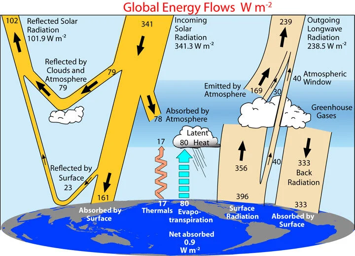
The often-quoted textbook warming of 33 degrees Celsius comes from assuming that the earth’s mean albedo, which measures the reflectivity of incoming sunlight, is the same 0.30 with or without its atmosphere. The albedo with an atmosphere, including the contribution of clouds, can be calculated from the shortwave satellite data on the left side of the figure above, as (79+23)/341 = 0.30. Rancourt calculates the albedo with no atmosphere from the same data, as 23/(23+161) = 0.125, which assumes the albedo is the same as that of the earth’s present surface.

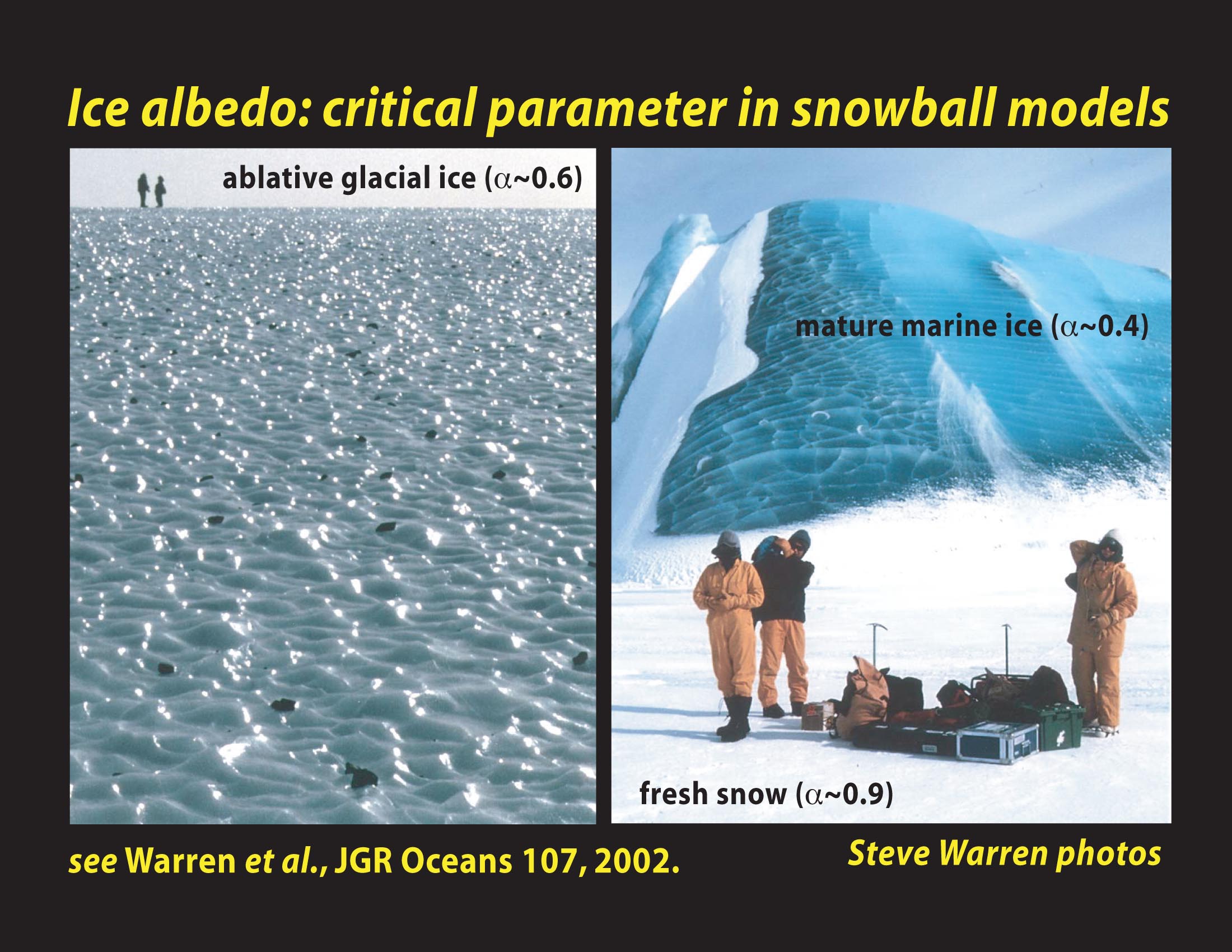
This value is considerably less than the textbook value of 0.30. However, the temperature of an earth with no atmosphere – whether it’s Rancourt’s -4.0 degrees Celsius or a more frigid -19 degrees Celsius – would be low enough for the whole globe to be covered in ice.

Such an ice-encased planet, a glistening white ball as seen from space known as a “Snowball Earth,” is thought to have existed hundreds of millions of years ago. What’s relevant here is that the albedo of a Snowball Earth would be at least 0.4 (the albedo of marine ice) and possibly as high as 0.9 (the albedo of snow-covered ice).

That both values are well above Rancourt’s assumed value of 0.125 seems to cast doubt on his calculation of -4.0 degrees Celsius as the temperature of an earth stripped of its atmosphere. His calculation of CO2 warming may also be on weak ground because, by his own admission, it ignores factors such as inhomogeneities in the earth’s atmosphere and surface; non-uniform irradiation of the surface; and constraints on the rate of decrease of temperature with altitude in the atmosphere, known as the lapse rate. Despite these limitations, Rancourt finds with his radiation balance approach that his double-layer atmosphere model yields essentially the same result as a single-layer model.

He also concludes that the steady state temperature of Earth’s surface is a sizable two orders of magnitude more sensitive to variations in the sun’s heat and light output, and to variations in planetary albedo due to land use changes, than to increases in the level of CO2 in the atmosphere. These claims are not accepted even by the vast majority of climate change skeptics, despite Rancourt’s accurate assertion that global warming doesn’t cause weather extremes.

Next: Challenges to the CO2 Global Warming Hypothesis: (3) The Greenhouse Effect Doesn’t Exist

Challenges to the CO2 Global Warming Hypothesis: (1) A New Take on the Carbon Cycle

Central to the dubious belief that humans make a substantial contribution to climate change is the CO2 global warming hypothesis. The hypothesis is that observed global warming – currently about 1 degree Celsius (1.8 degrees Fahrenheit) since the preindustrial era – has been caused primarily by human emissions of CO2 and other greenhouse gases into the atmosphere. The CO2 hypothesis is based on the apparent correlation between rising worldwide temperatures and the CO2 level in the lower atmosphere, which has gone up by approximately 47% over the same period.

In this series of blog posts, I’ll review several recent research papers that challenge the hypothesis. The first is a 2020 preprint by U.S. physicist and research meteorologist Ed Berry, who has a PhD in atmospheric physics. Berry disputes the claim of the IPCC (Intergovernmental Panel on Climate Change) that human emissions have caused all of the CO2 increase above its preindustrial level in 1750 of 280 ppm (parts per million), which is one way of expressing the hypothesis.

The IPCC’s CO2 model maintains that natural emissions of CO2 since 1750 have remained constant, keeping the level of natural CO2 in the atmosphere at 280 ppm, even as the world has warmed. But Berry’s alternative model concludes that only 25% of the current increase in atmospheric CO2 is due to humans and that the other 75% comes from natural sources. Both Berry and the IPCC agree that the preindustrial CO2 level of 280 ppm had natural origins. If Berry is correct, however, the CO2 global warming hypothesis must be discarded and another explanation found for global warming.

Natural CO2 emissions are part of the carbon cycle that accounts for the exchange of carbon between the earth’s land masses, atmosphere and oceans; it includes fauna and flora, as well as soil and sedimentary rocks. Human CO2 from burning fossil fuels constitutes less than 5% of total CO2 emissions into the atmosphere, the remaining emissions being natural. Atmospheric CO2 is absorbed by vegetation during photosynthesis, and by the oceans through precipitation. The oceans also release CO2 as the temperature climbs.

Berry argues that the IPCC treats human and natural carbon differently, instead of deriving the human carbon cycle from the natural carbon cycle. This, he says, is unphysical and violates the Equivalence Principle of physics. Mother Nature can't tell the difference between fossil fuel CO2 and natural CO2. Berry uses physics to create a carbon cycle model that simulates the IPCC’s natural carbon cycle, and then utilizes his model to calculate what the IPCC human carbon cycle should be.

Berry’s physics model computes the flow or exchange of carbon between land, atmosphere, surface ocean and deep ocean reservoirs, based on the hypothesis that outflow of carbon from a particular reservoir is equal to its level or mass in that reservoir divided by its residence time. The following figure shows the distribution of human carbon among the four reservoirs in 2005, when the atmospheric CO2 level was 393 ppm, as calculated by the IPCC (left panel) and Berry (right panel).

Human carbon IPCC.jpg
Human carbon Berry.jpg

A striking difference can be seen between the two models. The IPCC claims that approximately 61% of all carbon from human emissions remained in the atmosphere in 2005, and no human carbon had flowed to land or surface ocean. In contrast, Berry’s alternative model reveals appreciable amounts of human carbon in all reservoirs that year, but only 16% left in the atmosphere. The IPCC’s numbers result from assuming in its human carbon cycle that human emissions caused all the CO2 increase above its 1750 level.

The problem is that the sum total of all human CO2 emitted since 1750 is more than enough to raise the atmospheric level from 280 ppm to its present 411 ppm, if the CO2 residence time in the atmosphere is as long as the IPCC claims – hundreds of years, much longer than Berry’s 5 to 10 years. The IPCC’s unphysical solution to this dilemma, Berry points out, is to have the excess human carbon absorbed by the deep ocean alone without any carbon remaining at the ocean surface.

Contrary to the IPCC’s claim, Berry says that human emissions don’t continually add CO2 to the atmosphere, but rather generate a flow of CO2 through the atmosphere. In his model, the human component of the current 131 (= 411-280) ppm of added atmospheric CO2 is only 33 ppm, and the other 98 ppm is natural.

The next figure illustrates Berry’s calculations, showing the atmospheric CO2 level above 280 ppm for the period from 1840 to 2020, including both human and natural contributions. It’s clear that natural emissions, represented by the area between the blue and red solid lines, have not stayed at the same 280 ppm level over time, but have risen as global temperatures have increased. Furthermore, the figure also demonstrates that nature has always dominated the human contribution and that the increase in atmospheric CO2 is more natural than human.

Human carbon summary.jpg

Other researchers (see, for example, here and here) have come to much the same conclusions as Berry, using different arguments.

Next: Challenges to the CO2 Global Warming Hypothesis: (2) Questioning Nature’s Greenhouse Effect

Science vs Politics: The Precautionary Principle

Greatly intensifying the attack on modern science is invocation of the precautionary principle – a concept developed by 20th-century environmental activists. Targeted at decision making when the available scientific evidence about a potential environmental or health threat is highly uncertain, the precautionary principle has been used to justify a number of environmental policies and laws around the globe. Unfortunately for science, the principle has also been used to support political action on alleged hazards, in cases where there’s little or no evidence for those hazards.

precautionary principle.jpg

The origins of the precautionary principle can be traced to the application in the early 1970s of the German principle of “Vorsorge” or foresight, based on the belief that environmental damage can be avoided by careful forward planning. The “Vorsorgeprinzip” became the foundation for German environmental law and policies in areas such as acid rain, pollution and global warming. The principle reflects the old adage that “it’s better to be safe than sorry,” and can be regarded as a restatement of the ancient Hippocratic oath in medicine, “First, do no harm.”

Formally, the precautionary principle can be stated as:

When an activity raises threats of harm to human health or the environment, precautionary measures should be taken even if some cause and effect relationships are not fully established scientifically.

But in spite of its noble intentions, the precautionary principle in practice is based far more on political considerations than on science. It’s the “not fully established scientifically” statement that both embraces the principle involved and, at the same time, leaves it open to manipulation and subversion of science.

A notable example of the intrusion of precautionary principle politics into science is the bans on GMO (genetically modified organism) crops by more than half the countries in the European Union. The bans stem from the widespread, fear-based belief that eating genetically altered foods is unsafe, despite the lack of any scientific evidence that GMOs have ever caused harm to a human.

In a 2016 study by the U.S. NAS (National Academy of Sciences, Engineering and Medicine), no substantial evidence was found that the risk to human health was any different for current GMO crops on the market than for their traditionally crossbred counterparts. This conclusion came from epidemiological studies conducted in the U.S. and Canada, where the population has consumed GMO foods since the late 1990s, and similar studies in the UK and Europe, where very few GMO foods are eaten.

The precautionary principle also underlies the UNFCCC (UN Framework Convention on Climate Change), the 1992 treaty that formed the basis for all subsequent political action on global warming. In another post, I’ve discussed the lack of empirical scientific evidence for the narrative of catastrophic anthropogenic (human-caused) climate change. Yet Irrational fear of disastrous consequences of global warming pushes activists to invoke the precautionary principle in order to justify unnecessary, expensive remedies such as those embodied in the Paris Agreement or the Green New Deal.

One of the biggest issues with the precautionary principle is that it essentially advocates risk avoidance. But risk avoidance carries its own risks.

Dangers, great and small, are an accepted part of everyday life. We accept the risk, for example, of being killed or badly injured while traveling on the roads because the risk is outweighed by the convenience of getting to our destination quickly, or by our desire to have fresh food available at the supermarket. Applying the precautionary principle would mean, in addition to the safety measures already in place, reducing all speed limits to 10 mph or less – a clearly impractical solution that would take us back to horse-and-buggy days.  

Another, real-life example of an unintended consequence of the precautionary principle is what happened in Fukushima, Japan in the aftermath of the nuclear accident triggered by a massive earthquake and tsunami in 2011. As described by the authors of a recent discussion paper, Japan’s shutdown of nuclear power production as a safety measure and its replacement by fossil-fueled power raised electricity prices by as much as 38%, decreasing consumption of electricity, especially for heating during cold winters. This had a devastating effect: in the authors’ words,

“Our estimated increase in mortality from higher electricity prices significantly outweighs the mortality from the accident itself, suggesting the decision to cease nuclear production caused more harm than good.”

Adherence to the precautionary principle can also stifle innovation and act as a barrier to technological development. In the worst case, an advantageous technology can be banned because of its potentially negative impact, leaving its positive benefits unrealized. This could well be the case for GMOs. The more than 30 nations that have banned the growing of genetically engineered crops may be shutting themselves off from the promise of producing cheaper and more nutritious food.

The precautionary principle pits science against politics. In an ideal world, the conflict between the two would be resolved wisely. As things are, however, science is often subjugated to the needs and whims of policy makers.

Next: Challenges to the CO2 Global Warming Hypothesis: (1) A New Take on the Carbon Cycle

Absurd Attempt to Link Climate Change to Cancer Contradicted by Another Medical Study

Extreme weather has already been wrongly blamed on climate change. More outlandish claims have linked climate change to medical and social phenomena such as teenage drinking, declining fertility rates, mental health problems, loss of sleep by the elderly and even Aretha Franklin’s death.

Now the most preposterous claim of all has been made, that climate change causes cancer. A commentary last month in a leading cancer journal contends that climate change is increasing cancer risk through increased exposure to carcinogens after extreme weather events such as hurricanes and wildfires. Furthermore, the article declares, weather extremes impact cancer survival by impeding both patients' access to cancer treatment and the ability of medical facilities to deliver cancer care.

How absurd! To begin with, there’s absolutely no evidence that global warm­ing triggers extreme weather, or even that extreme weather is becoming more frequent. The following figure, depicting the annual number of global hurricanes making landfall since 1970, illustrates the lack of any trend in major hurricanes for the last 50 years – during a period when the globe warmed by ap­proximately 0.6 degrees Celsius (1.1 degrees Fahrenheit). The strongest hurricanes today are no more extreme or devastating than those in the past. If anything, major landfalling hurricanes in the US are tied to La Niña cycles in the Pacific Ocean, not to global warming.

Blog 7-15-19 JPG(2).jpg

And wildfires in fact show a declining trend over the same period. This can be seen in the next figure, displaying the estimated area worldwide burned by wildfires, by decade from 1900 to 2010. While the number of acres burned annually in the U.S. has gone up over the last 20 years or so, the present burned area is still only a small fraction of what it was back in the 1930s.

Blog 8-12-19 JPG(2).jpg

Apart from the lack of any connection between climate change and extreme weather, the assertion that hurricanes and wildfires result in increased exposure to carcinogens is dubious. Although hurricanes occasionally cause damage that releases chemicals into the atmosphere, and wildfires generate copious amounts of smoke, these effects are temporary and add very little to the carcinogen load experienced by the average person.

A far greater carcinogen load is experienced continuously by people living in poorer countries who rely on the use of solid fuels, such as coal, wood, charcoal or biomass, for cooking. Incomplete combustion of solid fuels in inefficient stoves results in indoor air pollution that causes respiratory infections in the short term, especially in children, and heart disease or cancer in adults over longer periods of time.

The 2019 Lancet Countdown on Health and Climate Change, an annual assessment of the health effects of climate change, found that mortality from climate-sensitive diseases such as diarrhea and malaria has fallen as the planet has heated, with the exception of dengue fever. Although the Countdown didn’t examine cancer specifically, it did find that the number of people still lacking access to clean cooking fuels and technologies is almost three billion, a number that has fallen by only 1% since 2010.

What this means is that, regardless of ongoing global warming, those billions are still being exposed to indoor carcinogens and are therefore at greater-than-normal risk of later contracting cancer. But the cancer will be despite climate change, not because of it – completely contradicting the claim in the cancer journal that climate change causes cancer.

Because climate change is actually reducing the frequency of hurricanes and wildfires, the commentary’s contention that extreme weather is worsening disruptions to health care access and delivery is also fallacious. Delays due to weather extremes in cancer diagnosis and treatment initiation, and the interruption of cancer care, are becoming less, not more common.

It makes no more sense to link climate change to cancer than to avow that it causes hair loss or was responsible for the creation of the terrorist group ISIS.

Next: Science vs Politics: The Precautionary Principle

How Science Is Being Misused in the Coronavirus Pandemic

Amidst the hysteria over the coronavirus pandemic, politicians constantly assure us that their COVID-19 policy decisions are founded on science. “Following the science” has become the mantra of national and local officials alike.

But the reality is that the various edicts and lockdown measures are based as much on political considerations as science.

Pandemic EPA-EFE MARTA PEREZ.jpg

One of the hallmarks of science is empirical evidence: true science depends on accumulated observations, not on models or anecdotal data. My previous post discussed the shortcomings of coronavirus models, which rely on assumptions about unknowns such as contagiousness and virus incubation period, and whose only observational data is from past flu epidemics or the current pandemic that the models are attempting to simulate.

Many governments thought they were being informed by science in employing models to forecast the epidemic’s course. But, as leaders discovered in places like Italy and New York where the healthcare system was rapidly overwhelmed, the models were of little use in predicting how many ventilators or how much other equipment they would need. It was their own on-the-spot observations and political experience, not science, that led the way.

Science is not a fountain of wisdom. As a UK sociologist remarks: “Scientists can provide evidence, but acting on that evidence requires political will.” Unfortunately, science can be subverted by the political process, politicians all too often choosing only the evidence that bolsters their existing beliefs. Because politics is more visceral than rational, the evidence and logic intrinsic to science rarely play a big role in political debate.

An example of how politics has trampled science in the coronavirus pandemic is the advice given by the UK government to its citizens on self-isolation (self-quarantine in the U.S.) for those with symptoms of COVID-19.

The UK NHS (National Health Service) says seven days after becoming sick is adequate self-isolation. Yet the WHO (World Health Organization), along with medical experts in many countries, recommends a self-quarantine period of 14 days, based on the observation that the incubation period after exposure to the virus ranges from 1 to 14 days. While scientists can and frequently do disagree, the difference between the NHS and WHO guidelines is purely the result of political interference with science.

Another area where science is being misused is antibody testing.

There’s been much fanfare about the possible use of antibody testing to determine whether someone who has recovered from COVID-19 is immune from reinfection by the virus, and can therefore circulate safely in society. That’s true for many other viruses, but hasn’t yet been established for the coronavirus. And if antibodies do confer protection against reinfection, it’s unknown how long the protection lasts – weeks, months or years.

Compounding these uncertainties is the unreliability of many currently available antibody tests, and the finding that some recovered individuals, as determined by an antibody test, still test positive for the coronavirus – meaning they could still possibly infect others. Recent research suggests these are false positives, arising from harmless fragments of the virus left in the body. However, until there’s evidence to resolve such questions, it’s a mistake for any politician or official to claim that science supports their policy position on antibody testing.

A third example of misuse of science during the pandemic is the debate over prescribing the malaria drug hydroxychloroquine as an early-stage treatment for COVID-19 patients.

It’s not unusual in medicine to prescribe a drug, originally developed to treat a particular illness, as an off-label remedy for another condition. Hydroxychloroquine has for many years been considered a safe and effective treatment for malaria, lupus and rheumatoid arthritis. At the beginning of the coronavirus pandemic, the drug was used successfully to treat COVID-19 in China, France and other countries.

But the use of hydroxychloroquine to treat coronavirus patients in the U.S. has been controversial. President Donald Trump, who took a course of the medication as a preventative measure and touted its potential benefits for sick patients, has been chastised by political opponents for his endorsement of the treatment. Several studies have appeared to show that the drug, not yet officially approved by the FDA (Food and Drug Administration), can cause serious heart problems. One of these studies has, however, been retracted because of doubts over the veracity of the data.

Nevertheless, what’s important about hydroxychloroquine from a scientific viewpoint is that all the studies so far have been epidemiological. As is well known, an epidemiological study can only show a correlation between the drug and certain outcomes, not a clear cause and effect. Epidemiological studies are notoriously misleading, as found in numerous nutritional studies. Delineation of cause and effect requires a clinical trial – a randomized controlled trial, in which the study population is divided randomly into two identical groups, with intervention in only one group and the other group used as a control. So far, no clinical trials of hydroxychloroquine have been completed.

Although science is a powerful tool for understanding the world around us, it has its limitations. It should not be used as an authority in policy making unless the science is firmly grounded in observational evidence.

Next: Absurd Attempt to Link Climate Change to Cancer Contradicted by Another Medical Study

Why Both Coronavirus and Climate Models Get It Wrong

Most coronavirus epidemiological models have been an utter failure in providing advance information on the spread and containment of the insidious virus. Computer climate models are no better, with a dismal track record in predicting the future.

This post compares the similarities and differences of the two types of model. But similarities and differences aside, the models are still just that – models. Although I remarked in an earlier post that epidemiological models are much simpler than climate models, this doesn’t mean they’re any more accurate.     

Both epidemiological and climate models start out, as they should, with what’s known. In the case of the COVID-19 pandemic the knowns include data on the progression of past flu epidemics, and demographics such as population size, age distribution, social contact patterns and school attendance. Among the knowns for climate models are present-day weather conditions, the global distribution of land and ice, atmospheric and ocean currents, and concentrations of greenhouse gases in the atmosphere.

But the major weakness of both types of model is that numerous assumptions must be made to incorporate the many variables that are not known. Coronavirus and climate models have little in common with the models used to design computer chips, or to simulate nuclear explosions as an alternative to actual testing of atomic bombs. In both these instances, the underlying science is understood so thoroughly that speculative assumptions in the models are unnecessary.

Epidemiological and climate models cope with the unknowns by creating simplified pictures of reality involving approximations. Approximations in the models take the form of adjustable numerical parameters, often derisively termed “fudge factors” by scientists and engineers. The famous mathematician John von Neumann once said, “With four [adjustable] parameters I can fit an elephant, and with five I can make him wiggle his trunk.”

One of the most important approximations in coronavirus models is the basic reproduction number R0 (“R naught”), which measures contagiousness. The numerical value of R0 signifies the number of other people that an infected individual can spread the disease to, in the absence of any intervention. As shown in the figure below, R0 for COVID-19 is thought to be in the range from 2 to 3, much higher than for a typical flu at about 1.3, though less than values for other infectious diseases such as measles.

COVID-19 R0.jpg

It’s COVID-19’s high R0 that causes the virus to spread so easily, but its precise value is still uncertain. What determines how quickly the virus multiplies, however, is the incubation period, during which an infected individual can’t infect others. Both R0 and the incubation period define the epidemic growth rate. They’re adjustable parameters in coronavirus models, along with factors such as the rate at which susceptible individuals become infectious in the first place, travel patterns and any intervention measures taken.

In climate models, hundreds of adjustable parameters are needed to account for deficiencies in our knowledge of the earth’s climate. Some of the biggest inadequacies are in the representation of clouds and their response to global warming. This is partly because we just don’t know much about the inner workings of clouds, and partly because actual clouds are much smaller than the finest grid scale that even the largest computers can accommodate – so clouds are simulated in the models by average values of size, altitude, number and geographic location. Approximations like these are a major weakness of climate models, especially in the important area of feedbacks from water vapor and clouds.

An even greater weakness in climate models is unknowns that aren’t approximated at all and are simply omitted from simulations because modelers don’t know how to model them. These unknowns include natural variability such as ocean oscillations and indirect solar effects. While climate models do endeavor to simulate various ocean cycles, the models are unable to predict the timing and climatic influence of cycles such as El Niño and La Niña, both of which cause drastic shifts in global climate, or the Pacific Decadal Oscillation. And the models make no attempt whatsoever to include indirect effects of the sun like those involving solar UV radiation or cosmic rays from deep space.

As a result of all these shortcomings, the predictions of coronavirus and climate models are wrong again and again. Climate models are known even by modelers to run hot, by 0.35 degrees Celsius (0.6 degrees Fahrenheit) or more above observed temperatures. Coronavirus models, when fed data from this week, can probably make a reasonably accurate forecast about the course of the pandemic next week – but not a month, two months or a year from now. Dr. Anthony Fauci of the U.S. White House Coronavirus Task Force recently admitted as much.

Computer models have a role to play in science, but we need to remember that most of them depend on a certain amount of guesswork. It’s a mistake, therefore, to base scientific policy decisions on models alone. There’s no substitute for actual, empirical evidence.

Next: How Science Is Being Misused in the Coronavirus Pandemic

Does Planting Trees Slow Global Warming? The Evidence

It’s long been thought that trees, which remove CO2 from the atmosphere and can live much longer than humans, exert a cooling influence on the planet. But a close look at the evidence reveals that the opposite could be true – that planting more trees may actually have a warming effect.

This is the tentative conclusion reached by a senior scientist at NASA, in evaluating the results of a 2019 study to estimate Earth’s forest restoration potential. It’s the same conclusion that the IPCC (Intergovernmental Panel on Climate Change) came to in a comprehensive 2018 report on climate change and land degradation. Both the 2019 study and IPCC report were based on various forest models.

The IPCC’s findings are summarized in the following figure, which shows how much the global surface temperature is altered by large-scale forestation (crosses) or deforestation (circles) in three different climatic regions: boreal (subarctic), temperate and tropical; the figure also shows how much deforestation affects regional temperatures.

Forestation.jpg

Trees impact the temperature through either biophysical or biogeochemical effects. The principal biophysical effect is changes in albedo, which measures the reflectivity of incoming sunlight. Darker surfaces such as tree leaves have lower albedo and reflect the sun less than lighter surfaces such as snow and ice with higher albedo. Planting more trees lowers albedo, reducing reflection but increasing absorption of solar heat, resulting in global warming.

The second main biophysical effect is changes in evapotranspiration, which is the release of moisture from plant and tree leaves and the surrounding soil. Forestation boosts evapotranspiration, pumping more water vapor into the atmosphere and causing global cooling that competes with the warming effect from reduced albedo.

These competing biophysical effects of forestation are accompanied by a major geochemical effect, namely the removal of CO2 from the atmosphere by photosynthesis. In photosynthesis, plants and trees take in CO2 and water, as well as absorbing sunlight, producing energy for growth and releasing oxygen. Lowering the level of the greenhouse gas CO2 in the atmosphere results in the cooling traditionally associated with planting trees.

The upshot of all these effects, plus other minor contributions, is demonstrated in the figure above. For all three climatic zones, the net global biophysical outcome of large-scale forestation (blue crosses) – primarily from albedo and evapotranspiration changes – is warming.

Additional biophysical data can be inferred from the results for deforestation (small blue circles), simply reversing the sign of the temperature change to show forestation. Doing this indicates global warming again for forestation in boreal and temperate zones, and perhaps slight cooling in the tropics, with regional effects (large blue circles) being more pronounced. There is strong evidence, therefore, from the IPCC report that widespread tree planting results in net global warming from biophysical sources.

The only region for which there is biogeochemical data (red crosses) for forestation – signifying the influence of CO2 – is the temperate zone, in which forestation results in cooling as expected. Additionally, because deforestation (red dots) results in biogeochemical warming in all three zones, it can be inferred that forestation in all three zones, including the temperate zone, causes cooling.

Which type of process dominates, following tree planting – biophysical or biogeochemical? A careful examination of the figure suggests that biophysical effects prevail in boreal and temperate regions, but biogeochemical effects may have the upper hand in tropical regions. This implies that large-scale planting of trees in boreal and temperate regions will cause further global warming. However, two recent studies (see here and here) of local reforestation have found evidence for a cooling effect in temperate regions.

Forest.jpg

But even in the tropics, where roughly half of the earth’s forests have been cleared in the past, it’s far from certain that the net result of extensive reforestation will be global cooling. Among other factors that come into play are atmospheric turbulence, rainfall, desertification and the particular type of tree planted.

Apart from these concerns, another issue in restoring lost forests is whether ecosystems in reforested areas will revert to their previous condition and have the same ability as before to sequester CO2. Says NASA’s Sassan Saatchi, “Once connectivity [to the climate] is lost, it becomes much more difficult for a reforested area to have its species range and diversity, and the same efficiency to absorb atmospheric carbon.”

So, while planting more trees may provide more shade for us humans in a warming world, the environmental benefits are not at all clear.

Next: Why Both Coronavirus and Climate Models Get It Wrong

Coronavirus Epidemiological Models: (3) How Inadequate Testing Limits the Evidence

Hampering the debate over what action to take on the coronavirus, and over which epidemiological model is the most accurate, is a shortage of evidence. Evidence includes the infectiousness of the virus, how readily it’s transmitted, whether infection confers immunity and, if so, for how long. The answers to such questions can only be obtained from individual testing. But testing has been conspicuously inadequate in most countries, being largely limited to those showing symptoms.

We know the number of deaths, those recorded at least, but a big unknown is the total number of people infected. This “evidence fiasco,” as eminent Stanford medical researcher and epidemiologist John Ioannidis describes it, creates great uncertainty about the lethality of COVID-19 and means that reported case fatality rates are meaningless. In Ioannidis’ words, “We don’t know if we are failing to capture infections by a factor of three or 300.”

The following table lists the death rate, expressed as a percentage of known infections, for the countries with the largest number of reported cases as of April 16, and the most recent data for testing rates (per 1,000 people).

Table (2).jpg

As Ioannidis emphasizes, the death rate calculated as a percentage of the number of cases is highly uncertain because of variations in testing rate. And the number of fatalities is likely an undercount, since most countries don’t include those who die at home or in nursing facilities, as opposed to hospitals.

Nevertheless, the data does reveal some stark differences from country to country. Two nations with two of the highest testing rates in the table above – Italy and Germany – show markedly distinct death rates – 13.1% and 2.9%, respectively – despite having not very different numbers of COVID-19 cases. The disparity has been attributed to different demographics and levels of health in Italy and Germany. And two countries with two of the lowest testing rates, France and Turkey, also differ widely in mortality, though Turkey has a lower number of cases to date.

Most countries, including the U.S., lack the ability to test a large number of people and no countries have reliable data on the prevalence of the virus in the population as a whole. Clearly, more testing is needed before we can get a good handle on COVID-19 and be able to make sound policy decisions about the disease.

Two different types of test are necessary. The first is a test to discover how many people are currently infected or not infected, apart from those already diagnosed. A major problem in predicting the spread of the coronavirus has been the existence of asymptomatic individuals, possibly 25% or more of the population, who unknowingly have the disease and transmit the virus to those they come in contact with.

A rapid diagnostic test for infection has recently been developed by U.S. medical device manufacturer Abbott Laboratories. The compact, portable Abbott device, which recently received emergency use authorization from the FDA (U.S. Food and Drug Administration), can deliver a positive (infected) result for COVID-19 in as little as five minutes and a negative (uninfected) result in 13 minutes. Together with a more sophisticated device for use in large laboratories, Abbott expects to provide about 5 million tests in April alone. Public health laboratories using other devices will augment this number by several hundred thousand.

That’s not the whole testing story, however. A negative result in the first test includes both those who have never been infected and those who have been infected but are now recovered. To distinguish between these two groups requires a second test – an antibody test that indicates which members of the community are immune to the virus as a result of previous infection.

A large number of 15-minute rapid antibody tests have been developed around the world. In the U.S., more than 70 companies have sought approval to sell antibody tests in recent weeks, say regulators, although only one so far has received FDA emergency use authorization. It’s not known how reliable the other tests are; some countries have purchased millions of antibody tests only to discover they were inaccurate. And among other unknowns are the level of antibodies it takes to actually become immune and how long antibody protection against the coronavirus actually lasts.       

But there’s no question that both types of test are essential if we’re to accumulate enough evidence to conquer this deadly disease. Empirical evidence is one of the hallmarks of genuine science, and that’s as true of epidemiology as of other disciplines.

Next: Does Planting Trees Slow Global Warming? The Evidence

Coronavirus Epidemiological Models: (2) How Completely Different the Models Can Be

Two of the most crucial predictions of any epidemiological model are how fast the disease in question will spread, and how many people will die from it. For the COVID-19 pandemic, the various models differ dramatically in their projections.

A prominent model, developed by an Imperial College, London research team and described in the previous post, assesses the effect of mitigation and suppression measures on spreading of the pandemic in the UK and U.S. Without any intervention at all, the model predicts that a whopping 500,000 people would die from COVID-19 in the UK and 2.2 million in the more populous U.S. These are the numbers that so alarmed the governments of the two countries.

Initially, the Imperial researchers claimed their numbers could be halved (to 250,000 and 1.1 million deaths, respectively) by implementing a nationwide lockdown of individuals and nonessential businesses. Lead scientist Neil Ferguson later revised the UK estimate drastically downward to 20,000 deaths. But it appears this estimate would require repeating the lockdown periodically for a year or longer, until a vaccine becomes available. Ferguson didn’t give a corresponding reduced estimate for the U.S., but it would be approximately 90,000 deaths if the same scaling applies.

This reduced Imperial estimate for the U.S. is somewhat above the latest projection of a U.S. model, developed by the Institute for Health Metrics and Evaluations at the University of Washington in Seattle. The Washington model estimates the total number of American deaths at about 60,000, assuming national adherence to stringent stay-at-home and social distancing measures. The figure below shows the predicted number of daily deaths as the U.S. epidemic peaks over the coming months, as estimated this week. The peak of 2,212 deaths on April 12 could be as high as 5,115 or as low as 894, the Washington team says.

COVID.jpg

The Washington model is based on data from local and national governments in areas of the globe where the pandemic is well advanced, whereas the Imperial model primarily relies on data from China and Italy alone.  Peaks in each U.S. state are expected to range from the second week of April through the last week of May.

Meanwhile, a rival University of Oxford team has put forward an entirely different model, which suggests that up to 68% of the UK population may have already been infected. The virus may have been spreading its tentacles, they say, for a month or more before the first death was reported. If so, the UK crisis would be over in two to three months, and the total number of deaths would be below the 250,000 Imperial estimate, due to a high level of herd immunity among the populace. No second wave of infection would occur, unlike the predictions of the Imperial and Washington models.

Nevertheless, that’s not the only possible interpretation of the Oxford results. In a series of tweets, Harvard public health postdoc James Hay has explained that the proportion of the UK population already infected could be anywhere between 0.71% and 56%, according to his calculations using the Oxford model. The higher the percentage infected and therefore immune before the disease began to escalate, the lower the percentage of people still at risk of contracting severe disease, and vice versa.

The Oxford model shares some assumptions with the Imperial and Washington models, but differs slightly in others. For example, it assumes a shorter period during which an infected individual is infectious, and a later date when the first infection occurred. However, as mathematician and infectious disease specialist Jasmina Panovska-Griffiths explains, the two models actually ask different questions. The question asked by the Imperial and Washington groups is: What strategies will flatten the epidemic curve for COVID-19? The Oxford researchers ask the question: Has COVID-19 already spread widely?  

Without the use of any model, Stanford biophysicist and Nobel laureate Michael Levitt has come to essentially the same conclusion as the Oxford team, based simply on an analysis of the available data. Levitt’s analysis focuses on the rate of increase in the daily number of new cases: once this rate slows down, so does the death rate and the end of the outbreak is in sight.

By examining data from 78 of the countries reporting more than 50 new cases of COVID-19 each day, Levitt was able to correctly predict the trajectory of the epidemic in most countries. In China, once the number of newly confirmed infections began to fall, he predicted that the total number of COVID-19 cases would be around 80,000, with about 3,250 deaths – a remarkably accurate forecast, though doubts exist about the reliability of the Chinese numbers. In Italy, where the caseload was still rising, his analysis indicated that the outbreak wasn’t yet under control, as turned out to be tragically true.

Levitt, however, agrees with the need for strong measures to contain the pandemic, as well as earlier detection of the disease through more widespread testing.

Next: Coronavirus Epidemiological Models: (3) How Inadequate Testing Limits the Evidence


Coronavirus Epidemiological Models: (1) What the Models Predict

Amid all the brouhaha over COVID-19 – the biggest respiratory virus threat globally since the 1918 influenza pandemic – confusion reigns over exactly what epidemiological models of the disease are predicting. That’s important as the world begins restricting everyday activities and effectively shutting down national economies, based on model predictions.

In this and subsequent blog posts, I’ll examine some of the models being used to simulate the spread of COVID-19 within a population. As readers will know, I’ve commented at length in this blog on the shortcomings of computer climate models and their failure to accurately predict the magnitude of global warming. 

Epidemiological models, however, are far simpler than climate models and involve far fewer assumptions. The propagation of disease from person to person is much better understood than the vagaries of global climate. A well-designed disease model can help predict the likely course of an epidemic, and can be used to evaluate the most realistic strategies for containing it.

Following the initial coronavirus episode that began in Wuhan, China, various attempts have been made to model the outbreak. One of the most comprehensive studies is a report published last week, by a research team at Imperial College in London, that models the effect of mitigation and suppression control measures on the pandemic spreading in the UK and U.S.

Mitigation focuses on slowing the insidious spread of COVID-19, by taking steps such as requiring home quarantine of infected individuals and their families, and imposing social distancing of the elderly; suppression aims to stop the epidemic in its tracks, by adding more drastic measures such as social distancing of everyone and the closing of nonessential businesses and schools. Both tactics are currently being used not only in the UK and U.S., but also in many other countries – especially in Italy, hit hard by the epidemic.

The model results for the UK are illustrated in the figure below, which shows how the different strategies are expected to affect demand for critical care beds in UK hospitals over the next few months. You can see the much-cited “flattening of the curve,” referring to the bell-shaped curve that portrays the peaking of critical care cases, and related deaths, as the disease progresses. The Imperial College model assumes that 50% of those in critical care will die, based on expert clinical opinion. In the U.S., the epidemic is predicted to be more widespread than in the UK and to peak slightly later.

COVID-19 Imperial College.jpg

What set alarm bells ringing was the model’s conclusion that, without any intervention at all, approximately 0.5 million people would die from COVID-19 in the UK and 2.2 million in the more populous U.S. But these numbers could be halved (to 250,000 and 1.1-1.2 million deaths, respectively) if all the proposed mitigation and suppression measures are put into effect, say the researchers.

Nevertheless, the question then arises of how long such interventions can or should be maintained. The blue shading in the figure above shows the 3-month period during which the interventions are assumed to be enforced. But because there is no cure for the disease at present, it’s possible that a second wave of infection will occur once interventions are lifted. This is depicted in the next figure, assuming a somewhat longer 5-month period of initial intervention.

COVID-19 Imperial College 2nd wave.jpg

The advantage of such a delayed peaking of the disease’s impact would be a lessening of pressure on an overloaded healthcare system, allowing more time to build up necessary supplies of equipment and reducing critical care demand – in turn reducing overall mortality. In addition, stretching out the timeline for a sufficiently long time could help bolster herd immunity. Herd immunity from an infectious disease results when enough people become immune to the disease through either recovery or vaccination, both of which reduce disease transmission. A vaccine, however, probably won’t be available until 2021, even with the currently accelerated pace of development.

Whether the assumptions behind the Imperial College model are accurate is an issue we’ll look at in a later post. The model is highly granular, reaching down to the level of the individual and based on high-resolution population data, including census data, data from school districts, and data on the distribution of workplace size and commuting distance. Contacts between people are examined within a household, at school, at work and in social settings.

The dilemma posed by the model’s predictions is obvious. It’s necessary to balance minimizing the death rate from COVID-19 with the social and economic disruption caused by the various interventions, and with the likely period over which the interventions can be maintained.

Next: Coronavirus Epidemiological Models: (2) How Completely Different the Models Can Be

Science on the Attack: Cancer Immunotherapy

As a diversion from my regular blog posts examining how science is under attack, occasional posts such as this one will showcase examples of science nevertheless on the attack – to illustrate the power of the scientific method in tackling knotty problems, even when the discipline itself is under siege. This will exclude technology, which has always thrived. The first example is from the field of medicine: cancer immunotherapy.

Cancer is a vexing disease, in fact a slew of different diseases, in which abnormal cells proliferate uncontrollably and can spread to healthy organs and tissues. It’s one of the leading causes of death worldwide, especially in high-income countries. Each type of cancer, such as breast, lung or prostate, has as many as 10 different sub-types, vastly complicating efforts to conquer the disease.

Although the role of the body’s immune system is to detect and destroy abnormal cells, as well as invaders like foreign bacteria and viruses, cancer can evade the immune system through several mechanisms that shut down the immune response.

One mechanism involves the immune system deploying T-cells – a type of white blood cell – to recognize abnormal cells. It does this by looking for flags or protein fragments called antigens displayed on the cell surface that signal the cell’s identity. The T-cells, sometimes called the warriors of the immune system, identify and then kill the offending cells.

But the problem is that cancer cells can avoid annihilation by deactivating a switch on the T-cell known as an immune checkpoint, the purpose of which is to prevent T-cells from becoming over zealous and generating too powerful an immune response. Switching off the checkpoint altogether takes the T-cell out of the action and allows the cancer to grow. The breakthrough of cancer immunotherapy was in discovering drugs that can act as checkpoint inhibitors, which keep the checkpoint activated or switched on at all times and therefore enable the immune system to do its job in attacking the cancerous cells.

cancer immunotherapy.jpg

However, such a discovery wasn’t an easy task. Attempts to harness the immune system to fight cancer go back over 100 years, but none of these attempts worked successfully on a consistent basis. The only options available to cancer patients were from the standard regimen of surgery, chemotherapy, radiation and hormonal treatments.

In what the British Society for Immunology described as “one of the most extraordinary breakthroughs in modern medicine,” researchers James P. Allison and Tasuku Honjo were awarded the 2018 Nobel Prize in Physiology or Medicine for their discoveries of different checkpoint inhibitor drugs – discoveries that represented the culmination of over a decade’s painstaking laboratory work. Allison explored one type of checkpoint inhibitor (known as CTLA-4), Honjo another one (known as PD-1).

Early clinical tests of both types of inhibitor showed spectacular results. In several patients with advanced melanoma, an aggressive type of skin cancer, the cancer completely disappeared when treated with a drug based on Allison’s research. In patients with other types of cancer such as lung cancer, renal cancer and lymphoma, treatment with a drug based on Honjo’s research resulted in long-term remission, and may have even cured metastatic cancer – previously not considered treatable.

Yet despite this initial promise, it’s been found that checkpoint inhibitor immunotherapy is effective for only a small portion of cancer patients: genetic differences are no doubt at play. States Dr. Roy Herbst, chief of medical oncology at Yale Medicine, “The sad truth about immunotherapy treatment in lung cancer is that it shrinks tumors in only about one or two out of 10 patients.” More research and possibly drug combinations will be needed, Dr. Herbst says, to extend the revolutionary new treatment to more patients.

Another downside is possible side effects from immune checkpoint drugs, caused by overstimulation of the immune system and consequent autoimmune reactions in which the immune system attacks normal, healthy tissue. But such reactions are usually manageable and not life-threatening.

Cancer immunotherapy is but one of many striking recent advances in the medical field, illustrating how the biomedical sciences can be on the attack even as they come under assault, especially from medical malfeasance in the form of irreproducibility and fraud.

Next: Coronavirus Epidemiological Models: (1) What the Models Predict

The Futility of Action to Combat Climate Change: (2) Political Reality

In the previous post, I showed how scientific and engineering realities make the goal of taking action to combat climate change inordinately expensive and unattainable in practice for decades to come, even if climate alarmists are right about the need for such action. This post deals with the equally formidable political realities involved.

By far the biggest barrier is the unlikelihood that the signatories to the 2015 Paris Agreement will have the political will to adhere to their voluntary pledges for reducing greenhouse gas emissions. Lacking any enforcement mechanism, the agreement is merely a “feel good” document that allows nations to signal virtuous intentions without actually having to make the hard decisions called for by the agreement. This reality is tacitly admitted by all the major CO2 emitters.

Evidence that the Paris Agreement will achieve little is contained in the figure below, which depicts the ability of 58 of the largest emitters, accounting for 80% of the world’s greenhouse emissions, to meet the present goals of the accord. The goals are to hold “the increase in the global average temperature to well below 2 degrees Celsius (3.6 degrees Fahrenheit) above pre-industrial levels,” preferably limiting the increase to only 1.5 degrees Celsius (2.7 degrees Fahrenheit).

Paris commitments.jpg

It’s seen that only seven nations have declared emission reductions big enough to reach the Paris Agreement’s goals, including just one of the largest emitters, India. The seven largest emitters, apart from India which currently emits 7% of the world’s CO2, are China (28%), the USA (14%), Russia (5%), Japan (3%), Germany (2%, biggest in the EU) and South Korea (2%). The EU designation here includes the UK and 27 European nations.

As the following figure shows, annual CO2 emissions from both China and India are rising, along with those from the other developing nations (“Rest of world”). Emissions from the USA and EU, on the other hand, have been steady or falling for several decades. Ironically, the USA’s emissions in 2019, which dropped by 2.9% from the year before, were no higher than in 1993 – despite the country’s withdrawal from the Paris Agreement.

emissions_by_country.jpg

As the developing nations, including China and India, currently account for 76% of global emissions, it’s difficult to imagine that the world as a whole will curtail its emissions anytime soon.

China, although a Paris Agreement signatory, has declared its intention of increasing its annual CO2 emissions until 2030 in order to fully industrialize – a task requiring vast amounts of additional energy, mostly from fossil fuels. The country already has over 1,000 GW of coal-fired power capacity and another 120 GW under construction. China is also financing or building 250 GW of coal-fired capacity as part of its Belt and Road Initiative across the globe. Electricity generation in China from burning coal and natural gas accounted for 70% of the generation total in 2018, compared with 26% from renewables, two thirds of which came from hydropower.

India, which has also ratified the Paris Agreement, believes it can meet the agreement’s aims even while continuing to pour CO2 into the atmosphere. Coal’s share of Indian primary energy consumption, which is predominantly for electricity generation and steelmaking, is expected to decrease slightly from 56% in 2017 to 48% in 2040. However, achieving even this reduction depends on doubling the share of renewables in electricity production, an objective that may not be possible because of land acquisition and funding barriers.

Nonetheless, it’s not China nor India that stand in the way of making the Paris Agreement a reality, but rather the many third world countries who want to reach the same standard of living as the West – a lifestyle that has been attained through the availability of cheap, fossil fuel energy. In Africa today, for example, 600 million people don’t have access to electricity and 900 million are forced to cook with primitive stoves fueled by wood, charcoal or dung, all of which create health and environmental problems. Coal-fired electricity is the most affordable remedy for the continent.

In the words of another writer, no developing country will hold back from increasing their CO2 emissions “until they have achieved the same levels of per capita energy consumption that we have here in the U.S. and in Europe.” This drive for a better standard of living, together with the lack of any desire on the part of industrialized countries to lower their energy consumption, spells disaster for realizing the lofty goals of the Paris Agreement.

Next: Science on the Attack: Cancer Immunotherapy

The Futility of Action to Combat Climate Change: (1) Scientific and Engineering Reality

Amidst the clamor for urgent action to supposedly combat climate change, the scientific and engineering realities of such action are usually overlooked. Let’s imagine for a moment that we humans are indeed to blame for global warming and that catastrophe is imminent without drastic measures to curb fossil fuel emissions – views not shared by climate skeptics like myself.

In this and the subsequent blog post, I’ll show how proposed mitigation measures are either impractical or futile. We’ll start with the 2015 Paris Agreement – the international agreement on cutting greenhouse gas emissions, which 195 nations, together with many of the world’s scientific societies and national academies, have signed on to.

The agreement endorses the assertion that global warming comes largely from our emissions of greenhouse gases, and commits its signatories to “holding the increase in the global average temperature to well below 2 degrees Celsius (3.6 degrees Fahrenheit) above pre-industrial levels,” preferably limiting the increase to only 1.5 degrees Celsius (2.7 degrees Fahrenheit). According to NASA, current warming is close to 1 degree Celsius (1.8 degrees Fahrenheit).

How realistic are these goals? To achieve them, the Paris Agreement requires nations to declare a voluntary “nationally determined contribution” toward emissions reduction. However, it has been estimated by researchers at MIT (Massachusetts Institute of Technology) that, even if all countries were to follow through with their voluntary contributions, the actual mitigation of global warming by 2100 would be at most only about 0.2 degrees Celsius (0.4 degrees Fahrenheit).

Higher estimates, ranging up to 0.6 degrees Celsius (1.1 degrees Fahrenheit), assume that countries boost their initial voluntary emissions targets in the future. The agreement actually stipulates that countries should submit increasingly ambitious targets every five years, to help attain its long-term temperature goals. But the targets are still voluntary, with no enforcement mechanism.

Given that most countries are already falling behind their initial pledges, mitigation of more than 0.2 degrees Celsius (0.4 degrees Fahrenheit) by 2100 seems highly unlikely. Is it worth squandering the trillions of dollars necessary to achieve such a meager gain, even if the notion that we can control the earth’s thermostat is true?     

Another reality check is the limitations of renewable energy sources, which will be essential to our future if the world is to wean itself off fossil fuels that today supply almost 80% of our energy needs. The primary renewable technologies are wind and solar photovoltaics. But despite all the hype, wind and solar are not yet cost competitive with cheaper coal, oil and gas in most countries, when subsidies are ignored. Higher energy costs can strangle a country’s economy.

Source: BP

Source: BP

And it will be many years before renewables are practical alternatives to fossil fuels. It’s generally unappreciated by renewable energy advocates that full implementation of a new technology can take many decades. That’s been demonstrated again and again over the past century in areas as diverse as electronics and steelmaking.

The claim is often made, especially by proponents of the so-called Green New Deal, that scale-up of wind and solar power could be accomplished quickly by mounting an effort comparable to the U.S. moon landing program in the 1960s. But the claim ignores the already mature state of several technologies crucial to that program at the outset. Rocket technology, for example, had been developed by the Germans and used to terrify Londoners in the UK during World War II. The vacuum technology needed for the Apollo crew modules and spacesuits dates from the beginning of the 20th century.

Renewable energy.jpg

Such advantages don’t apply to renewable energy. The main engineering requirements for widespread utilization of wind and solar power are battery storage capability, to store energy for those times when the wind stops blowing or the sun isn’t shining, and redesign of the electric grid.

But even in the technologically advanced U.S., battery storage is an order of magnitude too expensive today for renewable electricity to be cost competitive with electricity generated from fossil fuels. That puts battery technology where rocket technology was more than 25 years before Project Apollo was able to exploit its use in space. Likewise, conversion of the U.S. power grid to renewable energy would cost trillions of dollars – and, while thought to be attainable, is currently seen as merely “aspirational.”

The bottom line for those who believe we must act urgently on the climate “emergency”: it’s going to take a lot of time and money to do anything at all, and whatever we do may make little difference to the global climate anyway.

Next: The Futility of Action to Combat Climate Change: (2) Political Reality

Australian Bushfires: Ample Evidence That Past Fires Were Worse

Listening to Hollywood celebrities and the mainstream media, you’d think the current epidemic of bushfires in Australia means the apocalypse is upon us. With vast tracts of land burned to the ground, dozens of people and millions of wild animals killed, and thousands of homes destroyed, climate alarmists would have you believe it’s all because of global warming.

But not only is there no scientific evidence that the frequency or severity of wildfires are on the rise in a warming world, but the evidence also clearly shows that the present Australian outbreak is unexceptional.

Bushfire.jpg

Although almost 20 million hectares (50 million acres, or 77,000 square miles) nationwide have burned so far, this is less than 17% of the staggeringly large area incinerated in the 1974-75 bushfire season and less than the burned area in three other conflagrations. Politically correct believers in the narrative of human-caused climate change seem unaware of such basic facts about the past.

The catastrophic fires in the 1974-75 season consumed 117 million hectares (300 million acres), which is 15% of the land area of the whole continent. Because nearly two thirds of the burned area was in remote parts of the Northern Territory and Western Australia, relatively little human loss was incurred, though livestock and native animals such as lizards and red kangaroos suffered.

The Northern Territory was also the location of major bushfires in the 1968-69, 1969-70 and 2002-03 seasons that burned areas of 40 million, 45 million and 38 million hectares (99 million, 110 million and 94 million acres), respectively. That climate change wasn’t the cause should be obvious from the fact that the 1968-69 and 1969-70 fires occurred during a 30-year period of global cooling from 1940 to 1970.

Despite the ignorance and politically charged rhetoric of alarmists, the primary cause of all these terrible fires in Australia has been the lack of intentional or prescribed burning. The practice was used by the native Aboriginal population for as long as 50,000 years before early settlers abandoned it after trying unsuccessfully to copy indigenous fire techniques – lighting fires so hot that flammable undergrowth, the main target of prescribed burns, actually germinated more after burning.

The Aboriginals, like native people everywhere, had a deep knowledge of the land. They knew what types of fires to burn for different types of terrain, how long to burn, and how frequently. This knowledge enabled them to keep potential wildfire fuel such as undergrowth and certain grasses in check, thereby avoiding the more intense and devastating bushfires of the modern era. As the Aboriginals found, small-scale fires can be a natural part of forest ecology.

Only recently has the idea of controlled burning been revived in Australia and the U.S., though the approach has been practiced in Europe for many years. Direct evidence of the efficacy of controlled burning is presented in the figure below, which shows how bushfires in Western Australia expanded significantly as prescribed burning was suppressed over the 50 years from 1963 to 2013.

WA bushfires.jpg

Bushfires have always been a feature of life in Australia. One of the earliest recorded outbreaks was the so-called Black Thursday bushfires of 1851, when then record-high temperatures up to 47.2 degrees Celsius (117 degrees Fahrenheit) and strong winds exacerbated fires that burned 5 million hectares (12 million acres), killed 12 people and terrified the young colony of Victoria. The deadliest fires of all time were the Black Saturday bushfires of 2009, also in Victoria, with 173 fatalities.    

Pictures of charred koala bears, homes engulfed in towering flames and residents seeking refuge on beaches are disturbing. But there’s simply no evidence for the recent statement in Time magazine by Malcolm Turnbull, former Australian Prime Minister, that “Australia’s fires this summer – unprecedented in the scale of their destruction – are the ferocious but inevitable reality of global warming.” Turnbull and climate alarmists should know better than to blame wildfires on this popular but erroneous belief.

Next: The Futility of Action to Combat Climate Change: (1) Scientific and Engineering Reality

When Science Is Literally under Attack: Ad Hominem Attacks

Ad hominem.jpg

Science by its nature is contentious. Before a scientific hypothesis can be elevated to a theory, a solid body of empirical evidence must be accumulated and differing interpretations debated, often vigorously. But while spirited debate and skepticism of new ideas are intrinsic to the scientific method, stooping to personal hostility and ad hominem (against the person) attacks are an abuse of the discipline.

If the animosity were restricted to words alone, it could be excused as inevitable human tribalism. Loyalty to the tribe and conformity are much more highly valued than dissent or original thinking; ad hominem attacks are merely a defensive measure against proposals that threaten tribal unity. 

However, when the acrimony in scientific debate goes beyond verbal to physical abuse, either threatened or actual, then science itself is truly under assault. Unfortunately, such vicious behavior is becoming all too common.  

A recent example was a physical attack on pediatrician and California state senator Richard Pan, who had authored a bill to tighten a previous law allowing medical exemptions from vaccination for the state’s schoolchildren. After enduring vitriolic ad hominem attacks and multiple death threats calling for him to be “eradicated” or hung by a noose, Pan had to get a court restraining order against an anti-vaccinationist who forcefully shoved the lawmaker on a Sacramento city street in August, 2019, during debate on the exemptions bill. Although the attacker was arrested on suspicion of battery, Pan told the court he was fearful for his safety.

Pan has long drawn the anger of anti-vaccine advocates in California for his support of mandatory vaccination laws for children. But science is unquestionably on his side. Again and again, it’s been demonstrated that those U.S. states with lower exemption rates for vaccination enjoy lower levels of infectious disease. It’s this scientific evidence of the efficacy of immunization that has prompted many states to take a tougher stand on exemptions, and even to abolish nonmedical exemptions – for religious or philosophical reasons – altogether.

Medical exemptions are necessary for those children who can’t be vaccinated at all owing to conditions such as chemotherapy for cancer, immunosuppressive therapy for a transplant, or steroid therapy for asthma. Successful protection of a community from an infectious disease requires more than a certain percentage of the populace to be vaccinated against the disease – 94% in the case of measles, for example. Once this herd immunity condition has been met, viruses and bacteria can no longer spread, just as sheer numbers protect a herd of animals from predators.

But the earlier California law was being abused by some doctors, who were issuing exemptions that were not medically necessary at the request of anti-vaccine parents. The practice had caused the immunization rate for kindergarten-aged children to fall below 95% state-wide, and below 90% in several counties. As a result, measles was on the rise again in California.

Shortly after Pan’s bill was passed in September, 2019, another disturbing incident occurred in the legislature itself. An anti-vaccine activist hurled her menstrual cup containing human blood from a balcony onto the desks of state senators, dowsing several of the lawmakers. The woman, who yelled “That’s for the dead babies,” was subsequently arrested and faces multiple charges.

In the lead-up to such violence, the ad hominem attacks on Pan were no more virulent than those directed a century ago at Alfred Wegener, the German meteorologist who proposed the revolutionary theory of continental drift. Wegener was vehemently criticized by his peers because his theory threatened the geology establishment, which clung to the old consensus of rigidly fixed continents. One critic harshly dismissed his hypothesis as “footloose,” and geologists scorned what they called Wegener’s “delirious ravings” and other symptoms of “moving crust disease.” It wasn’t until the 1960s that continental drift theory was vindicated.

What’s worrying is the escalation of such defamatory rhetoric into violence. The intimidation of California legislators in the blood-throwing incident, together with the earlier street attack on Pan and death threats made to other senators, are a prime example. The anti-vaccinationists responsible are attacking both democracy and science.

Next: Australian Bushfires: Ample Evidence That Past Fires Were Worse

No Evidence That Snow Is Disappearing

“Let It Snow! Let It Snow! Let It Snow!”

- 1945 Christmas song

You wouldn’t know it from mainstream media coverage but, far from disappearing, annual global snowfall is actually becoming heavier as the world warms. This is precisely the opposite of what climate change alarmists predicted as the global warming narrative took shape decades ago.

The prediction of less snowy winters was based on the simplistic notion that a higher atmospheric temperature would allow fewer snowflakes to form and keep less of the pearly white powder frozen on the ground. But, as any meteorologist will tell you, the crucial ingredient for snow formation, apart from near-freezing temperatures, is moisture in the air. Because warmer air can hold more water vapor, global warming in general produces more snow when the temperature drops.

This observation has been substantiated multiple times in recent years, in the Americas, Europe and Asia. As just one example, the eastern U.S. has experienced 29 high-impact winter snowstorms in the 10 years from 2009 though 2018. There were never more than 10 in any prior 10-year period.

The overall winter snow extent in the U.S. and Canada combined is illustrated in the figure below, which shows the monthly extent, averaged over the winter, from 1967 to 2019. Clearly, total snow cover is increasing, not diminishing.

Snow NAmerica 1967-2019.jpg

In the winter of 2009-10, record snowfall blanketed the entire mid-Atlantic coast of the U.S. in an event called Snowmaggedon, contributing to the record total for 2010 in the figure above. The winter of 2013-14 was the coldest and snowiest since the 1800s in parts of the Great Lakes. Further north in Canada, following an exceptionally cold winter in 2014-15, the lower mainland of British Columbia endured the longest cold snap in 32 years during the winter of 2016-17. That same winter saw record heavy Canadian snowfalls, in both British Columbia in the west and the maritime provinces in the east. 

The trend toward snowier winters is reflected in the number of North American blizzards over the same period, depicted in the next figure. Once again, it’s obvious that snow and harsh conditions have been on the rise for decades, especially as the globe warmed from the 1970s until 1998.  

US blizzard frequency 1960-2014.jpeg

But truckloads of snow haven’t fallen only in North America. The average monthly winter snow extent for the whole Northern Hemisphere from 1967 to 2019, illustrated in the following figure, shows a trend identical to that for North America.

Snow NH 1967-2019.jpg

Specific examples include abnormally chilly temperatures in southern China in January 2016, accompanying the first snow in Guangzhou since 1967 and the first in nearby Nanning since 1983. Extremely heavy snow that fell in the Panjshir Valley of Afghanistan in February 2015 killed over 200 people. During the winters of 2011-12 and 2012-13, much of central and eastern Europe experienced very cold and snowy weather, as they did once more in the winter of 2017-18. Eastern Ireland had its heaviest snowfalls for more than 50 years with totals exceeding 50 cm (20 inches).

Despite all this evidence, numerous claims have been made that snow is a thing of the past. “Children just aren’t going to know what snow is,” opined a research scientist at the CRU (Climatic Research Unit) of the UK’s University of East Anglia back in 2000. But, while winter snow is melting more rapidly in the spring and there’s less winter snow in some high mountain areas, the IPCC (Intergovernmental Panel on Climate Change) and WMO (World Meteorological Organization) have both been forced to concede that it’s now snowing more heavily at low altitudes than previously. Surprisingly, the WMO has even attributed the phenomenon to natural variability – as it should.

The IPCC and WMO, together with climate alarmists, are fond of using the term “unprecedented” to describe extreme weather events. As we’ve seen in previous blog posts, such usage is completely unjustified in every case – with the single exception of snowfall, though that’s a concession few alarmists make.

Next: When Science Is Literally under Attack: Ad Hominem Attacks

No Evidence That Marine Heat Waves Are Unusual

A new wrinkle in the narrative of human-induced global warming is the observation and study of marine heat waves. But, just as in other areas of climate science, the IPCC (Intergovernmental Panel on Climate Change) twists and hypes the evidence to boost the claim that heat waves at sea are becoming more common.

Marine heat waves describe extended periods of abnormally high ocean temperatures, just like atmospheric heat waves on land. The most publicized recent example was the “Blob,” a massive pool of warm water that formed in the northeast Pacific Ocean from 2013 to 2015, extending all the way from Alaska to the Baja Peninsula in Mexico as shown in the figure below, and up to 400 meters (1,300 feet) deep. Sea surface temperatures across the Blob averaged 3 degrees Celsius (5 degrees Fahrenheit) above normal. A similar temperature spike lasting for eight months was seen in Australia’s Tasman Sea in 2015 and 2016.

Recent Marine Heat Waves

OceanHeatWaveGlobe.jpg

The phenomenon has major effects on marine organisms and ecosystems, causing bleaching of coral reefs or loss of kelp forests, for example. Shellfish and small marine mammals such as sea lions and sea otters are particularly vulnerable, because the higher temperatures deplete the supply of plankton at the base of the ocean food chain. And toxic algae blooms can harm fish and larger marine animals.

OceanHeatWave kelp.jpg

Larger marine heat waves not only affect maritime life, but may also influence weather conditions on nearby land. The Blob is thought to have worsened California’s drought at the time, while the Tasman Sea event may have led to flooding in northeast Tasmania. The IPCC expresses only low confidence in such connections, however.   

Nevertheless, in its recent Special Report on the Ocean and Cryosphere in a Changing Climate, the IPCC puts its clout behind the assertion that marine heat waves doubled in frequency from 1982 to 2016, and that they have also become longer-lasting, more intense and more extensive. But these are false claims, for two reasons.

First, the observations supporting the claims were all made during the satellite era. Satellite measurements of ocean temperature are far more accurate and broader in coverage than measurements made by the old-fashioned methods that preceded satellite data. These cruder methods included placing a thermometer in seawater collected in wooden, canvas or insulated buckets tossed overboard from ships and hauled back on deck, or in seawater retained in ship engine-room inlets from several different depths; and data from moored or drifting buoys.

Because of the unreliability and sparseness of sea surface temperature data from the pre-satellite era, it’s obvious that earlier marine heat waves may well have been missed. Indeed, it would be surprising if no significant marine heat waves occurred during the period of record-high atmospheric temperatures of the 1930s, a topic discussed in a previous blog post.

The second reason the IPCC claims are spurious is that most of the reported studies (see for example, here and here) fail to take into account the overall ocean warming trend. Marine heat waves are generally measured relative to the average surface temperature over a 30-year baseline period. This means that any heat wave measured toward the end of that period will appear hotter than it really is, since the actual surface temperature at that time will be higher than the 30-year baseline. As pointed out by a NOAA (U.S. National Oceanic and Atmospheric Administration) scientist, not adjusting for the underlying warming falsely conflates natural regional variability with climate change.  

Even if the shortcomings of the data are ignored, it’s been found that from 1925 to 2016, the global average marine heatwave frequency and duration increased by only 34% and 17%, respectively – hardly dramatic increases. And in any case, the sample size for observations made since satellite observations began in 1982 is statistically small.

There’s no evidence, therefore, that marine heat waves are anything out of the ordinary.

Next: No Evidence That Snow Is Disappearing

Ocean Acidification: No Evidence of Impending Harm to Sea Life

ocean fish.jpg

Apocalyptic warnings about the effect of global warming on the oceans now embrace ocean acidification as well as sea level rise and ocean heating, both of which I’ve examined in previous posts. Acidification is a potential issue because the oceans absorb up to 30% of our CO2 emissions, according to the UN’s IPCC (Intergovernmental Panel on Climate Change). The extra CO2 increases the acidity of seawater.

But there’s no sign that any of the multitude of ocean inhabitants is suffering from the slightly more acidic conditions, although some species are affected by the warming itself. The average pH – a measure of acidity – of ocean surface water is currently falling by only 0.02 to 0.03 pH units per decade, and has dropped by only 0.1 pH units over the whole period since industrialization and CO2 emissions began in the 18th century. These almost imperceptible changes pale in comparison with the natural worldwide variation in ocean pH, which ranges from a low of 7.8 in coastal waters to a high of 8.4 in upper latitudes.

The pH scale sets 7.0 as the neutral value, with lower values being acidic and higher values alkaline. It’s a logarithmic scale, so a change of 1 pH unit represents a 10-fold change in acidity. A decrease of 0.1 units, representing a 26% increase in acidity, still leaves the ocean pH well within the alkaline range.    

The primary concern with ocean acidification is its effect on marine creatures – such as corals, some plankton, and shellfish – that form skeletons and shells made from calcium carbonate. The dissolution of CO2 in seawater produces carbonic acid (H2CO3), which in turn produces hydrogen ions (H+) that eat up any carbonate ions (CO32-) that were already present, depleting the supply of carbonate available to calcifying organisms, such as mussels and krill, for shell building.

Yet the wide range of pH values in which sea animals and plants thrive tells us that fears about acidification from climate change are unfounded. The figure below shows how much the ocean pH varies even at the same location over the period of one month, and often within a single day.

ocean pH over 1 month.jpg

In the Santa Barbara kelp forest (F in the figure), for example, the pH fluctuates by 0.5 units, a change in acidity of more than 200%, over 13 days; the mean variation in the Elkhorn Slough estuary (D) is a full pH unit, or a staggering 900% change in acidity, per day. Likewise, coral reefs (E) can withstand relatively large fluctuations in acidity: the pH of seawater in the open ocean can vary by 0.1 to 0.2 units daily, and by as much as 0.5 units seasonally, from summer to winter.

ocean coral.jpg

A 2011 study of coral formation in Papua New Guinea at underwater volcanic vents that exude CO2 found that coral reef formation ceased at pH values less than 7.7, which is 0.5 units below the pre-industrial ocean surface average of 8.2 units and 216% more acidic. However, at the present rate of pH decline, that point won’t be reached for at least another 130 to 200 years. In any case, there’s empirical evidence that existing corals are hardy enough to survive even lower pH values.

Australia’s Great Barrier Reef periodically endures surges of pronouncedly acid rainwater at the low pH of about 5.6 that pours onto the Reef from flooding of the Brisbane River, which has occurred 11 times since 1840. But the delicate corals have withstood the onslaught each time. And there have been several epochs in the distant past when the CO2 level in the atmosphere was much higher than now, yet marine species that calcify were able to persist for millions of years.

Nonetheless, advocates of the climate change narrative insist that marine animals and plants are headed for extinction if the CO2 level continues to rise, supposedly because of reduced fertility and growth rates. However, there’s a paucity of research conducted under realistic conditions that accurately simulates the actual environment of marine organisms. Acidification studies often fail to provide the organisms with a period of acclimation to lowered seawater pH, as they would experience in their natural surroundings, and ignore the chemical buffering effect of neighboring organisms on acidification.

Ocean acidification, often regarded as the evil twin of global warming, is far less of a threat to marine life than overfishing and pollution. In Shakespeare’s immortal words, the uproar over acidification is much ado about nothing.

Next: No Evidence That Marine Heat Waves Are Unusual

Ocean Heating: How the IPCC Distorts the Evidence

Part of the drumbeat accompanying the narrative of catastrophic human-caused warming involves hyping or distorting the supposed evidence, as I’ve demonstrated in recent posts on ice sheets, sea ice, sea levels and extreme weather. Another gauge of a warming climate is the amount of heat stashed away in the oceans. Here too, the IPCC (Intergovernmental Panel on Climate Change) and alarmist climate scientists bend the truth to bolster the narrative.

Perhaps the most egregious example comes from the IPCC itself. In its 2019 Special Report on the Ocean and Cryosphere in a Changing Climate, the IPCC declares that the world’s oceans have warmed unabated since 2005, and that the rate of ocean heating has accelerated – despite contrary evidence for both assertions presented in the very same report! It appears that catastrophists within the IPCC are putting a totally unjustified spin on the actual data.

Argo float being deployed.

Argo float being deployed.

Ocean heat, known technically as OHC (ocean heat content), is currently calculated from observations made by Argo profiling floats. These floats are battery-powered robotic buoys that patrol the oceans, sinking 1-2 km (0.6-1.2 miles) deep once every 10 days and then bobbing up to the surface, recording the temperature and salinity of the water as they ascend. When the floats eventually reach the surface, the data is transmitted to a satellite. Before the Argo system was deployed in the early 2000s, OHC data was obtained from older types of instrument.

The table below shows empirical data documented in the IPCC report, for the rate of ocean heating (heat uptake) over various intervals from 1969 to 2017, in two ocean layers: an upper layer down to a depth of 700 meters (2,300 feet), and a deeper layer from 700 meters down to 2,000 meters (6,600 feet). The data is presented in alternative forms: as the total heat energy absorbed by the global ocean yearly, measured in zettajoules (1021 joules), and as the rate of areal heating over the earth’s surface, measured in watts (1 watt = 1 joule per second) over one square meter.

OHC Table.jpg

Examination of the data in either form reveals clearly that in the upper, surface layer, the oceans heated less rapidly during the second half of the interval between 1993 and 2017, that is from 2005 to 2017, than during the first half from 1993 to 2005.

The same is true for the two layers combined, that is for all depths from the surface down to 2,000 meters (6,600 feet). When the two lines in the table above are added together, the combined layer heating rate was 9.33 zettajoules per year or 0.58 watts per square meter from 2005 to 2017, and 10.14 zettajoules per year or 0.63 watts per square meter from 1993 to 2017. Although these numbers ignore the large uncertainties in the measurements, they demonstrate that the ocean heating rate fell between 1993 and 2017.

Yet the IPCC has the audacity to state in the same report that “It is likely that the rate of ocean warming has increased since 1993,” even while correctly recognizing that the present heating rate is higher than it was back in 1969 or 1970. That the heating rate has not increased since 1993 can also be seen in the following figure, again from the same IPCC report.

Ocean Heat Content 1995-2017

OHC recent.jpg

The light and dark green bands in the figure show the change in OHC, measured in zettajoules, from the surface down to 2,000 meters (6,600 feet), relative to its average value between 2000 and 2010, over the period from 1995 to 2017. It’s obvious that the ocean heating rate – characterized by the slope of the graph – slowed down over this period, especially from 2003 to about 2008 when ocean heating appears to have stopped altogether. Both the IPCC’s table and figure in the report completely contradict its conclusions.

This contradiction is important not only because it reveals how the IPCC is a blatantly political more than a scientific organization, but also because OHC science has already been tarnished by the publication and subsequent retraction of a 2018 research paper claiming that ocean heating had reached the absurdly high rate of 0.83 watts per square meter.

If true, the claim would have meant that the climate is much more sensitive to CO2 emissions than previously thought – a finding the mainstream media immediately pounced on. But mathematician Nic Lewis quickly discovered that the researchers had miscalculated the ocean warming trend, as well as underestimating the uncertainty of their result in the retracted paper. Lewis has also uncovered errors in a 2019 paper on ocean heating.

In a recent letter to the IPCC, the Global Warming Policy Foundation has pointed out the errors and misinterpretations in both the 2018 and 2019 papers, as well as in the IPCC report discussed above. There’s been no response to date.

Next: Ocean Acidification: No Evidence of Impending Harm to Sea Life