El Niño and La Niña May Influence the Climate More than Greenhouse Gases

The familiar El Niño and La Niña cycles are known to cause drastic fluctuations in global temperature, along with often catastrophic climatic effects in tropical regions of the Pacific Ocean. What is less well known is that the powerful ocean oscillations have been a feature of our climate for at least 20,000 years – that is, since before the most recent ice age ended.

A 2005 study established a complete record of El Niño events in the southeastern Pacific, by examining marine sediment cores drilled off the coast of Peru. The cores contain an El Niño signature in the form of tiny, fine-grained stone fragments, washed into the sea by multiple Peruvian rivers following floods on the continent caused by heavy El Niño rainfall. As indicated in the adjacent figure, the study site was approximately 80 kilometers (50 miles) from Lima at a depth of 184 meters (604 feet).

Northern Peru sees the heaviest El Niño rainfall, generating floods capable of dispersing large amounts of fine-grained river sediments. Smaller amounts of rainfall in central and southern Peru, which are not caused by El Niño, don’t result in flooding with the same dispersal capability.

The study authors classified the flood event signal as very strong when the concentration of stone fragments, known as lithics, was more than two standard deviations above the centennial mean. The frequency of these very strong events over the last 12,000 years is illustrated in the next figure; the black and gray bars show the frequency as the number of 500- and 1,000-year floods, respectively. Radiocarbon dating of the sediment cores was used to establish the timeline.

It can be seen that the number of very strong Peruvian flood events peaked around 9,500 years ago and again about 2,500 years ago, since when the number has been decreasing. No extreme floods occurred at all from about 5,500 to 7,500 years in the past.

A more detailed record is presented in the following figure, showing the variation over 20,000 years of the sea surface temperature off Peru (top), the lithic concentration (bottom) and a proxy for lithic concentration (middle). Sea surface temperatures were derived from chemical analysis of the marine sediment cores.

As indicated in this figure, the lithic concentration and therefore El Niño strength were high around 2,000 and 10,000 years ago – approximately the same periods when the most devastating floods occurred. The figure also reveals the absence of strong El Niño activity from 5,500 to 7,500 years ago, a dry interval without any major Peruvian floods.

But it’s seen that El Niños were strong in other eras too. During this 20,000-year span, El Niños first became prominent between 17,000 and 16,000 years before now, at the same time that sea surface temperatures jumped several degrees. The initial rise in both El Niños and ocean temperature was followed by roughly centennial fluctuations, alternating between weaker and stronger El Niño activity. After the gap from 7,500 to 5,500 years ago, El Niños surged again, as did sea surface temperatures.

On a finer scale, El Niños during the last two millennia were distinctly stronger than their modern counterparts between 2,000 and 1,300 years ago, then relatively weak during the MWP (Medieval Warm Period) from about 800 (1,300 years ago) to 1300. During the LIA (Little Ice Age) from about 1500 to 1850, El Niños strengthened once more before falling back to their present-day levels.

It may seem counterintuitive that El Niños, which release vast amounts of heat from the Pacific Ocean into the atmosphere and often raise the global temperature by several tenths of a degree for a year or so, are associated historically with prolonged periods of cooling such as the LIA. But ecologist Jim Steele has explained this phenomenon as arising from the absence of La Niña conditions during an El Niño. La Niña is the cool phase of the so-called ENSO (El Niño–Southern Oscillation), El Niño being the warm phase.

In a La Niña event, east to west trade winds cause warm water heated by the sun to pile up in the western tropical Pacific. This removes solar‑heated water from the eastern Pacific, resulting in upwelling of cooler subsurface waters there that replace the surface waters transported to the west and cause a temporary decline in global temperatures. But at the same time, the ocean gains heat at greater depths.

With the absence of this recharging of ocean heat during an El Niño, global cooling sets in for an extended period. Such cooling is usually associated with lower heat output from the sun, characterized by a falloff in the average monthly number of sunspots. Conversely, La Niñas usually accompany periods of higher solar output and result in extended global warming, as occurred during the MWP.

El Niño and La Niña have been major influences on our climate for many millennia and will continue to be. Until they are better understood, we can’t be sure they play less of a role in global warming than greenhouse gases.

Next: Sudden Changes in Ocean Currents Warmed Arctic, Cooled Antarctic in Past

Weather Extremes: Hurricanes and Tornadoes Likely to Diminish in 2021

Despite the brouhaha over the recent record-breaking heat wave in the Pacific northwest and disastrous floods in Europe and China, windy weather extremes – hurricanes and tornadoes – are attracting little media attention because they’re both on track for a relatively quiet season.

Scientists at the Climate Prediction Center of NOAA (the U.S. National Oceanic and Atmospheric Administration) don’t anticipate that 2021 will see the record-breaking 30 named storms of 2020, even though they think the total may still be above average. However, of last year’s 30 storms, only 13 became actual hurricanes, including 6 major hurricanes. The record annual highs are 15 hurricanes recorded in 2005 and 8 major hurricanes in 1950.

Hurricanes are classified by their sustained wind speeds on the Saffir-Simpson scale, ranging from Category 1, the weakest, to Category 5, the strongest. A major hurricane is defined as one in Category 3, 4 or 5, corresponding to a top wind speed of 178 km per hour (111 mph) or greater. NOAA predicts just 6 to 10 hurricanes this year, with 3 to 5 of those being in the major hurricane categories.

Hurricanes in the Atlantic basin, which has the best quality data available in the world, do show heightened ac­tivity over the last 20 years, particularly in 2005 and 2020. This can be seen in the figure below, depicting the frequency of all Atlantic hurricanes from 1851 to 2020. But researchers have found that the apparent increase in recent times is not related to global warming.

Hurricanes Atlantic 1851-2020.jpg

Rather, say the scientists who work at NOAA and several universities, the increase reflects natural variability. Although enhanced evaporation from warming oceans pro­vides more fuel for hurricanes, recent numbers have been artificially boosted by a big improvement in our ability to detect hurricanes, especially since the advent of satellite coverage in the late 1960s. And global warming can’t be the explanation, as the earth was cooling during the previous period of increased activity in the 1950s and 1960s.

Prior to that time, most data on hurricane frequency were based on eyewitness accounts, thus excluding all the hurricanes that never made landfall. What the researchers did was examine the eyewitness records, preserved by NOAA workers, in order to calculate the ratio of Atlantic hurricanes that didn’t come ashore to those that did, both in the modern era and in the past. The observations of non-landfalling hurricanes before the early 1970s came primarily from ships at sea.

Then, using a model for the radius of hurricane or major hurricane winds, the researchers were able to estimate the number of hurricanes or major hurricanes going back to 1860 that were never recorded. Their analysis revealed that the recent hike in the hurricane count is nothing remarkable, being comparable to earlier surges in the early 1880s and late 1940s. In the U.S., the past decade was in fact the second quietest for landfalling hurricanes and landfalling major hurricanes since the 1850s. Hurricane Ida was the first major U.S. landfalling hurricane this year.

Tornadoes, which occur predominantly in the U.S., have been less violent and fewer in number than average so far in 2021. Like hurricanes, tornadoes are categorized according to wind speed, using the Fujita Scale going from EF0 to EF5; EF5 tornadoes attain wind speeds up to 480 km per hour (300 mph).

Up to the end of August, 958 tornadoes had been reported by NOAA’s Storm Prediction Center in 2021 – of which 740 had been confirmed, according to Wikipedia. These numbers can be compared with the January to August average of 1035 confirmed tornadoes; the yearly average is 1253.

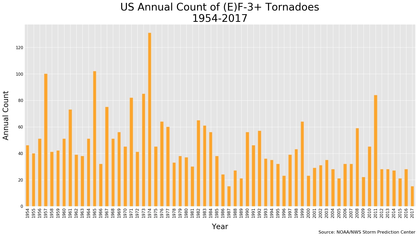
The annual incidence of all tornadoes in the U.S. shows no meaningful trend from 1950 to 2020, a period that included both warming and cooling spells, with net global warming of approximately 1.1 degrees Celsius (2.0 degrees Fahrenheit) during that time. But the number of strong tornadoes (EF3 or greater) has declined dramatically over the last half century, as seen in the next figure illustrating the number observed each year from 1954 to 2017.

Strong tornadoes.jpg

Clearly, the trend is downward instead of upward. Indeed, the average number of strong tornadoes annually from 1986 to 2017 was 40% less than from 1954 to 1985. In May this year, there wasn’t a single strong tornado for the first time since record-keeping began in 1950. Although there’s debate over whether the current system for rating tornadoes is flawed, 2021 looks like being another quiet year.

Next: What “The Science” Really Says about the Coronavirus Pandemic

Latest UN Climate Report Is More Hype than Science

In its latest climate report, the UN’s IPCC (Intergovernmental Panel on Climate Change) falls prey to the hype usually characteristic of alarmists who ignore the lack of empirical evidence for the climate change narrative of “unequivocal” human-caused global warming.

Past IPCC assessment reports have served as the voice of authority for climate science and, even among those who believe in man-made climate change, as a restraining influence – being hesitant in linking weather extremes to a warmer world, for instance. But all that has changed in its Sixth Assessment Report, which the UN Secretary-General has hysterically described as “code red for humanity.”

Among other claims trumpeted in the report is the statement that “Evidence of observed changes in extremes such as heat waves, heavy precipitation, droughts, and tropical cyclones, and, in particular, their attribution to human influence, has strengthened since [the previous report].” This is simply untrue and actually contrary to the evidence, with the exception of precipitation that tends to increase with global warming because of enhanced evap­oration from tropical oceans, resulting in more water vapor in the atmosphere.

In other blog posts and a recent report, I’ve shown how there’s no scientific evidence that global warm­ing triggers extreme weather, or even that weather extremes are becoming more frequent. Anomalous weather events, such as heat waves, hurricanes, floods, droughts and tornadoes, show no long-term trend over more than a century of reliable data.

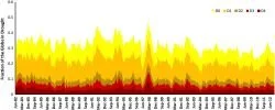
As one example, the figure below shows how the average glob­al area and intensity of drought remained unchanged on aver­age from 1950 to 2019, even though the earth warmed by about 1.1 degrees Celsius (2.0 degrees Fahrenheit) over that interval. The drought area is the percentage of total global land area, excluding ice sheets and deserts, while the intensity is characterized by the self-calibrating Palmer Drought Severity Index, which measures both dryness and wetness and classifies events as “moderate,” “severe” or “extreme.”

Drought.jpg

Although the IPCC report claims, with high confidence, that “the frequency of concurrent heatwaves and droughts on the global scale” are increasing, the scientific evidence doesn’t sup­port such a bold assertion. An accompanying statement that cold extremes have become less frequent and less severe is also blatantly incorrect.

Cold extremes are in fact on the rise, as I’ve discussed in previous blog posts (here and here). The IPCC’s sister UN agency, the WMO (World Meteorological Organi­zation) does at least acknowledge the existence of cold weather extremes, but has no explanation for their origin nor their growing frequency. Cold extremes include prolonged cold spells, unusually heavy snowfalls and longer winter seasons. Why the IPCC should draw the wrong conclusion about them is puzzling.

In discussing the future climate, the IPCC makes use of five scenarios that project differing emissions of CO2 and other greenhouse gases. The scenarios start in 2015 and range from one that assumes very high emissions, with atmospheric CO2 doubling from its present level by 2050, to one assuming very low emissions, with CO2 declining to “net zero” by mid-century.

But, as pointed out by the University of Colorado’s Roger Pielke Jr., the estimates in the IPCC report are dominated by the highest emissions scenario. Pielke finds that this super-high emissions scenario accounts for 41.5% of all scenario mentions in the report, whereas the scenarios judged to be the most likely under current trends account for only a scant 18.4% of all mentions. The hype inherent in the report is obvious by comparing these percentages with the corresponding ones in the Fifth Assessment Report, which were 31.4% and 44.5%, respectively. 

Not widely known is that the supposed linkage between climate change and human emissions of greenhouse gases, as well as the purported connection between global warming and weather extremes, both depend entirely on computer climate models. Only the models link climate change or extreme weather to human activity. The empirical evidence does not – it merely shows that the planet is warming, not what’s causing the warming.

A recent article in the mainstream scientific journal Science surprisingly drew attention to the shortcomings of climate models, weaknesses that have been emphasized for years by climate change skeptics. Apart from falsely linking global warming to CO2 emissions – because the models don’t include many types of natural variability – the models greatly exaggerate predicted temperatures, and can’t even reproduce the past climate accurately. As leading climate scientist Gavin Schmidt says, “You end up with numbers for even the near-term that are insanely scary—and wrong.”

The new IPCC report, with its prognostications of gloom and doom, should have paid more attention to its modelers. In making wrong claims about the present climate, and relying too heavily on high-emissions scenarios for future projections, the IPCC has strayed from the path of science.

Next: Weather Extremes: Hurricanes and Tornadoes Likely to Diminish in 2021

New EPA Climate Change Indicator Is Deceptive

New climate change indicators on the U.S. EPA (Environmental Protection Agency) website are intended to inform science-based decision-making by presenting climate science transparently. But many of the indicators are misleading or deceptive, being based on incomplete evidence or selective data.

A typical example is the indicator for heat waves. This is illustrated in the left panel of the figure below, depicting the EPA’s representation of heat wave frequency in the U.S. from 1961 to 2019. The figure purports to show a steady increase in the occurrence of heat waves, which supposedly tripled from an average of two per year during the 1960s to six per year during the 2010s.

Heat waves (min) EPA.jpg
Heat waves (max) EPA.jpg

Unfortunately, the chart on the left is highly deceptive in several ways. First, the data is derived from minimum, not maximum, temperatures averaged across 50 American cities. The corresponding chart for maximum temperatures, shown in the right panel above, paints a rather different picture – one in which the heat wave frequency less than doubled from 2.5 per year in the 1960s to 4.5 per year in the 2010s, and actually declined from the 1980s to the 2000s.

This maximum-temperature graph revealing a much smaller increase in heat waves than the minimum-temperature graph displayed so boldly on the EPA website is dishonestly hidden away in its technical documentation.

A second deception is that the starting date of 1961 for both graphs is conveniently cherry-picked during a 30-year period of global cooling from 1940 to 1970. That in itself exaggerates the warming effect since then. Starting instead in 1980, after the current bout of global warming had begun, it can be seen that the heat wave frequency based on maximum temperatures (right panel) barely increased at all from 1981 to 2019. Similar exaggeration and sleight of hand can be seen in the EPA indicators for heat wave duration, season length and intensity.

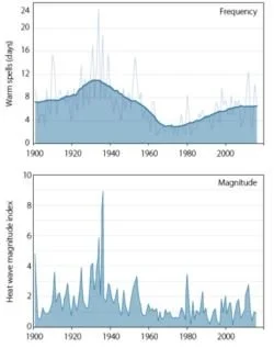
A third deception is that the 1961 start date ignores the record U.S. heat of the 1930s, a decade characterized by persistent, searing heat waves across North America, especially in 1934 and 1936. The next figure shows the frequency and magnitude of U.S. heat waves from 1900 to 2018.

Heat waves.jpg

The frequency (top panel) is the annual number of calendar days the maximum temperature exceeded the 90th percentile for 1961–1990 for at least six consecutive days. The EPA’s data is calculated for a period of at least four days, while the heat wave index (lower panel) measures the annual magnitude of all heat waves of at least three days in that year combined.

Despite the differences in definition, it’s abundantly clear that heat waves over the last few decades – the ones publicized by the EPA – pale in comparison to those of the 1930s, and even those of other decades such as the 1910s and 1950s. The peak heat wave index in 1936 is a full three times higher than it was in 2012 and up to nine times higher than in many other years.

The heat wave index shown above actually appears on the same EPA website page as the mimimum-temperature chart. But it’s presented as a tiny Figure 3 that is only 20% as large as the much more prominent Figure 1 showing minimum temperatures. As pointed out recently by another writer, a full-size version of the index chart, from 1895 to 2015, was once featured on the website, before the site was updated this year with the new climate change indicators.

The EPA points out that the 1930s heat waves in North America, which were concentrated in the Great Plains states of the U.S. and southern Canada, were exacerbated by Dust Bowl drought that depleted soil moisture and reduced the moderating effects of evaporation. While this is undoubtedly true, it has been suggested by climate scientists that future droughts in a warming world could result in further record-breaking U.S. heat waves. The EPA has no justification for omitting 1930s heat waves from their data record, or for suppressing the heat wave index chart.

Although the Dust Bowl was unique to the U.S. and Canada, there are locations in other parts of North America and in other countries where substantial heat waves occurred before 1961 as well. In the summer of 1930 two record-setting, back-to-back scorchers, each lasting eight days, afflicted Washington, D.C.; while in 1936, the province of Ontario – also well removed from the Great Plains – experienced 44 degrees Celsius (111 degrees Fahrenheit) heat during the longest, deadliest Canadian heat wave on record. In Europe, France was baked during heat waves in both 1930 and 1947, and many eastern European countries suffered prolonged heat waves in 1946.   

What all this means is that the EPA’s heat-wave indicator grossly misrepresents the actual science and defeats its stated goal for the indicators of “informing our understanding of climate change.”

Next: Challenges to the CO2 Global Warming Hypothesis: (4) A Minimal Ice-Age Greenhouse Effect

Is Recent Record Cold Just La Niña, or the Onset of Global Cooling?

Little noticed by the mainstream media in their obsession with global warming is an exceptionally chilly 2020-21 winter in the Northern Hemisphere and an unusually early start to the Southern Hemisphere winter. Low temperature and snowfall records are tumbling all over the globe. The harsh cold has already crippled this year’s crops and vines in Europe, while the U.S. state of Texas was ravaged by the subfreezing polar vortex.

Is this the beginning of a predicted grand solar minimum, which was the subject of an earlier post – or simply a manifestation of the naturally occurring La Niña cycle? A grand solar minimum is signified by a steep decline in the maximum number of sunspots during the 11-year solar cycle, a decline that appears to be underway already.

The familiar El Niño and La Niña cycles arise from seesaw changes in surface temperatures in the tropical Pacific Ocean and last for periods of a year or more at a time. The persistent but irregular pattern is visible in the graph below, showing satellite measurements of the global temperature since 1979. Warm spikes such as those in 1998, 2010 and 2016 are due to El Niño; cool spikes like those in 2000 and 2008 are due to La Niña. The climatic effects of El Niño and La Niña include catastrophic flooding in the western Americas and flooding or severe drought in Australia; La Niña has also been tied to major landfalling hurricanes in both the U.S. and the western Pacific.

UAH April 2021.jpg

The zero baseline in the figure represents the average temperature in the tropical lower atmosphere or troposphere from 1991 to 2020 (though the satellite record began in 1979). Observations in the troposphere are a more reliable indicator of global warming than surface data, which are distorted by the urban heat island effect on land and by insufficient measurement stations across the oceans.

Right now, in May 2021, it’s clear that we’re experiencing another La Niña, with the mean April temperature having fallen back to the long-term average. This isn’t permanent of course, and the mercury will continue to rise and fall with future El Niño and La Niña fluctuations. But those fluctuations are superimposed on an overall warming trend of 0.14 degrees Celsius (0.25 degrees Fahrenheit) per decade at present – the familiar global warming.

Whether the present frigid and snowy conditions in much of the world are merely a result of La Niña, or the start of a longer cooling trend, we won’t know for several years yet. Climate, after all, is a long-term average of the weather over an extended period of time, up to decades.

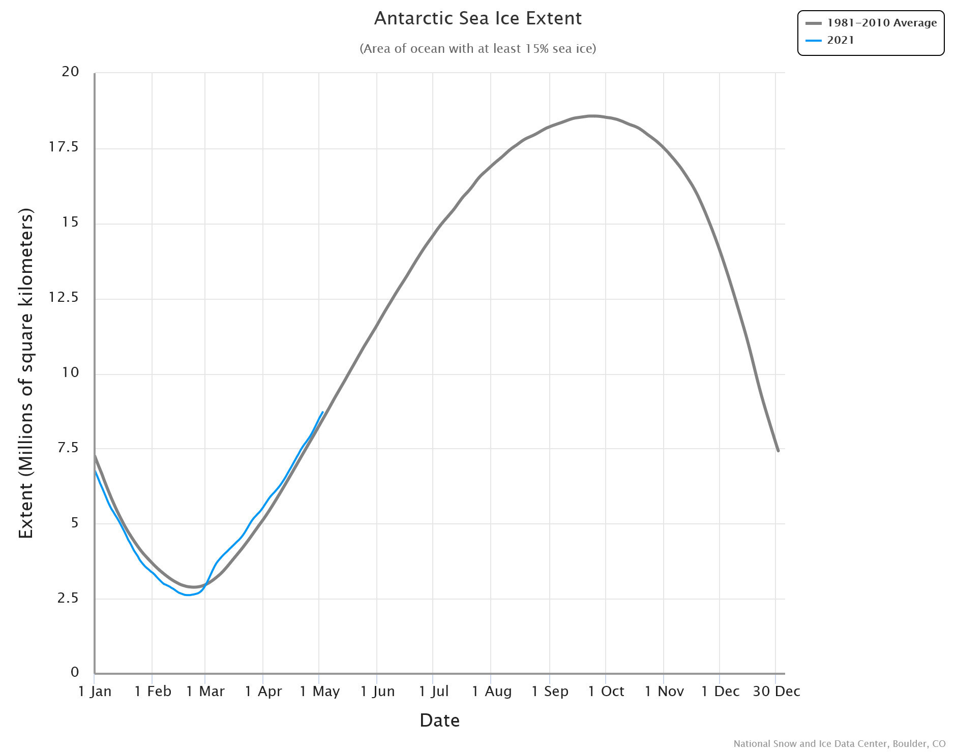
Nonetheless, there’s ample evidence that the current cold snap is not about to let up. At the same time as the UK experienced its lowest average minimum temperature for April since 1922, and both Switzerland and Slovenia suffered record low temperatures for the month, bone-chilling cold struck Australia, New Zealand and even normally shivery Antarctica in the Southern Hemisphere. The next figure shows how the 2021 sea ice extent (in blue) around Antarctica is above or close to the 30-year average from 1981 to 2010 (in gray).

SH Antarctic sea ice.jpeg

Snow records have continued to be broken around the world too. Belgrade, the capital of Serbia, registered its all-time high snowfall for April, in record books dating back to 1888; during April, both Finland and Russia reported their heaviest snow in decades; and the UK, Spain and several countries in the Middle East saw rare spring snowfalls from March to May. On the other side of the globe, up to 22 cm (9 inches) of snow fell on southeastern Australia mountain peaks a full two months before the start of the 2021 ski season; and southern Africa was also blanketed in early-season snow.

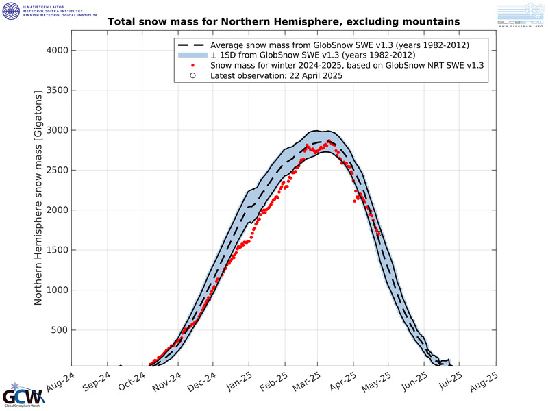
The figure below shows the  Northern Hemisphere snow mass (excluding mountains) for the current season, based on data from the Finnish Meteorological Institute. As can be seen, the snow mass for much of the season has tracked more than one standard deviation above the average for 1982-2012, and in March 2021 exceeded the average by two standard deviations. The mass is measured in billions of tonnes (Gigatonnes, Gt where 1 tonne = 1.102 U.S. tons).

Snow 2020-21.jpg

As startling as all this unusual weather is, it should be noted that recent bursts of extreme cold have sometimes been interspersed with brief periods of unseasonal warmth. Such swings between extremes may result from jet stream blocking, a phenomenon that can arise from natural sources such as a downturn in UV from a quieter sun, which can in turn produce changes in upper atmosphere wind patterns.

Next: New EPA Climate Change Indicator Is Deceptive

Little Evidence for Link between Natural Disasters and Global Warming

A new report on extreme weather in 2020 shows how socio-economic studies of natural disasters have been used to buttress the popular but mistaken belief that global warming causes weather extremes. Two international agencies, UNDRR (the UN Office for Disaster Risk Reduction) – in conjunction with CRED (the Centre for Research on the Epidemiology of Disasters) – and IFRC (the International Red Cross), both issued reports in 2020 claiming that climate-related disasters are currently escalating.

However, as the two reports themselves reveal, such claims are manifestly wrong. This can be seen in the following figure, originally included in the UNDRR-CRED’s report but since withdrawn, showing the annual number of climate-related disasters from 2000 through 2020. The disasters are those in the yellow climatological (droughts, glacial lake outbursts and wildfires), green meteorological (storms, extreme temperatures and fog), and blue hydrological (floods, landslides and wave action) categories.

CRED disasters.jpg

The UNDRR-CRED report draws a strong link between global warming and extreme weather events, citing a “staggering rise in climate-related disasters over the last twenty years.” But, as shown in the figure above, the total number of climate-related disasters in fact exhibits a distinctly declining trend (in red) since 2000, falling by 11% over the last 21 years. This completely contradicts the claims in two different sections of the report that the annual number of disasters since 2000 has either risen significantly from before or been “relatively stable.”

Another blatant inconsistency in the UNDRR-CRED report, an inconsistency that bolsters its false claim of a rising disaster rate, is a comparison between the period from 2000 to 2019 and the preceding 20 years from 1980 to 1999. The report contends that the earlier 20 years saw only 4,212 disasters, compared with 7,348 during the later period.       

However, the University of Colorado’s Roger Pielke Jr., who studies natural disasters, says that the report’s numbers are flawed. As CRED has repeatedly acknowledged, data from 20th-century disasters are unreliable because disasters were reported differently before the Internet existed. Climate writer Paul Homewood has noted a sudden jump in the annual number of disasters listed in CRED’s EM-DAT (Emergency Events Database) after 1998, which the agency itself attributes to increased disaster reporting in the Internet era. So its claim that the number of disasters over 20 years jumped from 4,212 to 7,348 is meaningless.

The IFRC report reaches the same erroneous conclusions as the CRED-UNDRR report – not surprisingly, since they are both based on CRED’s EM-DAT. As seen in the next figure, which is the same as the Red Cross report’s Figure 1.1, climate- and weather-related disasters since 2000 have declined by approximately the same 11% noted above. The report’s misleading assertion that such disasters have risen almost 35% since the 1990s relies on the same failure to account for a major increase in disaster reporting since 1998 due to the arrival of the Internet.

CRED Red Cross.jpg

That natural disasters are in fact diminishing over time is reinforced by data on the associated loss of life. The figure below illustrates the annual global number of deaths from natural disasters, including weather extremes, corrected for population increase over time and averaged by decade from 1900 to 2015.

CRED Fig 3.jpg

Because the data is compiled from the same EM-DAT database, the annual number of deaths shows an uptick from the 1990s to the 2000s. Yet it’s abundantly clear that disaster-related deaths have been dwindling since the 1920s. However, this is due as much to improvements in planning and engineering to safeguard structures, and to early warning systems that allow evacuation of threatened communities, as it is to diminishing numbers of natural disasters.

Economic loss studies of natural disasters have been quick to blame human-caused climate change for the apparently increasing frequency and intensity of weather-related events. But once the losses are corrected for population gain and the ever-increasing value of property in harm’s way, there’s very little evidence to support any connection between natural disasters and global warming.

According to numerous analyses by Pielke, the frequency and intensity of the phenomena causing financial losses show no detectable trend to date. Climate-related losses themselves are actually declining as a percentage of global gross domestic product. Another research study, based on the NatCatSERVICE database of reinsurance giant Munich Re, has concluded that both human and economic vulnerability to climate-related disasters exhibit a decreasing trend, and that average disaster mortality has dropped by a sizable 6.5 times from 1980–1989 to 2007–2016.

The IPCC (Intergovernmental Panel on Climate Change), whose assessment reports serve as the voice of authority for climate science, endorsed these findings in a 2014 report on the impacts of climate change. But most of the political world and the mainstream media cling to the erroneous notion that extreme weather is triggered by global warming and becoming more frequent, despite a lack of scientific evidence for either assertion.

Next: Is Recent Record Cold Just La Niña, or the Onset of Global Cooling?

Natural Sources of Global Warming and Cooling: (1) Solar Variability and La Niña

The role played by the sun in climate change has long been trivialized by advocates of the orthodoxy that links global warming almost entirely to our emissions of greenhouse gases. But recent research suggests that solar fluctuations, while small, may affect climate by driving the multidecadal switch from El Niño to La Niña conditions in the Pacific Ocean. Other research finds that our inability to correctly simulate the cooling La Niña cycle is a major reason that computer climate models run hot.     

La Niña is the cool phase of ENSO (the El Niño – Southern Oscillation), a natural cycle that causes temperature fluctuations and other climatic effects in tropical regions of the Pacific. The familiar El Niño and La Niña events, which last for a year or more at a time, recur at irregular intervals from two to seven years. Serious effects of ENSO range from catastrophic flooding in the U.S. and Peru to severe droughts in Australia. 

The sun has several natural cycles, the most well known of which is the 11-year sunspot cycle. During the sunspot cycle the sun’s heat and light output waxes and wanes by about 0.08%. Although this variation in itself is too small to have any appreciable direct effect on the earth’s climate, indirect solar effects can have an impact on the warming and cooling of our planet – indirect effects that are ignored in climate models.

Just such an indirect solar effect may have been discovered in a new study revealing a correlation between the end of sunspot cycles and the switch from El Niño to La Niña states of the tropical Pacific. The research was conducted by a team of scientists from NASA and the U.S. National Center for Atmospheric Research.

The researchers found that the termination of all five solar cycles between 1960 and 2010-11 coincided with a flip from a warmer El Niño to a cooler La Niña. And the end of the most recent solar cycle, which has just occurred, also coincides with the beginning of a new La Niña event. Because the end of the 11-year solar cycle is fuzzy, the research team relied for its “clock” on the sun’s more well-defined magnetic polarity cycle known as a Hale cycle, which is precisely 22 years in length.

The correspondence between the 11-year solar cycle and the onset of La Niña events is illustrated in the figure below, showing the six-month smoothed monthly sunspot number since 1950 in black and the Oceanic El Niño Index in color. The red and blue boxes mark El Niño and La Niña periods, respectively, in the repeating pattern. What stands out is that the end of each sunspot cycle is closely correlated with the switch from El Niño to La Niña. That the correlation is mere coincidence is statistically highly unlikely, say the study authors, although further research is needed to establish the physical connection between the sun and earth responsible for the correlation.

Solar ENSO.jpg

Another study, headed by climate scientists at the U.S. Lawrence Livermore National Laboratory, finds that multidecadal La Niña variability is why computer climate models overestimate sea surface temperatures in the Pacific by two to three times. The La Niña cycle results in atmospheric cooling and a distinct pattern of cooler-than-normal sea surface temperatures in the central and eastern tropical Pacific, with warmer waters to the north and south.

Many climate models produce ENSO variations, but are unable to predict either the timing of El Niño and La Niña events or temperatures measured by satellite in the tropical lower atmosphere (troposphere). However, the study authors found that approximately 13% of 482 simulations by 55 computer models do show tropospheric warming in the tropics that matches the satellite record. And, unexpectedly, those simulations reproduce all the characteristics of La Niña.

The next figure shows how well one of these particular simulations reproduces a La Niña temperature pattern, in both geographic extent (upper panel) and ocean depth (lower panel). The panels labeled B are the computer simulation and the panels labeled C are the satellite observations. Temperatures are depicted as an average warming (positive) or cooling (negative) rate, in degrees Celsius per decade, over the period from 1979 to 2018. La Niña cooling in the Pacific is clearly visible in both B and C.

Solar 2.jpg

The other 87% of the computer simulations overestimate tropical Pacific temperatures, which is why, the authors say, the multimodel mean warming rate is two to three times higher than observed. But their results show that natural climate variability, here in the form of La Niña, is large enough to explain the difference between reality and climate model predictions.

Next: Little Evidence for Link between Natural Disasters and Global Warming

No Evidence That 2020 Hurricane Season Was Record-Breaking

In a world that routinely hypes extreme weather events, it’s no surprise that the mainstream media and alarmist climate scientists have declared this year’s Atlantic hurricane season “unprecedented” and “record-shattering.” But the reality is that the season was merely so-so and no records fell.

While it’s true that the very active 2020 season saw a record-breaking 30 named storms, only 13 of these became hurricanes. That was fewer than the historical high of 15 recorded in 2005 and only one more than the 12 hurricanes recorded in 1969 and 2010, according to NOAA (the U.S. National Oceanic and Atmospheric Administration). The figure below shows the frequency of all Atlantic hurricanes from 1851 to 2020.

Atlantic hurricanes.jpg

Of 2020’s 13 hurricanes, only six were major hurricanes, less than the record eight in 1950 and seven in 1961 and 2005, as shown in the next figure. A major hurricane is defined as one in Category 3, 4 or 5 on the so-called Saffir-Simpson scale, corresponding to a top wind speed of 178 km per hour (111 mph) or greater. Although it appears that major Atlantic hurricanes were less frequent before about 1940, the lower numbers reflect the relative lack of observations in early years of the record. Aircraft reconnaissance flights to gather data on hurricanes only began in 1944, while satellite coverage dates only from the 1960s.

Atlantic major hurricanes.jpg

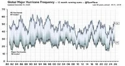
Despite the lack of any significant trend in Atlantic hurricanes in a warming world, the frequency of hurricanes globally is actually diminishing as seen in the following figure. The apparent slight increase in major hurricanes since 1981 has been ascribed to improvements in observational capabilities, rather than warming oceans that provide the fuel for hurricanes and typhoons.

Hurricane frequency global (Ryan Maue).jpg

As further evidence that recent hurricane activity is nothing unusual, the figure below depicts what is known as the ACE (Accumulated Cyclone Energy) index for the Atlantic basin from 1855 to 2020. The ACE index is an integrated metric combining the number of storms each year, how long they survive and how intense they become. Mathematically, the index is calculated by squaring the maximum sustained wind speed in a named storm every six hours that it remains above tropical storm intensity and summing that up for all storms in the season.

Atlantic ACE.jpg

For 2020, the Atlantic basin ACE index was 179.8, which ranks 13th behind 2017, 2005, the peak in 1933 and nine other years. For comparison, this year’s ACE index for the northwestern Pacific, where typhoons are common, was 148.5. The higher value for the Atlantic this year reflects the greater number of named storms.

NOAA attributes the enhanced number of atmospheric whirligigs in the Atlantic in recent years to the warm phase of the naturally occurring AMO (Atlantic Multi-Decadal Oscillation). The AMO, which has a cycle time of approximately 65 years and alternates between warm and cool phases, governs many extremes, such as cyclonic storms in the Atlantic basin and major floods in eastern North America and western Europe. The present warm phase began in 1995, marking the beginning of a period when both named Atlantic storms and hurricanes have become more common on average – as seen in the first two figures above.

Another contribution to storm activity in the Atlantic comes from La Niña cycles in the Pacific. Apart from a cooling effect, La Niñas result in quieter conditions in the eastern Pacific and heightened activity in the Atlantic. The current La Niña started several months ago and is expected to continue into 2021.

Despite NOAA’s recognition of what has caused so many Atlantic storms in 2020, activists continue to claim that climate change is making hurricanes stronger and more destructive and increasing the likelihood of more frequent major hurricanes. Pontificates Michael “hockey stick” Mann: “The impacts of climate change are no longer subtle. We’re seeing them play out right now in the form of unprecedented wildfires out West and an unprecedented hurricane season back East.”

Clearly, there’s no evidence for such nonsensical, unscientific statements.

Next: New Evidence That the Ancient Climate Was Warmer than Today’s

No Evidence for Dramatic Loss of Great Barrier Reef Corals

A 2020 study of the Great Barrier Reef that set alarm bells ringing in the mainstream media is based on faulty evidence, according to Australian scientist and leading coral reef authority, Professor Peter Ridd. The study claims that between 1995 and 2017 the reef lost half its corals, especially small baby colonies, because of global warming – but Ridd says the claims are false.

The breathtakingly beautiful Great Barrier Reef, labeled by CNN as one of the seven natural wonders of the world, is the planet’s largest living structure. Visible from outer space and 2,300 km (1,400 miles) long, the reef hugs the northeastern coast of Australia. A healthy portion of the reef is shown in the image below.

Ridd-GBF coral.jpg

CREDIT: DAVID CHILD, EVENING STANDARD.

But corals are susceptible to overheating and undergo bleaching when the water gets too hot, losing their vibrant colors. During the prolonged El Niño of 2016-17, higher temperatures caused mass bleaching that damaged portions of the northern and central regions of the Great Barrier Reef. Ridd’s fellow reef scientists contended at the time that as much as 30% to 95% of the reef’s corals died. However, Ridd disagreed, estimating that only 8% of the Great Barrier Reef suffered; much of the southern end of the reef wasn’t affected at all. 

Likewise, Ridd finds no evidence for the 50% loss of corals since 1995 claimed in the recent study. He says the most reliable data on coral extent comes from AIMS (the Australian Institute of Marine Science), who have been measuring over 100 reefs every year since 1986. As the following figure illustrates, AIMS data shows that coral cover fluctuates dramatically with time but there is approximately the same amount of Great Barrier Reef coral today as in 1995. Adds Ridd:

There was a huge reduction in coral cover in 2011 which was caused by two major cyclones that halved coral cover. Cyclones have always been the major cause of temporary coral loss on the Reef.

Ridd coral cover.jpg

It can be seen that the coral cover averages only about 20% in the years since 1986, when AIMS measurements began. But a 2019 research paper reported that the first reef expedition back in 1928-29 discovered very similar coverage: on a reef island known as Low Isles, the coral cover ranged from 8% to 42% in different parts of the island. So essentially no coral has disappeared over a period of 90 years that encompasses both warming and cooling periods.

The paper’s authors did find that the coral colonies on Low Isles were 30% smaller in 2019 than in 1928-29, and that coral “richness” had declined. Apart from its faulty conclusion about coral loss, the 2020 study also found smaller colony sizes throughout the reef, even though the relative abundance of large colonies was unchanged.

Nevertheless, the most recent AIMS report records small gains in the cover of hard corals in the central and southern Great Barrier Reef, following another mass bleaching event in late 2019. Hard corals are the primary reef-building corals; soft corals don’t form reefs.

Even more encouraging news for coral reef health comes from a just-reported survey of coral reefs on the opposite side of the country – the Rowley Shoals, a chain of three coral atolls 300 km (190 miles) off the coast of northwest Western Australia. Following an extensive marine heat wave in December 2019, an April 2020 survey found that up to 60% of the Rowley Shoals corals had become a pallid white (left image below). Yet a follow-up survey just six months later revealed that much of the bleached coral had already recovered (right image) and that perhaps only 10% of the reef had been killed.

Rowley Shoals bleaching.jpg
Rowley Shoals coral.jpg

CREDIT: WESTERN AUSTRALIA DBCA.

Tom Holmes, the marine monitoring coordinator at Western Australia’s DBCA (Department of Biodiversity, Conservation and Attractions), said "We were expecting to see widespread mortality, and we just didn't see it … which is a really amazing thing." Holmes explained that, while high ocean temperatures cause coral to bleach, what is less well known is that bleached corals don’t die immediately. Bleaching is initially just a sign of stress, but if the stress continues for a long time, it does lead to mortality.

However, Holmes – ever the cautious scientist – feels the reef may have been lucky and dodged a bullet this time. That’s because the marine heat wave that caused the bleaching was short-lived, dissipating at the end of the Australian summer a few months ago and giving the corals a chance to recover.

The resilience of the Rowley Shoals is no surprise to Ridd. Despite having been fired from his position at James Cook University in northern Queensland for his politically incorrect views on the Great Barrier Reef and climate change, Ridd continues to push the case for more accurate measurements and better quality assurance in coral reef science.

Next: No Evidence That 2020 Hurricane Season Was Record-Breaking

Evidence Mounting for Global Cooling Ahead: Record Snowfalls, Less Greenland Ice Loss

Despite the ongoing drumbeat of apocalyptic proclamations about our warming climate, a close look at recent evidence suggests we’re on the threshold of a cooling spell. Even before the northern 2020-21 winter arrives, early-season snowfall records are tumbling all over North America and Europe. And, while Greenland has been losing ice for decades, the rate of loss has slowed dramatically since 2016.

Could all this be a prelude to an upcoming grand solar minimum?

Snow extent in the Northern Hemisphere fall has in fact been increasing yearly since at least the 1960s, as shown in the figure below depicting the fall monthly average snowfall measured by satellite, up to 2019. The trend is the same for Eurasia as it is for North America.

Snow NH Fall.jpg

But the 2020 fall extent is likely to surpass that of any previous year, based on data from the Finnish Meteorological Institute for Northern Hemisphere snow mass (as opposed to extent) to date. As seen in the next figure, the snow mass this season is already tracking above the average for 1982-2012; the mass is measured in billions of tonnes (gigatonnes, where 1 tonne = 1.102 U.S. tons).

fmi_swe_tracker.jpg

In the U.S., much of the white powder blanketing the northern states prematurely in 2020 has fallen in Minnesota. The state recently experienced its largest early-season snowstorm in recorded history, going back about 140 years. Dropping up to 23 cm (9 inches) of snow in some places, which is a lot for the fall, the storm produced the second biggest October snowfall ever in the state. The cities of Alexandria and St. Cloud, Minnesota saw their snowiest October on record.

And snow records were also smashed in towns and cities across Montana and South Dakota. All of this has been accompanied by misery in the form of bitterly cold temperatures across the U.S. and Canada.

In Europe, skiing and sledding enthusiasts are delighted with the early onset of a snowpack deeper than 80 cm (3 feet) on some Austrian glaciers. Both the Alps and Pyrenees had several heavy early-season snowfalls in October, and even parts of lower-altitude Scandinavia are already buried in snow.

As for ice, much recent attention has been focused on the Greenland ice sheet. A  research paper published in the journal Nature in October 2020 set alarm bells ringing by insisting that Greenland’s ice is now melting faster than at any time in the past 12,000 years. This spurious claim seems to have been influenced by a big jump in the rate of ice loss, from an average 75 gigatonnes (83 gigatons) yearly in the 20th century to an average annual loss of 258 gigatonnes (284 gigatons) between 2002 and 2016; a greater-than-average loss of 329 gigatonnes (363 gigatons) occurred in 2019.

However, the paper’s authors failed to note that the rate of Greenland ice loss has not increased since 2002, or that the 2019 loss was less than seen seven years before, in 2012. In fact, as illustrated in the figure below, the loss rate has drastically slowed since 2016. The figure shows satellite measurements of the ice loss at regular intervals from April 2002 to April 2019, in gigatonnes, but doesn’t include the massive summer melt in 2019. The 2020 loss was only 152 gigatonnes (168 gigatons).

Greenland mass loss 2002-19.jpg

Although a hefty amount of ice is normally lost during the short Greenland summer, some of this ice loss is compensated by ice gained over the long winter from the accumulation of compacted snow. The ice sheet, 2-3 km (6,600-9,800 feet) thick, consists of layers of compressed snow built up over at least hundreds of thousands of years. In addition to summer melting, the sheet loses ice by calving of icebergs at its edges.

The slowdown in ice loss since 2016 is a clear sign that the doomsday talk and panic engendered by the Nature paper is unwarranted. And, not only is Greenland losing less ice, and snowfall in the Northern Hemisphere setting new records, but this year’s winter in the Southern Hemisphere was also exceptionally snowy and brutal – all likely harbingers of the soon-to-arrive grand solar minimum.

Next: No Evidence for Dramatic Loss of Great Barrier Reef Corals

It’s Cold, Not Hot, Extremes That Are on the Rise

Despite the hullabaloo about hot weather extremes in the form of heat waves and drought, little attention has been paid to cold weather extremes by the mainstream media or the IPCC (Intergovernmental Panel on Climate Change), whose assessment reports are the voice of authority for climate science. Yet, though few people know it, cold extremes appear to be on the rise – in contrast to weather extremes in general which are trending downward rather than upward, if at all.

The WMO (World Meteorological Organi­zation) does at least acknowledge the existence of cold weather extremes, but has no explanation for their origin nor their rising frequency. Cold extremes include prolonged cold spells, unusually heavy snowfalls and longer winter seasons. In a world obsessed with global warming, such events go almost unnoticed.

One person who has noticed is Madhav Khandekar, who has a PhD in meteorology and was formerly a research scientist at Environment Canada as well as an expert reviewer for the Fourth Assessment Report of the IPCC. Although much of Khandekar’s work on cold extremes has focused on Canada, he has also catalogued cold weather events worldwide. In remarking recently that extreme weather – both hot and cold – is part of natural climate variability, Khandekar points out:

“Even when the earth’s climate was cooling down during the 1945-77 period there were as many extreme weather events as there are now.”

Before we look at recent cold weather extremes, it’s important to distinguish between climate and weather. Weather is what’s predicted in daily forecasts which describe short-term changes in atmospheric conditions. Climate, on the other hand, is a long-term average of the weather over an extended period of time, typically 30 years.

Recurring frigid global temperatures over the past 15 years have been documented by Khandekar, the WMO and the blog Electroverse. The northern winter of 2005-06 was exceptionally cold over most of western and northeastern Europe, while in May 2006 during the southern winter, South Africa reported 54 cold weather records. The winter of 2009-10 was equally brutal: Scotland suffered some of the bitterest winter months in almost 100 years; Siberia witnessed perhaps its coldest winter ever; and Beijing saw its coldest day in 50 years.

Northern climes experienced abnormally low temperatures again in the winters of 2014-15, 2015-16 and 2018-2019. The period from January to March 2015 was the coldest in the northeastern U.S. since 1895, as shown in the figure below. In January 2016, eastern China froze as far south as Thailand, a very rare event. And in early 2019, bone-chilling cold persisted for months over much of the north-central U.S. and western Canada.

Cold - Khandekar Northeast PNG.png

During the current southern winter and northern summer, cold temperature records have been smashed all over the globe. The Australian island state of Tasmania recorded its coldest ever winter minimum, exceeding the previous low by 1.2 degrees Celsius (2.2 degrees Fahrenheit); Norway endured its coldest July in 50 years; neighboring Sweden shivered through its coldest summer since 1962; and Russia was also anomalously cold.

Snowfalls around the planet show the same pattern, in contrast to the climate change narrative that predicted snow would disappear in a warming world. In 2007, snow fell in Buenos Aires, Argentina for the first time since 1918. In the winter of 2009-10, record snowfall blanketed the entire mid-Atlantic coast of the U.S. in an event called Snowmaggedon. Extremely heavy snow that fell in the Panjshir Valley of Afghanistan in February 2015 killed over 200 people. In the winter of 2017-18, eastern Ireland had its heaviest snowfalls for more than 50 years with totals exceeding 50 cm (20 inches).

Cold- Patagonia sheeep.jpg

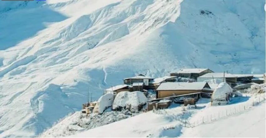
In the southern winter this year, massive snowstorms covered much of Patagonia in more than 150 cm (60 inches) of snow, and buried at least 100,000 sheep and 5,000 cattle alive. Snowfalls not seen for decades occurred in other parts of South America, and in South Africa, southeastern Australia and New Zealand. In the chilly northern summer mentioned above, monster snowdrifts almost obliterated the southern Russian village of Kurush.

Cold - Kurush.jpg

Despite the mainstream media’s assertion that cold weather extremes are caused by climate change, Khandekar says such an explanation lacks scientific credibility. He links colder and snowier-than-normal winters in North America not to global warming, but to the naturally occurring North Atlantic Oscillation and Pacific Decadal Oscillation, and those in Europe to the current slowdown in solar activity. The IPCC and WMO are largely silent on the issue.

Next: Upcoming Grand Solar Minimum Could Wipe Out Global Warming for Decades

Australian Bushfires: Ample Evidence That Past Fires Were Worse

Listening to Hollywood celebrities and the mainstream media, you’d think the current epidemic of bushfires in Australia means the apocalypse is upon us. With vast tracts of land burned to the ground, dozens of people and millions of wild animals killed, and thousands of homes destroyed, climate alarmists would have you believe it’s all because of global warming.

But not only is there no scientific evidence that the frequency or severity of wildfires are on the rise in a warming world, but the evidence also clearly shows that the present Australian outbreak is unexceptional.

Bushfire.jpg

Although almost 20 million hectares (50 million acres, or 77,000 square miles) nationwide have burned so far, this is less than 17% of the staggeringly large area incinerated in the 1974-75 bushfire season and less than the burned area in three other conflagrations. Politically correct believers in the narrative of human-caused climate change seem unaware of such basic facts about the past.

The catastrophic fires in the 1974-75 season consumed 117 million hectares (300 million acres), which is 15% of the land area of the whole continent. Because nearly two thirds of the burned area was in remote parts of the Northern Territory and Western Australia, relatively little human loss was incurred, though livestock and native animals such as lizards and red kangaroos suffered.

The Northern Territory was also the location of major bushfires in the 1968-69, 1969-70 and 2002-03 seasons that burned areas of 40 million, 45 million and 38 million hectares (99 million, 110 million and 94 million acres), respectively. That climate change wasn’t the cause should be obvious from the fact that the 1968-69 and 1969-70 fires occurred during a 30-year period of global cooling from 1940 to 1970.

Despite the ignorance and politically charged rhetoric of alarmists, the primary cause of all these terrible fires in Australia has been the lack of intentional or prescribed burning. The practice was used by the native Aboriginal population for as long as 50,000 years before early settlers abandoned it after trying unsuccessfully to copy indigenous fire techniques – lighting fires so hot that flammable undergrowth, the main target of prescribed burns, actually germinated more after burning.

The Aboriginals, like native people everywhere, had a deep knowledge of the land. They knew what types of fires to burn for different types of terrain, how long to burn, and how frequently. This knowledge enabled them to keep potential wildfire fuel such as undergrowth and certain grasses in check, thereby avoiding the more intense and devastating bushfires of the modern era. As the Aboriginals found, small-scale fires can be a natural part of forest ecology.

Only recently has the idea of controlled burning been revived in Australia and the U.S., though the approach has been practiced in Europe for many years. Direct evidence of the efficacy of controlled burning is presented in the figure below, which shows how bushfires in Western Australia expanded significantly as prescribed burning was suppressed over the 50 years from 1963 to 2013.

WA bushfires.jpg

Bushfires have always been a feature of life in Australia. One of the earliest recorded outbreaks was the so-called Black Thursday bushfires of 1851, when then record-high temperatures up to 47.2 degrees Celsius (117 degrees Fahrenheit) and strong winds exacerbated fires that burned 5 million hectares (12 million acres), killed 12 people and terrified the young colony of Victoria. The deadliest fires of all time were the Black Saturday bushfires of 2009, also in Victoria, with 173 fatalities.    

Pictures of charred koala bears, homes engulfed in towering flames and residents seeking refuge on beaches are disturbing. But there’s simply no evidence for the recent statement in Time magazine by Malcolm Turnbull, former Australian Prime Minister, that “Australia’s fires this summer – unprecedented in the scale of their destruction – are the ferocious but inevitable reality of global warming.” Turnbull and climate alarmists should know better than to blame wildfires on this popular but erroneous belief.

Next: The Futility of Action to Combat Climate Change: (1) Scientific and Engineering Reality

No Evidence That Snow Is Disappearing

“Let It Snow! Let It Snow! Let It Snow!”

- 1945 Christmas song

You wouldn’t know it from mainstream media coverage but, far from disappearing, annual global snowfall is actually becoming heavier as the world warms. This is precisely the opposite of what climate change alarmists predicted as the global warming narrative took shape decades ago.

The prediction of less snowy winters was based on the simplistic notion that a higher atmospheric temperature would allow fewer snowflakes to form and keep less of the pearly white powder frozen on the ground. But, as any meteorologist will tell you, the crucial ingredient for snow formation, apart from near-freezing temperatures, is moisture in the air. Because warmer air can hold more water vapor, global warming in general produces more snow when the temperature drops.

This observation has been substantiated multiple times in recent years, in the Americas, Europe and Asia. As just one example, the eastern U.S. has experienced 29 high-impact winter snowstorms in the 10 years from 2009 though 2018. There were never more than 10 in any prior 10-year period.

The overall winter snow extent in the U.S. and Canada combined is illustrated in the figure below, which shows the monthly extent, averaged over the winter, from 1967 to 2019. Clearly, total snow cover is increasing, not diminishing.

Snow NAmerica 1967-2019.jpg

In the winter of 2009-10, record snowfall blanketed the entire mid-Atlantic coast of the U.S. in an event called Snowmaggedon, contributing to the record total for 2010 in the figure above. The winter of 2013-14 was the coldest and snowiest since the 1800s in parts of the Great Lakes. Further north in Canada, following an exceptionally cold winter in 2014-15, the lower mainland of British Columbia endured the longest cold snap in 32 years during the winter of 2016-17. That same winter saw record heavy Canadian snowfalls, in both British Columbia in the west and the maritime provinces in the east. 

The trend toward snowier winters is reflected in the number of North American blizzards over the same period, depicted in the next figure. Once again, it’s obvious that snow and harsh conditions have been on the rise for decades, especially as the globe warmed from the 1970s until 1998.  

US blizzard frequency 1960-2014.jpeg

But truckloads of snow haven’t fallen only in North America. The average monthly winter snow extent for the whole Northern Hemisphere from 1967 to 2019, illustrated in the following figure, shows a trend identical to that for North America.

Snow NH 1967-2019.jpg

Specific examples include abnormally chilly temperatures in southern China in January 2016, accompanying the first snow in Guangzhou since 1967 and the first in nearby Nanning since 1983. Extremely heavy snow that fell in the Panjshir Valley of Afghanistan in February 2015 killed over 200 people. During the winters of 2011-12 and 2012-13, much of central and eastern Europe experienced very cold and snowy weather, as they did once more in the winter of 2017-18. Eastern Ireland had its heaviest snowfalls for more than 50 years with totals exceeding 50 cm (20 inches).

Despite all this evidence, numerous claims have been made that snow is a thing of the past. “Children just aren’t going to know what snow is,” opined a research scientist at the CRU (Climatic Research Unit) of the UK’s University of East Anglia back in 2000. But, while winter snow is melting more rapidly in the spring and there’s less winter snow in some high mountain areas, the IPCC (Intergovernmental Panel on Climate Change) and WMO (World Meteorological Organization) have both been forced to concede that it’s now snowing more heavily at low altitudes than previously. Surprisingly, the WMO has even attributed the phenomenon to natural variability – as it should.

The IPCC and WMO, together with climate alarmists, are fond of using the term “unprecedented” to describe extreme weather events. As we’ve seen in previous blog posts, such usage is completely unjustified in every case – with the single exception of snowfall, though that’s a concession few alarmists make.

Next: When Science Is Literally under Attack: Ad Hominem Attacks

No Evidence That Marine Heat Waves Are Unusual

A new wrinkle in the narrative of human-induced global warming is the observation and study of marine heat waves. But, just as in other areas of climate science, the IPCC (Intergovernmental Panel on Climate Change) twists and hypes the evidence to boost the claim that heat waves at sea are becoming more common.

Marine heat waves describe extended periods of abnormally high ocean temperatures, just like atmospheric heat waves on land. The most publicized recent example was the “Blob,” a massive pool of warm water that formed in the northeast Pacific Ocean from 2013 to 2015, extending all the way from Alaska to the Baja Peninsula in Mexico as shown in the figure below, and up to 400 meters (1,300 feet) deep. Sea surface temperatures across the Blob averaged 3 degrees Celsius (5 degrees Fahrenheit) above normal. A similar temperature spike lasting for eight months was seen in Australia’s Tasman Sea in 2015 and 2016.

Recent Marine Heat Waves

OceanHeatWaveGlobe.jpg

The phenomenon has major effects on marine organisms and ecosystems, causing bleaching of coral reefs or loss of kelp forests, for example. Shellfish and small marine mammals such as sea lions and sea otters are particularly vulnerable, because the higher temperatures deplete the supply of plankton at the base of the ocean food chain. And toxic algae blooms can harm fish and larger marine animals.

OceanHeatWave kelp.jpg

Larger marine heat waves not only affect maritime life, but may also influence weather conditions on nearby land. The Blob is thought to have worsened California’s drought at the time, while the Tasman Sea event may have led to flooding in northeast Tasmania. The IPCC expresses only low confidence in such connections, however.   

Nevertheless, in its recent Special Report on the Ocean and Cryosphere in a Changing Climate, the IPCC puts its clout behind the assertion that marine heat waves doubled in frequency from 1982 to 2016, and that they have also become longer-lasting, more intense and more extensive. But these are false claims, for two reasons.

First, the observations supporting the claims were all made during the satellite era. Satellite measurements of ocean temperature are far more accurate and broader in coverage than measurements made by the old-fashioned methods that preceded satellite data. These cruder methods included placing a thermometer in seawater collected in wooden, canvas or insulated buckets tossed overboard from ships and hauled back on deck, or in seawater retained in ship engine-room inlets from several different depths; and data from moored or drifting buoys.

Because of the unreliability and sparseness of sea surface temperature data from the pre-satellite era, it’s obvious that earlier marine heat waves may well have been missed. Indeed, it would be surprising if no significant marine heat waves occurred during the period of record-high atmospheric temperatures of the 1930s, a topic discussed in a previous blog post.

The second reason the IPCC claims are spurious is that most of the reported studies (see for example, here and here) fail to take into account the overall ocean warming trend. Marine heat waves are generally measured relative to the average surface temperature over a 30-year baseline period. This means that any heat wave measured toward the end of that period will appear hotter than it really is, since the actual surface temperature at that time will be higher than the 30-year baseline. As pointed out by a NOAA (U.S. National Oceanic and Atmospheric Administration) scientist, not adjusting for the underlying warming falsely conflates natural regional variability with climate change.  

Even if the shortcomings of the data are ignored, it’s been found that from 1925 to 2016, the global average marine heatwave frequency and duration increased by only 34% and 17%, respectively – hardly dramatic increases. And in any case, the sample size for observations made since satellite observations began in 1982 is statistically small.

There’s no evidence, therefore, that marine heat waves are anything out of the ordinary.

Next: No Evidence That Snow Is Disappearing

No Evidence That Heat Kills More People than Cold

The irony in the recent frenzy over heat waves is that many more humans die each year from cold than they do from heat. But you wouldn’t know that from sensational media headlines reporting “killer” heat waves and conditions “as hot as hell.” In reality, cold weather worldwide kills 17 times as many people as heat.

This conclusion was reached by a major international study in 2015, published in the prestigious medical journal The Lancet. The study analyzed more than 74 million deaths in 384 locations across 13 countries including Australia, China, Italy, Sweden, the UK and USA, over the period from 1985 to 2012. The results are illustrated in the figure below, showing the average daily rate of premature deaths from heat or cold as a percentage of all deaths, by country.

World heat vs cold deaths.jpg

Perhaps not surprisingly, moderate cold kills people far more often than extreme cold, for a wide range of different climates. Extreme cold was defined by the study authors as temperatures falling below the 2.5th percentile at each location, a limit which varied from as low as -11 degrees Celsius (12 degrees Fahrenheit) in Toronto, Canada to as high as 25 degrees Celsius (77 degrees Fahrenheit) in Bangkok, Thailand. Moderate cold includes all temperatures from this lower limit up to the so-called optimum, the temperature at which the daily death rate at that location is a minimum.

Likewise, extreme heat was defined as temperatures above the 97.5th percentile at each location, and moderate heat as temperatures from the optimum up to the 97.5th percentile. But unlike cold, extreme and moderate heat cause approximately equal numbers of excess deaths.

The study found that on average, 7.71% of all deaths could be attributed to hot or cold – to temperatures above or below the optimum – with 7.29% being due to cold, but only 0.42% due to heat. That single result puts the lie to the popular belief that heat waves are deadlier than cold spells. Hypothermia kills a lot more of us than heat stroke. And though both high and low temperatures can increase the risk of exacerbating cardiovascular, respiratory and other conditions, it’s cold that is the big killer.

This finding is further borne out by seasonal mortality statistics. France, for instance, recorded 700 excess deaths attributed to heat in the summer of 2016, 475 in 2017 and 1,500 in 2018. Yet excess deaths from cold in the French winter from December to March average approximately 24,000. Even the devastating summer heat wave of 2003 claimed only 15,000 lives in France.

Similar statistics come from the UK, where an average of 32,000 more deaths occur during each December to March period than in any other four-month interval of the year. Flu epidemics boosted this total to 37,000 in the winter of 2016-17, and to 50,000 in 2017-18. Just as in France, these numbers for deaths from winter cold far exceed summer mortalities in the UK due to heat, which reached only 1,700 in 2018 and just 2,200 in the heat-wave year of 2003.

Even more evidence that cold kills a lot more people than heat is seen in an earlier study, published in the BMJ (formerly the British Medical Journal) in 2000. This study, restricted to approximately 3 million deaths in western Europe from 1988 to 1992, found that annual cold related deaths were much higher than heat related deaths in all seven regions studied – with the former averaging 2,000 per million people and the latter only 220 per million. Additionally, no more deaths from heat occurred in hotter regions than colder ones.

A sophisticated statistical approach was necessary in both studies. This is because of differences between regions and individuals, and the observation that, while death from heat is typically rapid and occurs within a few days, death from cold can be delayed up to three or four weeks. The larger Lancet study used more advanced statistical modeling than the BMJ study.

And despite the finding that more than 50% of published papers in biomedicine are not reproducible, the fact that two independent papers reached essentially the same result gives their conclusions some credibility.

Next: No Evidence That Climate Change Is Accelerating Sea Level Rise

No Evidence That Climate Change Causes Weather Extremes: (6) Heat Waves

This Northern Hemisphere summer has seen searing, supposedly record high temperatures in France and elsewhere in Europe. According to the mainstream media and climate alarmists, the heat waves are unprecedented and a harbinger of harsh, scorching hot times to come.

But this is absolute nonsense. In this sixth and final post in the present series, I’ll examine the delusional beliefs that the earth is burning up and may shortly be uninhabitable, and that this is all a result of human-caused climate change. Heat waves are no more linked to climate change than any of the other weather extremes we’ve looked at.

The brouhaha over two almost back-to-back heat waves in western Europe is a case in point. In the second, which occurred toward the end of July, the WMO (World Meteorological Organization) claimed that the mercury in Paris reached a new record high of 42.6 degrees Celsius (108.7 degrees Fahrenheit) on July 25, besting the previous record of 40.4 degrees Celsius (104.7 degrees Fahrenheit) set back in July, 1947. And a month earlier during the first heat wave, temperatures in southern France hit a purported record 46.0 degrees Celsius (114.8 degrees Fahrenheit) on June 28.

How convenient to ignore the past! Reported in Australian and New Zealand newspapers from August, 1930 is an account of an earlier French heatwave, in which the temperature soared to a staggering 50 degrees Celsius (122 degrees Fahrenheit) in the Loire valley, located in central France. That’s a full 4.0 degrees Celsius (7.2 degrees Fahrenheit) above the so-called record just mentioned in southern France, where the temperature in 1930 may well have equaled or exceeded the Loire valley’s towering record.

And the same newspaper articles reported a temperature in Paris that day of 38 degrees Celsius (100 degrees Fahrenheit), stating that back in 1870 the thermometer had reached an even higher, unspecified level there – quite possibly above the July 2019 “record” of 42.6 degrees Celsius (108.7 degrees Fahrenheit).    

The same duplicity can be seen in proclamations about past U.S. temperatures. Although it’s frequently claimed that heat waves are increasing in both intensity and frequency, there’s simply no scientific evidence for such a bold assertion. The following figure charts official data from NOAA (the U.S. National Oceanic and Atmospheric Administration) showing the yearly number of days, averaged over all U.S. temperature stations, from 1895 to 2018 with extreme temperatures above 38 degrees Celsius (100 degrees Fahrenheit) and 41 degrees Celsius (105 degrees Fahrenheit).

ac-rebuttal-heat-waves-081819.jpg

The next figure shows NOAA’s data for the year in which the record high temperature in each U.S. state occurred. Of the 50 state records, a total of 32 were set in the 1930s or earlier, but only seven since 1990.

US high temperature records.jpg

It’s obvious from these two figures that there were more U.S. heat waves in the 1930s, and they were hotter, than in the present era of climate hysteria. Indeed, the annual number of days on which U.S. temperatures reached 100 degrees, 95 degrees or 90 degrees Fahrenheit has been steadily falling since the 1930s. The EPA (Environmental Protection Agency)’s Heat Wave Index for the 48 contiguous states also shows clearly that the 1930s were the hottest decade.

Globally, it’s exactly the same story, as depicted in the figure below.

World record high temperatures 500.jpg

Of the seven continents, six recorded their all-time record high temperatures before 1982, three records dating from the 1930s or before; only Asia has set a record more recently (the WMO hasn’t acknowledged the 122 degrees Fahrenheit 1930 record in the Loire region). And yet the worldwide baking of the 1930s didn’t set the stage for more and worse heat waves in the years ahead, even as CO2 kept pouring into the atmosphere – the scenario we’re told, erroneously, that we face today. In fact, the sweltering 1930s were followed by global cooling from 1940 to 1970.

Contrary to the climate change narrative, the recent European heat waves came about not because of global warming, but rather a weather phenomenon known as jet stream blocking. Blocking results from an entirely different mechanism than the buildup of atmospheric CO2, namely a weakening of the sun’s output that may portend a period of global cooling ahead. A less active sun generates less UV radiation, which in turn perturbs winds in the upper atmosphere, locking the jet stream in a holding or blocking pattern. In this case, blocking kept a surge of hot Sahara air in place over Europe for extended periods.

It should be clear from all the evidence presented above that mass hysteria over heat waves and climate change is completely unwarranted. Current heat waves have as little to do with global warming as floods, droughts, hurricanes, tornadoes and wildfires.

Next: No Evidence That Heat Kills More People than Cold

No Evidence That Climate Change Causes Weather Extremes: (5) Wildfires

Probably the most fearsome of the weather extremes commonly blamed on human-caused climate change are tornadoes – the previous topic in this series – and wildfires. Both can arrive with little or no warning, making it difficult or impossible to flee, are often deadly, and typically destroy hundreds of homes and other structures. But just like tornadoes, there is no scientific evidence that the frequency or severity of wildfires are on the rise in a warming world.

You wouldn’t know that, however, from the mass hysteria generated by the mainstream media and climate activists almost every time a wildfire breaks out, especially in naturally dry climates such as those in California, Australia or Spain. While it’s true that the number of acres burned annually in the U.S. has gone up over the last 20 years or so, the present burned area is still only a small fraction of what it was back in the record 1930s, as seen in the figure below, showing data compiled by the U.S. National Interagency Fire Center.

Wildfires US-acres-burned 1926-2017 copy.jpg

Because modern global warming was barely underway in the 1930s, climate change clearly has nothing to do with the incineration of U.S. forests. Exactly the same trend is apparent in the next figure, which depicts the estimated area worldwide burned by wildfires, by decade from 1900 to 2010. Clearly, wildfires have diminished globally as the planet has warmed.

Global Burned Area

1900-2010

Wildfires global-acres-burned JPG.jpg

In the Mediterranean, although the annual number of wildfires has more than doubled since 1980, the burned area over three decades has mimicked the global trend and declined:

Mediterranean Wildfire Occurrence & Burnt Area

1980-2010

Wildfires Mediterranean_number_and_area 1980-2010 copy.jpg

The contrast between the Mediterranean and the U.S., where wildfires are becoming fewer but larger in area, has been attributed to different forest management policies on the two sides of the Atlantic – despite the protestations of U.S. politicians and firefighting officials in western states that climate change is responsible for the uptick in fire size. The next figure illustrates the timeline from 1600 onwards of fire occurrence at more than 800 different sites in western North America. 

Western North America Wildfire Occurrence

1600-2000

Western North American wildfires JPG.jpg

The sudden drop in wildfire occurrence around 1880 has been ascribed to the expansion of American livestock grazing in order to feed a rapidly growing population. Intensive sheep and cattle grazing after that time consumed most of the grasses that previously constituted the fuel for wildfires. This depletion of fuel, together with the firebreaks created by the constant movement of herds back and forth to water sources, and by the arrival of railroads, drastically reduced the incidence of wildfires. And once mechanical equipment for firefighting such as fire engines and aircraft became available in the 20th century, more and more emphasis was placed on wildfire prevention.

But wildfire suppression in the U.S. has led to considerable increases in forest density and the buildup of undergrowth, both of which greatly enhance the potential for bigger and sometimes hotter fires – the latter characterized by a growing number of terrifying, superhot “firenadoes” or fire whirls occasionally observed in today’s wildfires.

Intentional burning, long used by native tribes and early settlers and even advocated by some environmentalists who point out that fire is in fact a natural part of forest ecology as seen in the preceding figure, has become a thing of the past. Only now, after several devastating wildfires in California, is the idea of controlled burning being revived in the U.S. In Europe, on the other hand, prescribed burning has been supported by land managers for many years.

Combined with overgrowth, global warming does play a role by drying out vegetation and forests more rapidly than before. But there’s no evidence at all for the notion peddled by the media that climate change has amplified the impact of fires on the ecosystem, known technically as fire severity. Indeed, at least 10 published studies of forest fires in the western U.S. have found no recent trend in increasing fire severity.

You may think that the ever-rising level of CO2 in the atmosphere would exacerbate wildfire risk, since CO2 promotes plant growth. But at the same time, higher CO2​ levels reduce plant transpiration, meaning that plants’ stomata or breathing pores open less, the leaves lose less water and more moisture is retained in the soil. Increased soil moisture has led to a worldwide greening of the planet.

In summary, the mistaken belief that the “new normal” of devastating wildfires around the globe is a result of climate change is not supported by the evidence. Humans, nevertheless, are the primary reason that wildfires have become larger and more destructive today. Population growth has caused more people to build in fire-prone areas, where fires are frequently sparked by an aging network of power lines and other electrical equipment. Coupled with poor forest management, this constitutes a recipe for disaster.

Next: No Evidence That Climate Change Causes Weather Extremes: (6) Heat Waves

No Evidence That Climate Change Causes Weather Extremes: (4) Tornadoes

tornadoes.jpg

Tornadoes are smaller and claim fewer lives than hurricanes. But the roaring twisters can be more terrifying because of their rapid formation and their ability to hurl objects such as cars, structural debris, animals and even people through the air. Nonetheless, the narrative that climate change is producing stronger and more deadly tornadoes is as fallacious as the nonexistent links between climate change and other weather extremes previously examined in this series.

Again, the UN’s IPCC (Intergovernmental Panel on Climate Change), whose assessment reports constitute the bible for the climate science community, has dismissed any connection between global warming and tornadoes. While the agency concedes that escalating temperatures and humidity may create atmospheric instability conducive to tornadoes, it also points out that other factors governing tornado formation, such as wind shear, diminish in a warming climate. In fact, declares the IPCC, the apparent increasing trend in tornadoes simply reflects their reporting by a larger number of people now living in remote areas.

A tornado is a rapidly rotating column of air, usually visible as a funnel cloud, that extends like a dagger from a parent thunderstorm to the ground. Demolishing homes and buildings in its often narrow path, it can travel many kilometers before dissipating. The most violent EF5 tornadoes attain wind speeds up to 480 km per hour (300 mph).

The U.S. endures by far the most tornadoes of any country, mostly in so-called Tornado Alley extending northward from central Texas through the Plains states. The annual incidence of all U.S. tornadoes from 1954 to 2017 is shown in the figure below. It’s obvious that no trend exists over a period that included both cooling and warming spells, with net global warming of approximately 1.1 degrees Celsius (2.0 degrees Fahrenheit) during that time.

US Tornadoes (NOAA) 1954-2017.jpg

But, as an illustration of how U.S. tornado activity can vary drastically from year to year, 13 successive days of tornado outbreaks in 2019 saw well over 400 tornadoes touch down in May, with June a close second – and this following seven quiet years ending in 2018, which was the quietest year in the entire record since 1954. The tornado surge, however, had nothing to do with climate change, but rather an unusually cold winter and spring in the West that, combined with heat from the Southeast and late rains, provided the ingredients for severe thunderstorms. 

The next figure depicts the number of strong (EF3 or greater) tornadoes observed in the U.S. each year during the same period from 1954 to 2017. Clearly, the trend is downward instead of upward; the average number of strong tornadoes annually from 1986 to 2017 was 40% less than from 1954 to 1985. Once more, global warming cannot have played a role. 

US strong tornadoes (NOAA) 1954-2017.jpg

In the U.S., tornadoes cause about 80 deaths and more than 1,500 injuries per year. The deadliest episode of all time in a single day was the “tri-State” outbreak in 1925, which killed 747 people and resulted in the most damage from any tornado outbreak in U.S. history. The most ferocious tornado outbreak ever recorded, spawning a total of 30 EF4 or EF5 tornadoes, was in 1974.

Tornadoes also occur more rarely in other parts of the world such as South America and Europe. The earliest known tornado in history occurred in Ireland in 1054. The human toll from tornadoes in Bangladesh actually exceeds that in the U.S., at an estimated 179 deaths per year, partly due to the region’s high population density. It’s population growth and expansion outside urban areas that have caused the cost of property damage from tornadoes to mushroom in the last few decades, especially in the U.S.

Next: No Evidence That Climate Change Causes Weather Extremes: (5) Wildfires

No Evidence That Climate Change Causes Weather Extremes: (3) Hurricanes

This third post in our series on the spurious links between climate change and extreme weather examines the incidence of hurricanes – powerful tropical cyclones that all too dramatically demonstrate the fury nature is capable of unleashing.

Although the UN’s IPCC (Intergovernmental Panel on Climate Change) has noted an apparent increase in the strongest (Category 4 and 5) hurricanes in the Atlantic Ocean, there’s almost no evidence for any global trend in hurricane strength. And the IPCC has found “no significant observed trends” in the number of global hurricanes each year.

Hurricanes occur in the Atlantic and northeastern Pacific Oceans, especially in and around the Gulf of Mexico; their cousins, typhoons, occur in the northwestern Pacific. Hurricanes can be hundreds of miles in extent with wind speeds up to 240 km per hour (150 mph) or more, and often exact a heavy toll in human lives and personal property. The deadliest U.S. hurricane in recorded history struck Galveston, Texas in 1900, killing an estimated 8,000 to 12,000 people. In the Caribbean, the Great Hurricane of 1780 killed 27,500 and winds exceeded an estimated 320 km per hour (200 mph). The worst hurricanes and typhoons worldwide have each claimed hundreds of thousands of lives.

How often hurricanes have occurred globally since 1981 is depicted in the figure below.

Hurricane frequency global (Ryan Maue).jpg

You can see immediately that the annual number of hurricanes overall (upper graph) is dropping. But, while the number of major hurricanes of Category 2, 3, 4 or 5 strength (lower graph) seems to show a slight increase over this period, the trend has been ascribed to improvements in observational capabilities, rather than warming oceans that provide the fuel for tropical cyclones.

The lack of any trend in major global hurricanes is borne out by the number of Category 3, 4 or 5 global hurricanes that make landfall, illustrated in the next figure. 

Hurricanes - global landfalls 1970-2018.png

It’s clear that the frequency of landfalling hurricanes of any strength (Categories 1 through 5) hasn’t changed in the nearly 50 years since 1970 – during a time when the globe warmed by approximately 0.6 degrees Celsius (1.1 degrees Fahrenheit). So the strongest hurricanes today aren’t any more extreme or devastating than those in the past. If anything, major landfalling hurricanes in the U.S. are tied to La Niña cycles in the Pacific Ocean, not to global warming.

Data for the North Atlantic basin, which has the best quality data available in the world, do, however, show heightened hurricane activity over the last 20 years. The figure below illustrates the frequency of all North Atlantic hurricanes (top graph) and major hurricanes (bottom graph) for the much longer period from 1851 to 2018.

Hurricanes - North Atlantic & major 1850-2020.png

What the data reveals is that the annual number of major North Atlantic hurricanes during the 1950s and 1960s was at least comparable to that during the last two decades when, as can be seen, the number took a sudden upward hike from the 1970s, 1980s and 1990s. But, because the earth was cooling in the 1950s and 1960s, the present enhanced hurricane activity in the North Atlantic is highly unlikely to result from global warming.

Even though it appears from the figure that major North Atlantic hurricanes were less frequent before about 1940, the lower numbers simply reflect the relative lack of observations in early years of the record. Aircraft reconnaissance flights to gather data on hurricanes didn’t begin until 1944, while satellite coverage dates from only 1966. While the data shown in the figure above has been adjusted to compensate for these deficiencies, it’s probable that the number of major North Atlantic hurricanes before 1944 is still undercounted.

The true picture is much more complicated, and any explanation of changing hurricane behavior needs to account as well for other factors, such as the now more rapid intensification of these violent storms and their slower tracking than before, both of which result in heavier rain following landfall.

The short duration of the observational record, and the even shorter record from the satellite era, makes it impossible to assess whether recent hurricane activity is unusual for the present interglacial period. Paleogeological studies of sediments in North Atlantic coastal waters suggest that the current boosted hurricane activity is not at all unusual, with several periods of frequent intense hurricane strikes having occurred thousands of years ago.

Next: No Evidence That Climate Change Causes Weather Extremes: (4) Tornadoes

No Evidence That Climate Change Causes Weather Extremes: (2) Floods

Widespread flooding and devastating tornadoes in the U.S. Midwest this May only served to amplify the strident voices of those who claim that climate change has intensified the occurrence of major floods, droughts, hurricanes, heat waves and wildfires. Like-minded voices in other countries have also fallen into the same trap of linking weather extremes to global warming.  

Apart from the IPCC (Intergovernmental Panel on Climate Change)’s dismissal of such hysterical beliefs, an increasing number of research studies are helping to dispel the notion that a warmer world is necessarily accompanied by more severe weather.

A 2017 Australian study of global flood risk concluded very little evidence exists that worldwide flooding is becoming more prevalent. Despite average rainfall getting heavier as the planet warms, the study authors point out that excessive precipitation is not the only cause of flooding. What is less obvious is that alterations to the catchment area – such as land-use changes, deforestation and the building of dams – also play a major role. 

Yet the study found that the biggest influence on flood trends is not more intense precipitation, changes in forest cover or the presence of dams, but the size of the catchment area. Previous studies had emphasized small catchment areas, as these were thought less likely to have been extensively modified. However, the new study discovered that, while smaller catchments do show a trend in flood risk that’s increasing over time, larger catchments exhibit a decreasing trend.

Globally, larger catchments dominate, so the trend in flood risk is actually decreasing rather than increasing in most parts of the globe, if there’s any trend at all. This is illustrated in the figure below, the data coming from 1,907 different locations over the 40 years from 1966 to 2005. Additional data from other locations and for a longer (93-year) period show the same global trend.

Flood1.jpg

But while the overall trend is decreasing, the local trend in regions where smaller catchments are more common, such as Europe, eastern North America and southern Africa, is toward more flooding. The study authors suggest that the lower flood trend in larger catchment areas is due to the expanding presence of agriculture and urbanization.

Another 2017 study, this time restricted to North America and Europe, found “no compelling evidence for consistent changes over time” in the occurrence of major floods from 1930 to 2010. Like the first study described above, this research included both small and large catchment areas. But the only catchments studied were those with minimal alterations and less than 10% urbanization, so as to focus on any trends driven by climate change.

The second figure below shows the likelihood of a 100-year flood occurring in North America or Europe in any given year, during two slightly different periods toward the end of the 20th century. A 100-year flood is a massive flood that occurs on average only once a century, and has a 1 in 100 or 1% chance of occurring or being exceeded in any given year – although the actual interval between 100-year floods is often less than 100 years.

Flood2.jpg
Flood3.jpg

You can see that for both periods studied, the probability of a 100-year flood in North America or Europe hovers around the 1% (0.01) level or below, implying that 100-year floods were no more or less likely to occur during those intervals than at any time. The straight lines drawn through the data points are meaningless. Similar results were obtained for 50-year floods. 

Although the international study authors concluded that major floods in the Northern Hemisphere between 1931 and 2010 weren’t caused by global warming and were no more likely than expected from chance alone, they did find that floods were influenced by the climate. The strongest influence is the naturally occurring Atlantic Multidecadal Oscillation, an ocean cycle that causes heavier than normal rainfall in Europe and lighter rainfall in North America during its positive phase – leading to an increase in major European floods and a decrease in North American ones.

The illusion that major floods are becoming more common is due in part to the world’s growing population and the appeal, in the more developed countries at least, of living near water. This has led to people building their dream homes in harm’s way on river or coastal floodplains, where rainfall-swollen rivers or storm surges result in intermittent flooding and subsequent devastation. It’s changing human wants rather than climate change that are responsible for disastrous floods.

Next: No Evidence That Climate Change Causes Weather Extremes: (3) Hurricanes